

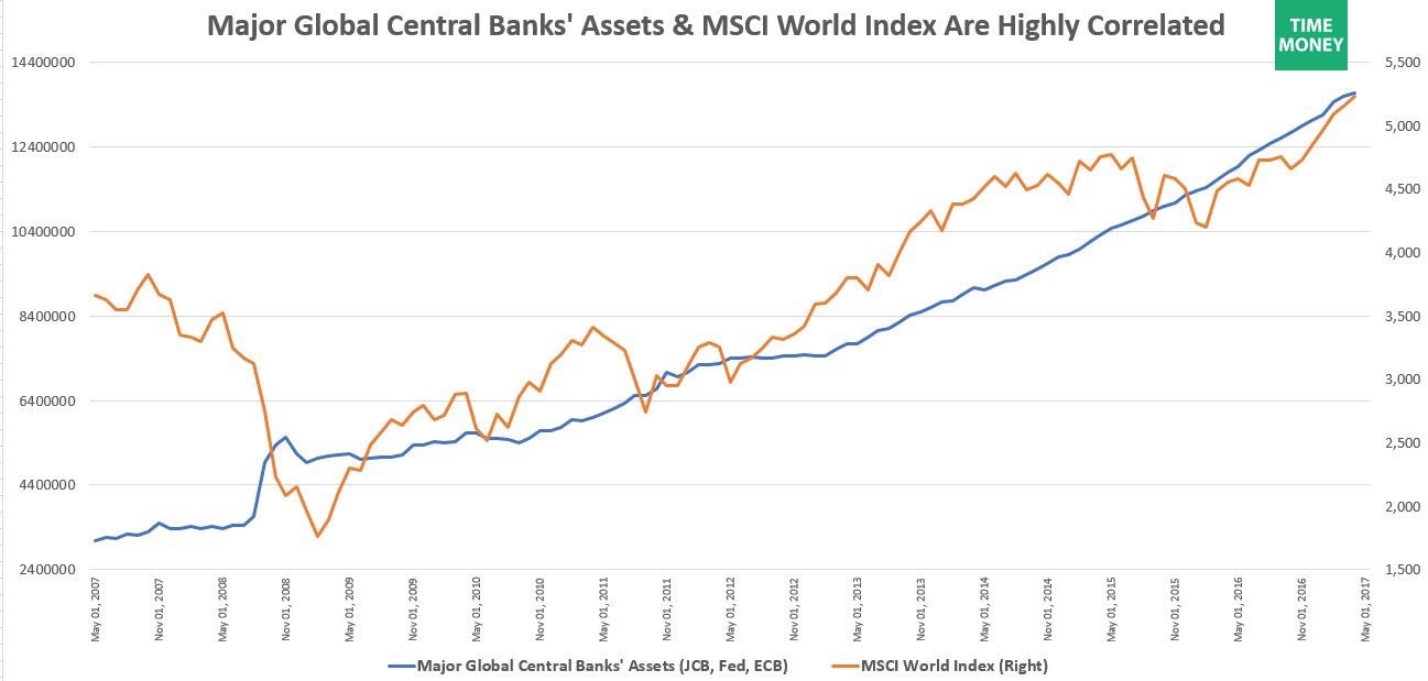
The biggest question facing investors looking at monetary policy is when the central banks will start unwinding their balance sheets. If the Fed shrinks its balance sheet and the ECB continues its bond purchases, it’s equivalent to shuffling papers. As you can see in the chart below, the JCB, ECB, and the Fed have collectively had their balance sheets increase in size since late 2008. There hasn’t been a 20% correction since a few months after the start of the central bank buying. There hasn’t even been a 5% correction in the S&P 500 since the beginning of last year. The MSCI World index has a 79% correlation with the global central banks’ assets since 2007.
Citi expects the growth in central banks’ balance sheets to slow in the next few months and then start to shrink in the middle of 2018. In the next 3 months, we will get greater clarity on what will happen in 2018 as the Fed will either tell us when it’s starting the program or already start it. The biggest uncertainty will be with the ECB. Citi seems to be maintaining its projection that the ECB will stop its expansion in 2018. I’m not sure if Citi has changed its stance since the latest ECB meeting. I could be misinterpreting the lack of discussion for a taper. The ECB may have said it hasn’t had discussions about an unwind because it’s too early in the process. As I said, in the next 3 months we’ll know for sure what the ECB will do. So far, there hasn’t been much of a market reaction to the expected decline in central banks’ balance sheets, but I expect risk assets to start pricing it in soon. As you can see, credit spreads have been highly correlated with central bank buying. If this continues, I expect credit spreads to widen in the next few months.
In seemingly perfect synchrony, the expected shrinkage of the central banks’ balance sheets is happening along with the increase in the high yield energy debt credit default swaps index as you can see in the chart below. We could see a rerun of the increase in defaults seen in early 2016. It’s probably too early to compare the two scenarios because the weak frackers already went bankrupt last year, so the ones remaining are stronger. Plus, the breakeven costs were lowered, so there frackers are more resilient. Finally, it seems unlikely that oil prices will falls to the $20s with OPEC’s cuts in place. While the high yield credit market won’t get as bad as early 2016, spreads could widen in the next few weeks if oil stays in the mid to low $40s.

With the current central bank buying still in place for now, investors are piling into risky assets such as investment grade debt, high yield debt, and emerging market debt. As you can see from the chart below, the 4-week rolling average of the buying in these markets has reached the highest level since February 2015. There has been $35 billion in buying, which is very close the 2015 high.

Another big winner was stocks as there was the biggest inflow into stocks since the presidential election. $24.6 billion flew into stocks with ETFs receiving $26.3 billion and mutual funds losing $1.7 billion. As you can see from the chart below, Vanguard is receiving record flows. Vanguard took in $34 billion in May which was 5th straight record month of inflows. This brings flows to $181 billion for 2017 which is 42% higher than any other start to a year.

As you can see from the chart below, the 10-year breakeven inflation rate continues to fall. It is now at 1.71%. It’s almost not worth paying attention to it because the Fed has ignored it. The breakeven inflation was higher in 2013, yet there were no rate hikes. We now have the excuse Yellen will use for raising rates with declining inflation; she blames her decision on the declining price of telecommunication services.

The Fed continues to hope for wage inflation. The chart below does a great job of discussing a few trends I have reviewed in the past. The jobless claims to population ratio is at an all-time low. This chart only goes back to 1997 because that’s as far back as the wage growth data goes. It would look more impressive if it showed the data back until the 1960s. The point of this chart is that the low jobless claims reports haven’t led to exceptional wage growth like you’d expect. Wage growth was higher in the late 1990s and the late 2000s. The latest jobless claims report from this Thursday is no different from the reports we have become used to seeing. Jobless claims fell 8,000 to 237,000 which was below the estimates for 242,000. The record high job openings suggest that firms are having trouble finding qualified workers. You would think that this would cause wages to go up, but I think the lack of labor productivity gains are preventing firms from paying higher wages. This is despite the record S&P 500 profit margins. The reason why this is possible is because small businesses still do a majority of the hiring in America and they aren’t seeing record profit margins despite the exceptionally high optimism they show in surveys.

Conclusion
Central banks still run the show when it comes to risk assets. The upward trend in central banks’ balance sheets and record S&P 500 earnings are powering stocks higher. I expect this tailwind to continue for the next few months until profit margins reach their ceiling in Q3 and the Fed starts the unwind. The headwinds will only get stronger in 2018 as the Fed increases its unwind, the ECB starts its taper, and the S&P 500 faces the tough comparisons from the amazing earnings season we had 2 months ago. I see a possible correction in the fall and the potential ending of the bull market in the first half of 2018. For now, we party on.



Comments
Log in or sign up to join the conversation.