
Federal Reserve Bank of Chicago President Charles Evans got some attention recently with the following statement:
In a world of global competition and new technology, I think competition is coming from new places. New partners are choosing to merge and sort of changing the marketplace and [bringing] more competitive pressures on price margins…If that’s the case, and I think that’s just speculative at this point, then it means that we need even more accommodation to get inflation up.
Here are some of the data that might support such a statement. The existence of a Phillips Curve is one of the Fed’s core assumptions: as unemployment gets lower, the inflation rate should pick up. We’ve seen a huge drop in unemployment over the last six years. And in response, inflation did … pretty much nothing. It sure looks like other factors — maybe changes in competitive structure, maybe something else– are having a bigger influence on inflation than is the unemployment rate at the moment.

Inflation rate measured as year-over-year percent change in the implicit price deflator on personal consumption expenditures (second quarter to second quarter for 2010-2016, first quarter to first quarter for 2017), and unemployment rate (June of each year for 2010-2016, May for 2017).
But to that I’d add this– there’s really nothing new about the claim that other factors have a bigger influence on inflation than the unemployment rate. Here for example is a scatter plot going back to 1949 of the year-over-year change in inflation against the unemployment rate. I’ve drawn the regression line, as economists like to do, to help your imagination see the modest negative relation that holds in the data. But it is indeed modest, with an R2 of only 6%.
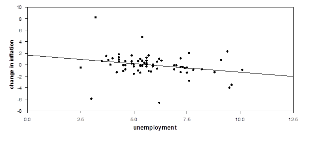
Annual data, 1949-2017. Vertical axis: year-over-year change in the inflation rate. Horizontal axis: unemployment.
Of course, economists have been teaching for a couple of generations that the Phillips Curve shifts over time due to changes in expected inflation. I’ve actually already incorporated a quick and dirty fix for this in the figure above by measuring the difference between this year’s and last year’s inflation on the vertical axis. If people expect this year’s inflation to be the same as last year, the result (as in Charles Jones’s macroeconomics textbook) is a Phillips Curve adjusted for expectations.
Or we can try to measure expectations of inflation using for example the University of Michigan’s survey of consumer expectations. But that actually brings the R2 down to 5%. That means 95% of the variance comes from something else.
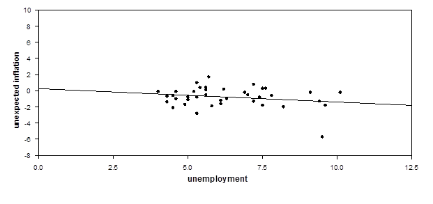
Annual data, 1979-2017. Vertical axis: year-over-year inflation rate minus previous year’s expected inflation. Horizontal axis: unemployment.
We can try to tweak this further by using the difference between the unemployment rate and the “natural unemployment rate” on the horizontal axis. That has a better fit, in part because our ex-post estimates of the natural rate are based on whether we saw inflation go up that year. If inflation went up, we infer that the natural rate of unemployment must have been higher. But good luck figuring out whether the U.S. is above or below the natural rate right now.
I’m not saying the Phillips Curve has no basis in facts. I agree that the Phillips Curve is the correct framework for thinking about these questions. But I also agree with President Evans that other factors seem to be more important than the unemployment rate right now in determining inflation.
Because they always have been.
And I also agree with President Evans’s conclusion. Given that inflation has stayed so low for so long, it makes sense to wait to see stronger evidence that inflation is really picking up before we put the brakes on the economy.
Comments
Log in or sign up to join the conversation.