


"Violent revolutions do not so much redistribute wealth as destroy it... The only real revolution is in the enlightenment of the mind and the improvement of character."
— Will Durant, The Lessons of History
For roughly three decades after World War II, worker pay rose almost one-for-one with productivity. As the economy grew, so did wages. That allowed a single income to buy a house, two cars, and take the family on vacation every year. Then, around 1979, it stopped.
Productivity kept climbing, rising nearly 60% over the next forty years. But wages didn't follow. They rose just 13.7% over the same stretch, adjusted for inflation.
That's what Peter Turchin asked about in his America's 250th birthday post on Substack. Turchin is a complexity scientist who runs quantitative models on thousands of years of political and economic history, the same models that led him to a concept called elite overproduction, which we'll get to shortly.
His question for America at 250, and the question we're going to look at today, is this: could a growing economy still mean a growing paycheck?
Look at this chart from the Economic Policy Institute.
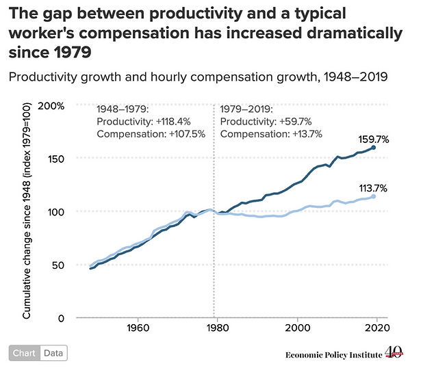
From 1948 to 1979, productivity and worker pay moved almost in lockstep. Productivity grew 118.4%, compensation grew 107.5%.
Then the lines split: from 1979 to 2019, productivity grew another 59.7%, compensation just 13.7%.
Critics will rightly say that this measure is somewhat misleading. For example, machinery and automation propel productivity, and they come at a cost.
Economists like the late Martin Feldstein at Harvard and Robert Lawrence at AEI believe that once you count employer-paid health insurance and retirement contributions as compensation, use one consistent inflation measure instead of two, and look at total compensation instead of take-home wages, most of the "GDP up, paychecks flat" story disappears.
While their take is worth considering, it also proves the point another way. The share of compensation received as spendable cash has shrunk relative to the share accruing to a benefits statement.
Call it a measurement dispute or call it a distribution problem, either way, it explains why a family that's "doing fine" on paper doesn't feel like they are.
If wages really fell behind the cost of living, it wouldn't just show up in one abstract ratio. It would show up everywhere people spend money: healthcare, housing and education.
Here’s the thing. It does.
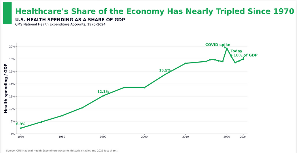
In healthcare, medical spending has steadily consumed a larger share of the American economy for more than fifty years.
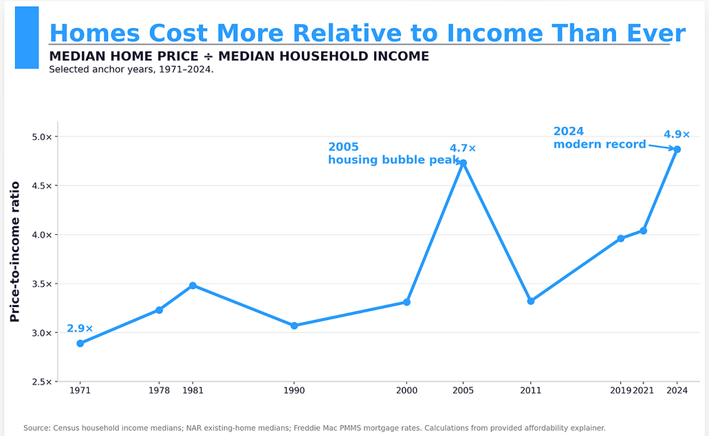
Over the last half century, home prices have climbed far faster than household incomes, pushing ownership further out of reach for the typical family.
But price isn't the whole story. Mortgage rates matter too. Today's homes are the least affordable by price on record, yet the monthly payment burden was worse during the Volcker era.
There are two ways to measure housing, and they lead to different conclusions.
By price alone, 2024 is the worst on record, a home now costs 4.9 times median household income, higher than even the 2005 bubble peak. By monthly payment as a share of income, 2024 is bad but not the worst ever, 31%, worse than 2005, but still better than 1981's 47%, when Volcker-era rates alone ate up nearly half a typical paycheck.
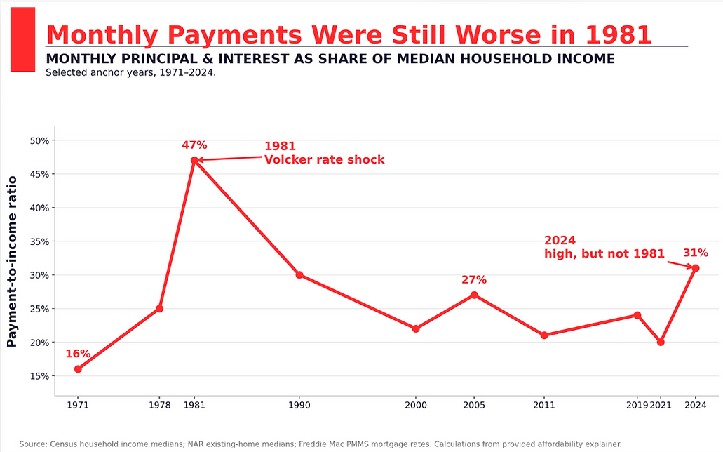
Regardless, housing has gotten harder to afford, not easier.
Education? Same story. Public college tuition didn't merely outrun inflation, it left both inflation and wage growth far behind, fundamentally changing the economics of earning a degree.
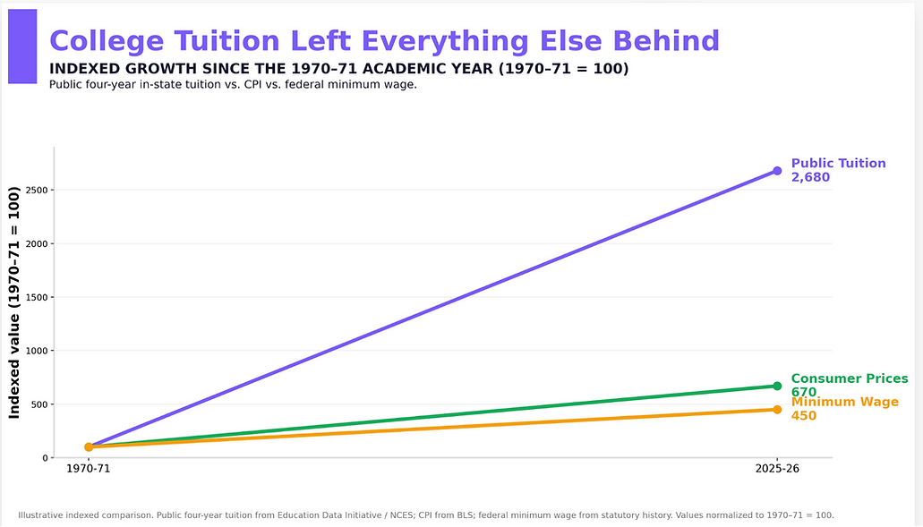
As for retirement contributions, according to the NBER, in 1979 nearly 45% of the US work force was covered by an employer-funded pension, though roughly half were not vested. Pensions provided a guaranteed payment in retirement, for life. Today, pensions have largely been replaced by 401k and other defined contribution plans.
With each of these examples, there is nuance. Statistics can be found to support almost any argument you want to make. Plausible cases can be made that inflation is or isn’t high, that wages have or have not kept up with inflation, that today is or isn’t “harder” on the average American than it was in the (pick your decade).
Again, I go back to Dr. Turchin’s work, looking not just at the past several decades, but at 250 years.
Turchin’s Multi-Century View
Turchin asks: how much of the economy's growing output made it into the paycheck of the typical worker?
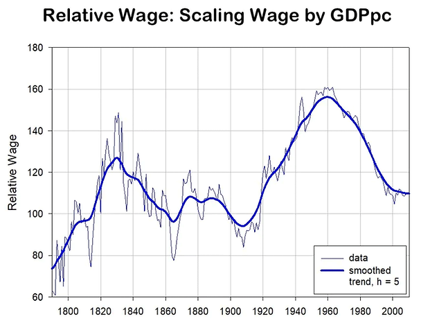
Source: Peter Turchin
For 250 years, Turchin tracked a "relative wage": worker wages measured against GDP per capita. That ratio moves in two long cycles: up through the early republic until about 1830, down for eighty years after, up again from the New Deal through the postwar decades.
And now, by his research, down again.
In Turchin's read of the antebellum U.S., the problem wasn't just money at the top, it was too many people with elite credentials chasing too few offices. Between roughly 1830 and 1860, the ranks of lawyers and would-be officeholders grew faster than the system's ability to absorb them. Too many ambitious men, not enough Senate seats and judgeships. In his story, that surplus helps turn routine conflict into open violence: episodes like the caning of a U.S. senator on the Senate floor in 1856 are symptoms of that pressure, not outliers.
The downswing after that, the Gilded Age, was defused through reform: labor law, antitrust enforcement, the New Deal. The downswing before it wasn't defused. It became the Civil War.
In Turchin's research, a rising glut of elites and a shrinking middle class aren't two separate problems. They're the same problem, seen from opposite ends: too many players at the top and too little stability in the middle.
The chart below layers six separate measures onto a single scale: wages, health, immigration, inequality, polarization, and instability itself.
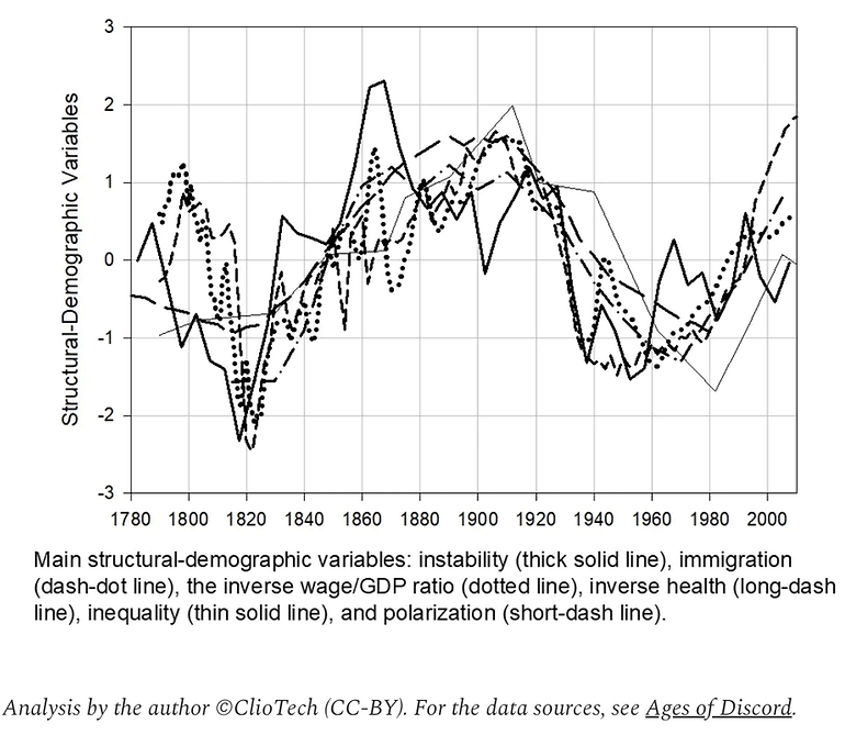
Source: Peter Turchin
If there's one thing you should take away from it, it's this: these six measures rarely move together. When they have, twice in 250 years, the country entered a period of real upheaval. Right now, they're moving together again.
The troughs in the chart are the good times. They land around 1820 and 1950. The peaks land around the run-up to the Civil War. Turchin's research for this chart runs through 2010, but in his own words, the disintegrative trend it captures has only deepened since, in a country he now calls "extremely fragile."
Turchin isn't predicting a repeat of the 1860s. Neither am I. I'm simply asking us to consider whether his research, falling relative wages, rising inequality, more division, means something larger is upon us.
The point of all of this is to better understand what we are living through and from there, perhaps have some influence. We are heading into what looks to be an interesting election season. Already New York City has elected a “Democratic Socialist” as mayor. The question becomes “why?”
I think the answer lies in the status quo. We are among the lucky ones. If we don’t willingly change something, change may find us in what could be a most unpleasant way. As Peter Turchin's research shows, we’ve seen this situation in the US before. Today is the third time in 250 years we've seen distortions this extreme. Can we find a better resolution this time? I want to believe we can.
Next week we’ll continue exploring where we are, how we got here, and possible paths for the future. While I am aware of the cyclical research of others, some of whom I consider friends, I refuse to accept their work as prophecy.


Comments
Log in or sign up to join the conversation.