

That’s the title of a paper with David Greenlaw, Managing Director of Morgan Stanley, Ethan Harris, head of global economics research at Bank of America Merrill Lynch, and Kenneth West, professor of economics at the University of Wisconsin, which we presented at the U.S. Monetary Policy Forum annual conference in New York on Friday.
Assets held by the Federal Reserve quintupled between 2007 and 2014. The initial phase of this expansion took the form of emergency lending in the fall of 2008, shown in purple in the graph below. These doubled the Fed’s balance sheet within the space of a few months, but were subsequently repaid and are now off the books. Our paper does not discuss the efficacy of the Fed’s lending programs.
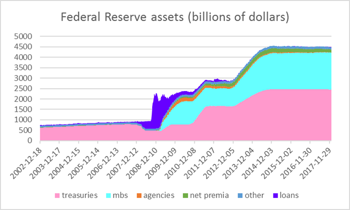
Federal Reserve assets, Dec 18, 2002 to Jan 3, 2018. Wednesday values in billions of dollars. Treasuries: U.S. Treasury securities held outright. MBS: Mortgage-backed securities held outright. Agencies: Federal agency debt securities held outright. Net premia: unamortized premia minus unamortized discounts. Other: sum of float, other Federal Reserve assets, foreign currency denominated assets, gold, Treasury currency, and special drawing rights. Loans: sum of loans, net portfolio holdings of Commercial Paper Funding Facility LLC, Maiden Lane I, II, and III, net portfolio holdings of TALF LLC, repurchase agreements, preferred interests in AIA Aurora LLC and ALICO Holdings LLC, central bank liquidity swaps, and term auction credit. Data source: Federal Reserve H41 archive. Source: Greenlaw, Hamilton, Harris and West (2018).
Our focus is instead on the steady purchases of Treasury securities (in pink) and mortgage-backed securities (in turquoise) carried out in three separate phases popularly referred to as QE1, QE2, and QE3. As Ben Bernanke put it just before he stepped down as Chair of the Federal Reserve, “the problem with QE is it works in practice, but it doesn’t work in theory.” In standard macro-finance models, these should not have had any effect on interest rates or economic activity (see for example Eggertson and Woodford, 2003). More refined models imply potential effects from altering the supply of publicly held Treasury securities, coming from factors such as nonpecuniary benefits some institutions may derive from holding Treasury securities (Woodford, 2012) or preferences or restrictions on the kinds of securities different institutions hold (Chen, Curdia and Ferrero, 2012; Greenwood and Vayanos, 2014). Another possibility is that large Fed holdings of Treasury securities implicitly or explicitly commit the Fed or the Treasury to alternative future policy (Hamilton and Wu, 2012; Eggertsson and Proulx, 2016).
Some of the strongest evidence that these policies work comes from event studies. Researchers have proposed a few key dates on which Fed announcements concerning expansion of QE1, QE2, or QE3 resulted in significant moves in long-term interest rates. These studies have helped contribute to a rough consensus that these programs were successful in lowering the interest rate on 10-year Treasuries by about 100 basis points, thereby boosting consumption and investment demand and helping the economic recovery.
One concern is which Fed announcements get selected for inclusion in such studies. To gauge the importance of date selection, we examined every single day when there was an FOMC announcement, release of Fed minutes, or a policy-related speech by the Fed Chair. We identified 255 such days between October 31, 2008 and December 31, 2017. The graph below plots the cumulative change in the nominal and real 10-year Treasury yields on these days alone. After initial drops with announcements of the onsets of QE1, QE2, and QE3, the overall change in yields on these days of Fed announcements was dramatically up during each of these episodes– exactly the opposite of the claimed effect.
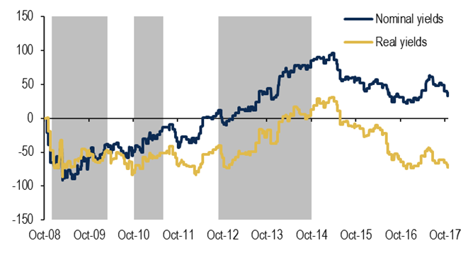
Cumulative change in basis points on days of FOMC meetings, minute releases, and Chair speeches, with zero change imputed to all other days. Shaded regions denote Jan 2009 to Mar 2010 for QE1, Nov 2010 to June 2011 for QE2 and Oct 2012 to Oct 2014 for QE3. Many of the announcement effects should come before or at the start of the shaded areas. Source: Greenlaw, Hamilton, Harris and West (2018).
As a second approach, we looked at the Reuters bond market wrap-up for every day when the interest rate moved up or down by more than one standard deviation. Applying a filter like this was necessary to keep the search manageable and to restrict the search for days for which there was a meaningful market summary from Reuters. We were interested in whether the Reuters summary attributed the move to Federal Reserve actions or announcements. We identified 161 such days over this period. The graph below plots the cumulative change in yields on these Reuters Fed news days. These give a similar impression from the first graph– initial Fed announcements drove interest rates down, but Reuters also attributed subsequent interest rate rises to announcements or actions by the Fed.
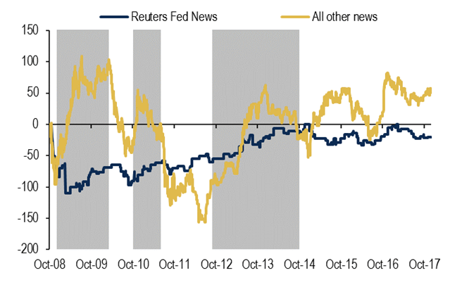
Cumulative change in nominal 10-year yield on days on which Reuters reports concluded that news about the Fed was a major factor influencing bond markets (in blue) and on all other days (in gold). Source: Greenlaw, Hamilton, Harris and West (2018).
The most important date in every event study is March 18, 2009, when the Fed announced its intention to increase its purchases significantly, driving the 10-year yield down by a stunning 47 basis points. But after the statement released at the Fed’s subsequent meeting on April 29, the yield went back up by 10 basis points. The latter move is included in both our previous graphs but is left out of most event studies. The Reuters wrap-up for that day offered this summary:
U.S. government bond prices fell on Wednesday, sending yields to 5-month highs, after the Federal Reserve sounded a hopeful tone on the economy in its post-meeting policy statement…. The statement also disappointed bond investors hoping that the Fed would announce an expansion of its program of buying Treasuries, which is part of its credit easing efforts and had helped keep yields from rising.
One possibility is that the initial response in March was based on investor anticipation of a larger program than the Fed actually delivered. A second possibility is that the market was reacting in March not just to the bond purchases but also to the Fed’s information that the economy was weaker than some analysts had believed, a signal that was in part reversed in April; see Nakamura and Steinsson (2016) for evidence on the importance of such signaling effects associated with Fed announcements. A third possibility is that the consequences of the Fed’s bold new plan required time for everyone to analyze and digest. Whatever the interpretation, it seems likely that using the March 18 move as a stand-in for the effects of the overall policy as eventually implemented could well overstate the program’s true effects.
Another example that people often point to is the 9-basis-point jump in the 10-year yield on May 22, 2013 when Fed Chair Bernanke raised the possibility that the Fed might soon taper the pace at which it was buying new securities, a reaction popularly dubbed the “taper tantrum.” Here again we feel conventional wisdom may have overemphasized the role of the Federal Reserve. The figure below plots the cumulative change in interest rates during 2013. The changes on days of Fed statements or attributed by Reuters to anything about the Fed are a very minor part of the broad rise in yields.
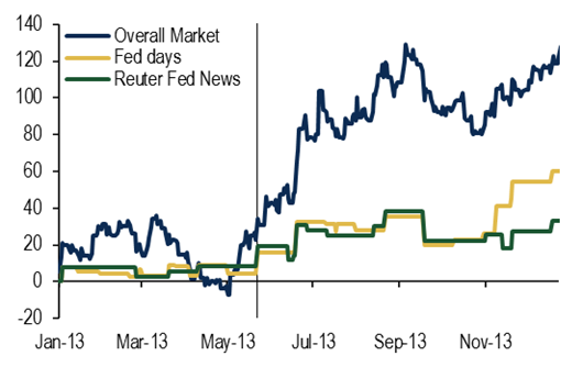
Cumulative change in nominal 10-year yield from December 31, 2012 to December 31, 2013. Blue: actual change, gold: changes only on days of FOMC statements, minutes, or Fed Chair speeches; green: changes only on days identified by Reuters as driven by Fed news. Vertical line is drawn on May 21, the day before Bernanke’s first taper warning.
The market’s reactions to Fed announcements of its current program to shrink its balance sheet are also worth noting. As seen in the tables below, the shrinkage began earlier than market participants had been expecting (row one), the drawdown in the balance sheet a couple years out was larger than expected (row two), the Fed paused its rate hikes for only one press conference meeting when starting the shrinkage (row three), and the shrinkage was presented as very much a pre-programed plan (row four).
(Click on image to enlarge)
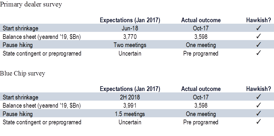
Median expectations for balance-sheet actions based on New York Fed primary dealer survey and Blue Chip survey. Source: Greenlaw, Hamilton, Harris and West (2018).
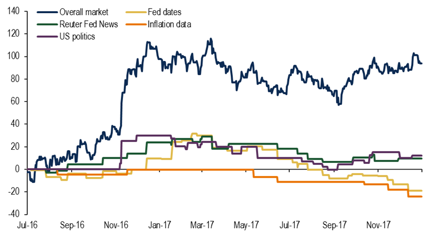
But that news from the Fed seems to have played little role in the rise in interest rates last year. Indeed, the cumulative change on days of Fed statements is actually negative. We have dubbed the lack of market reaction to last year’s news about the balance sheet as the “shrinkage shrug.”
(Click on image to enlarge)
Our study raises a caution about the event study methodology. There is a potential tendency to select dates after the fact that confirm the researcher’s prior beliefs about what the effect was supposed to have been. The impact of the Fed’s balance-sheet policy appears to us to be substantially less certain than the current consensus, and the effect could be substantially smaller than is often believed.
Comments
Log in or sign up to join the conversation.