

Image Source: Luke Chesser on Unsplash
It’s a beautiful day in Maryland. It’ll be 75 degrees. And what better way to spend it than outside with the dogs at the farm? Maryland’s second false spring has arrived, meaning that we’ll be back in the 30s by mid-week and we’ll probably have snow on Orioles’ Opening Day.
Yesterday, I laid out the case that a short squeeze is possible, followed by a continuation of the trend. I’m not convinced there is a bottom in this market yet, especially with the MOVE Index surging to levels we haven’t seen since May of 2025.
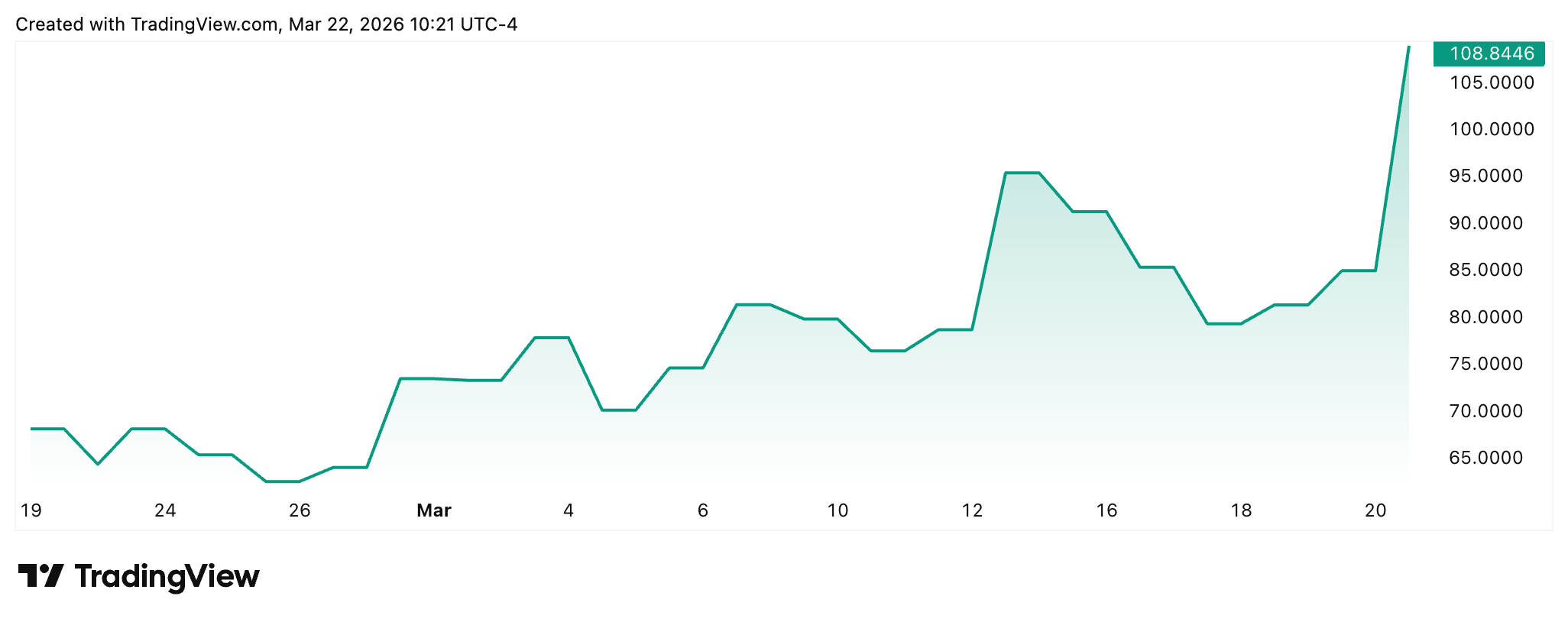
Image Source: TradingView
There’s one other reason why I’m very concerned today: The first email that arrived in my inbox at 5:51 am.
As you may know, the 'Waterfall Structure' of markets goes that liquidity lives upstream of everything. Momentum follows and then returns. When liquidity, all capital and credit available inside the system, evaporates, the market follows.
Well, here comes the chart that makes me swallow very, very hard.
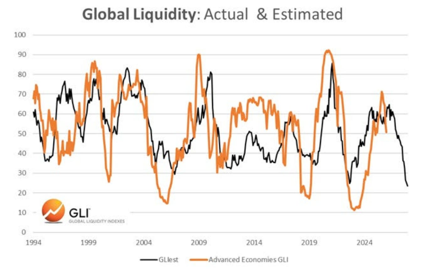
Image Source: Michael Howell, Global Liquidity Index
Bond volatility has picked up in recent weeks, as we’ve discussed.
As Howell explained this morning, roughly 77% of global lending is now collateral-based, and given that Treasuries and other forms of bonds are used as that collateral, a surge in yields leads to a decline in collateral quality and cuts to repo-style lending (you can borrow less with the same collateral as cuts rise).
These are all things I explained at length last summer while diving into Bank for International Settlements reports on cuts and the impact of the Bank of Japan’s monetary policy on U.S. bond markets.
The thing that speaks out in Howell’s analysis today - and I always recommend subscribing to his letter because of how important it is to market knowledge - is that he laid out specifically how much each $10 increase in oil prices impacts his liquidity index, how much a move in the MOVE index impacts liquidity, and how much a rise in the U.S. dollar (which is also rising) impacts the index as well.
It all added up to a staggering potential decline in liquidity - and a line that I’ve written about my own commentary in the past that made hair stand on my arms. “I hope we are wrong…” Howell writes.
But, if you follow the Waterfall argument, you know the probability that he isn’t.
Chart No. 2: The Irony of It All
Perhaps nothing is more absurd than the fact that, during a slump in global markets, surging oil prices, and known issues with the debasement of paper money, the U.S. dollar is the thing that would win in a declining-liquidity environment.
The Invesco DB US Dollar Index Bullish Fund (UUP) continues its upward trend.
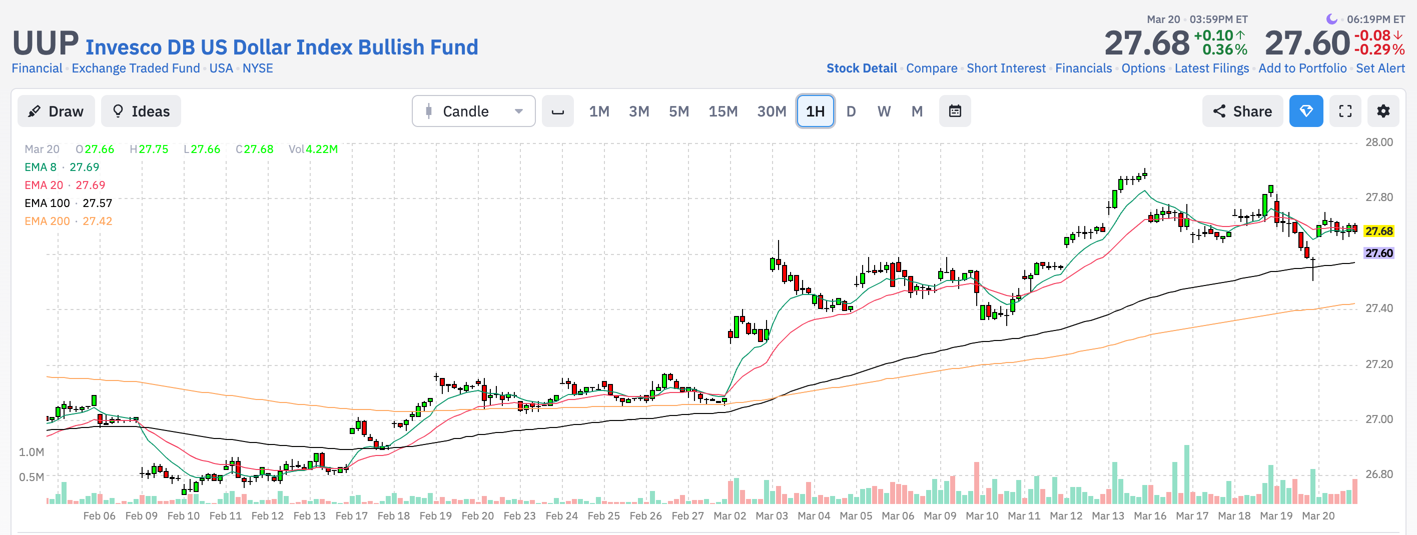
Image Source: Finviz
Wait, what? When global markets sell off, and liquidity dries up, every leveraged position in the world needs one thing to unwind: dollars.
It’s not because the dollar is strong in any fundamental sense, but because the entire global financial system is denominated in it. Every offshore loan, every currency swap, every emerging market bond that was issued in dollars creates a claim that has to be settled in dollars.
When the music stops, demand for dollars doesn’t come from confidence. It comes from the obligations.
You end up with a bizarre outcome where the very currency being debased by deficits and money printing becomes the most sought-after asset in a crisis. Oil surges, equities crater, gold does whatever gold does, and the dollar rallies. Not because anyone believes in it, but because everyone owes in it.
In March 2020, this phenomenon happened fast -- before the Federal Reserve had to open swap lines to other foreign central banks, whose financial systems were desperate for U.S. dollars.
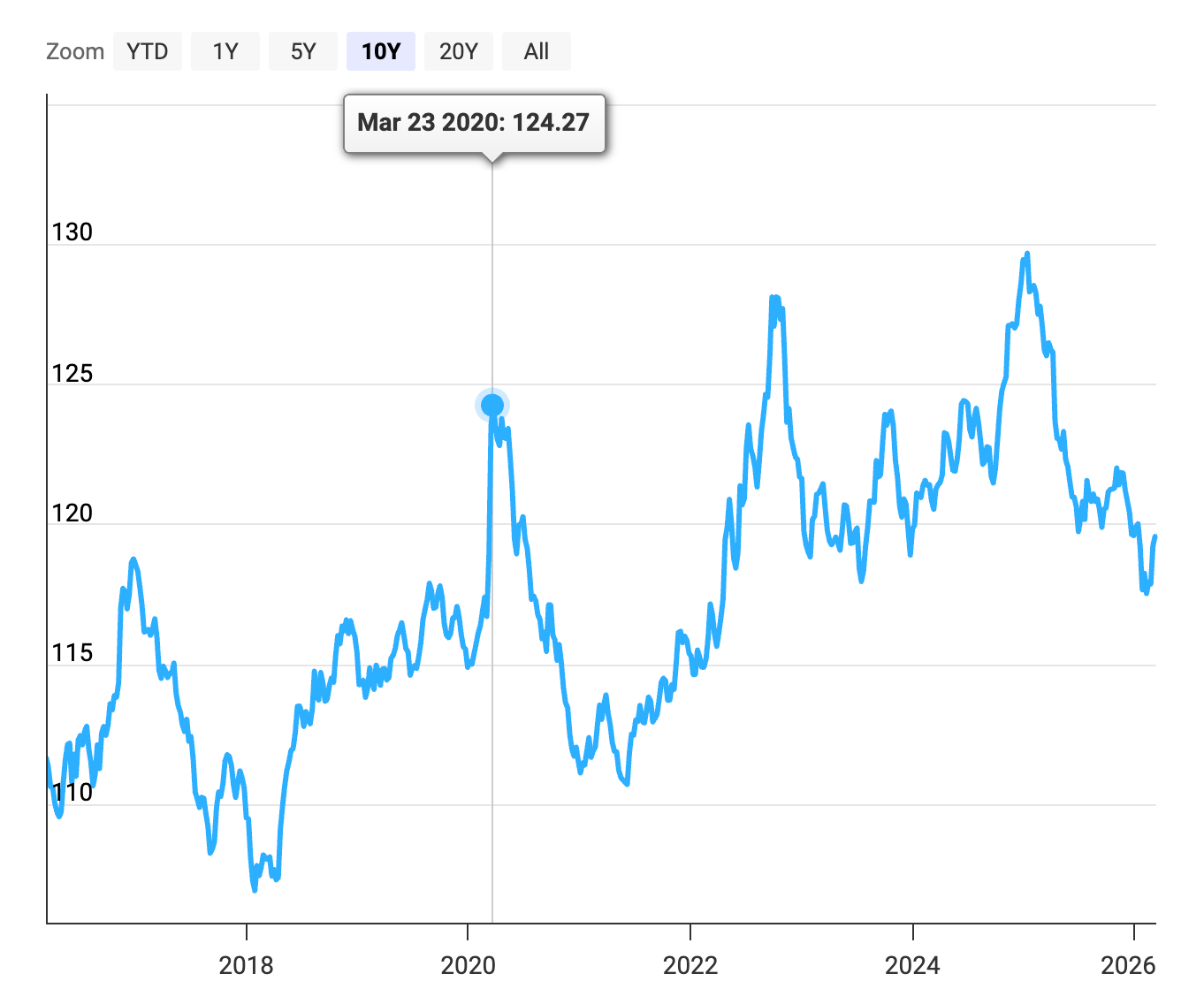
Image Source: DXY, Macrotrends.net
This odd paradox is the difference between something being valuable and something being necessary. The dollar doesn’t need to be sound. It just needs to be the unit of account for $13+ trillion in offshore dollar-denominated debt.
Until that changes, every liquidity crisis is a dollar crisis in reverse -- the worse things get, the more people need the very thing that helped cause the problem. Isn’t global finance wonderful?
Chart 3: You’re Locked Into the Dollar For Now
The global financial system doesn’t run on the dollar because everyone likes it. It runs on the dollar because $13+ trillion in offshore debt is denominated in it, because commodity markets price in it, and because the plumbing of international trade was built around it.
And it’s so huge that it’s impossible to think about how it would ever be unwound in a logical manner. Wrote the Bank for International Settlements in its July 2025 Report:
“The latest growth in dollar credit outside the United States reflects significant credit from bank loans alongside bonds. Dollar credit stood at $14 trillion at end-Q3 2025, with 55% in the form of debt securities. (Chart 6.1).”
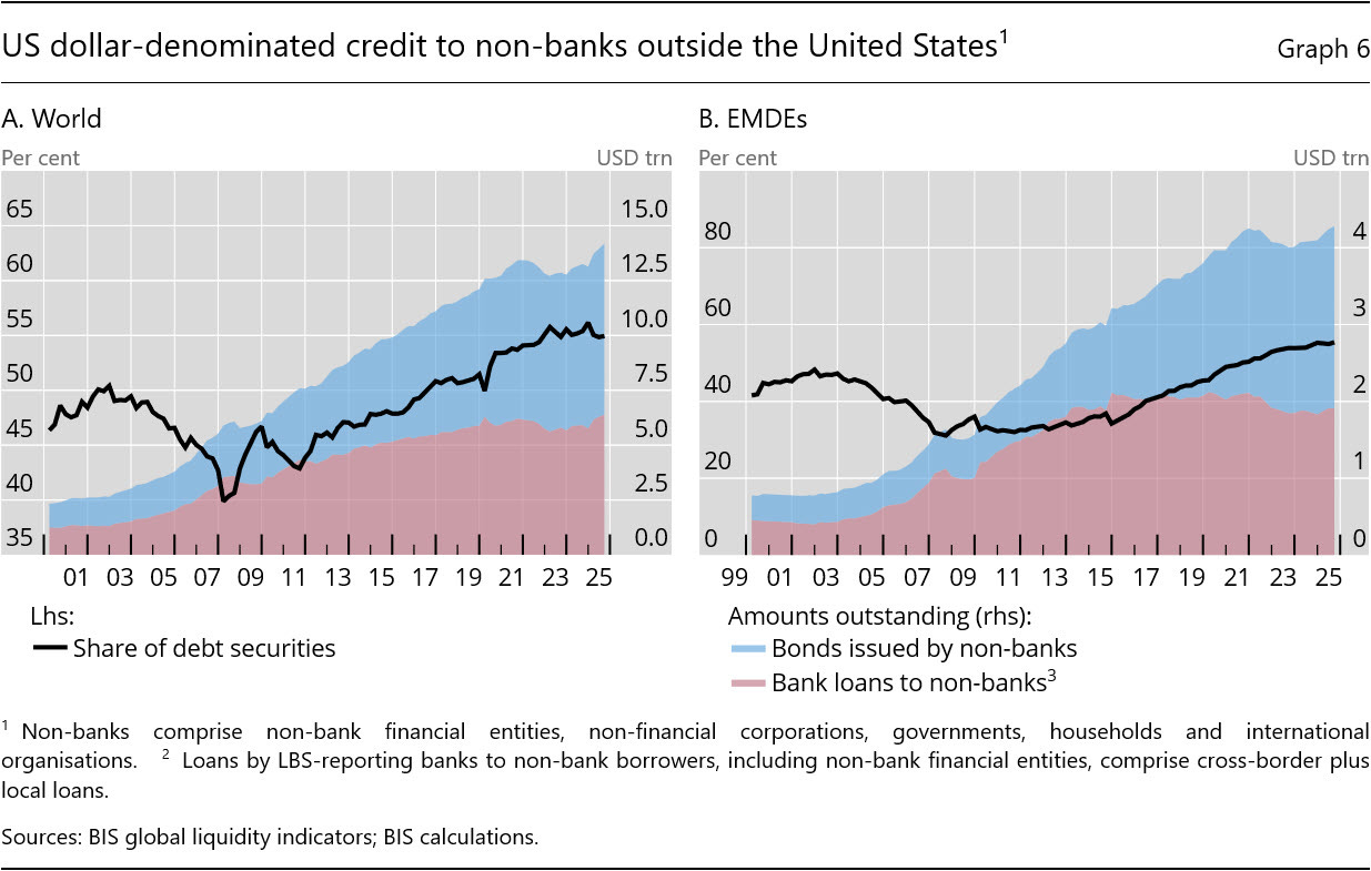
Image Source: BIS
And Robert N. McCauley of Boston University and the University of Oxford showed us two charts in 2024 that showcase how the dollar spreads around the world.
First, dollar credit to non-banks outside the United States in 2024.
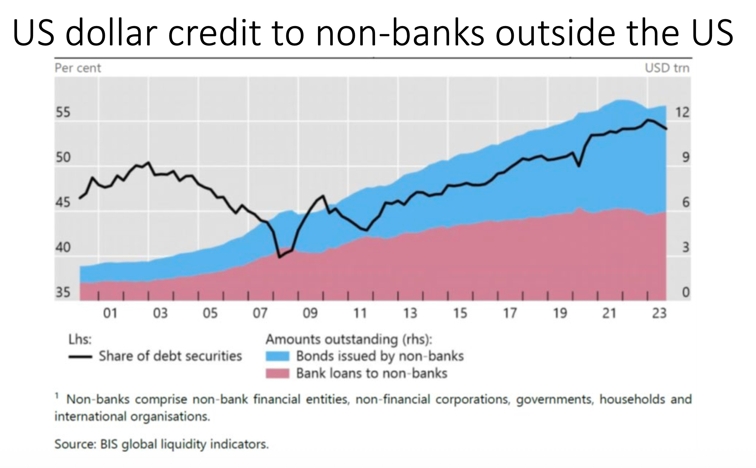
Image Source: McCauley Presentation 2024
Next, the trillions of dollar-based liabilities held by non-US banks abroad.
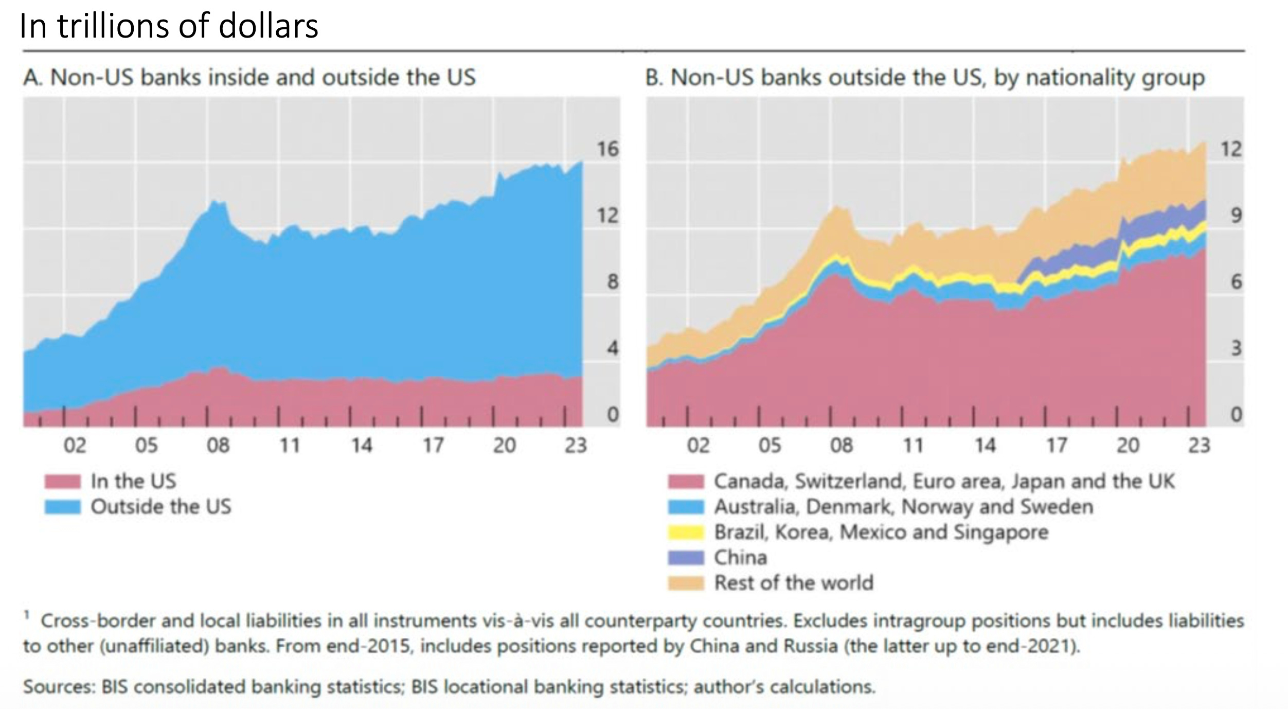
Image Source: Bank for International Settlements
Some people are likely saying: We might see nations just “refuse to use the dollar.” Just no more dollars, right? Rapidly and suddenly.
Here’s the thing, “refusing to accept the dollar” assumes there’s something else to accept. Right now, there isn’t at scale.
The euro has a fractured fiscal union behind it. The yuan has capital controls that make it unusable for global settlement. Gold can’t clear a derivatives contract. Bitcoin, for all its promise, settles at about $10 billion a day. The dollar clears all of that before lunch.
You’d have to rebuild the entire settlement infrastructure of global finance, and nobody has even started. Could it happen eventually? Sure. But “eventually” in monetary systems means decades, not news cycles.
In the meantime, every liquidity crunch, margin call, and forced unwind of leveraged positions anywhere on earth creates more demand for the very thing people claim they want to abandon.
Again, that’s the paradox. The worse the dollar’s fundamentals get, the more the world needs it in a crisis. You can dislike that, but you can’t opt out of it until something else can do what the dollar does. And nothing can -- at least not yet.
Now, let’s move on.
Chart 4: Retail Says, "Meh"
Overall, retail sentiment is the lowest since November, which was the last time we saw a policy adjustment (the Bank of Japan's stimulus measures) and a rise in insider buying. We remain nowhere near the levels last seen during the GILT Crisis or the April 2025 collapse.
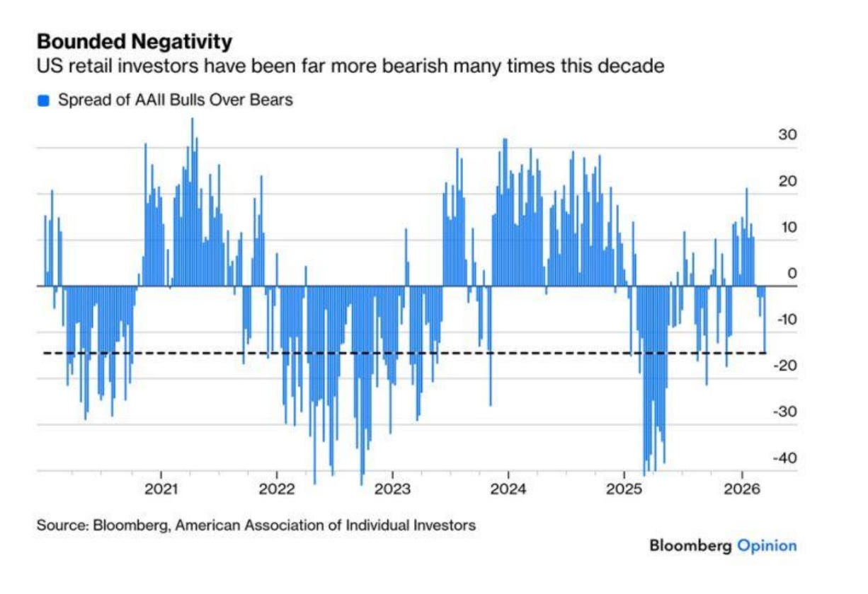
Image Source: Bloomberg
But have another look at this chart and realize that this entire market, since COVID-19, has just been one crisis following another -- and no one ever pays the piper.
We’re not at a point where capitulation would kick in, but we don’t have clear signals of a pure bottom. While I think there’s a possible squeeze in play because that’s how markets behave ahead of these more negative periods, there isn’t anything at the heavy macro-level that gives me a ton of optimism in the months ahead. I need to see some sort of monetary policy action, sorry to say.
Chart 5: Energy is Still Under-Owned
I’ve seen this chart pop up on feeds a lot in the last week. It’s the argument that active equity funds hold a very low percentage of energy stocks in their portfolios compared to the rest of their portfolios. It’s viewed as some guiding torch that energy stocks are cheap. Well, here’s a quick counterargument to that.
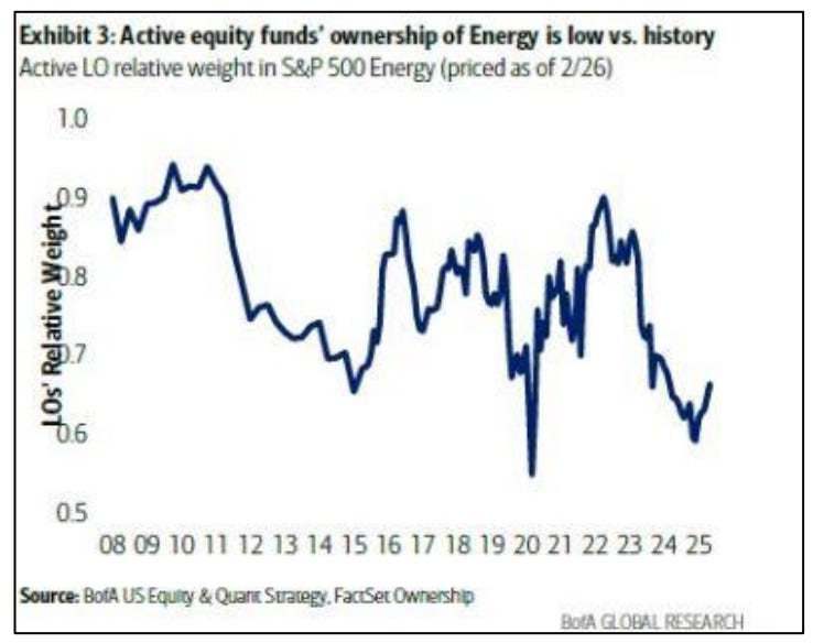
Image Source: Bank of America
I love energy stocks. I love pipelines. I like certain debt-free upstream operators. I believe it’s insane that the entire energy infrastructure that would power AI is trading at multiples way lower than those of the speculative players in the AI space.
But, we live in a highly financialized economy, where the SEC is now calling for more crypto-based ETFs and innovative tokenized products. The reality is that the incentives to buy and hold these assets have been continually eroded by various policies. And in a world of alpha-chasing, friction-less investing, what would you rather own when they print money? Oil or Bitcoin?
A rational man might say energy. But what about a hedge fund manager who loves leverage and momentum -- and yachts?
Chart 6: The AI Private Credit Story in One Chart
This next chart tells a story we’ve been covering. The Qualtrics 2030 loan (in the chart below) traded at par through January, and by mid-March, it was trading at 85 cents on the dollar. That’s a 15% decline in six weeks on debt that was supposed to be good money.
What changed wasn’t the balance sheet. What changed was the market’s view of the company’s future, as AI disruption risk repriced the loan in real time.
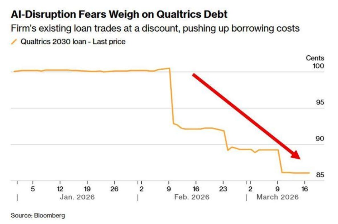
Image Source: Bloomberg
This is exactly the pattern I wrote about yesterday. The underlying asset deteriorates, the secondary market marks it down, and by the time anyone thinks about activating redemption limits, the damage is already priced in.
Gates won’t prevent this kind of repricing. They’ll just make sure the investors holding the paper can’t get out while it happens. The fire doesn’t wait for permission. And neither does the market.
Chart 7: Contrarian Long on This Real Estate Market?
One of the things I look back on is that I had a chance to invest in Dubai's real estate market in 2020, right as COVID-19 shut the world down. I bought land in a swamp in Florida. The Dubai property went up 140% in two years.
The Florida property, it broke even after a bunch of upgrades. Well, here’s the Dubai Property Index.
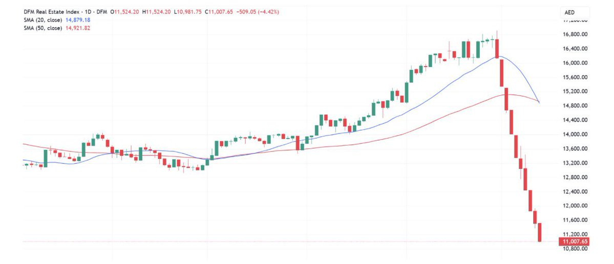
Image Source: TradingView via The Pareto Investor
I will say that this is one of the most beautiful places I’ve ever traveled, and one of the more interesting economic models of our times. A contrarian buy?
Chart 8: Food Prices Will Be Higher Regardless
It doesn’t matter if the war ends tomorrow; this is the price of fertilizer. It’s surging right as planting season kicks off for major crops.
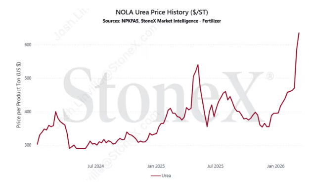
Image Source: StoneX
As I explained in my Iran presentation two weeks ago, this was the story that would show up much later in the year, a six- to 12-month lag.
You know what happens in six months, right on time? The Mid-Term election. If this becomes a story about rising grocery and produce prices, this will be the original chart that flips the House and the Senate. I'm just saying.
Chart 9: Just Two Remain
Now, briefly away from finance, in one of the “chalkier” tournaments that we’ve seen in the NCAA Men’s Basketball Tournament, just two perfect brackets remain heading into the Sweet 16 play-in games. And that to me is pretty stunning.

There haven’t been a ton of wild upsets. Sure, Texas has advanced, but that doesn’t seem completely illogical, even with them beating Gonzaga. I am pretty convinced that fewer people than ever are taking a more traditional approach and are now betting more on bigger upsets in the first rounds -- only to find out that, no, North Dakota State is, in fact, not better than Michigan State.
Just two remaining? Out of over 26 million brackets. And that Mini Me person apparently had 25 brackets, based on the fact that this is their 24th.
Seven of my eight elite eight remain intact, as does my Final Four. I’m the only person in our pool to take Arizona over Michigan State in the finals, so that’s basically what I need to happen if I want a Southwest Gift Card.
Chart 10: The Most Important Chart This Week
These are near-month oil prices in Oman and Dubai -- settlement on over $170 and $153, respectively. Another chart I saw had cash Dubai crude prices over $170, which are levels we’ve never really seen.
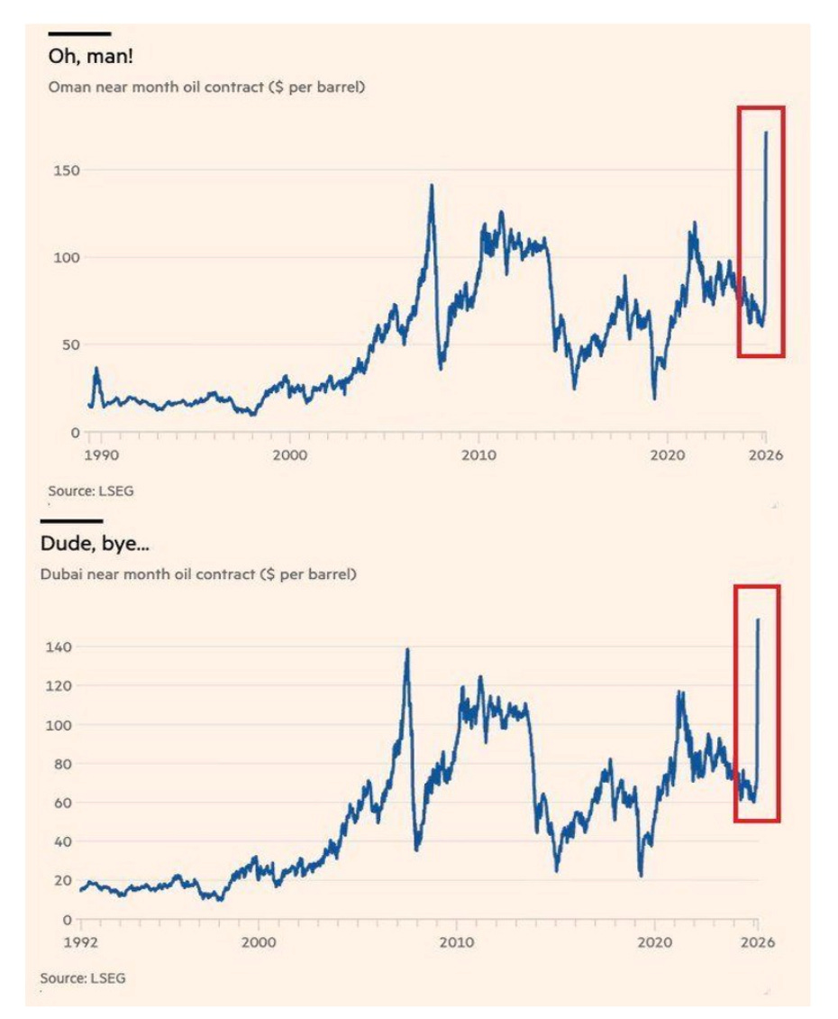
Image Source: Financial Times
This is telling us there’s a shortage of crude coming out of the Strait of Hormuz, and that Brent and WTI prices haven’t fully reflected this yet. There’s still the hope that this unwinds, but we’re now crossing a new level.
As I noted at the start of this, higher crude prices impact liquidity levels, which in turn impact momentum, which impacts everything else downstream in terms of equity returns. I think what’s confusing even here is that gold could move a lot lower if we end up seeing people have to dump gold positions for dollars.
What a world we live in.
Chart 11: And Finally, History Rhymes
It’s been a while since I revisited my argument that we would see a similar pathway to the 1970s with waves of inflation.
I didn’t have Middle East tensions like this on the bingo card, just really more of a focus on how capital waves occur and the constant pace of monetary expansion. Well, Here’s the current path of CPI in brown, and the '70s CPI figure, which was honestly way less doomed than the one we have now.
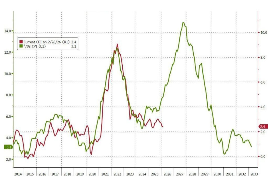
Image Source: ZeroHedge, Bloomberg
Here’s the issue. In a world of debt, and the threat of credit crises, picture the false choice that Jerome Powell may need to make on the way out the door. You either accept the consequences of 17 years of loose fiscal conditions and non-stop monetary expansion to save markets, and allow all of this to correct on your watch, or you go the route of what England and Japan have done, which is to inject stimulus in the face of inflationary threats.
My bet is on the latter. And if that’s the case, the lessons remain the same: More monetary expansion will come at some point, and if that’s also the case, we’ll need to release our latest "Hedge of Tomorrow 2.0" report on April 2, my 45th Birthday.


Comments
Log in or sign up to join the conversation.