
Deflationary Spiral In The Commodities Sector
Tonight I would like to update some charts we’ve been following for a very long time in regards to the deflationary spiral that really took hold in July of 2014. With the US dollar still in correction mode one would think that commodities would be going through the roof like the PM complex but that’s not the case. It appears that everything but the PM complex is starting to gather momentum to the downside.
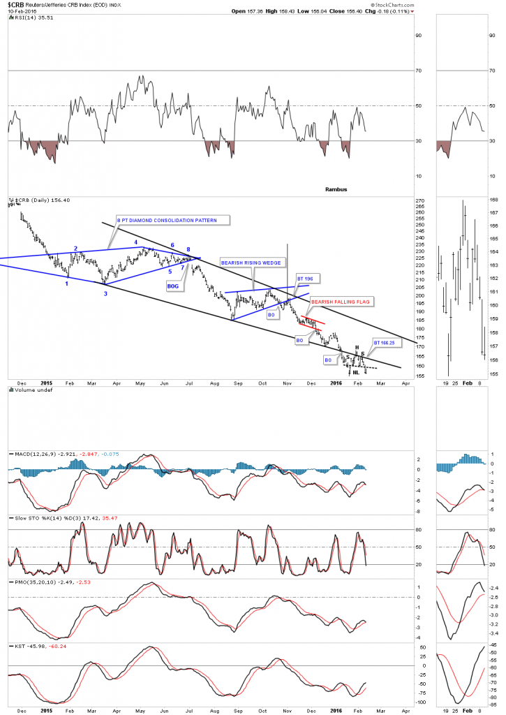
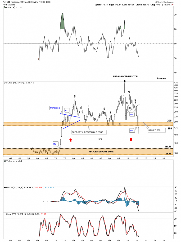
Lets start with a few commodities index we’ve been tracking which for the most part are completing their breakouts and backtesting process. I doubt you’ll see this take on the CRB index anywhere else but Rambus Chartology. We’ve been tracking this one year bearish falling wedge once it became visible after the fourth reversal point was made. Note the breakout and backtest of the bottom rail that has formed a H&S consolidation pattern as the backtest.
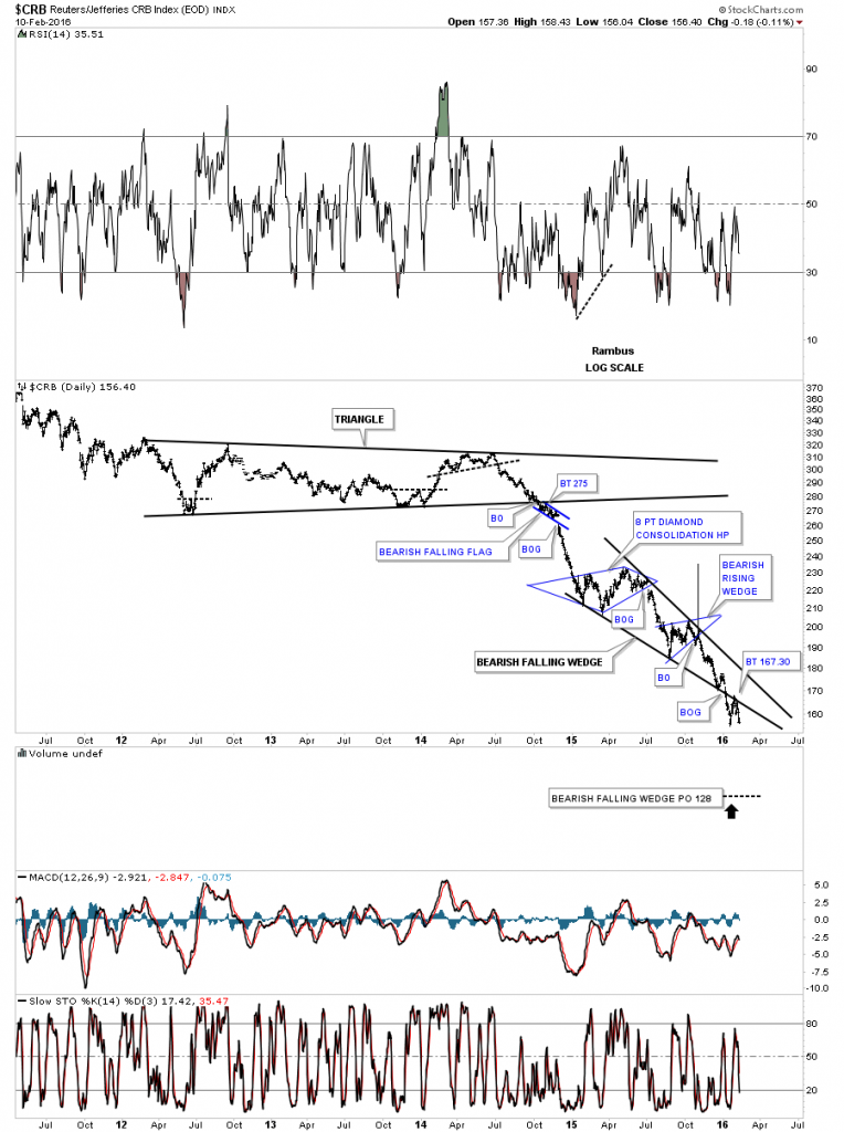
The long term daily chart for the CRB index puts the bearish falling wedge in perspective.
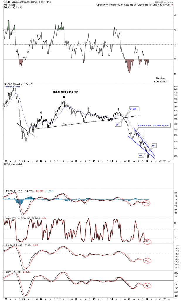
The weekly look.
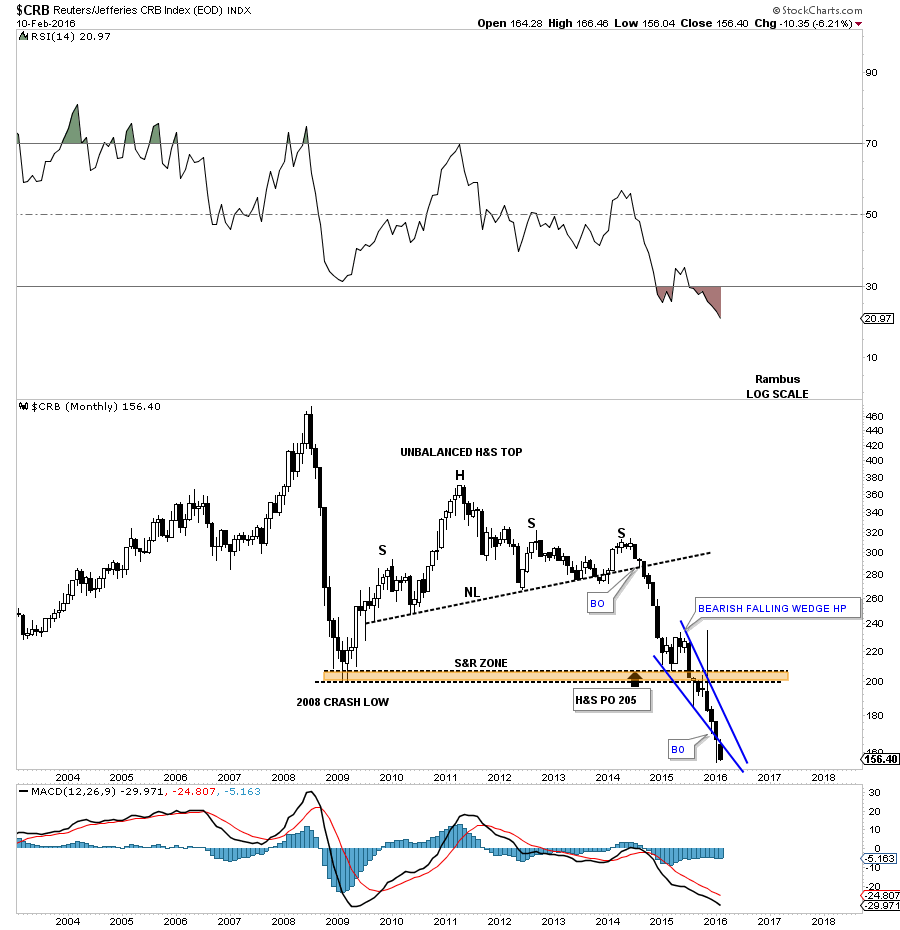
The monthly candlestick chart shows another possible black candle forming just below the bottom rail of the falling wedge.
The quarterly chart goes back about 60 years or so which shows the complete history of this index. Keep in mind each bar is three months in the making. We still have roughly another month and a half to complete our current quarterly bar. The red arrows shows you how it’s reversing symmetry back down through the thin zone that was made on the way up back in the early 1970’s. I know many people didn’t believe this chart when I first posted but so far it’s playing as expected. Basically there is no support until the top of the lower brown shaded S&R zone is reached around the 110 area.
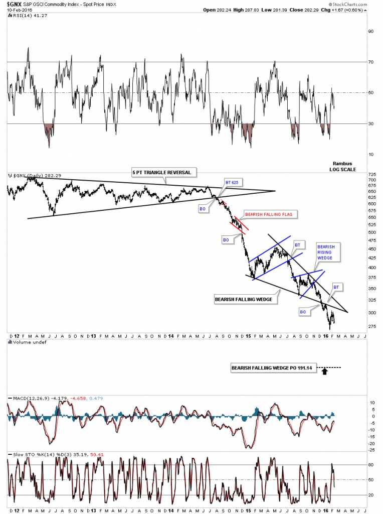
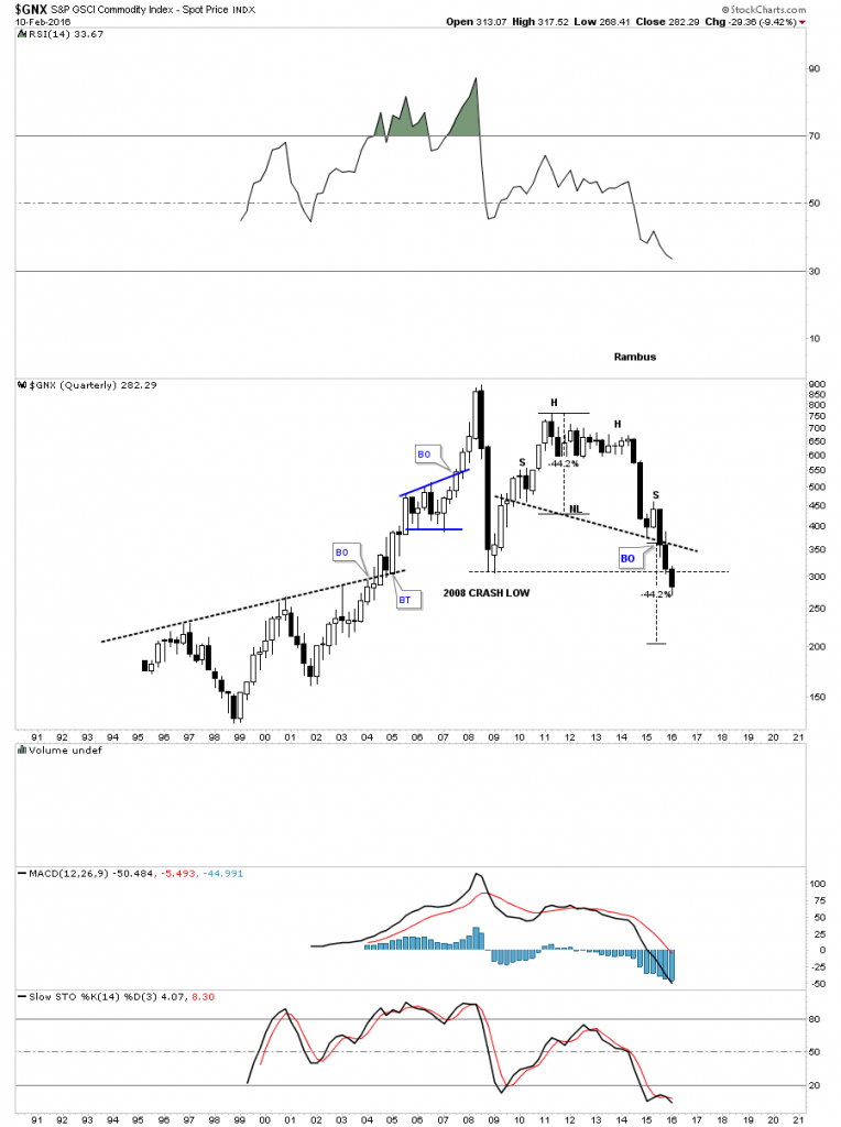
Below is another commodities index we’ve been following the $GNX which is showing a bearish falling wedge with a breakout and backtest.
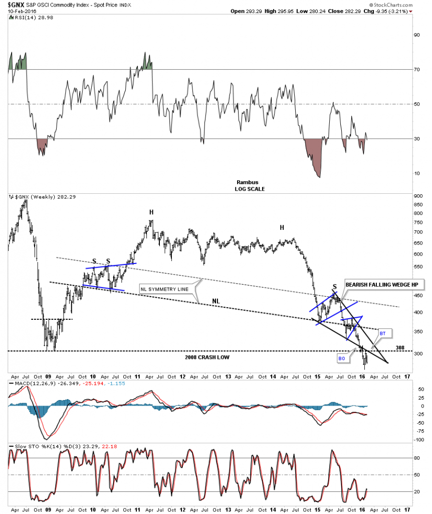
$GNX weekly:
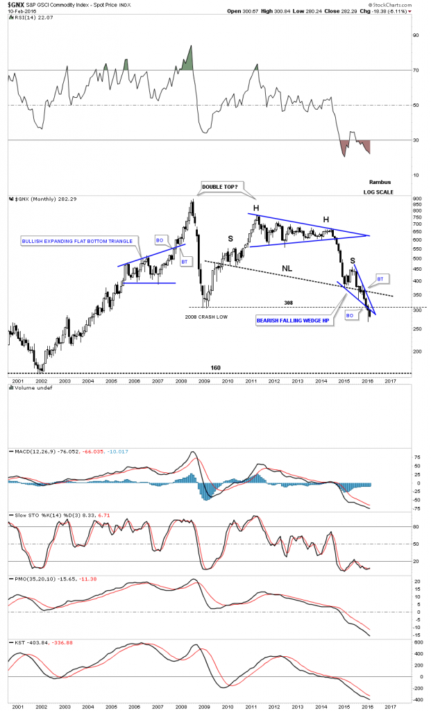
$GNX monthly:
$GNX quarterly: Now trading below the 2008 crash low.
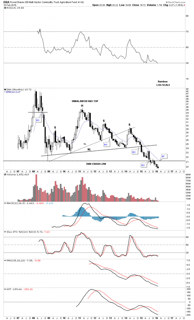
The monthly candlestick chart for the DBA shows it’s now trading below its 2008 crash low possibly forming another black candle.
The DBC which is an actively traded commodities index shows it to has broken down from the bearish falling wedge with a backtest in place. Note the two smaller blue consolidation patterns that make up the bigger black falling wedge.
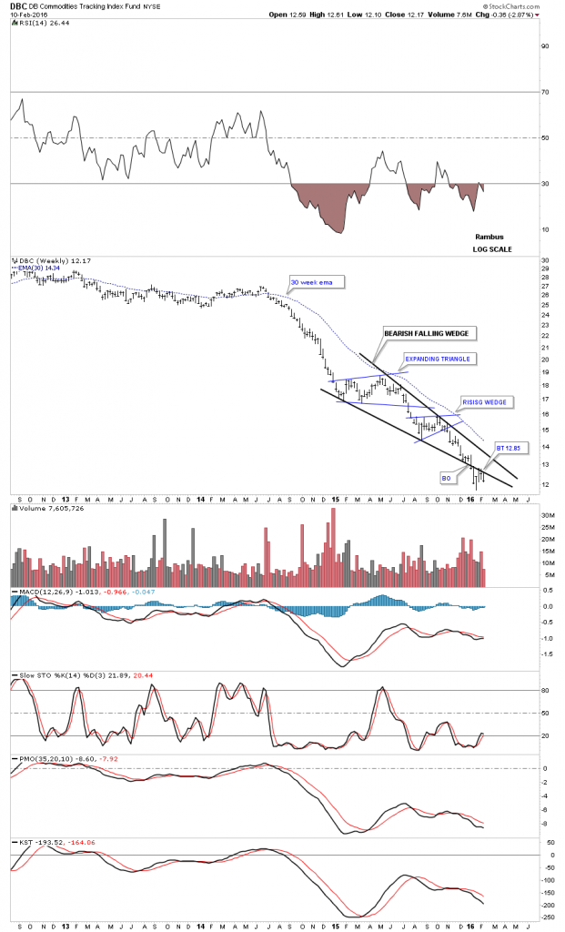
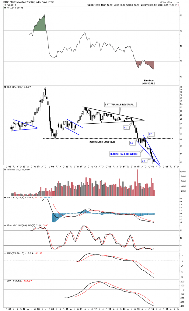
DBC monthly candlestick:
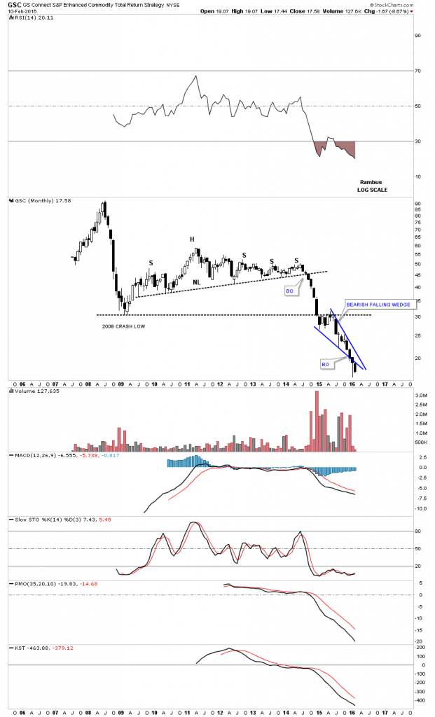
GSC monthly candlestick chart:
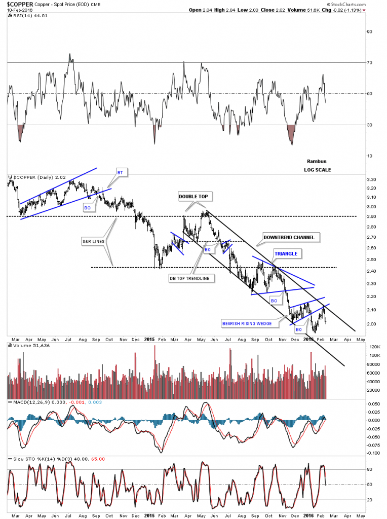
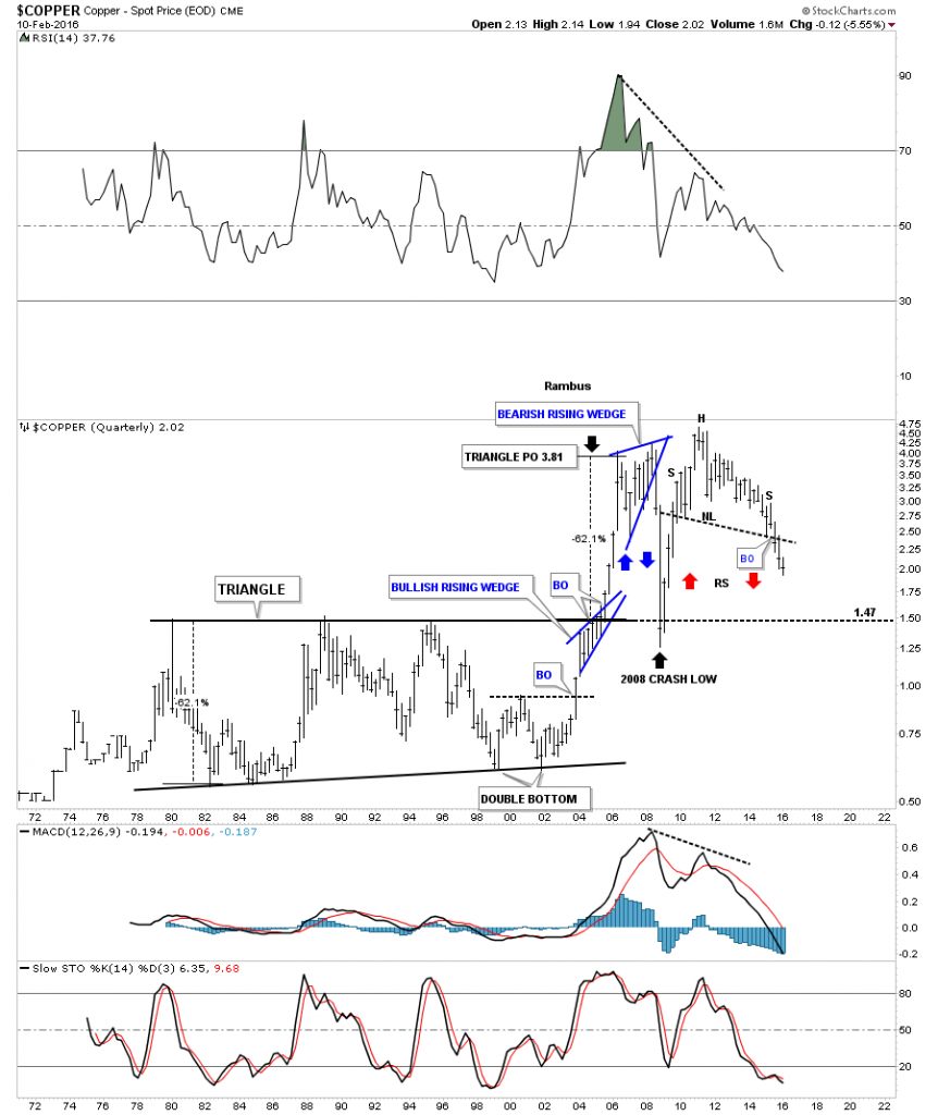
Lets now look at a few of the important commodities starting with copper. The daily chart shows it has been trapped in a downtrend channel for close to a year now.
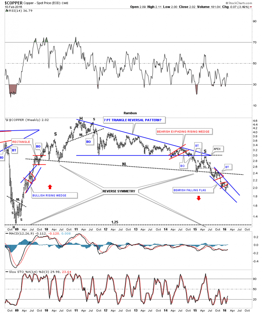
Note the reverse symmetry taking place on the weekly chart for copper which is showing a blue bullish rising wedge on the left hand side of the chart that was made during its bull market. Now look on the right hand side of the chart and you can see we have a similar pattern which is the one year blue falling flag. The reverse symmetry says copper should find a low at the 2008 crash low around the 1.25 area at a minimum.
The monthly candlestick chart shows just how strong its bull market was when it formed two bullish rising wedges. Note the string of white candlesticks that formed, all in a row, during the impulse move between each bullish rising wedge. I suspect we’ll see a string of black candlesticks all in a row before copper bottoms out.
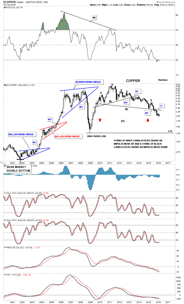
The 45 year quarterly chart for copper shows it massive base which built out during the lastpart of the 1970’s and early 2000’s before it broke above the top rail. The base of the massive triangle measured 62% which gave a price objective up to the 3.81 area. Note the blue bullish rising wedge that formed right on the top rail of the black triangle. That blue bullish rising wedge gave copper the energy it need to reach its price objective at 3.81.
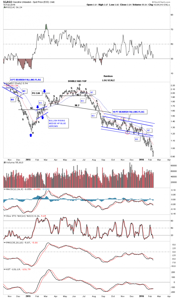
Next lets look at the GASO chart which has been in the news recently. I heard of a place in MO. where gasoline was selling for .99 cents. Who could have ever imagined that price just a few short years ago. Below is a daily chart for GASO which shows you why gasoline is getting cheaper. The last time we looked at this daily chart it was just breaking below the bottom rail of the 10 point bearish falling flag. Since then it has backtested the bottom rail from below.
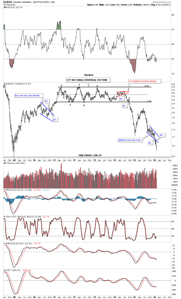
The weekly chart shows GASO built out a massive 5 point rectangle reversal pattern that reversed the bull market. The 2008 crash low comes in around the .79 cents area.
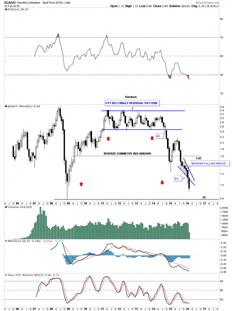
We’ve been following this monthly candlestick chart ever since it broke down below the bottom rail of the rectangle reversal pattern. Actually I posted this chart on Friday night when we first opened up our doors at Rambus Chartology back in 2012.
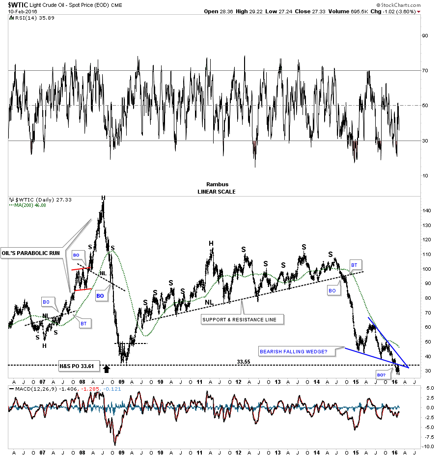
Below is the very short term daily chart for $WTIC which we’ve been following for the last couple of days which shows the small H&S consolidation pattern breaking down yesterday. Today we got the backtest.
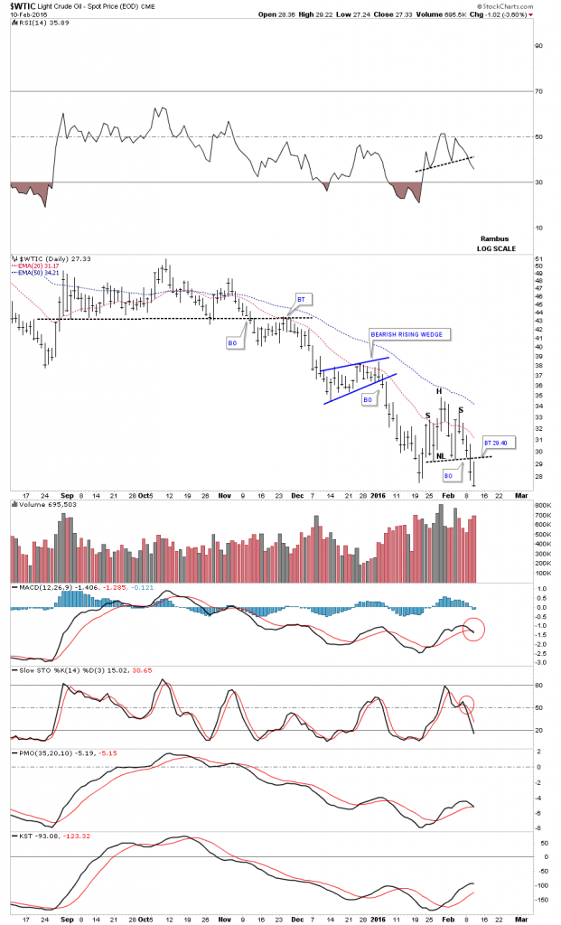
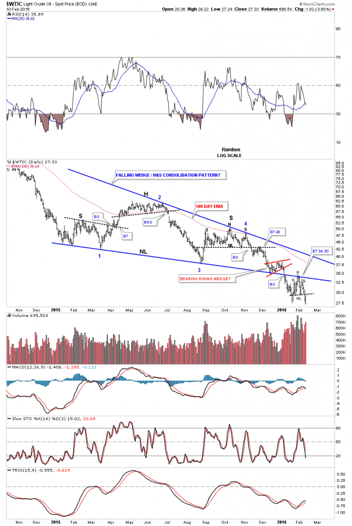
The daily chart shows the combo H&S / bearish falling wedge consolidation patterns that has been building out for most of 2015. They’re one of the same. Early this year oil finally broke down and looks like it may have just finished off the backtesting process by building out a small H&S consolidation pattern as the backtest.
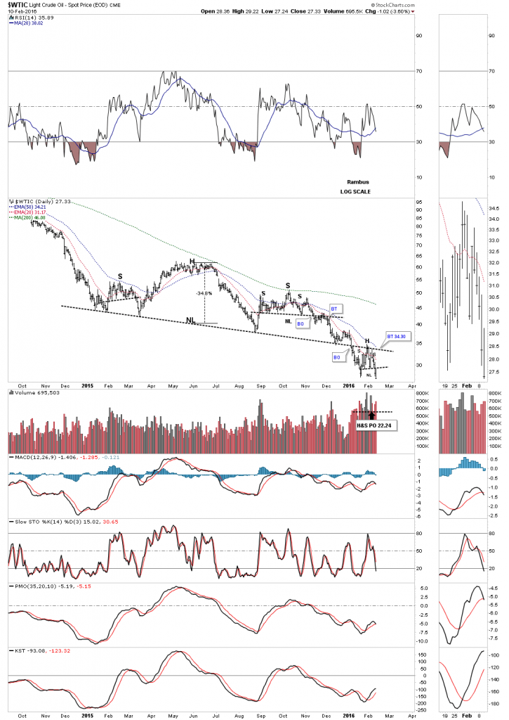
The log scale chart shows the H&S consolidation pattern has a price objective down to the 22.45 area.
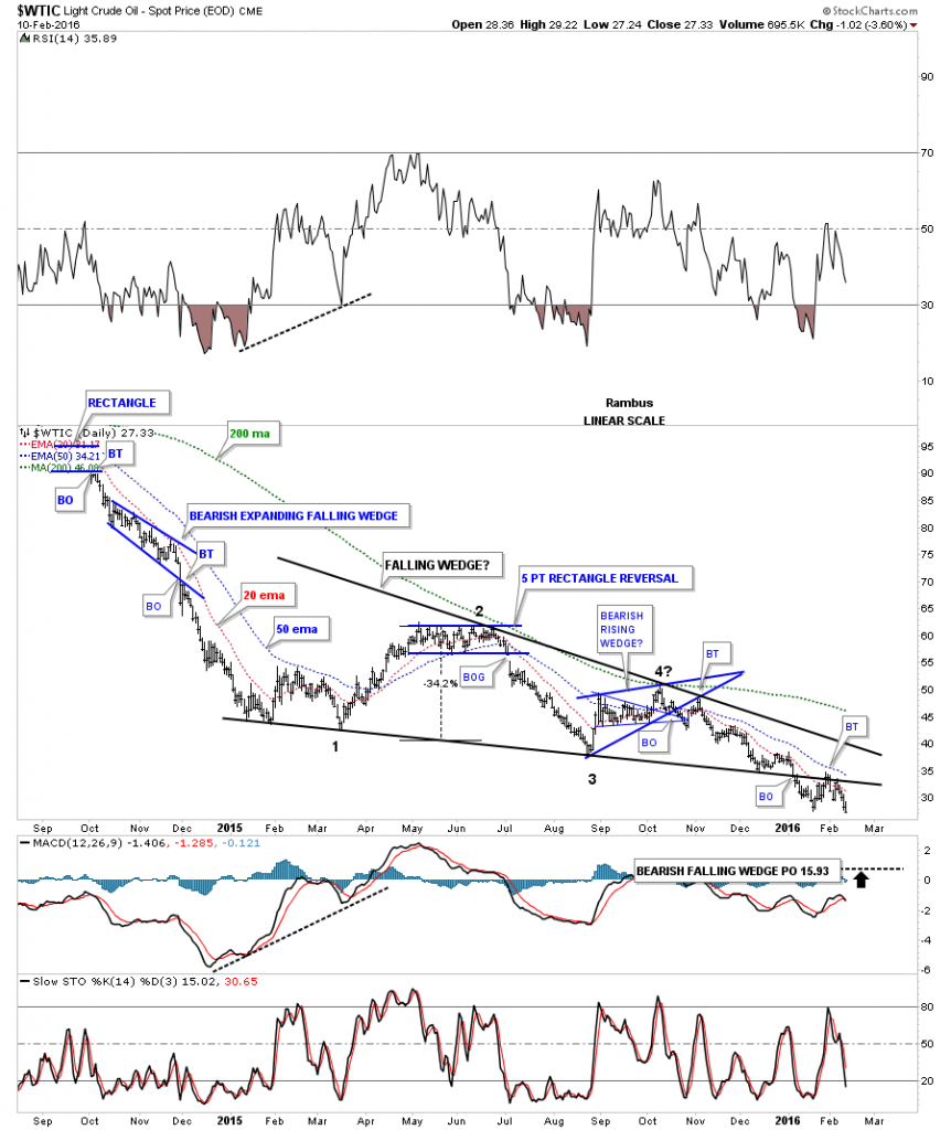
The linear scale chart for oil has a lower price objective which is all the way down to the 15.93 area. Before you discount this price objective, the linear scale chart gave me the correct price objective when oil broke down from its parabolic run to 147 which we’ll look at in a minute.
This next chart is the long term daily chart for $WTIC which shows its parabolic run to 147 and then its parabolic decline to the 35 area. It’s hard to see on this chart now but oil made a small H&S top at 147 and then made the bigger H&S top where you can see the neckline. Note the price action on the bottom right hand side of the chart which shows the 2008 crash low where the breakout from the blue bearish falling wedge takes out the bottom rail and the 2008 low with a nice clean backtest. All the work now looks like it may be finished.
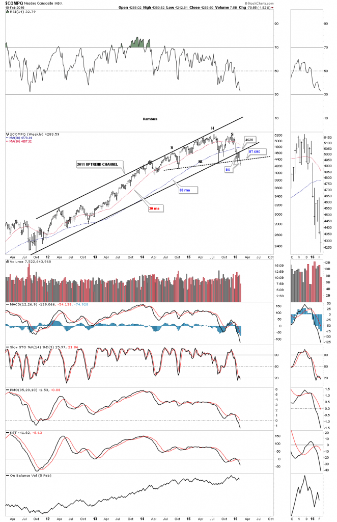
There are several more oil charts I would like to show you but I’m running out of time so instead lets look at a couple of stock market indexes to see how they’ve been coming along since the last time we looked at them. The weekly chart for the $COMPQ shows it’s finally breaking below its long term neckline this week.
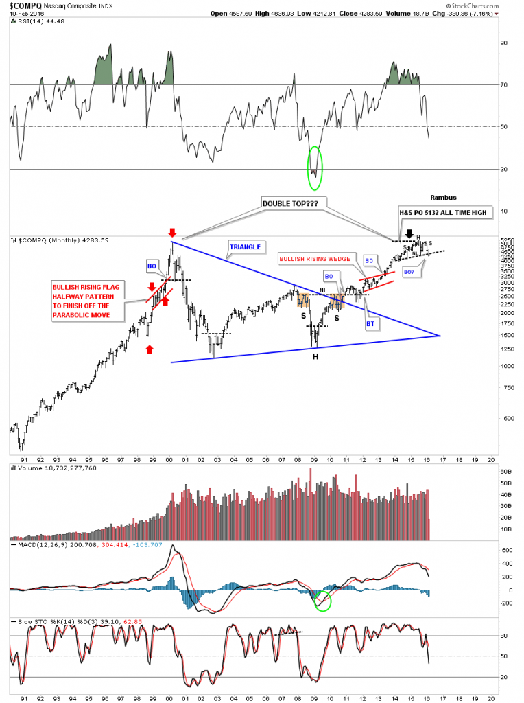
The long term monthly chart for the COMPQ shows you just how important that H&S top is that we just looked at on the weekly chart above. It has formed at the same height as the 2000 top. I don’t believe it will be a double top but at this point no one knows what the outcome will be. The only thing we really know is that a H&S top has formed at the end of a six year bull market.
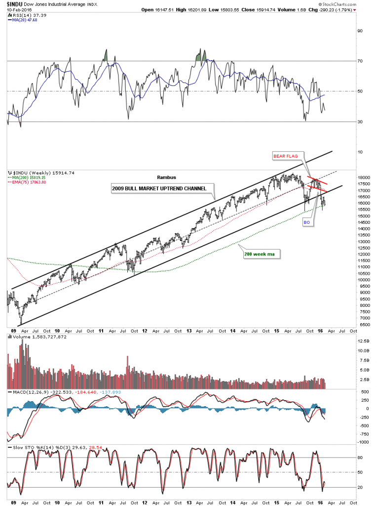
The long term weekly chart shows the INDU’s bull market. As you can see it has broken below the bottom rail of its six year uptrend channel. I originally thought the red falling flag was going to be a red bullish falling flag but when the price action broke below the bottom rail I had to reverse my thought process to a potential bear market.
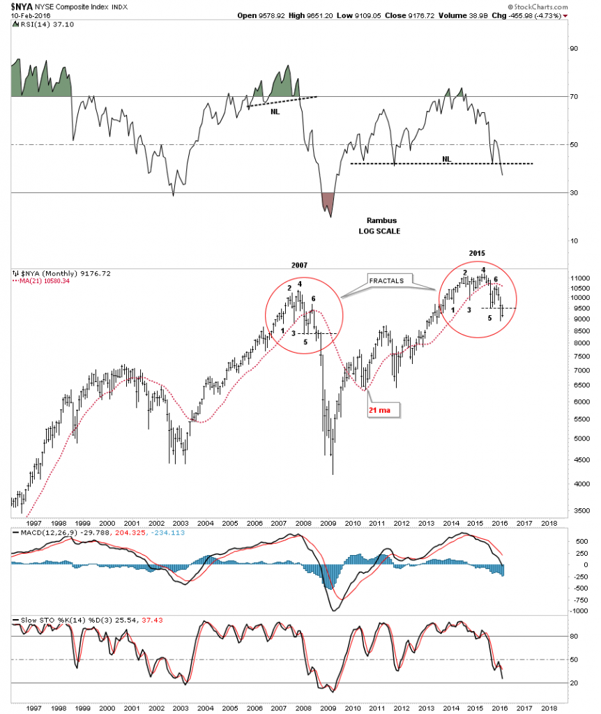
The monthly chart for the $NYA shows the 2007 and 2015 fractals we’ve been following for awhile now. Just compare each number in the 2007 top to the corresponding numbers in the 2015 top. Note the thin black dashed line just below point #5 on each top to help give you a feel for where we are at right now. If this fractal keeps playing out you can see what happened back in 2007 after point 5 was broken to the downside. Will history repeat?
I have many more charts I could show you be I’m going to have to wait for the Weekend Report to get them all posted. At any rate it still looks like the deflationary spiral that really took off in July of 2014 is still alive and well even with the US dollar consolidating. The PM complex looks like it may be the only place to park some capital as everything unwinds. All the best…Rambus


