
Gold:XAU Ratio Chart: Finally A Turn
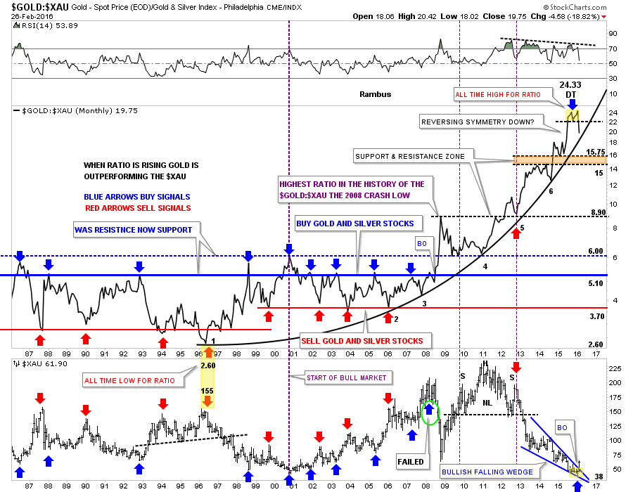
I’ve been highlighting this ratio chart for some time now which is showing, perhaps one of the biggest clues, that at a minimum the $XAU is now going to outperform gold. I’ve added a few more lines to help you understand the importance of this chart for the big picture because the big picture dominates all other time frames unless you’re a short term trader. To get in at the bottom of a bear market doesn’t happen very often in ones investment career but the potential is there right now in the PM complex.
The last time we looked at this ratio chart I pointed out the potential double top that was forming at the most recent highs. As you can see the double top is now more pronounced as the ratio starts declining. Note how the price action is reversing symmetric down over the same area on the way up. Is that double top at 24.33 the all time high for this ratio chart? Time will tell. The first real area of support would come in at the brown shaded support and resistance zone between 15 and 15.75.
Next I would like to show you why this ratio chart is so important for the big picture. I’ve added a parabolic arc to the six lows that began forming at the all time low at 2.60 in 1996 on the ratio chart. The yellow shaded area shows how close the ratio chart at 2.60 and the high for the $XAU at 155 was in 1996. For the last 20 years gold has been outperforming the $XAU with a few mild corrections along the way like the 10 year bull market that began in 2000. Even then the ratio just traded sideways until it breakout topside during the 2008 crash which set into motion a massive divergence where gold just kept outperforming the $XAU.
Now we can look to the right hand side of the chart where you can see the double top on the ratio chart at 24.33. Keep in mind the double top is a reversal pattern which is showing up after 20 years of gold outperforming the $XAU. Twenty years is pretty amazing when you think about it. Looking at the $XAU chart at the bottom you can see the blue bullish falling wedge that broke out this month.
So we have the ratio chart putting in a 20 year double top and the $XAU putting in an all time low at 38 or so. What these two charts are strongly suggesting to me is that it’s finally the big cap PM miners turn to outperform gold going forward. It’s right there before our very eyes. What will these two charts look like in a year or two years or five years? If we look back at this bottom in a year or two and it stands out like a sore thumb then you can say you bought the very bottom of the bear market. There is no bell that goes off at the bottom of a bear market. There will always be doubt every time there is a down day or when the inevitable corrections take place. I can tell you right now the hardest thing will be staying on the bull, it’s the nature of the beast to throw us off. Chartology got us out or short during most of the bear market now Chartology will keep us in the bull market until something drastically changes these long term charts. I think we’re witnessing the end of a massive 20 year divergence between the $XAU and gold which is going to lead to much higher prices for the big cap PM miners over the ensuing bull market. Have a great weekend. All the best…Rambus
Disclosure: None.


