
Suspended Animation 10-07-16
t’s actually quite amazing. In March of this year, I wrote a missive entitled “Fed Levitation” discussing the Fed’s ability to detach asset prices from the underlying fundamentals. To wit:
“So what is it? Are we ‘data dependent’ or are we more concerned about ‘global economic weakness?’ Or, is this just part of the Fed’s careful orchestration to support asset markets?
The Federal Reserve is trying very clearly to accomplish several goals through their very confusing ‘forward guidance:’
- Keep asset prices above the recent lows to avoid triggering a rash of potential ‘margin calls’ that would fuel a more rapid price reversion in the markets.
- Talk down the “dollar” to provide a boost to exports (which makes up roughly 45% of corporate profits) and commodity prices. The Fed-assisted boost in oil prices also gives TBTF banks the room necessary to off-load bad energy-related debt exposure before the next price decline and run of defaults.
- The Fed also realizes they cannot allow market prices to overheat to the upside and, therefore, use offsetting language to quell expectations.
It’s genius.
Like the ‘little Dutch boy,’ the Fed currently has a finger stuck in every hole of the dike. The only question is how long is it before the Federal Reserve runs out of ‘fingers’ to plug the next leak?”
Despite the “Brexit,” weakening economic growth, declining profitability, terror attacks, Presidential election antics and Deutsche Bank, the markets continue to cling to its bullish trend. Investors, like “Pavlov’s dogs,” have now been trained the Fed will always be there to bail out the markets. But then again, why shouldn’t they? The chart below shows this most clearly.
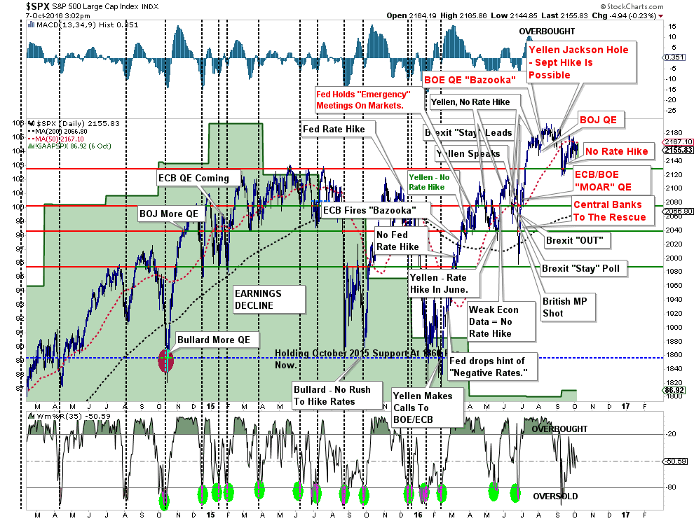
Okay…maybe not clearly…but you get the idea.
Over the past several months the markets have consistently drifted from one Fed or Central Bank meeting to the next. Yet, with each meeting, the questions of stronger economic growth, rate hikes, and financial stability are passed off until the next meeting. So, we wait.
The chart below shows the very strange price behavior over the last three trading days. Early morning sell-offs are quickly recovered back to levels above the running bullish trend and then go flat-line.
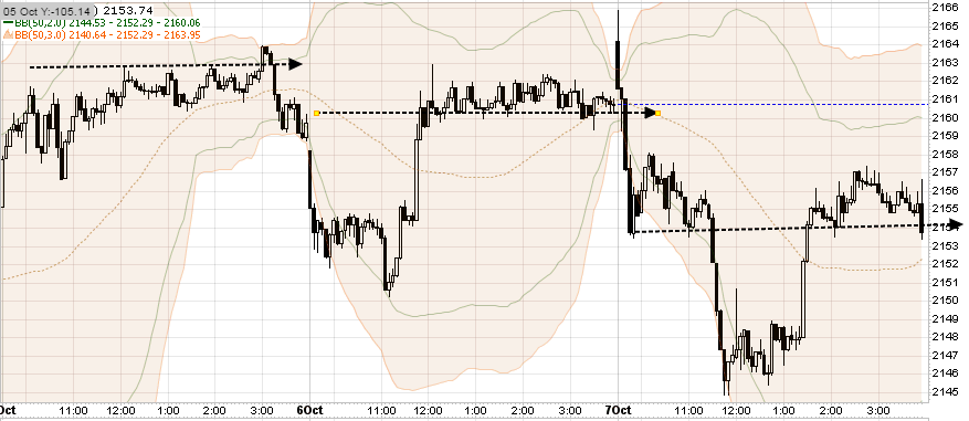
However, it’s not just the last three days, but rather the last couple of months where this levitation of asset prices and defense of critical support is apparent. Despite the news, good or bad, asset prices react very mildly. This “strange” price consolidation behavior will end, and historically speaking, the resolution of such consolidations tend to be rather significant.
As I wrote this past Tuesday:
“For now, Central Bankers ‘rule the world’ and their word alone has been enough to push markets higher despite repeated failed forecasts of stronger economic growth.But it is this repeated failure that keeps the ‘bulls’ alive, as each failure by Central Banks to achieve their monetary policy goals simply means leaving accommodative monetary policy in place. Of course, no one has asked the question what happens when they actually do succeed in raising rates?
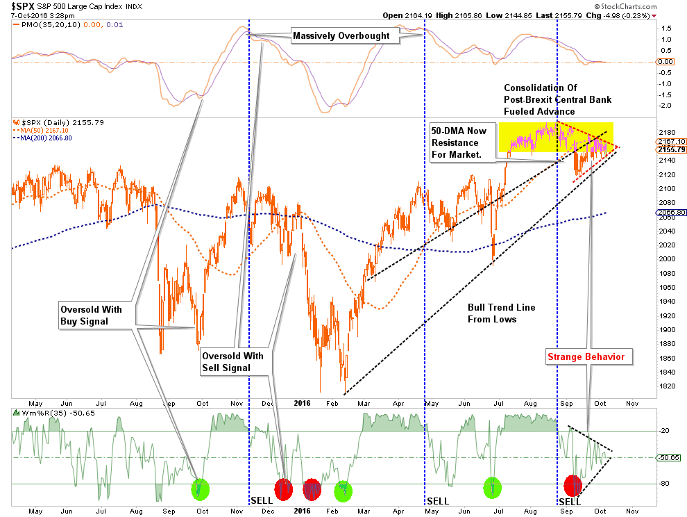
The market currently remains above the running bullish trend line which has been the rally point for Central Banks to intervene with either actual monetary interventions or promises to do more. Despite concerns of global disruption due to the ‘Brexit,’ or the next potential bank failure with Deutsche Bank, nothing has been able to shake the markets as investor complacency remains elevated.
As shown below, the current price action continues to consolidate in a very tight range which will resolve itself in very short order. A breakout to the upside will clear the markets for a further advance. However, while the technicals suggest a move to 2400, it is quite possible it could be much less. Notice in the bottom section of the chart below.Turning the current ‘sell signal’ back into a ‘buy signal’ at such a high level does not give the markets a tremendous amount of runway.”
For now, however, the markets remain stuck.
If The Economy Is So Good, Why Are Bankruptcies On The Rise?
As I have discussed many times in the past, economic cycles, while they can be extended through monetary interventions, cannot be repealed.
While there are many currently suggesting that the current economic cycle still has years to potentially run due to low interest rates and continued accommodative policy. However, there is mounting evidence this current cycle may be nearer its end than most believe. I discussed one such piece of evidence last week with respect to auto sales. To wit:
“The problem with general media commentary and analysis is the focus on a ‘single’ data point rather than the ‘trend’of the series. The chart below shows us two important points.”
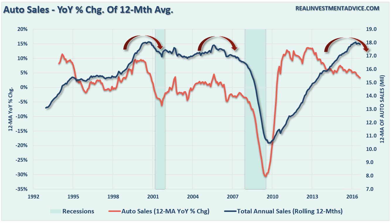
The first is that while the ‘annualized’ reported sales number was near the highest in 10-years, the historical average of cars sold is still at levels below both previous peaks.
Secondly, and more importantly, is both previous peaks in total auto sales were preceded by a decline in the annual percentage change of cars sold. Since 2013, the rate of change in auto sales has declined markedly even as inventories continue to build. This explains the push for dealer incentives, sub-prime credit loans, longer loan terms, and special lease provisions to continue to push inventory out.
Lastly, all of this data suggests that the auto sales cycle is very long in the tooth and the economy is likely weaker than the latest ‘annualized’ run of auto sales suggests. As we saw at both previous peaks in auto sales, the push to sell autos at ‘any cost’ has generally ended poorly.
Given the consumer is roughly 70% of the economic equation through their spending (the demand side of the equation), things like auto sales, restaurant trends, retail sales, etc. are good measures for tracking consumer health. However, it is “demand” that pushes the “supply” side of the equation as well. When demand is strong, commercial and industrial businesses tend to borrow money to increase production and employment to meet increases in demand. As Wolf Richter noted this past week, there are early signs of economic stress here as well.
“In October 2008, the absolute peak of the prior credit bubble, there were $1.59 trillion commercial and industrial loans outstanding. As the Great Recession chewed into the economy, C&I loans plunged. Many of them were cleansed from bank balance sheets via charge-offs. But then the Fed decided what the US needed was more debt to fix the problem of too much debt, thus kicking off what would become the greatest credit bubble in US history. By July 2016, C&I loans had surged to $2.064 trillion, 30% above their prior bubble peak.
But in August, something stopped working: C&I loans actually fell 0.3% to $2.058 trillion, according to the Federal Reserve Board of Governors. That translates into an annualized decline of 3.8%, after an uninterrupted six-year spree of often double-digit annualized increases. Note that first month-to-month dip since October 2010:”
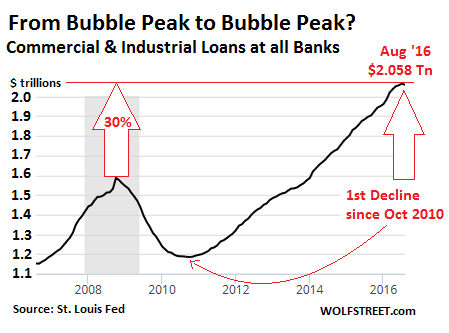
There are two important points being made here. The first is that if loan demand has peaked that is also suggestive economic activity, and ultimately employment, have likely peaked as well.
Secondly, and very importantly to those betting on a resurgence in oil and energy prices, a big chunk of the gains in the Energy sector came from massive loan demand to expand drilling activity, particularly in the “shale” fields. As the chart shows below, there is a direct correlation between the increases in the Fed’s balance sheet and oil prices.
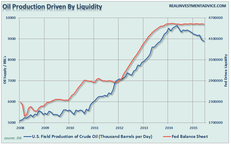
Of course, the increase in oil production WAS NOT due to investments in oil drilling by banks, but rather by the loans given to oil companies to expand their drilling and production.
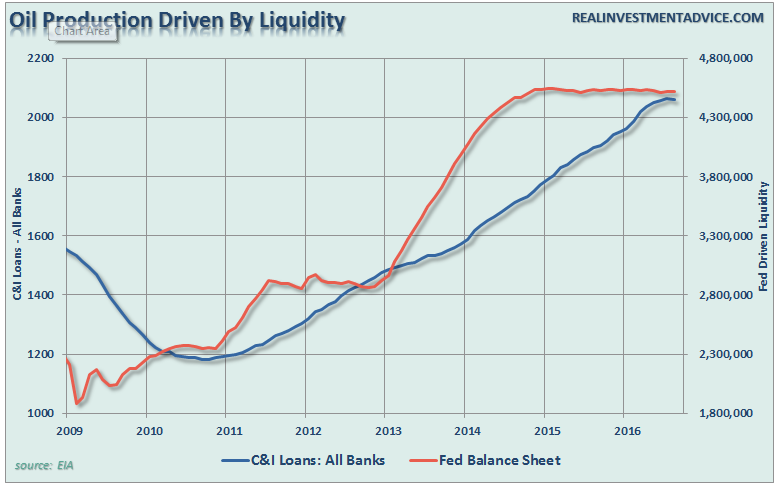
With the Fed’s liquidity being drained from the system, it is not surprising to see loans from banks beginning to slow. This is particularly the case given the rise in bankruptcy filings as of late. As Wolf notes:
“The ugliest credit stories in terms of bonds, according to Standard & Poor’s Distress Ratio, are the doom-and-gloom categories of ‘Energy’ and ‘Metals, Mining, and Steel.’ Next down the line are two consumer-facing industries: brick-and-mortar retailers and restaurants.
But when they go bankrupt, they are included in the overall commercial bankruptcy numbers, and those numbers are getting uglier by the month.
In September, US commercial bankruptcy filings soared 38% from a year ago to 3,072, the 11th month in a row of year-over-year increases, according to theAmerican Bankruptcy Institute.
Commercial bankruptcy filings skyrocketed during the Financial Crisis and peaked in March 2010 at 9,004. Then they fell on a year-over-year basis. In March 2013, the year-over-year decline in filings reached 1,577. Filings continued to fall, but at a slower and slower pace, until November 2015, when for the first time since March 2010, bankruptcy filings rose year-over-year. That was the turning point. Note that there is no ‘plateauing’:”
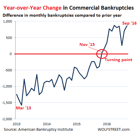
“Rising bankruptcies are an indicator that the ‘credit cycle’ has ended. The Fed’s policy of easy credit has encouraged businesses to borrow – those that could. But by now, this six-year debt binge has created an ominous debt overhang that is suffocating these businesses as they find themselves, against all promises, mired in an economy that’s nothing like the escape-velocity hype that had emanated from Wall Street, the Fed, and the government.”
Recessions & Markets – Who Really Leads?
So, why are rising bankruptcies important? Elena Holodny recently penned the following note from a UBS team led by strategist Julian Emanuel:
“It is worth noting that no US equity bear market of the last 25 years has begun without a recession starting within 12 months following the market top.”
Unfortunately, that is not exactly an accurate statement. As I noted previously in “Think Like A Bear, Invest Like A Bull:”
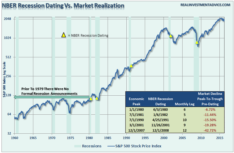
“However, the ‘lead effect’ is much more coincident in reality. This is due to the fact that recessions are only revealed in hindsight once data is revised lower. This lag effect of the data revisions in shown below.”
It is during the latter stages of the economic cycle when “growth and value” investing gives way to pure momentum and speculation. As investor “greed” and “exuberance” rises, the time-tested principals of “value” investing become a relic of the past.
It is ONLY during the last stage of an investment cycle that “fundamentals appear not to matter” as typically the fundamentally worst stocks lead the markets higher.
In other words, it is during these late stages we hear discussions of why “This Time Is Different (TTID)” and “There Is No Alternative (TINA).”
This cycle does end, and the reversion process back to value has historically been a painful one. Unfortunately, after it is far too late, investors begin to change from TTID and TINA to FUBAR (F***ed Up Beyond All Recognition)”.
Understand It, But Don’t Fear It
Currently, there is little doubt that we are in both the late stages of an economic cycle and a momentum driven market. Therefore, investment focus must be adjusted to current market dynamics that requires a focus on relative strength and momentum as opposed to valuation-based strategies.
There have been many studies published that have shown that relative strength momentum strategies, in which as assets’ performance relative to its peers predicts its future relative performance, work well on both an absolute or time series basis. Historically, past returns (over the previous 12 months) have been a good predictor of future results. This is the basic application of Newton’s Law Of Inertia, that states “an object in motion tends to remain in motion unless acted upon by an unbalanced force.”
In other words, when markets begin strongly trending in one direction, that direction will continue until an “unbalanced” force stops it. Momentum strategies, which are trend following strategies by nature, have been proven to work well across extreme market environments, multiple asset classes and over historical time frames.
While there is substantial evidence that market valuations and fundamentals are not supportive of asset prices at current levels, investor psychology has likewise reached extremes. In such an environment, it is also beneficial for investors to shift focus to momentum based strategies as trend-following strategies reflect the behavioral factors such as anchoring, herding, and the disposition effect.
Let me explain.
Fundamentally based investors are slow to react to new information (they anchor), which initially leads to under-reaction but eventually shifts to over-reaction during late cycle stages.
The other inherent problem of primarily data-based investors is the “herding” effect. As prices move higher, valuation arguments lose relevance. However, the need to produce investment performance in a rising market, leads to “justifications” to explain over-valued holdings. In other words, buying begets more buying.
Lastly, as the markets turn, the “disposition” effect takes hold and winners are sold to protect gains, but losers are held in the hopes of better prices later. The end effect is not a pretty one.
By applying momentum strategies to fundamentally derived investment portfolios it allows the portfolio to remain allocated during rising markets while managing the inherent risk of behavioral dynamics.
As I discussed last week, despite the fact that I write like a “bear,” the portfolio model has remained allocated to equities during the market’s advance. The point is simple, our job as investors is to make money when markets are rising as well as avoid potentially catastrophic losses when trends change.
As stated above, there is ample evidence mounting this current bull market and economic cycle are very “long in the tooth.” However, for now, the market has not violated its bullish trend and the economy is still “struggling through.”
This will change. The timing of WHEN is always the critical question. As BofAML recently wrote:
“What if current trends persist? We chose five macro indicators and determined what levels tended to coincide with historical recessions and bear markets. While we are cognizant that trends change and that relying on the recent trend can often give you false signals when trends reverse, we also think that there is some value in considering what might happen if the current trends were to persist.
In this exercise, we extrapolated the trends over the last few years in an attempt to estimate when the recessionary thresholds will be breached. In this scenario, the range ofpotential recession start dates implied by these models was as early as July 2016 and as far off as April 2019, with an average start date of October 2017.”
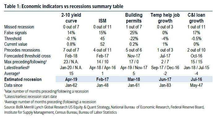
Importantly, it is correct when people say there is NO SIGN OF RECESSION currently. However, what they get consistently wrong is accounting for the future negative revisions to past data which reveals the start of recessions in hindsight. Unfortunately, you just can’t invest that way.
Of course, by the time you figure it out, you will have also figured out “you are the pigeon at the poker table.”
THE MONDAY MORNING CALL
The Monday Morning Call – Analysis For Active Traders
Double Inside Weeks
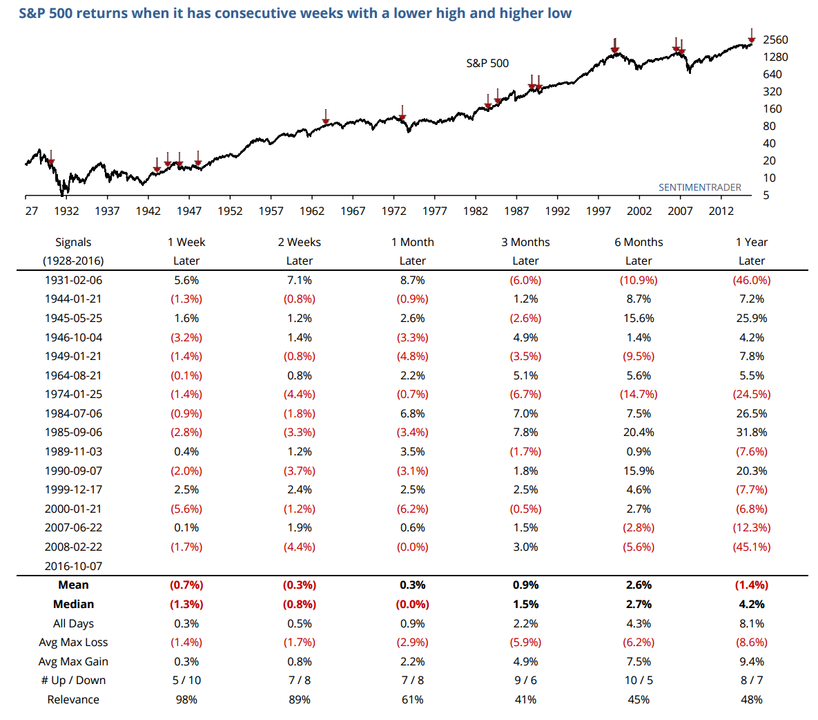
Sentiment Trader recently had a very interesting note:
“For the second week in a row, the S&P 500 formed an inside week. This is when this week’s high is lower than the previous week’s high, and this week’s low is higher than the previous week’s low.
In other words, this week’s bar on a chart completely fits within the prior week’s bar. It’s rare to see a single inside week, much less two in a row. The last occurrences were prior to the last two bear markets, which is interesting.
Obviously, anything with the only two precedents being those dates is worth looking at further, so the table below shows every date back to 1928 when this occurred. The S&P’s immediate bias was to the downside, showing a poor risk/reward ratio over the next 1 and 2 weeks. It wasn’t exactly great on any time frame, but with a relatively short-term price pattern, we wouldn’t read too much into beyond the medium-term.”
This analysis corresponds with much of what we have been discussing over the last several weeks.
“Outside of a volatile price week, not much has changed in terms of the broader market keeping allocations reduced from targeted levels currently.”
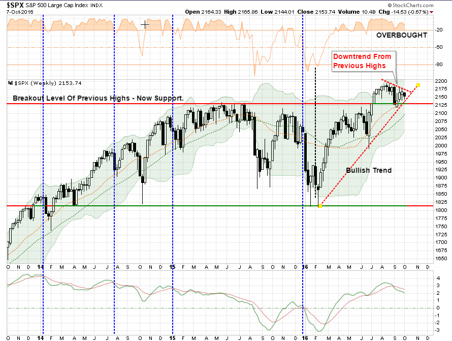
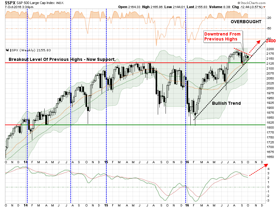
“As stated at the beginning of this missive, the bullish trend remains intact currently and the “buy signal” from the February lows is still rising. However, that ‘buy signal,’ as shown at the bottom of the chart, has reversed. With the S&P 500 currently in a very tight consolidation pattern, a break to the downside would likely quickly test support where the previous breakout level intersects with the bullish trend from the February lows. A violation of that level would likely lead to a rather sharp market correction of 8-10%.”
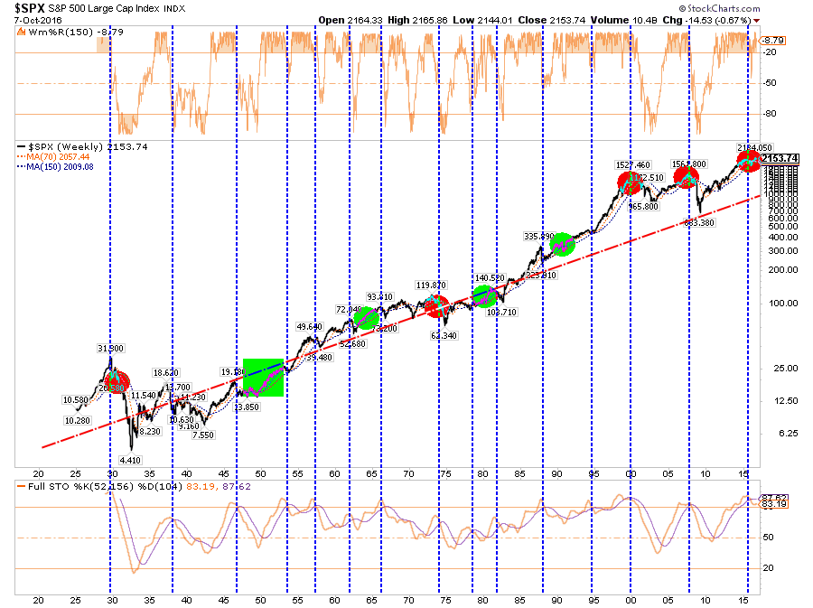
However, I want to juxtapose the analysis from Sentiment Trader above with one other thought. The one differential between the periods where the double-inside week led to just a mild correction or sloppy performance, versus the onset of a more major correction, was when the market was NOT on a more major sell signal combined with extreme overbought conditions as shown in the chart below.
In other words, don’t get too complacent.
Model Update
S.A.R.M. Sector Analysis & Weighting
Another week of rather volatile price action this past week which substantially changes nothing. For the week, the market declined by 0.57% but maintained its bullish trend line for now. This keeps portfolio equity risk weightings remain below our target of 75% but did we also did not get stopped out of our trading position we added last week. The consolidation pattern of the market keeps us somewhat on hold.
As I stated last week:
“I am not highly confident in the addition of the position at the current time, but the market has continued to consistently hold the bullish trend line. Again, this is a trading position and NOT a long-term hold at this point.”
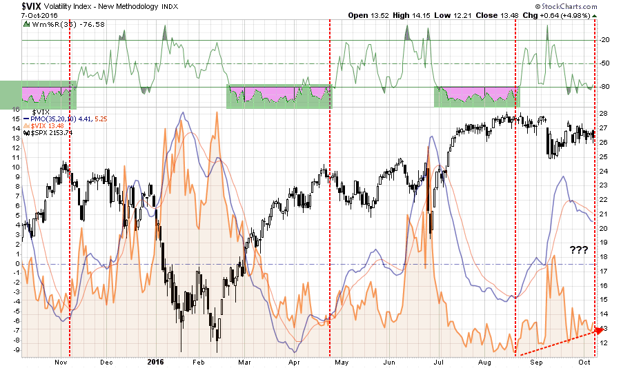
Last week, I also stated that I would consider re-adding another trading position in the volatility index (VXX). As shown in the chart below, while volatility has declined it is not yet at the extreme oversold condition that provides the best risk/reward for a VXX hedge at this time.
I am still considering adding the hedge if volatility once again gets smashed to extremely low levels. I will update this analysis in Tuesday’s Technically Speaking post. (click here for free e-delivery)
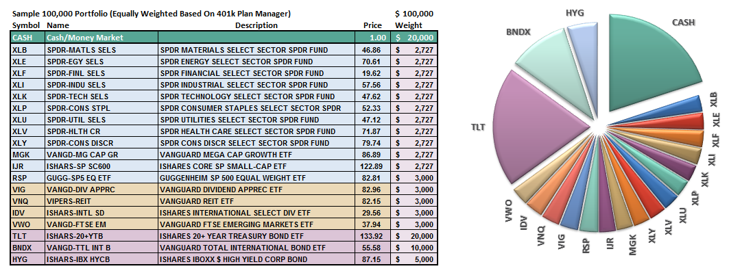
Let’s take a look at the equal weighted portfolio model.
(Note: This is an equally weighted model example and may differ from discussions of overweighting/underweighting specific sectors or holdings.)
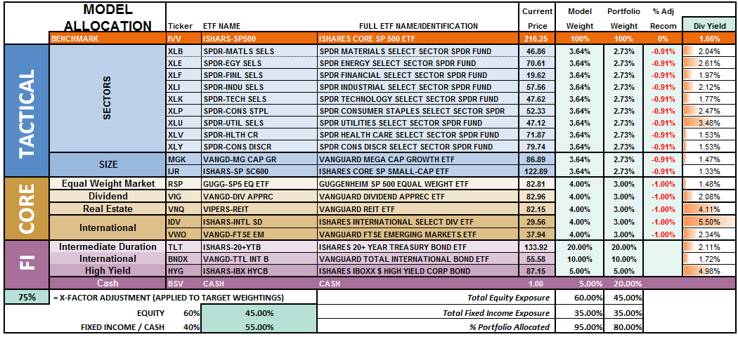
The overall model still remains underweight target allocations. This is due to the inability of the markets to generate a reasonable risk/reward setup to take on more aggressive equity exposure at this time.
Relative performance of each sector of the model as compared to the S&P 500 is shown below. The table compares each position in the model relative to the benchmark over a 1, 4, 12, 24 and 52-week basis.
Historically speaking, sectors that are leading the markets higher continue to do so in the short-term and vice-versa. The relative improvement or weakness of each sector relative to index over time can show where money is flowing into and out of. Normally, these performance changes signal a change that last several weeks.
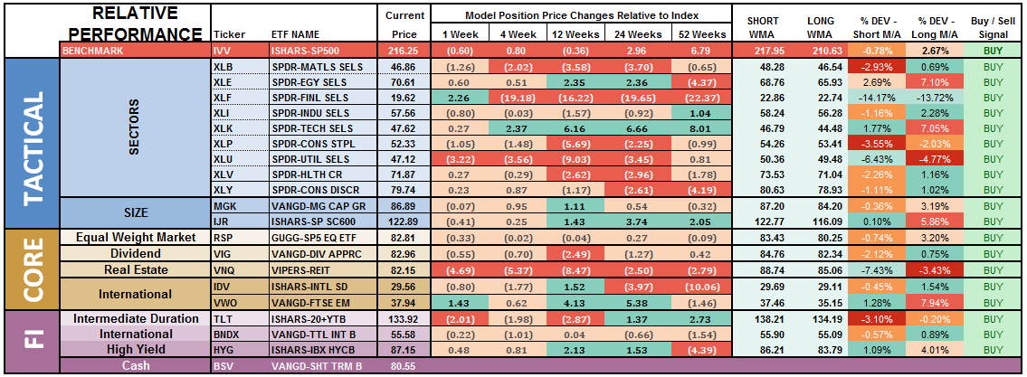
Notice in the next to last column to the right, the majority of sectors which have previously been pushing extreme levels of deviation from their long-term moving average, have corrected much of those extremes.
Financials, Basic Materials, Staples, Utilities, REIT’s and Bonds are currently at the biggest deviations below their short-term moving average. Historically speaking, and as noted above, such deviations would suggest these sectors deserve some attention in portfolios as this is where buying opportunities TEND to exist. It also supports the idea of further consolidation, or correction, in the markets is likely as these more defensive sectors tend to benefit from the rotation from “risk” to “safety.”
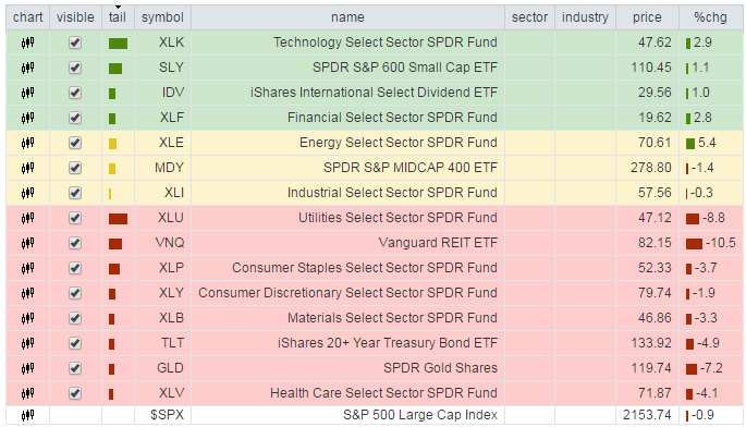
The chart below is the “spaghetti” chart, via StockCharts, showing the relative strength/performance rotation of sectors relative to the S&P 500. If we are trying to “beat the index” over time, we want to overweight sectors/asset classes that are either improving in performance or outperforming the index, and underweight or exclude everything else.
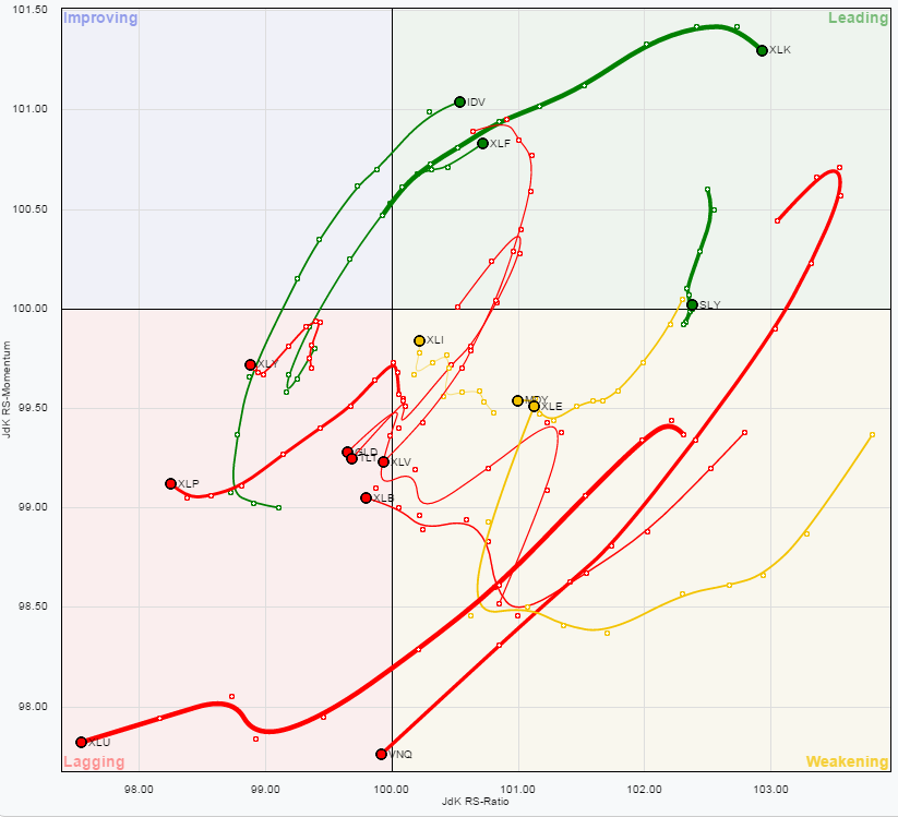
Utilities, REIT’s, Staples, Discretionary, Materials, Bonds, Gold, and Healthcare have remained under pressure this past week. This has largely been due to the rise in interest rates. However, that rise in rates looks largely done and suggests a decline in rates from here is much more likely as hopes of a Fed rate hike in December fades along with upcoming economic data.
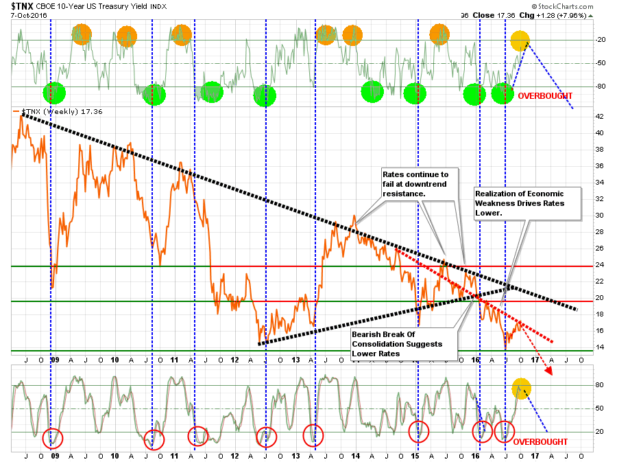
With rates now back to overbought conditions, bonds and interest rate sensitive sectors are now extremely oversold.
We have been pretty aggressive buyers of bonds over the last week in anticipation of a rotation back into safety. Such a rotation will likely coincide with weaker than expected economic data and/or a break of the bullish trend line in the markets.
Conversely, the rush into International, Emerging Markets, Small Cap, and Financial sectors has likely run a bulk of its course. These are excellent areas to lift profits in particularly given the recent strength in the US dollar.
Most importantly, given that a bulk of the sectors remain either in weakening or lagging sectors, this suggests the current advance in the market remains on relatively weak footing.
Profit taking should also be focused on Technology stocks as the current outperformance of this sector is very long in the tooth.
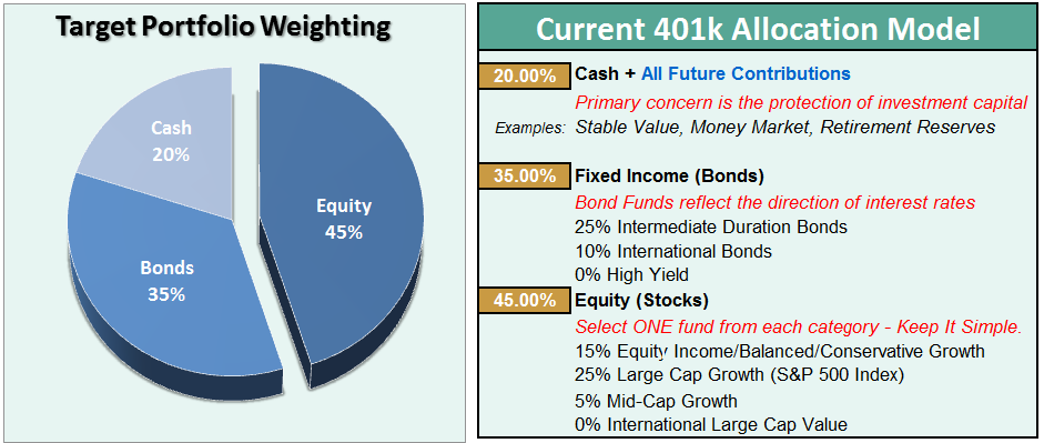
The risk-adjusted equally weighted model has been increased to 75%. However, the markets need to break above the previous consolidation range to remove resistance to a further advance.
Such an increase will change model allocations to:
- 20% Cash
- 35% Bonds
- 45% in Equities.
As always, this is just a guide, not a recommendation. It is completely OKAY if your current allocation to cash is different based on your personal risk tolerance, time frames, and goals.
For longer-term investors, we still need to see improvement in the fundamental and economic backdrop to support the resumption of a long-term bullish trend.Currently, there is no evidence of that occurring.
THE REAL 401k PLAN MANAGER
The Real 401k Plan Manager – A Conservative Strategy For Long-Term Investors
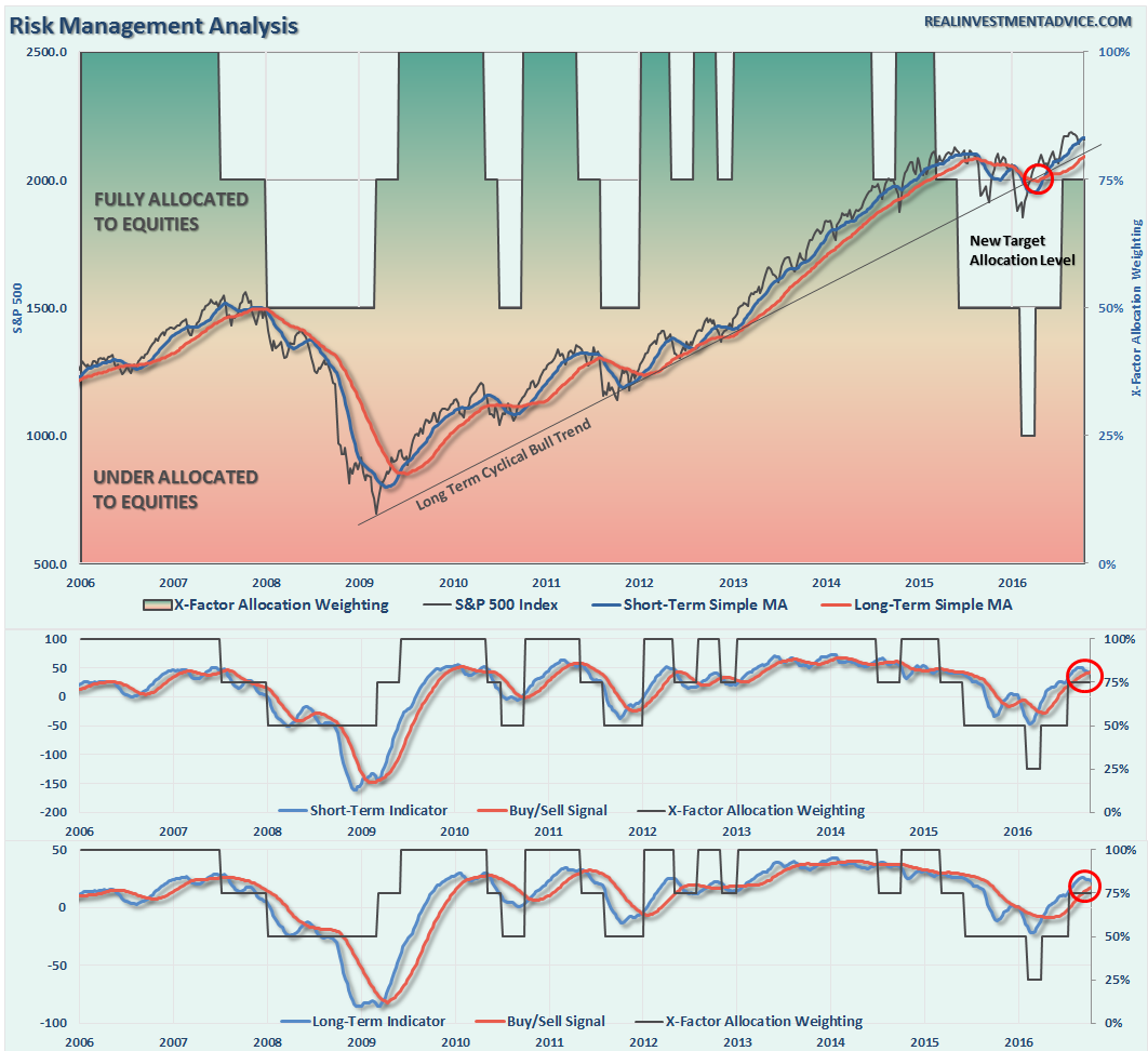
NOTE: I have redesigned the 401k plan manager to accurately reflect the changes in the allocation model over time. I have overlaid the actual model changes on top of the indicators to reflect the timing of the changes relative to the signals.
There are 4-steps to allocation changes based on 25% reduction increments. As noted in the chart above a 100% allocation level is equal to 60% stocks. I never advocate being 100% out of the market as it is far too difficult to reverse course when the market changes from a negative to a positive trend. Emotions keep us from taking the correct action.

We’re Stuck
Once again, we remain stuck. The market remains confined within in a very narrow trading range that limits our ability to assess the current risk/reward for increasing or decreasing equity related exposure.
This past week the markets bounced sharply off of the bullish trend support line but was unable to make any headway through overhead resistance. So, as stated, we’re stuck.
Early warning signals are suggesting the correction has more room to go, so let’s be patient once again this coming week.
With the election right around the corner, increased volatility is expected. Therefore, having a little extra cash in portfolios will likely be a good hedge for now. Sit tight for now and I will update you on Tuesday.
If you need help after reading the alert; don’t hesitate to contact me.
Current 401-k Allocation Model
The 401k plan allocation plan below follows the K.I.S.S. principal. By keeping the allocation extremely simplified it allows for better control of the allocation and a closer tracking to the benchmark objective over time. (If you want to make it more complicated you can, however, statistics show that simply adding more funds does not increase performance to any great degree.)
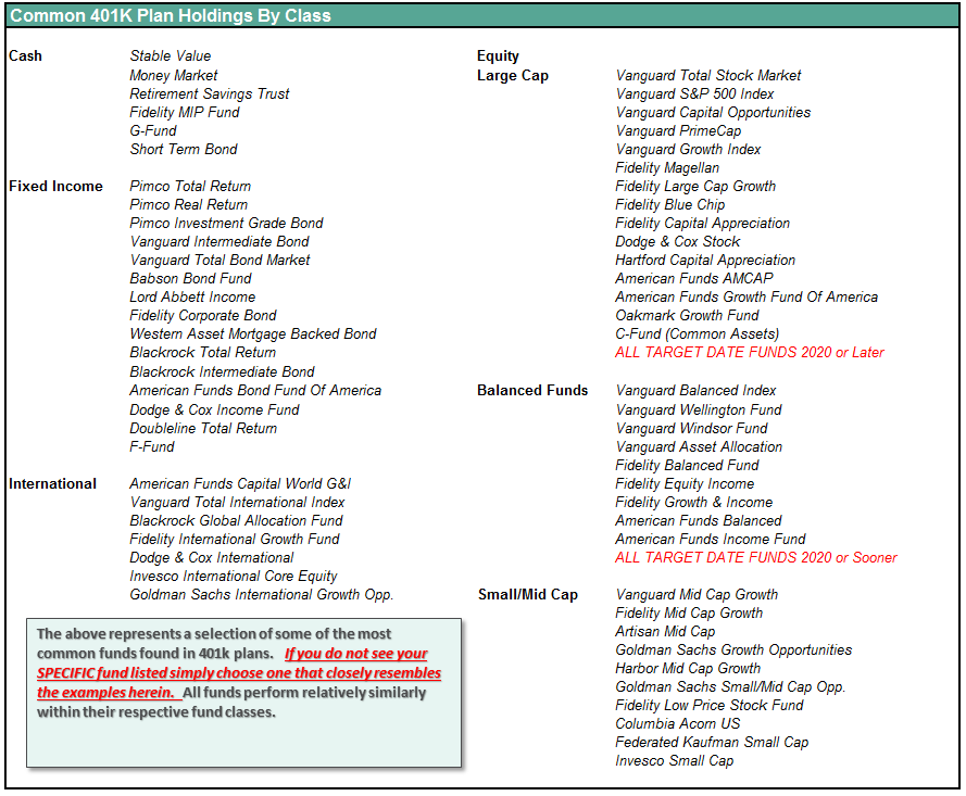
401k Choice Matching List
The list below shows sample 401k plan funds for each major category. In reality, the majority of funds all track their indices fairly closely. Therefore, if you don’t see your exact fund listed, look for a fund that is similar in nature.
Disclosure: The information contained in this article should not be construed as financial or investment advice on any subject matter. Streettalk Advisors, LLC expressly disclaims all liability in ...
more


Thanks sir for sharing