

A candlestick shadow represents the extremes of where the price visited during the life of a candlestick on a chart before closing at its ultimate price.
On a bullish candlestick, the shadows represent the difference between the closing price and the high price (upper shadow), and on a bearish candlestick the shadow represents the difference between the open price and the low price (lower shadow).
The Basics of How Candlestick Charts Work
If that is at all confusing, let’s go over the basic definition of a candlestick. A candlestick on a chart looks like the following:

It represents the open, high, low, and closing prices over the life of a candlestick, depending on the chart setting.
For example, if you’re viewing a daily chart, each candlestick represents one day of price action. In this case, each point on a candlestick would represent the open, high, low, and closing prices throughout one day of trading.
Let’s look at a real-life example:
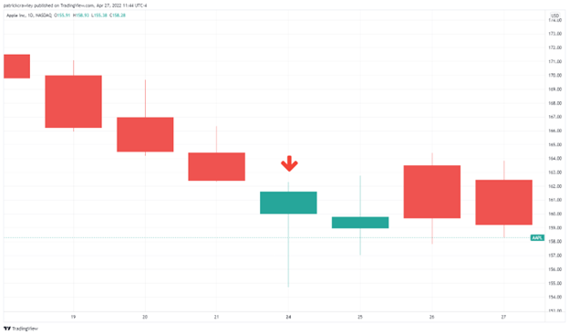
Above is a daily chart of Apple and we’ve highlighted an individual candlestick with a red arrow above it. Let’s break down each element of this candlestick and the potentially confusing nature of candlestick charts should become clear.
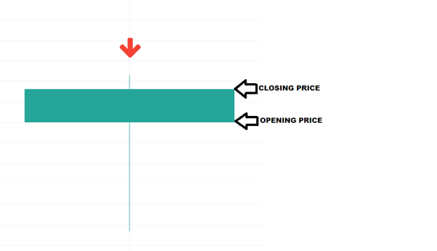
We’ll zoom on in this candlestick to get a better look:

The above candlestick, like all candlesticks, has two primary elements: the body and the shadow.
The body is the wide, solid part of the candlestick. This represents two price points: the open and close. In this case, because we’re looking at a bullish candlestick, the lower part of the body is represents the opening price, or the first price traded at 9:30am EST on that day, while the top part of the body represents the closing price, or the last price traded at 4:00pm EST on that day.
Visually represented:
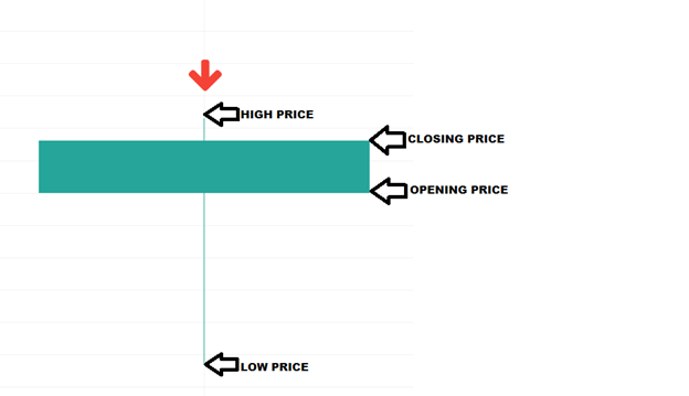
Now to the shadow, the subject of this article. The shadow are those thin lines coming from the top and bottom of the body. You’ll also hear those referred to as “wicks,” as they look like the wick of a candle.
The shadows represent all price action that occurred outside of the range between the opening and closing price, or the high and low for the day.
Let’s highlight the wicks in the above example:
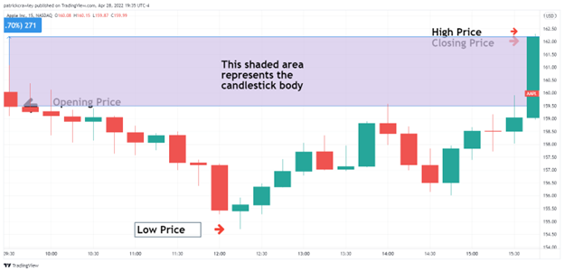
You might see some logic forming here. I think it becomes clear when you go “within” the candlestick, in other words, go to a lower time frame and see how this day’s price action unfolded on an intraday time frame.

Each candlestick on the above chart represents 15 minutes of trading on the daily candlestick we’ve been analyzing for most of this article. Seeing things represented like this might make more sense to you.
I’ll shade the area between the opening and closing prices which represents the candlestick body. The zone above the shaded area would be the upper wick, while the lower zone would be the lower wick:
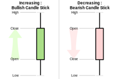
Bullish vs Bearish Candlesticks
One potentially confusing factor with candlestick charts is that bullish and bearish candlesticks are formulated differently. Bullish candlesticks are typically green and bearish red, however some charts will represent them using a mix of different colors like black and white, green and purple, and so on.
When the closing price is higher than the opening price, that is a bullish candlestick. On a candlestick chart, these will be color-coded, so the charting platform will do this work for you.
When the closing price is lower than the opening price, that is a bearish candlestick. The typically red color coding will identify it as a bearish candlestick and you’ll know that the higher point of the body is the open and the lower point is the close.
We’ll refer back to this simple chart again:
Bottom Line
Candlestick charting is a very simple concept but initially can be quite confusing.
The key point to remember is that each candlestick (bar) tells the story of what happened in trading over the life of the bar by giving you four key price points: the highest price the stock traded during that period (say, 15 minutes for example), the lowest price the stock traded at for that period, the first or opening price, and the last or closing price the stock traded at during that period.


Comments
Log in or sign up to join the conversation.