
Zooming In And Out On U.S. New Home Sale Prices
We're going to use charts to tell a short term story and a long term story about new home sales in the United States. Let's start with the most newsworthy of those charts, where we find evidence that new home sale prices in the U.S. have flatlined since January 2017, with our chart showing the relationship between the trailing twelve month average of median new home sale prices and median household income.
(Click on image to enlarge)
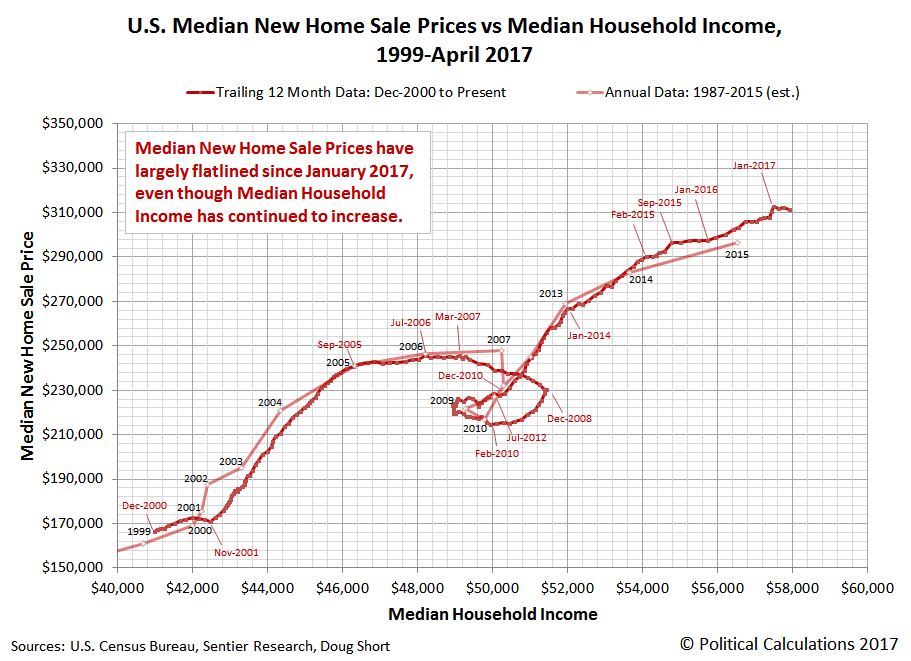
If this is the first time that you've seen this chart, that "loop-de-loop" is what the bursting of a housing bubble looks like as the U.S. economy experiences a major recession. Next, let's zoom out to see all the data we have for median new home sale prices and median household income, which for annual data, extends back to 1967.
(Click on image to enlarge)

One of the cool things about this chart is that it illustrates why the first U.S. housing bubble was such an exceptional event in the context of the long term relationships between median new home sale prices and median household incomes.
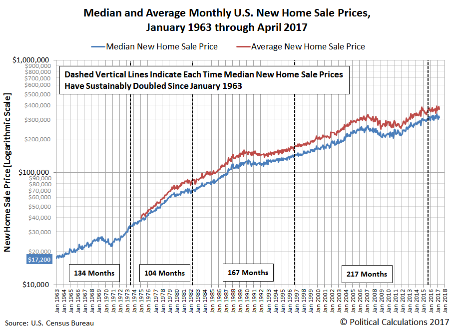
Speaking of which, the only reason we go back to 1967 in this chart is because the U.S. Census Bureau has only reported median household incomes for the U.S. since 1967 (monthly data is available from Sentier Research going back to December 2000). The Census Bureau's data on monthly new home sale prices however goes back to January 1963, where the following chart shows that data, and as a bonus, the average new home sale prices, which have only been reported since January 1975.
(Click on image to enlarge)
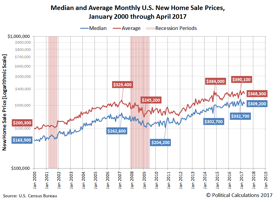
Let's next zoom in on those streams of data since January 2000, while also showing the official periods of recession for the U.S. economy during that period of time:
(Click on image to enlarge)
In our final chart, we'll calculate the trailing twelve month average of U.S. median new home sale prices while zooming in even closer to look at the period from July 2012 through April 2017, which contains three separate trends for the rate of escalation of median new home sale prices in the U.S.
(Click on image to enlarge)

And so, we come full circle, as we once again confirm that U.S. median new home sale prices have flatlined since January 2017 (although the three most recent months will still be subject to revision during the next several months).
Disclosure: None.


