
We're Not There Yet
Are we there yet? No. We have not reached a bottom in the US stock market. Could I be wrong? Yes, but I am confident.
I am being asked if it is time to buy the dip and are we near the bottom. Nobody knows for sure, but I believe:
- It is not the time to buy the dip
- We should not be overly tempted to invest in rallies until clear bottom indications are present
- That we are in a Bear market which will have multiple strong upward reactions before reaching the bottom
- That there is minimal risk of the market running away to the upside leaving you behind
- That signs of the necessary “capitulation” are not present, even though the market mood is gloomy
- That there is too much risk in rising interest rates, supply chain problems, inflation shocks, Russian war, and possible election conflicts in Q4.
Specifically, I believe a simple review of current valuation metrics versus long-term averages, and current price levels versus long-term trend lines gives an important perspective that the pressures favoring a Bear outweigh those favoring a Bull. That has been so for some time, but a catalyst is required to change investor mood and stock market direction. I believe the catalysts are present and the mood has changed.
It is historically true that US stocks move in an erratic pendulum-like pattern around long-term average valuation levels and around long-term price trend lines. It is also logically reasonable to assume such behavior will be characteristic of the future.
Pendulum comments by Howard Marks, CEO, OakTree Capital:
“The mood swings of the securities markets resemble the movement of a pendulum. …whenever the pendulum is near either extreme, it is inevitable that it will move back toward the midpoint sooner or later [mean reversion]. …[in] financial and market cycles, most excesses on the upside — and the inevitable reactions to the downside, which also tend to overshoot — are the result of exaggerated swings of the pendulum of psychology ..This oscillation is one of the most dependable features of the investment world … cycles are inevitable, often profound, and the most reliable feature of the business and investment worlds… “
Accordingly, the data in the two tables below present reasonably plausible extrapolations of where we might see a bottom being formed. And, the final table at the end of this note tracks two technical factors that I believe are a reasonable indicator of the capitulation that is generally necessary for selling pressure to subside and for buying pressure to increase, thus forming a bottom.
It all sounds quite simple. It never is actually simple though. However, looking for complexity in an analysis may not be better and could tend to lead to search for data that confirms preconceived conclusions. For that reason alone, I believe the argument for the KISS system is generally best.
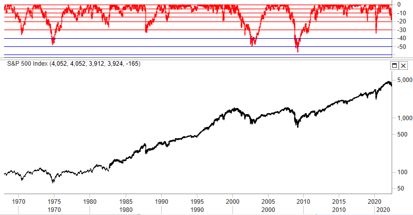
The S&P 500 is 18+% below its 4819 high made on January 4th. I believe it is reasonable to expect at least another 12% to 15% more down, and very possibly a good deal more, perhaps down another 15+% to around 3300 or lower. 3300 is about 32% below the recent high.
The red area of the chart of the S&P 500 below shows its price position relative to its 3-year high for more than 50 years. It shows that the S&P 500 has dropped more than 30% 6 times and near or more than 50% 3 of those 6 times (the 1973 stagflation Bear, the 2000 DotCom Bear and the 2008 mortgage crisis Bear). If our circumstances are as bad as those three periods, we should contemplate a possible 50% Bear from the recent 4819 high. If our circumstances are less severe, we should probably think in terms of a possible 30% to 35% Bear.
QVM Group
Of course, it is a lot easier to forecast WHAT is likely to happen than WHEN it is likely to happen. That said, I believe we are in a Bear market and that it is likely to play out over several months. Unlike the sudden market drop during COVID most Bear markets take a year or more to exhaust themselves.
- The Great Depression Bear took 3 years to the bottom and 25 years to recover to the former high
- The 1970’s stagflation Bear took 1 year to bottom and 7 years to get back to the former high
- The DotCom Bear took 2 years to the bottom and 7 years to recover to the former high
- The mortgage crisis Bear took 1 year and 6 years to get back to the former high
- The Covid Bear took 1 month to the bottom and 6 months to recover to the former high This Bear is 4 months into decline ….
It seems to me that this Bear is unlikely to be declared dead until the occurrence of some combination of:
- the Fed saying they are approaching the end of rate increases and portfolio reduction inflation shocks subside
- Covid and war disrupted supply chains appear to be re-normalizing
- disrupted oil and gas and fertilizer and food supplies in particular begin to improve substantially
- it becomes clear that Russia does not intend to widen the war beyond Ukraine.
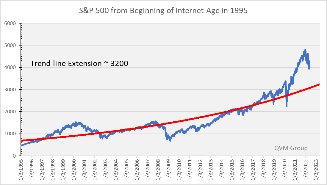
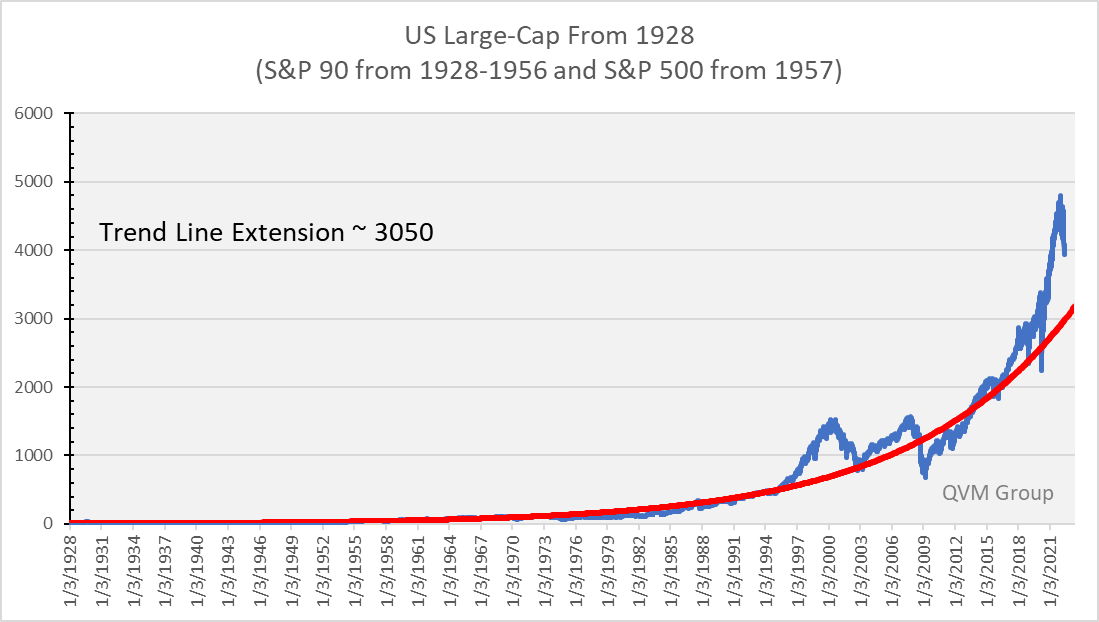
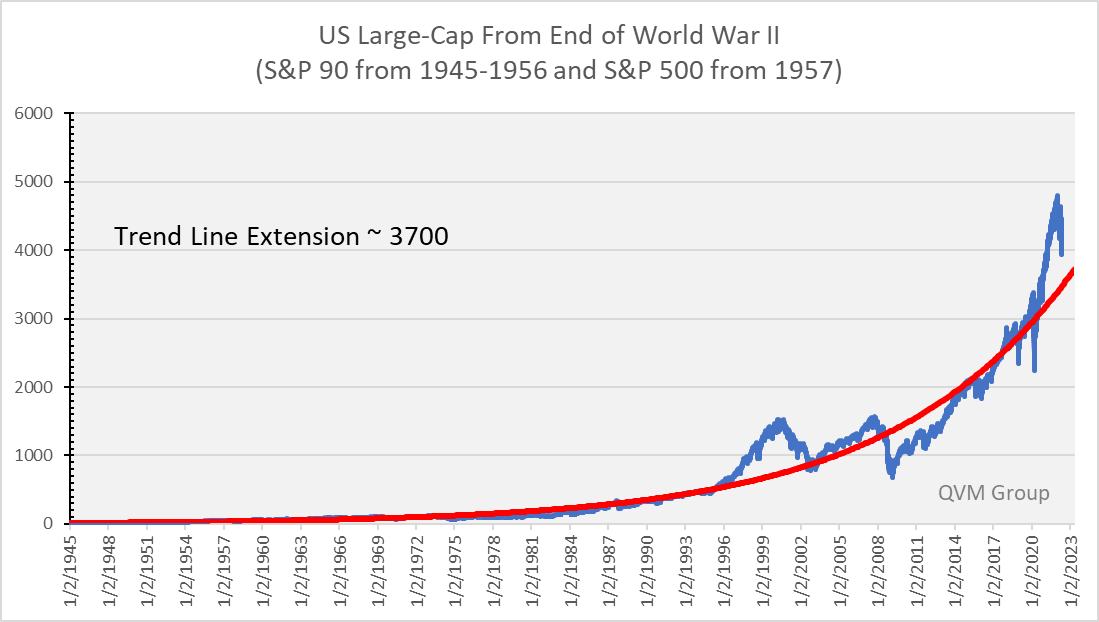
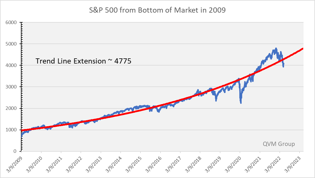
Staying with chart-based thinking, the chart below draws an exponential growth curve in red through the price of the S&P 500 from 1995 onward, and then extends the trend line 1 year into the future, The blue line is the S&P 500 price. The trend line extends to about 3200 and the current S&P 500 price is about 4000. The index would have to drop about 20% just to get back to its trend line, and that is before any downside overshoot which normally takes place in the market pendulum swing.
Why 1995 as a starting point? HTML (the web language that enabled the commercialization of the internet) was introduced that year. From 1995 onward has been the internet age which has its own unique business and investment attributes.
Other similarly constructed charts are provided further below beginning in 1928 when the S&P 90 was launched, beginning in 1945 when the USA became the supreme industrial power at the end of WW II, and 2009 when the S&P began recovering from the second most devastating Bear market in our history. Those charts suggest trend line extensions of 3050, 3700, and 4775 respectively. Given that the rise of the S&P 500 has been so steep since 2009, I place the least faith in that trend line (actually discount it completely in my own mind), but present it so as not to fit data to my argument.
I think the period from 1995 is the best period to use, because it covers the period of globalization of trade, the ubiquitous use of computers in business investing, two full market cycles, and the democratization of investing, among other things.
QVM Group
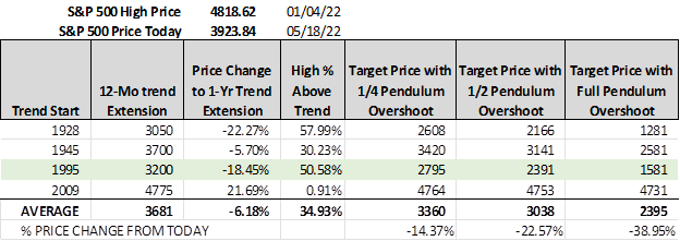
This table presents the extension of the trend line through the next 12 months from the 4 starting years. It then shows the price decline in the S&P 500 necessary for the index to be at its trend line a year from now. Then it calculates 3 levels of possible overshoot. The first overshoot is for the index to go below the trend line by ¼ of the distance that the high was above the trend line. The second assumed the overshoot is equal to ½ of the distance the high was above the trend line. The third assumes a full swing of the pendulum below the trendline to match the distance of the high above the trend line.
Those three overshoots, suggest possible bottoms around 3300-3400, 3000, and 2400.
QVM Group
Now let’s switch over to valuation metrics to gauge possible bottoms.
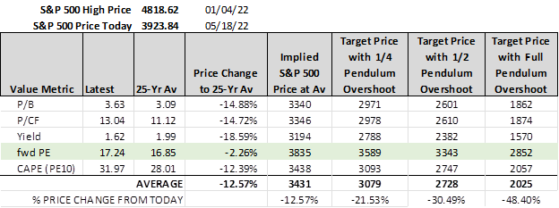
Looking at current valuation levels compared to 25-year averages, the table below calculates the index levels that are the trend line for that metric and also the overshoots at the same ¼, ½ and full swing approach we just discussed above. The trend line is around 3400. The metrics suggest possible overshoot bottoms around 3100, 2800, and 2000.
QVM Group
You can see the pendulum swing effect in the 25-year chart below of the S&P 500 from JP Morgan. It shows the 25-year average forward PE (current price divided by the consensus 12-month forecasted S&P 500 earnings per share) as the middle dashed green line, as well as forward PE ratios that are +/- 1 standard deviations above and below the 25-year average. The recent high was meaningfully above the +1 std. dev. level, and the 2008 low was meaningfully below the -1 std. dev. Level.
A “full” pendulum swing from the recent high to a mirror image low would be a valuation below the -1 std. dev. Level. Let’s say the pendulum only swings down to -1 std. dev. before going up again. What would that mean for a bottom price?
The consensus 12-month forward earnings forecast for the S&P 500 is $230 per share and the -1 std. dev. valuation level is 13.49x. That translates to a possible bottom price of about 3100 (about 36% below the recent high and about 21% below where the S&P 500 is now).
You could say, why make such a dire forecast. Well, there hasn’t been such a confluence of severe circumstances adverse to stock price in a long-time, meaning that a more severe than normal outcome is reasonable to expect – and pendulum swing is a real part of investment markets.
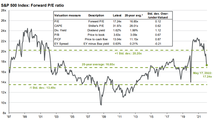
JP Morgan Guide to the Markets
These are the trend line charts for the 4 starting years (1928, 1945, 1995 and 2009).
QVM Group
QVM Group
QVM Group
QVM Group
There are many different systems and methodologies to attempt to gauge a bottom in the stock market. Underneath all those approaches is the concept of seller exhaustion. Once the bulk of sellers have unloaded the last of the shares they are inclined to sell, and the news and mood is extremely low, that is precisely when there is the greatest return potential, and when aggressive buyers begin to accumulate shares (not when everybody on TV is asking if now is the time to buy the dip). That extreme condition forms the bottom and the beginning of a rise. The rise continues as other investors follow and the cycle starts again.
That’s nice, but what quantitative information might indicate that exhaustion. Here is one set of two measures that are readily accessible and fairly straight forward (no complexity and no brain damage trying to interpret them) and have reasonable potential to indicate exhaustion.
A bottom may be in if:
- the percentage of S&P 500 stocks above their 50-day moving average is 5% or less, and the RSI (relative strength index) is at or below 20.
Note:
The RSI is a momentum indicator that measures the tendency of a stock or index to close closer to the top or the bottom of its average daily price range. It is not a measure of “relative strength” which compares performance relative to other assets – and unfortunate use of the same words to describe two entirely different measures.
The chart below shows those occasions when both criteria were met (with blue circles). Historically, since 1998, they indicated market bottoms during Bears and Corrections. I don’t have data for both of those criteria before 1998. There are other indicators, such as back-to-back 90% down days and others, but these two seem to be fairly reliable. We aren’t too far away from a bottom in terms of these measures to suggest seller exhaustion. Maybe a bottom will occur sooner than I expect. I will watch these for you closely.
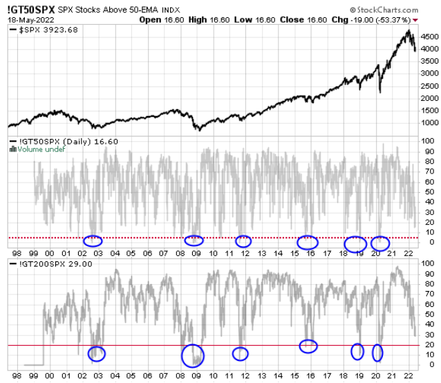
Stockcharts.com
You could also add the VIX and the ratio of equity Puts and Calls and the RSI (perhaps 30 days to reduce noise) to seek corroboration of the Bear bottom signal.
This article is a broad market call but directly relevant S&P 500 symbols are:
- SPY SPDR S&P 500 ETF
- IVV iShares S&P 500 ETF
- VOO Vanguard S&P 500 ETF
- VFINX Vanguard S&P 500 mutual fund.
Of course, because the S&P 500 encompasses perhaps 85% of USA market cap, and because it is the gold standard for benchmarking US stocks, so goes many other funds and individual securities. Check the Beta and correlation to see how closely your securities are likely to follow the S&P 500.
Remember also that as a Bear gets more severe, correlations tend to converge to 1, and it is not until the recovery stage that correlations once again diverge.
Disclaimer: "QVM Invest”, “QVM Research” are service marks of QVM Group LLC. QVM Group LLC is a registered investment advisor.
Important Note: This report is for ...
more

