
Note that this article was originally written by Doug Short. From 2016-2022, and it was improved upon and updated by Jill Mislinski. Starting in January 2023, AP Charts pages will be maintained by Jennifer Nash at Advisor Perspectives/VettaFi.

Image Source: Pixabay
Here is the opening statement from the Department of Labor:
"In the week ending January 14, the advance figure for seasonally adjusted initial claims was 190,000, a decrease of 15,000 from the previous week's unrevised level of 205,000. The 4-week moving average was 206,000, a decrease of 6,500 from the previous week's unrevised average of 212,500.
"The advance seasonally adjusted insured unemployment rate was 1.1 percent for the week ending January 7, unchanged from the previous week's unrevised rate. The advance number for seasonally adjusted insured unemployment during the week ending January 7 was 1,647,000, an increase of 17,000 from the previous week's revised level. The previous week's level was revised down by 4,000 from 1,634,000 to 1,630,000. The 4-week moving average was 1,673,000, a decrease of 5,500 from the previous week's revised average. The previous week's average was revised down by 1,000 from 1,679,500 to 1,678,500."
This morning's seasonally adjusted 190,000 new claims, down 15,000 from the previous week's unrevised figure, came in below the Investing.com forecast of 214,000. Here is a close look at the data over the decade (with a callout for the past year), which gives a clearer sense of the overall trend.
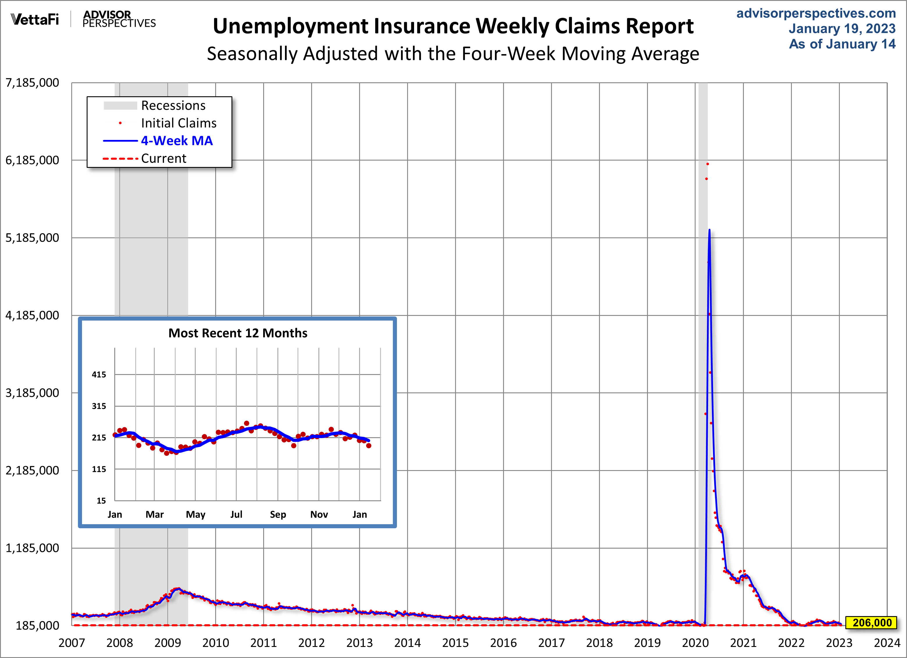
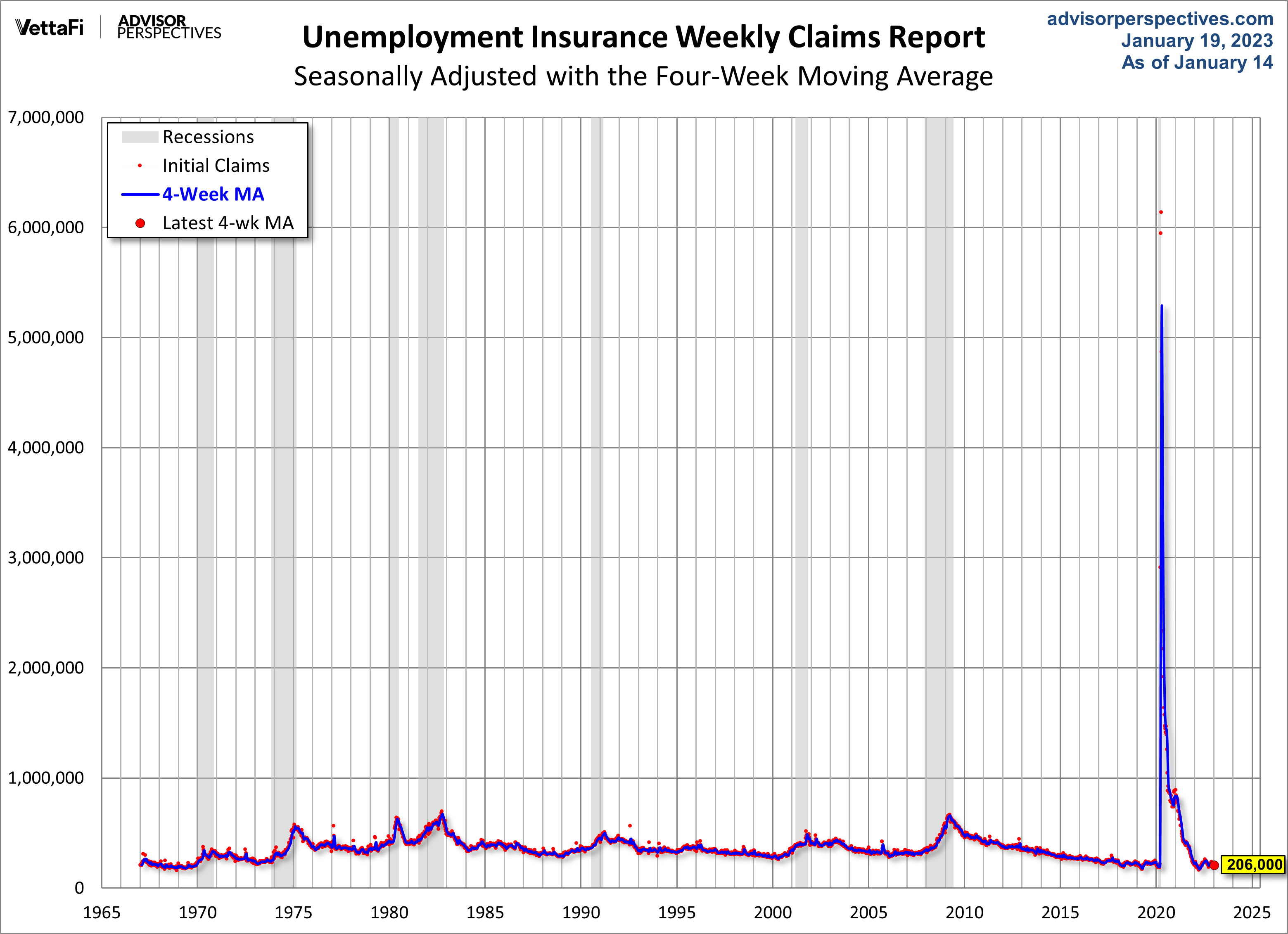
As we can see, there's a good bit of volatility in this indicator, which is why the four-week moving average (the highlighted number) is a more useful number than the weekly data. Here is the complete data series.
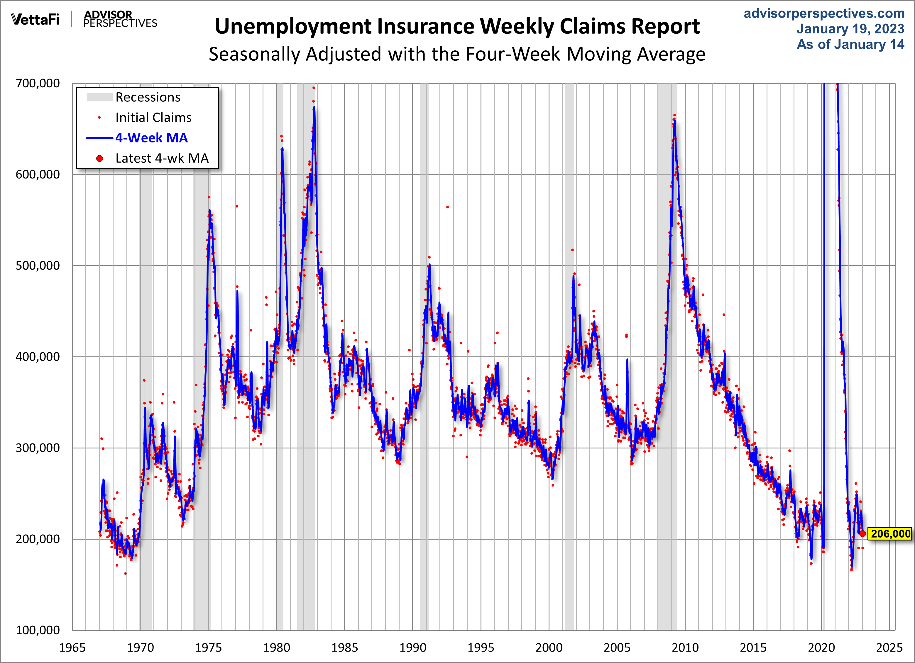
Here's a copy of the above chart, but zoomed in, so the COVID-19 spike isn't as prominent.
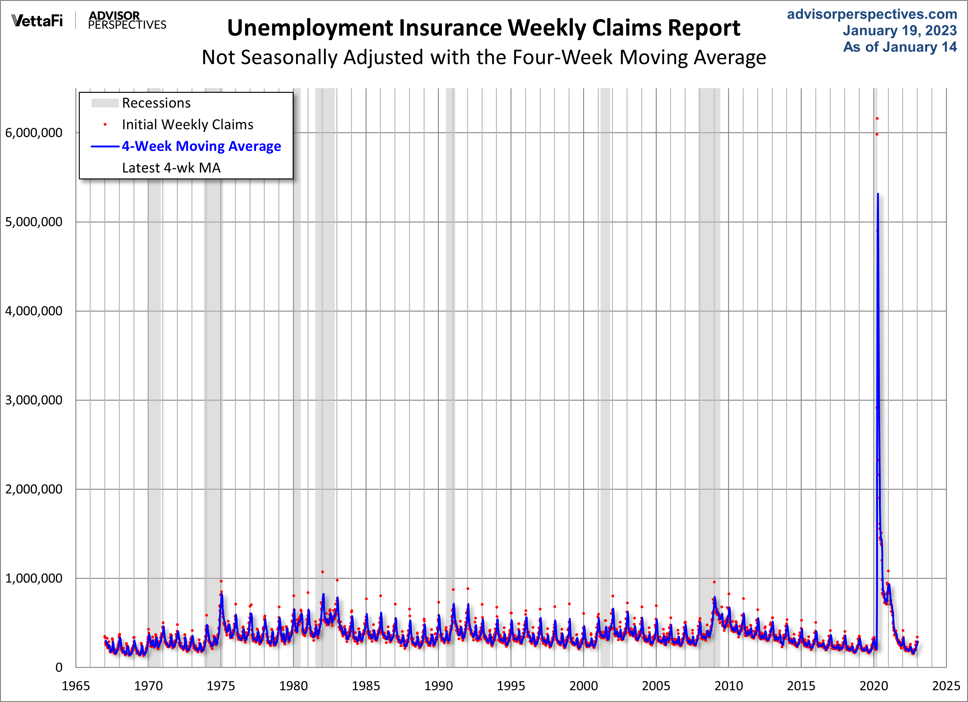
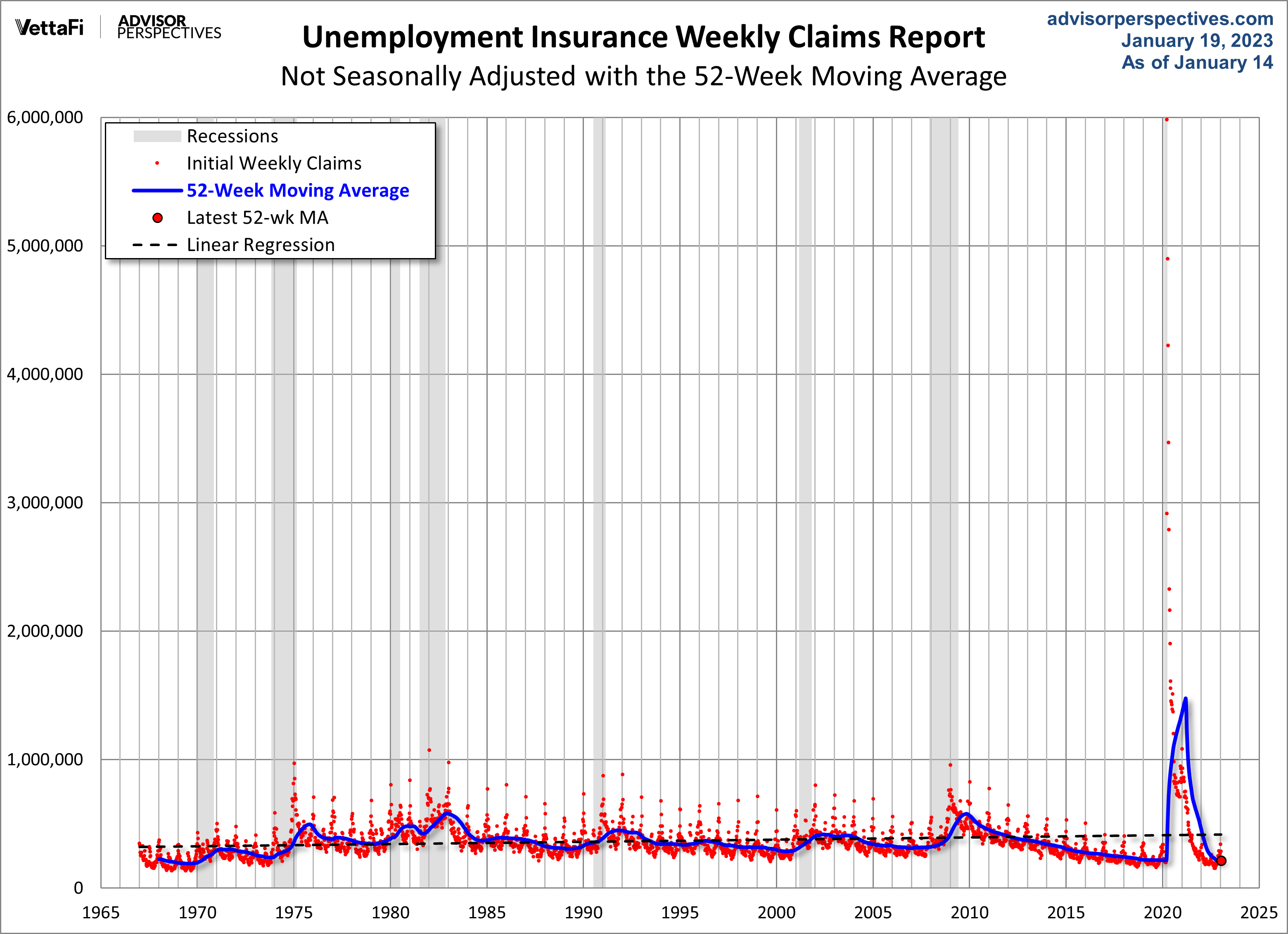
The headline Unemployment Insurance data is seasonally adjusted. What does the non-seasonally adjusted data look like? See the chart below, which clearly shows the extreme volatility of the non-adjusted data (the red dots). The four-week MA gives an indication of the recurring pattern of seasonal change (note, for example, those regular January spikes).
Because of the extreme volatility of the non-adjusted weekly data, we can add a 52-week moving average to give a better sense of the secular trends. The chart below also has a linear regression through the data.
For an analysis of unemployment claims as a percent of the labor force, see this regularly updated piece The Civilian Labor Force, Unemployment Claims and the Business Cycle. Here is a snapshot from that analysis.

Here's our complete list of monthly employment updates:
- ADP Employment Report
- Employment Situation Summary
- Labor Market Conditions Index
- Long-Term Trends by Age Group
- Aging Work Force
- Ratio of Part-Time and Full-Time Employment
- Multiple Jobholders
- Workforce Recovery Since the Recession
- Civilian Labor Force, Unemployment Claims, and the Business Cycle
More By This Author:
Cryptocurrencies Through Wednesday, Jan. 18NAHB Housing Market Index: "Builder Confidence Uptick Signals Turning Point for Housing Lies Ahead"
Weekly Gasoline Prices: Regular And Premium Up Again

Comments
Log in or sign up to join the conversation.