
Weekly Market Outlook - Election Week
Last week wasn't just rough. It was the worst week the market has logged since September, and it was close to being the worst week since January. Whatever the case, it was bad, with the S&P 500 (SPX) (SPY) losing 1.94% of its value over the course of five straight losing days. In fact, the index has now logged nine straight losing days. That's the longest losing streak since 1980.
There's a potential upside to such a move. That is, after such a dry spell, the buyers may be chomping at the bit. There's a potential downside too -- the selloff may indicate exactly what it looks like it indicates. The irony? Friday's close for the S&P 500 was right at the pivotal 200-day moving average line, with no clear suggestion about where it was going next.
That makes this week a huge one for stocks, made even bigger by Tuesday's Presidential voting.
We'll take a look at where things ended up last week after a quick run-down of last week's and this week's major economic news.
Economic Data
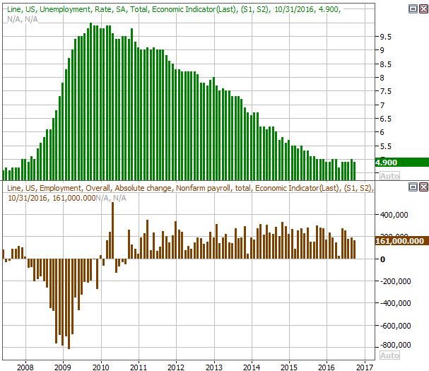
Last week's economic dance card was full, but there's little doubt as to the highlight - Friday's jobs report. Though it was "good," it wasn't great. The unemployment rate fell from 5.0% to 4.9%, but the 161,000 new nonfarm payrolls fell short of the expected 175,000. Wages were up 0.4% and grew the most they had since 2009. There's more positive than negative packed into the report but just barely.
Payroll Growth and Unemployment Rate Chart
Source: Thomson Reuters
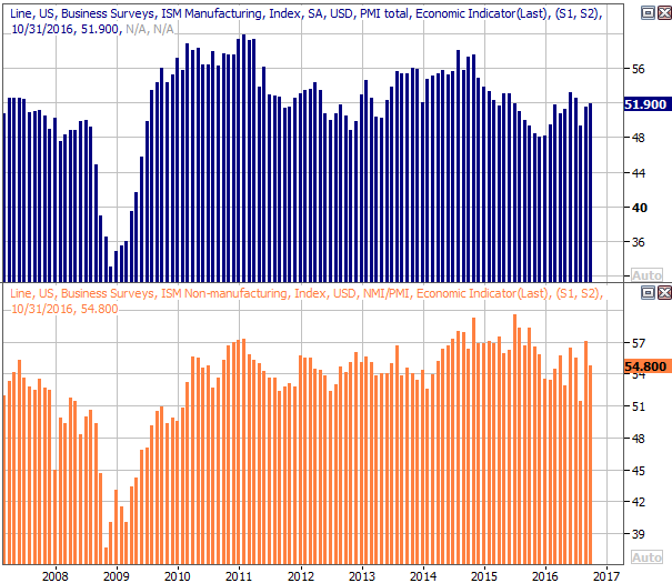
It was also a big week for ISM data. Both the services and the manufacturing indices were posted, with the former falling, and the latter rising. Both remain above the key 50 level, but neither are especially impressive (or consistent) right now.
ISM Indices Chart
Source: U.S. Bureau of Economic Analysis
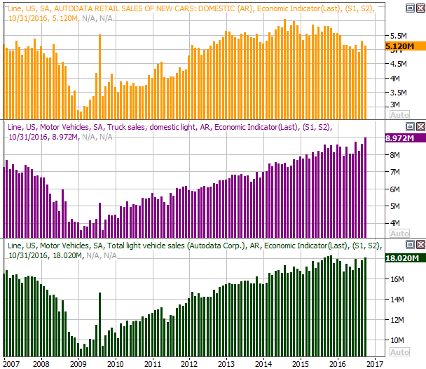
We also heard last month's automobile sales on Tuesday. They were a bit better than expected -- and up -- reversing September's lull that raised red flags of a more serious slow-down. Still, the auto industry isn't exactly back in a growth trend.
Auto Sales Chart
Source: Thomson Reuters
Last but not least, though the Federal Reserve had a chance to raise interest rates last week, but once again deferred to do so, suggesting the economy isn't quite ready for that burden just yet. A December rate increase remains very likely though.
Economic Calendar
Source: Briefing.com
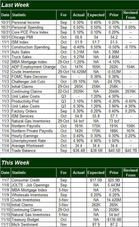
This week is going to be an amazingly light week in terms of economic news. In fact, none of it is worth previewing, other than to note that we're going to be hearing about September's JOLTS (job openings survey) on Tuesday. Openings continue to trend higher and remain above hiring levels. The growth pace is slowing, though.
JOLTS (Job Openings and Labor Turnover) Chart
Source: Thomson Reuters
The lack of economic data will just put that much more focus on the election's results and what that may mean for the economy.
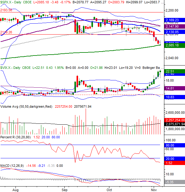
Stock Market Index Analysis
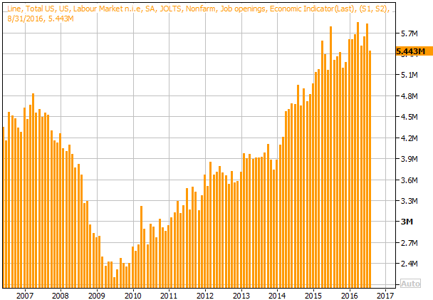
While the true disposition and conviction of the sellers isn't perfectly clear, there's no denying the sellers have become much more serious within the past couple of weeks. The S&P 500 broke under a major floor at 2120, and on Friday when it looked like the 200-day moving average line might finally spark a rebound, the bears roared again and sent the S&P 500 to a ninth straight daily loss.
The 200-day line is still in play, though... perhaps annoyingly so. The index parked right above it on Friday, and could easily in Monday above or below that pivotal long-term indicator.
S&P 500 & VIX Daily Chart
Chart created with TradeStation
That said, there's also no denying the bulls are on the defensive here, and the bulls are going to have to undo some damage first before reigniting an uptrend. The Percent R line is now well below the 20 thresholds, and it's staying there. The MACD lines are showing us a new bearish divergence and did so while both MACD lines were below the zero level (suggesting the undertow was already bearish anyway).Throw in the fact that the CBOE Volatility Index (VIX )(VXX) is also in full-breakout mode and moving to higher highs -- yet still has room to keep running -- the bulls have a lot of work cut out for them.
To fully appreciate where the VIX is and where it could go before it's all said and done, you have to take a step back and look at the weekly chart of the S&P 500. The VIX has broken above it upper Bollinger band, but could move as high as 32 before it hits a firmer ceiling that's more typically seen at a major bottom.
S&P 500 & VIX Weekly Chart
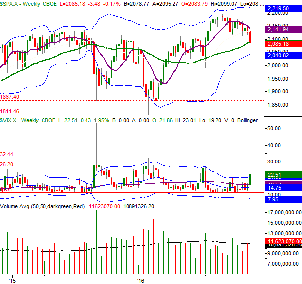
Chart created with TradeStation
It's also on the weekly chart we can get a feel for how far the market hasn't fallen.
From the September peak to Friday's close of 2055.18, the S&P 500 has given up 6.3%. That's a sizeable dip, but not yet a more typical correction move of 10%. In the November-to-January dip the S&P 500 gave up 14.4% from peak to trough, and the index lost 12.5% of its peak value in August and September of last year.
A 10% pullback from the S&P 500's August high of 2194 would put the index at 1975, for perspective. That's right around July's low, and it's also (though not shown on our chart) close to a key Fibonacci retracement line.
The daily chart of the NASDAQ Composite (COMP) doesn't show us anything new, so we'll skip that one. The weekly chart of the NASDAQ offers a little more insight, though. Namely, we can see on the weekly chart of the composite how rounded and gradual the recent pullback took shape. Rather than an upside-down "V," it's an upside-down "U." Those gradual, methodical reversals tend to last a little while.
NASDAQ Composite & VXN Weekly Chart
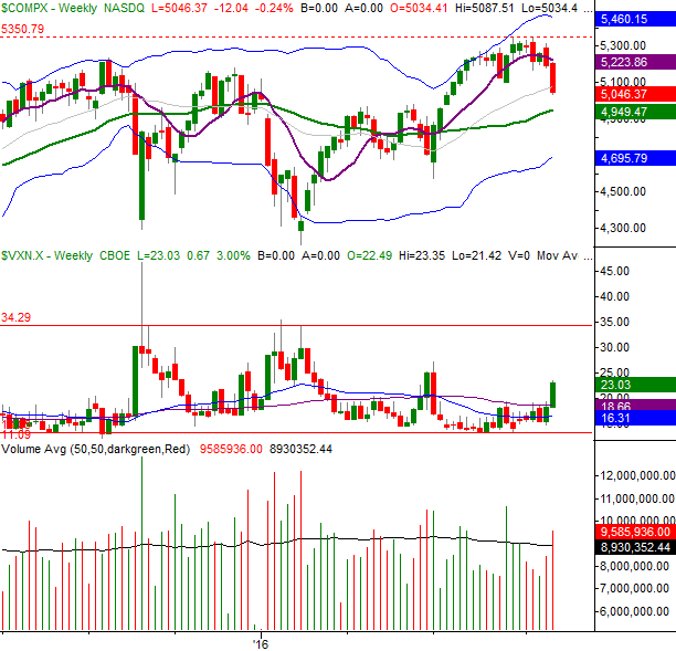
Chart created with TradeStation
The weekly chart of the NASDAQ Composite also shows us the Nasdaq Volatility Index (VXN), like the VIX, isn't anywhere near a peak that says fear is fully baked in. The VXN, however, is starting to break out. It's rare for it to start such an upward thrust without following through on it.
Bottom line? The tough part here is distinguishing between the market doing what it's going to do and the market reflecting assumptions about the outcome of the Presidential election. We have to assume, however, the shape of the chart has properly indicated where things are headed, as it indicates how people are going to feel about the election's results.
In other words, we should take the chart at face value.
That's still tough to do though, as the 2016 Presidential Race has been like no other.
We'll have to assume there may be more downside ahead based on the current momentum. The BigTrends TrendScore ended last week at 24.7 (on a scale of 0 to 100), which is well into bearish territory. The 200-day moving average line, however, is the big key here. It could take a few days for the S&P 500 to decide which side of that line it belongs on. It would take a move all the way back above 2145, however, to say it was in decidedly bullish shape.
Disclosure: None.


thanks for sharing