
Utilities Forever

Image Source: Pexels
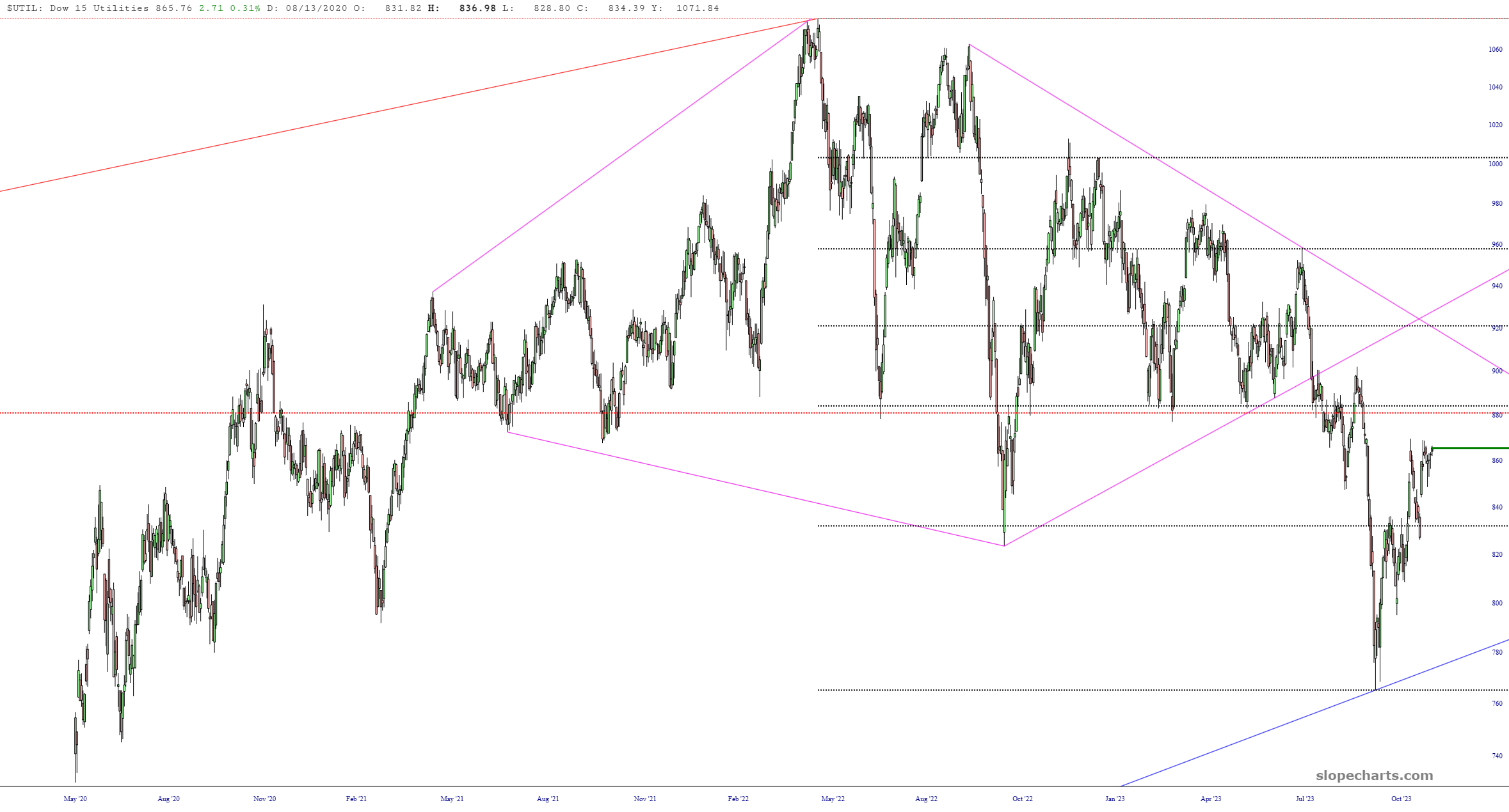
My favorite pattern remains the diamond found by way of the Dow Utilities. It’s a slower mover, but I think ultimately, it’s going to unravel quite nicely.
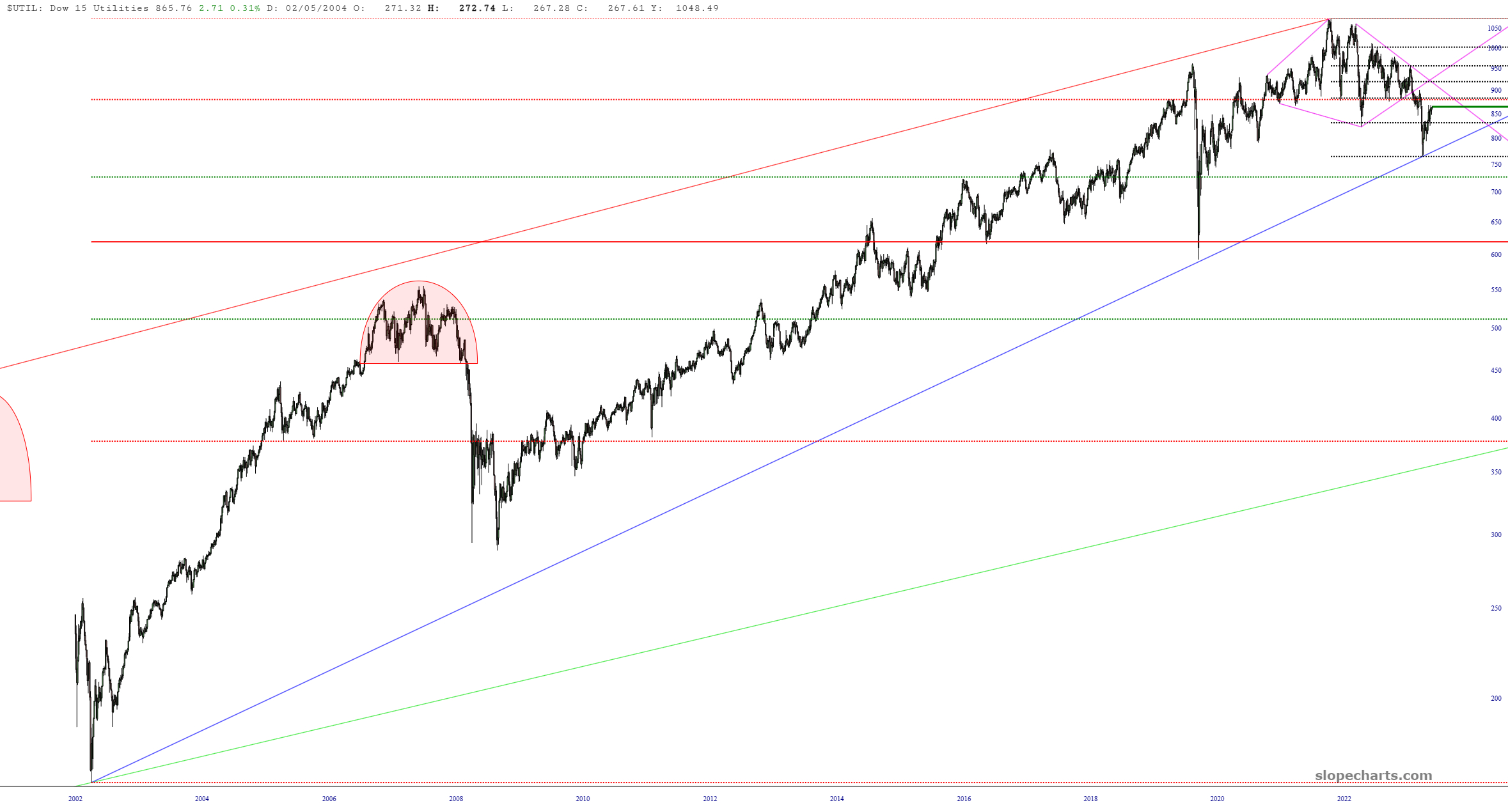
Here is the longer view. The last time the utilities were in such a well-formed pattern was before the financial crisis, although back then it was in the form of a head-and-shoulders top (tinted in pink).
Incidentally, I was curious how TLT and XLU interacted with one another since they are obviously both interest-sensitive instruments.
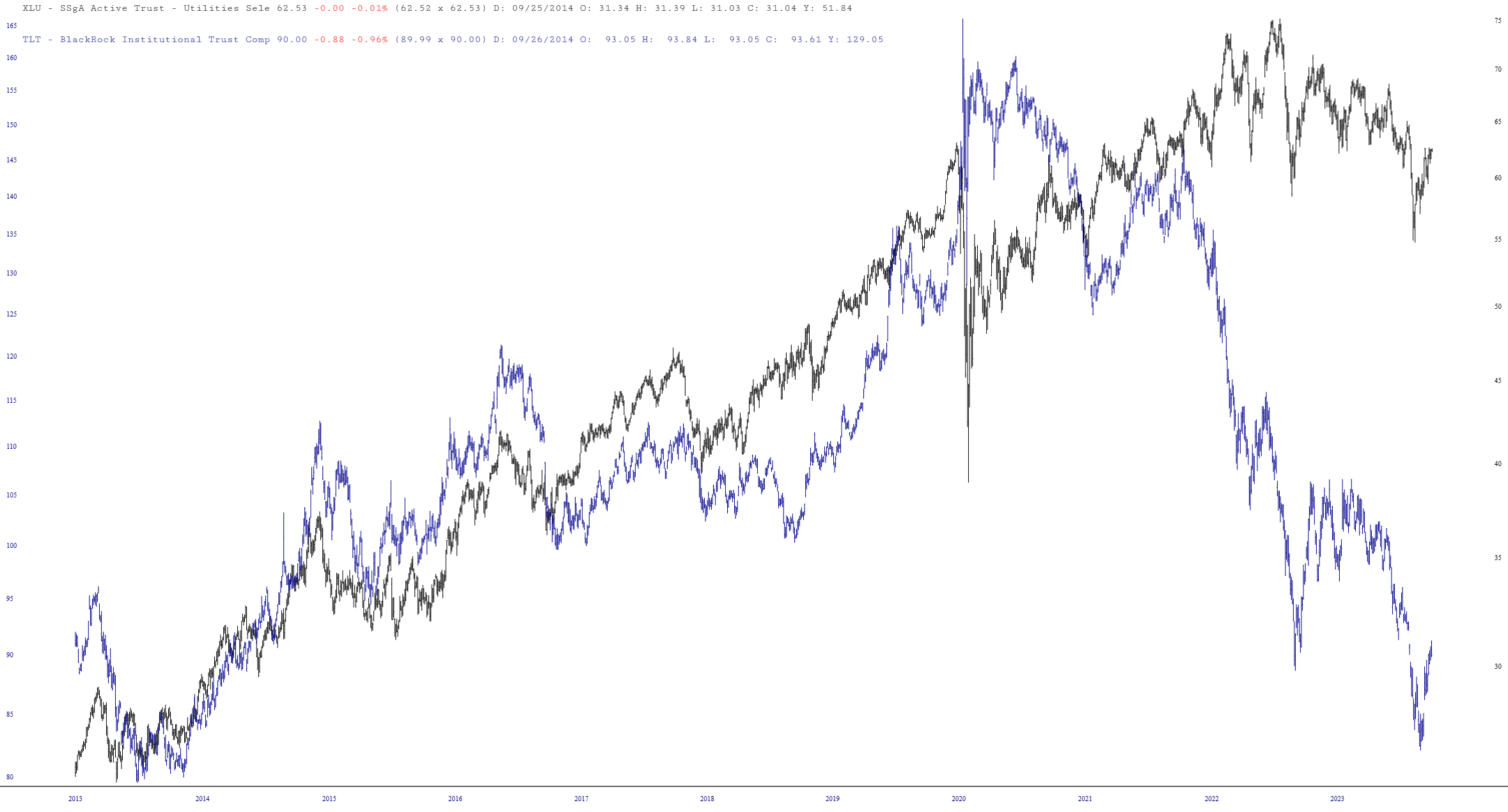
I find this chart to be exceptionally curious. For years, TLT and XLU were virtually in lockstep, but after Covid struck, they seemed to go their separate ways. The bonds (shown as TLT, in blue) have been in a 4-year long bear market, whereas the utilities (in black) are, yes, off their highs, but they have been annoying robust. I’d be curious to know any ideas as to why this divergence took place and whether you think utilities will get the memo and “catch down” with their bond brethren.
More By This Author:
Bitcoin Going To Blast?
Miners Looking Bullish
Alphabet’s Dividing Line
I tilt to the bearish side. Slope of Hope is not, and has never been, a provider of investment advice. So I take absolutely no responsibility for the losses – – or any credit ...
more

