
Using Commodity Channel Index (CCI) And Directional Movement Index (DMI) Technical Analysis Chart Indicator
Commodity Channel Index (CCI)
The Commodity Channel Index indicator (often abbreviated as 'CCI') is a technical analysis indicator introduced by Donald Lambert in 1980. As an oscillator, it was created as -- and still lends itself to -- indentifying instances where a stock or index is overbought or oversold. But, as is the case with many technical analysis tools, the Commodity Channel Index indicator has been refined and interpreted in a variety of unconventional but still highly effective ways.
The answer the common question "Why is it a 'commodity"' channel index?', Lambert was a commodity trader, and developed the indicator as a means to find cyclical turning points for commodity prices. The tool, though, has been practically applied to stocks and market indices.
The CCI indicator -- a single-line tool plotted on a scale of -100 to +100 -- plots the difference between a stock's price change for any given bar and its average price change (per bar) over the course of a specified timeframe. The indicator formula is:
CCI = (((High + Low + Close)/3) - X-period SMA of ((High + Low + Close)/3)) / (.015* x Mean Deviation)
* In this case, the '0.15' value is the chosen "constant" preferred by Lambert, though this can be adjusted as needed.
High readings (above +100) of the commodity channel index say prices for that instrument are above their norm thanks to abnormally large gains for recent bars, indicating strength. Conversely, low readings (below -100) of the commodity channel index say recent weakness has been uncharacteristically weak, suggesting extreme bearishness.
That's where the interpretation of the CCI indicator can become tricky, and nuanced.
As a mathematical oscillator that is designed to spot instances where a security is overbought or oversold, the logical interpretation of the CCI tool would be to sell when readings are above +100 or buy when readings are below -100. But, careful study of the indicator's history reveals that a stock or index that's overbought can stay overbought and rally indefinitely. Likewise, an oversold security can remain oversold indefinitely, with that stock or index continuing to move lower the whole time.
In that light, the commodity channel index can also serve as a momentum indicator. As always, interpretation and application are subjective, and in this particular case may be best used in conjunction with other indicators.
Some traders also use crosses above the zero line as a buy or sell signal, as it would suggest a new trend is in development.
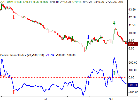
The example below illustrates how the CCI tool could have been used with Alcoa (AA); each noteworthy signal is marked with an arrow. Once the CCI indicator broke below -100, a prolonged downtrend ensued, confirming commodity channel index can indeed identify momentum. Later on, when the CCI line broke above the zero level, that signal could have prompted an exit of the bearish trade and/or cued a new bullish trade. After that, when the commodity channel index surged well above +100, it was indeed an indication that Alcoa shares were overbought, and a pullback soon followed.
AA Daily Chart with CCI
Though it requires a certain degree of interpretation and "feel" to use it, CCI can be a potent addition to a trader's arsenal.
Directional Movement Index (DMI)
The Directional Movement Index, or DMI, is a moving average of range expansion during a specified period of time. In other words, it indicates how strong a trend is by looking at how significant price changes have been in a specified period of time. But, unlike most technical momentum indicators, directional movement index lines aren’t plotted based on a stock or index’s closing price. Rather, they’re plotted based on the bar-to-bar changes in a security’s highs or lows.
The DMI indicator is actually a two-plot indicator….the +DMI line, which tracks the size of the bar-to-bar changes in a security’s highs, and the -DMI line, which tracks the size of the bar-to-bar changes in a security’s lows. The +DMI and -DMI lines are plotted on the same plane (starting at zero, and theoretically extending infinitely higher, but usually capped between 40 or 50), and often compared to one another as a means of deriving buy and sell signals from the directional movement index indicator.
The directional movement index plots aren’t difficult to interpret once understood, but there is one potentially confusing nuance with them. That is, when the bull trend is strong, the +DMI line is rising and the -DMI line (usually) falls. Conversely, when a bearish trend is strong, the -DMI line rises and the +DMI line (also usually) falls. For that reason, it’s critical to know which line is which when interpreting a DMI chart. This is usually accomplished by using different colors to plot the -DMI and +DMI lines.
An example will clarify how each directional movement index line moves in relation to bullish or bearish trends.
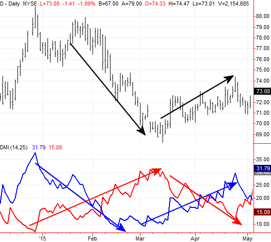
On the image below, the +DMI line is plotted in blue, and the -DMI line is plotted in red. The former rises when the trend is bullish and falls when the trend is bearish. Conversely, the -DMI line points higher when the trend is bearish, and moves lower when the trend is bullish.
D Daily Chart with DMI
As for using the directional movement index indicator to generate buy and sell signals, crosses of the +DMI and -DMI line are one way of doing so. But, that’s not the only way; some technical analysts argue that such a methodology is too lagging in nature… meaning it doesn’t create a signal until well after the trend has started. As an alternative, some technicians use higher highs made by the -DMI or +DMI lines as a sell or buy signal, respectively.
Whatever approach is chosen, traders should test it for accuracy and use those signals consistently when using the directional movement index indicator as a trading tool.

Despite the tepid start to the trading week last week, the bullish finished strong, taking all the major indices above some major technical resistance lines.
Granted, Friday's bullish move was more than a little overheated, with the opening gaps leaving the market vulnerable to a pullback that may well serve to start a corrective move. But, it's interesting that the market was able to muster that much bullish interest on what was (frankly) less than truly bullish prompt.
We'll talk about the risks and rewards of the current situation below, right after a quick wrap-up of last week's and this week's major economic numbers.
Economic Data
It wasn't an especially busy week last week in terms of economic news, but it was a significant week for real estate data.
The flurry of housing news started on Monday with the NAHB Housing Market Index, which advanced to 64 from September's score of 61. But, the party got started in earnest on Tuesday with September's housing starts and building permits. Though permits fell from a pace of 1.1161 million units to 1.103 million, starts ramped up from August's pace of 1.132 million to 1.206 million... almost a multi-year record high. Regardless, both pieces of data continue to climb in a healthy manner.
Housing Starts and Building Permits Chart

Source: Thomas Reuters
On Thursday we got updated FHFA Housing Price Index and existing home sales figures, both of which also pointed to an increasingly strong real estate market. The FHFA Housing Price Index said home prices were up 0.3% for the month, and up 5.5% compared to August-2014's numbers. And, existing home sales were cranked up to an annual pace of 5.5 million houses... the second highest pace since 2007 (when the number was falling).
Those two uptrends also say the housing market is solid.
Existing Home Sales and FHFA Housing Price Index Chart

Source: Thomas Reuters
Everything else is on the following grid:
Economic Calendar

Source: Briefing.com
This week is obviously going to be quite a bit busier, kicking off with new home sales on Monday. If last week's real estate data is any indication (and it is), that number should at least be respectable if not encouraging.
The highlight of the week, though, is going to be Wednesday's word from the Federal Reserve. Though it's not an official rate-change decision meeting, the possibility is always on the table in case of emergencies. But, given the wave of numbers that imply economic weakening rather than strengthening - like the fact that ECB President Mario Draghi is talking about stimulus - we don't have much reason to worry this is the month we'll see a rate hike in the U.S.
Though it's a bit off the radar, this week will also be a big one for consumer sentiment. On Tuesday we'll hear the Conference Board's consumer confidence level for October, and on Friday we'll get the final reading of this month's Michigan Sentiment Index. Though choppy, both are in broad uptrends. It may be worth keeping a close eye on the Michigan Sentiment Index, however, as it's been acting a little toppy, toying with the development of a downtrend.
Consumer Sentiment Chart

Source: Thomas Reuters
Stock Market Index Analysis
Like it or not, the market broke out last week, and cleared some key technical hurdles in the process. Even more than that, it confirmed the breakout effort via a handful of indicators. Though hardly an ideal rally effort (and one that should be viewed with extreme cautions), as they say, it is what it is.
For the S&P 500 (SPX) (SPY), "what it is" is a thrust above the 200-day moving average line (green) thanks to Friday's gain. That may be the grandmother of all technical bullish clues. More than that, however, the bullishness seen on Thursday and Friday was on above average volume, but not dangerously high volume (volume surges often occur at market tops). Take a look.
S&P 500 & VIX Daily Chart

Chart created with TradeStation
Last week we talked about the fact that we had yet to get a Percent R confirmation of bullishness. In the meantime, we DID get it. As you can also see highlighted in the chart, the Percent R line did pull back last week, but didn't fall back under the 80 threshold before moving higher again at the same time the S&P 500 itself made a new high. That's a bullish confirmation.
The daily chart of the Nasdaq Composite (COMP) looks similar, though in some ways, not quite as healthy. For instance, the composite left a rather big gap behind on Friday, and it's rather clear the NASDAQ's upper Bollinger band is doing its best to act as a ceiling. Bollinger bands have prompted reversals more often than not this year, and while it's possible this bullish thrust could be different than most of the recent ones and instead gently push the upper Bollinger band upward rather than pull back from it, we have no evidence this is going to happen yet.
NASDAQ Composite & VXN Daily Chart

Chart created with TradeStation
We also don't yet have a bullish Percent R confirmation for the NASDAQ Composite, though we're in a good position to make one. And for what it's worth, the BigTrends TrendScore for stocks as of Friday's close was a bullish 88.8 (out of 100).
The one thing to watch that may be more telling than the market indices themselves this week are the volatility indices... the Nasdaq Volatility Index (VXN) and CBOE Volatility Index (VIX) (VXX). Both are right above key support levels and though each is on a course to move below those floors this week, traders should watch out for potential support at those lines... 13.7 for the VXN and 12.2 for the VIX. Unexpected support there could lead to a surprising reversal for stocks. Until then though, the trend is your friend.
Fed Funds Rate Outlook
It's been a while since we updated the Fed Funds rate prediction chart (based on the way Fed Funds futures are priced, and their open interest). But, with changes to the economic landscape forcing the Federal Reserve to rethink the need for such a maneuver, a refreshed look is merited.
Long story made short, the first likely rate hike in years has been pushed back to March of next year, and even then it's a "just barely" scenario; traders are saying there's a 43.1% chance the Fed Funds rate will be at 0.5% then, with a 40.4% chance it'll still be at 0.25% at that time. The odds for a 0.5% rate don't reaching convicting levels until June of next year, where they should stay at least through September... with a small outside possibility of reaching 0.75% by September.
Fed Funds Outlook and Odds Chart
Source: CME Group
Although they're just odds based on Fed Funds futures activity and pricing, traders are collectively right more often than they may believe is possible. [Try a web search for "jelly bean, wisdom of crowds" to understand why they're so good as a group.] This includes the prediction of future interest rates.
Disclosure: None.


