
U.S. Household Wealth Is In A Bubble – Part 2
U.S. Stocks Are In A Bubble
In Part 1 of this series called “Why U.S. Household Wealth Is In A Bubble,” I explained why America’s post-Great Recession wealth boom is driven by a tremendous bubble that will end in tears.
In Part 2 of this series, I will go into more detail about the U.S. stock market bubble that is a major driver of the overall household wealth bubble. Common stocks – including those held indirectly in mutual funds – are one of the largest components of U.S. household wealth, along with bonds and housing. When stocks are extremely inflated, like they were during the late-1990s Dot-com bubble, they contribute to the inflation of household wealth. Conversely, when stocks experience a bear market, like they did when the Dot-com bubble popped, household wealth falls as well. In this piece, I will show a wide variety of charts and other data that prove beyond a reasonable doubt that the U.S. stock market is excessively inflated and heading for serious pain.
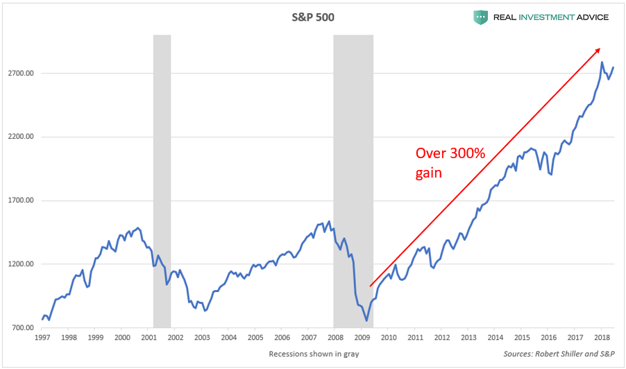
Since the Great Recession bear market bottom in March 2009, the bellwether S&P 500 stock index is up a jaw-dropping 300 percent. In addition, the index is approximately 80 percent higher than its 2007 peak.
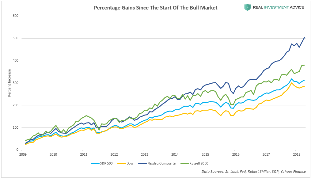
The more volatile Russell 2000 small cap index and the tech-centric Nasdaq Composite Index are up even more than the S&P 500 – approximately 400 percent and 500 percent respectively:
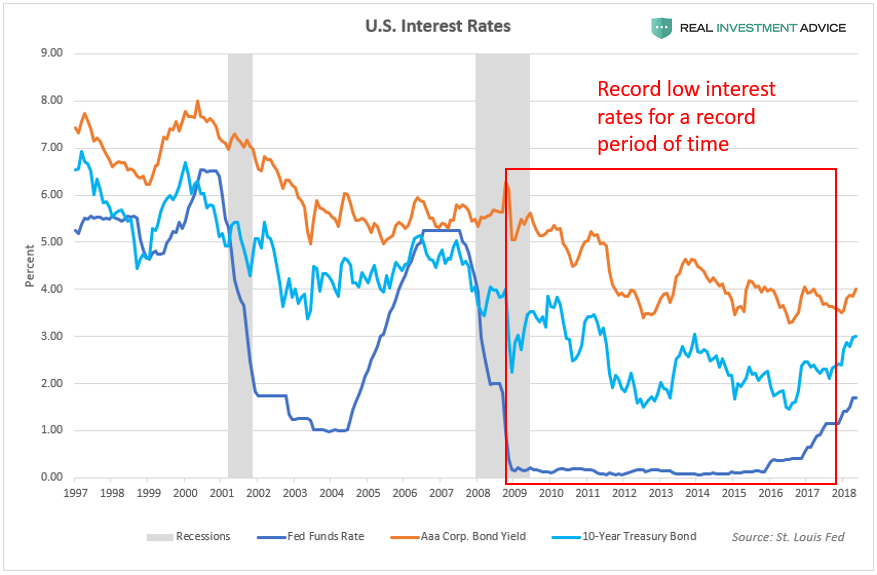
As discussed in Part 1 of this series, record low interest rates are the primary reason for both the overall U.S. household wealth bubble as well as the U.S. stock market bubble. The chart below shows how U.S. interest rates (the Fed Funds Rate, 10-Year Treasury yields, and Aaa corporate bond yields) have been at record low levels for a record period of time since the 2008 financial crisis. The fact that credit has been so cheap for so long explains why the household wealth bubble is so extreme and why the stock market bubble is so inflated, as valuation indicators later on in this piece will show.
Low interest rates contribute to the inflation of asset and credit bubbles in numerous ways:
- Investors can borrow cheaply to speculate in assets (ex: cheap mortgages for property speculation and low margin costs for trading stocks)
- By discouraging the holding of cash in the bank versus speculating in riskier asset markets
- By encouraging higher rates of inflation, which helps to support assets like stocks and real estate
- By encouraging more borrowing by consumers, businesses, and governments
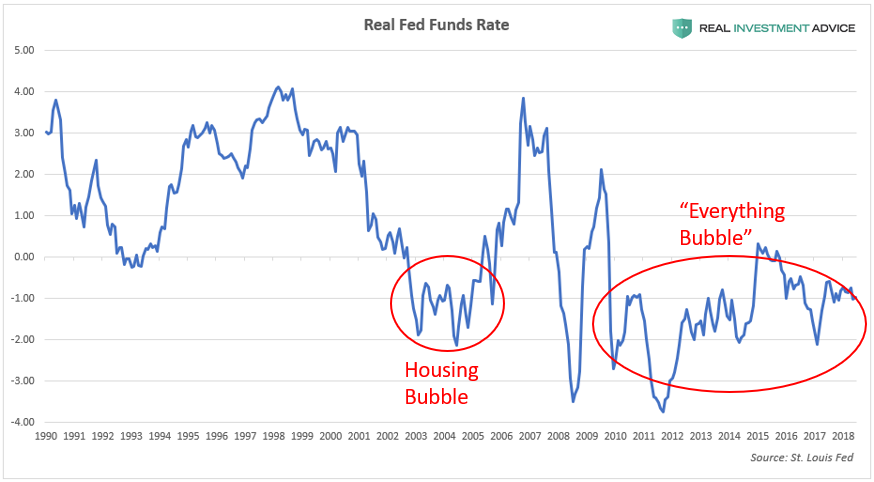
The chart of real (inflation-adjusted) interest rates below confirms just how loose U.S. monetary policy has been since the Great Recession. In recent decades, the only time the U.S. has experienced negative real interest rates for a significant amount of time was during the mid-2000s housing bubble and during the current “Everything Bubble” period that started after 2009. (Note: “Everything Bubble” is a term that I’ve coined to describe a dangerous bubble that has been inflating across the globe in a wide variety of countries, industries, and assets – please visit my website to learn more.)
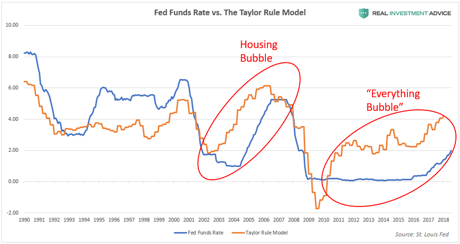
Another way of determining how excessively loose (or tight) U.S. monetary conditions are is by comparing the Fed Funds Rate to the Taylor Rule model. The Taylor Rule is a proposed guideline created by economist John Taylor to estimate the ideal level for central bank-controlled benchmark interest rates – such as the Fed Funds Rate – for the purpose of maximizing the stability of economic growth. When the Fed Funds Rate is much lower than the Taylor Rule model, it means that interest rates are likely too low relative to economic growth and inflation, which greatly increases the probability of forming a dangerous economic bubble. The chart below shows that the Fed Funds Rate was much lower than the Taylor Rule model during the formation of both the mid-2000s housing bubble as well as the current “Everything Bubble.”
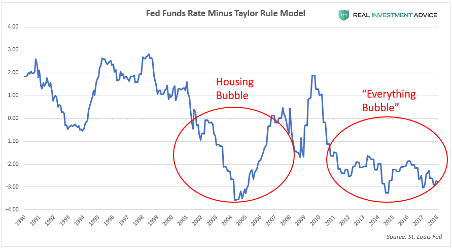
The chart below plots the difference between the Fed Funds Rate and the Taylor Rule model to show when U.S. monetary policy is likely too tight (when the chart is in positive territory) or too loose (when the chart is in negative territory). Both the U.S. housing bubble and the current “Everything Bubble” formed when the difference between the Fed Funds Rate and the Taylor Rule model was negative (the Fed Funds Rate was lower than the Taylor Rule model).
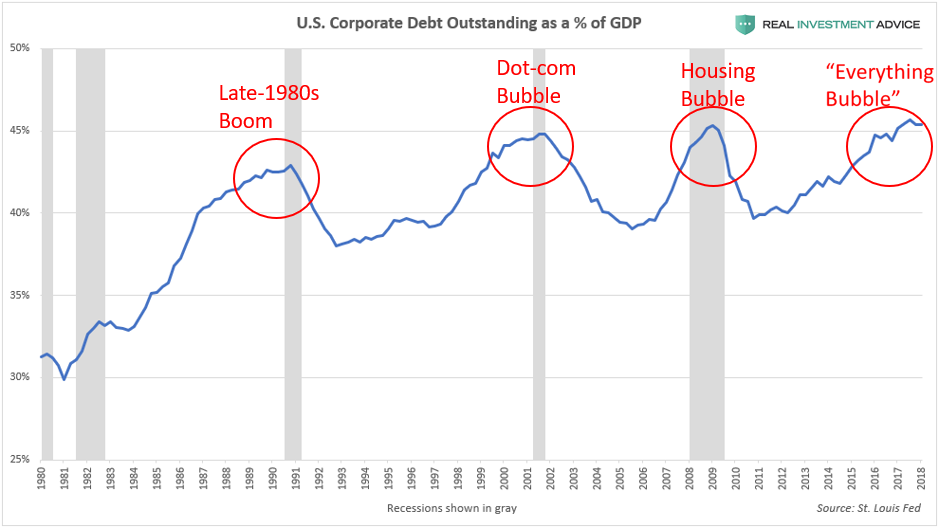
Ultra-low interest rates have encouraged corporations to borrow very heavily (via the bond market) since the Global Financial Crisis. Total outstanding non-financial U.S. corporate debt is up by over $2.5 trillion or 40 percent since its 2008 peak, causing the U.S. corporate debt-to-GDP ratio to hit an all-time high of over 45 percent, which is even more extreme than the level reached during the Dot-com bubble and U.S. housing and credit bubble. Click here to read my U.S. corporate debt warning report.
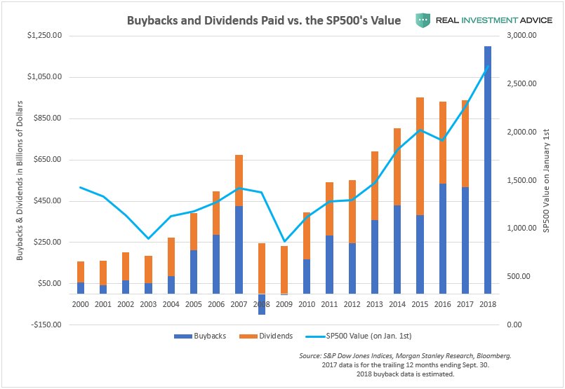
American public corporations have been using their borrowings to boost their stock prices through share buybacks, dividend increases, and mergers & acquisitions. Though these activities make shareholders happy and help increase executive compensation in the shorter-term, they are contrary to the long-term success of these companies. In the past, corporations prioritized long-term business investments and expansions, but pumping stock prices is the name of the game now. The chart below shows the surge in share buybacks and dividends paid. Share buybacks are expected to exceed $1 trillion this year, which would trounce all prior records. The passing of President Donald Trump’s tax reform plan encouraged corporations to further escalate their share buyback plans this year.
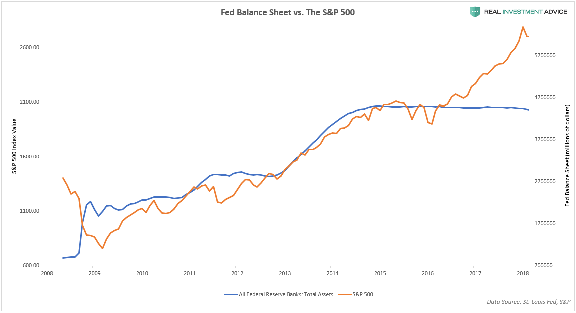
As discussed in Part 1 of this series, each of the Federal Reserve’s QE programs led to an increase in the Fed’s balance sheet and a corresponding surge in asset prices. The chart below shows how tightly correlated the S&P 500 was to the Fed’s balance sheet from 2009 until 2016. Despite the flat-lining of the Fed’s balance sheet in 2014, the S&P 500 continued to rise again in late-2016 due to optimism over President Trump’s election win and his plans for increased infrastructure spending, tax reform, and greater corporate stock buybacks (a byproduct of the tax reform plan).
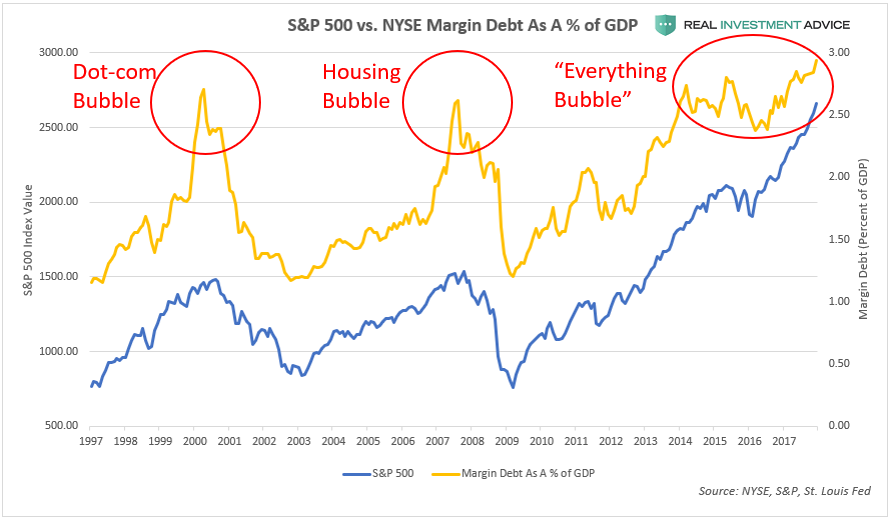
During bull markets and bubbles, it becomes more popular for traders to borrow money from their brokers in the form of margin loans for the purpose of speculating on rising stock prices. When margin debt levels reach extremes, it is often indicative of overly optimistic market sentiment, which foreshadows a market correction or bear market ahead. During the Dot-com bubble and housing bubble era, margin debt peaked at approximately 2.75 percent of GDP. In the current stock market bubble, margin debt is nearly at 3 percent of GDP, which is a worrisome sign.Another risk of having such large amounts of margin debt in an over-extended bull market is that it exacerbates the eventual downturn by causing powerful liquidation sell-offs as bullish traders are forced to jettison assets to satisfy margin calls.
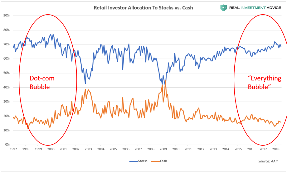
Another example of overly optimistic market sentiment is the chart below, which shows that retail investors have the highest allocation to stocks (blue line) and the lowest cash holdings (orange line) since the Dot-com bubble. From a contrarian perspective, this is worrisome because small investors tend to be wrong at major market turnings points (example: being too bearish in early-2009 at the very start of the bull market).
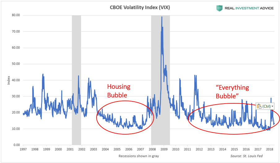
The CBOE Volatility Index or VIX is a popular fear gauge that is derived from the sentiment of stock option traders. The VIX is usually viewed in a contrarian manner: when fear is very high (typically over 30 to 40), it is often a good time to buy stocks. When fear is very low (usually under 20), however, it is a sign of dangerous market complacency or even euphoria that tends to occur during a bubble. The VIX often remains in complacency territory for a long time before the stock bull market or bubble ends. For the last 7 years or so, the VIX has been acting very similarly to the way it did during the mid-2000s bubble cycle – I believe that this is not a coincidence as it is due to the unusually loose monetary conditions present during each cycle. Loose monetary conditions tend to temporarily backstop the financial markets, artificially suppress volatility, and create dangerous levels of complacency.
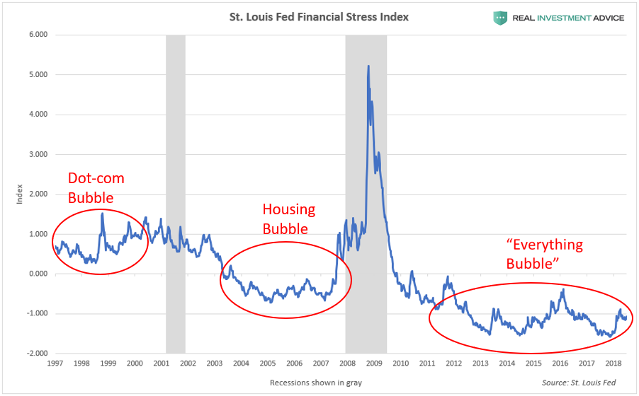
The St. Louis Fed Financial Stress Index is another indicator that shows if there are dangerous levels of complacency in the financial markets. Bubbles form during relative troughs in the Financial Stress Index. The Dot-com bubble formed when the index was at a relative low, as did the mid-2000s U.S. housing and credit bubble, and the “Everything Bubble” is forming during the current trough. (Read my piece on the St. Louis Fed Financial Stress Index for more information.)
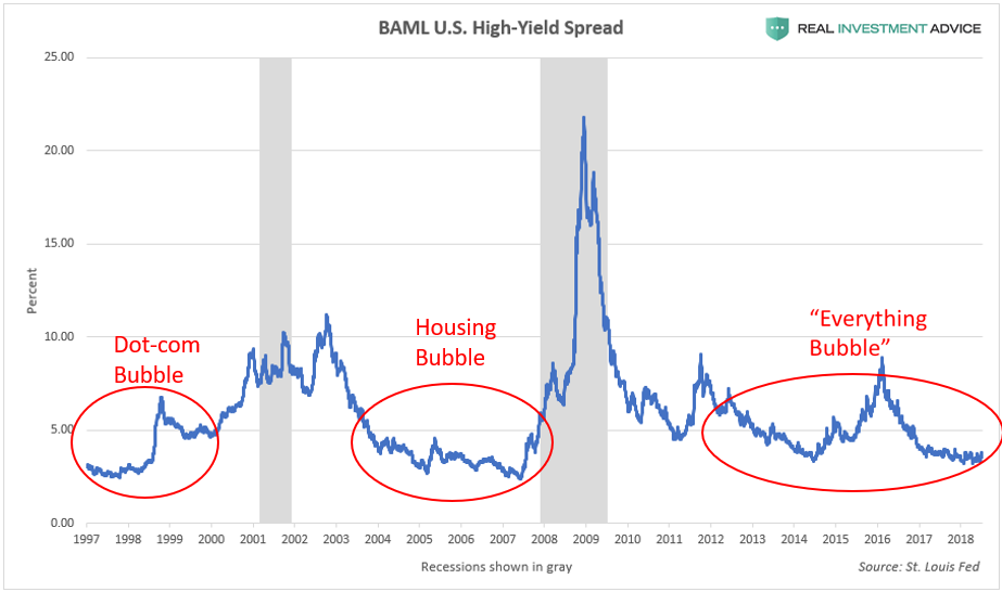
High-yield (or “junk”) bond spreads are another effective market complacency indicator. In central bank-manipulated environments like we’ve had for several decades, very low high-yield bond spreads indicate the formation of a dangerous bubble.The high-yield spread was unusually low during the Dot-com bubble and housing bubble, as well as during the current “Everything Bubble.” (Read my piece “Junk Bond Spreads Reveal Complacency” to learn more about this indicator.)
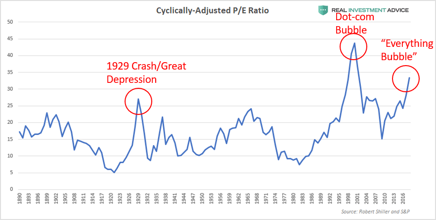
Another class of indicators measure the overall market’s valuation to help determine if it is undervalued, fairly valued, or overvalued relative to fundamentals such as earnings, sales, and book value. The cyclically-adjusted price-to-earnings ratio (aka CAPE or Shiller P/E) is basically a smoothed price-to-earnings ratio (learn more here). According to CAPE, the U.S. stock market is currently more overvalued than it was in 1929, right before the stock market crash and Great Depression. While the market was more overvalued during the Dot-com bubble, it should not automatically be assumed that the market will reach those levels again. Just because it can happen doesn’t mean that it must happen. When market valuations reach extremes, reversion to the mean is inevitable, and it’s going to happen again to this market – it’s just a matter of time.
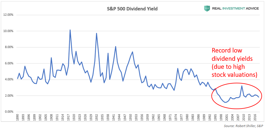
The long-term chart of the S&P 500’s dividend yield also confirms the market overvaluation thesis. When stock market valuations are very high, dividend yields are low, and vice versa. For the past two decades or so, dividend yields have been at their lowest levels in well over a century. This is a result of the Fed-caused market overvaluation since the late-1990s. (Note: while I am aware that dividend payout ratios have been declining over time as well, this only partly explains why dividend yields are so low. Extremely high market valuations are the other rarely-discussed reason why yields are so low.)
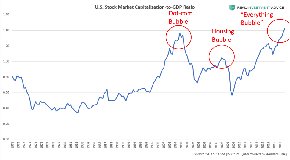
The U.S. stock market capitalization-to-GDP ratio (the total value of the U.S. stock market divided by the GDP) also shows that the stock market has gotten far ahead of the underlying economy, just as it did in the prior two bubbles. Unfortunately, it’s even worse this time around. This ratio is often nicknamed “Warren Buffett’s favorite indicator” because he described it as “probably the best single measure of where valuations stand at any given moment.
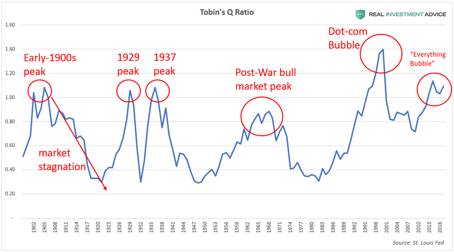
Tobin’s Q ratio (the total U.S. stock market value divided by the total replacement cost of assets) is another valuable market valuation indicator. When the ratio is under .40, the broad market is undervalued and worth buying into. Conversely, when the ratio is over 1.0, it means that the market is overvalued and heading for a correction or mean reversion soon. Conservative investors may want to consider selling stocks and staying in cash when Tobin’s Q ratio is over 1.0. The majority of the most important historic stock market peaks occurred when the ratio was over 1.0. Right now, the ratio is even higher than it was in 1929 before the stock market crash and Great Depression (which confirms the warning given by the cyclically-adjusted P/E ratio discussed earlier).
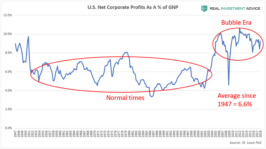
The next chart below shows U.S. after-tax corporate profits as a percentage of the gross national product (GNP). This is not a valuation measure like the last several charts, but a measure of how profitable American corporations are. This chart is highly correlated with the S&P 500’s net profit margin and is used as a proxy for that because long-term S&P 500 profit margin data is very hard to find. American corporations have been unusually profitable since the early-to-mid-2000s: profit margins have averaged approximately 9 percent versus the 6.6 percent average since 1947.
While above-average corporate profitability may sound like a good thing when taken at face value, I view it as another worrisome sign because it’s further evidence of an economy and financial markets that are being juiced by cheap credit and financial engineering. Ultra-low interest rates help to boost corporate profitability by reducing borrowing costs. Cheap credit also gives consumer spending a strong boost, which has a significant effect on our economy that is heavily driven by consumer spending. Low interest rate environments allow the government (federal, state, and local) to borrow more cheaply in the bond market and use it to boost spending, which gives the overall economy a shot in the arm. In addition, artificially-inflated financial markets boost the profitability of the financial sector.
A major risk for the stock market is the mean reversion of corporate profitability, which is a nightmarish prospect when considering how overpriced stocks currently are relative to earnings. This mean reversion is likely to occur as the result of the ending of ultra-cheap credit conditions (when corporate bonds fall back to earth) and through increased competition, which is what Milton Friedman warned about. (Note: critics may try to rebut my assertions by claiming that U.S. corporate profitability is unusually high due to corporations earning a higher percentage of earnings overseas. I’ve accounted for this by using gross national product as the denominator instead of the more commonly used GDP.)
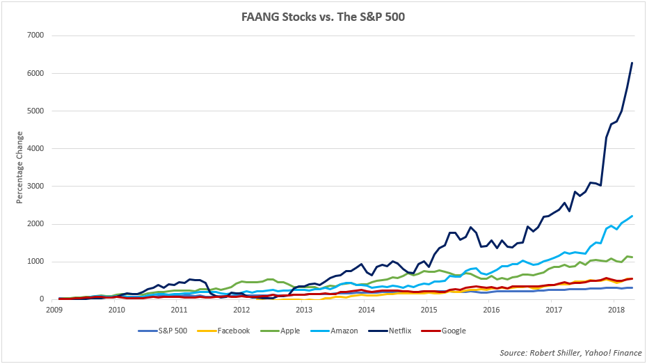
What is particularly alarming about the current U.S. stock market bubble is the fact that it’s driven by a very narrow group of stocks, which means that there isn’t a healthy breadth, or broad strength, behind the bull market. In general, tech stocks have been leading the way – in particular, a group of stocks known as FAANG, which is an acronym for Facebook, Apple, Amazon, Netflix, and Google. The chart below compares the performance of the FAANG stocks to the S&P 500 during the bull market that began in March 2009. While the S&P 500 is up approximately 300 percent, the FAANGs are up significantly more, with Apple rising by over 1,000 percent, Amazon rising more than 2,000 percent, and Netflix surging by over 6,000 percent.
The disproportionate amount of influence that this small group of top-performing stocks currently have on the overall market cannot be overstated. Here are some recent statistics that have been making the rounds:
- 10 stocks (including the FAANGs) have accounted for 100 percent of the S&P 500’s year to date returns. (Source)
- Excluding the FAANGs, the S&P 500’s first half returns would have been negative (Source)
- The top 20 stocks in the S&P 500 make up more of the overall index than the bottom 400 combined (Source)
- The combined market capitalization of Facebook, Google, Amazon, Microsoft, and Apple increased $260B in just 11 trading days in mid-July 2018 alone (Source)
- The combined market capitalization of Facebook, Google, Amazon, Microsoft, and Apple increased an incredible $812B since the start of 2018 (that’s the size of a company like Microsoft or Google) (Source)
Today’s FAANG phenomenon is reminiscent of the Nifty Fifty group of stocks that dominated the 1960s and early-1970s bull market. The Nifty Fifty were fast-growing blue chip stocks that led the overall market and were seen as “one decision” stocks (the only decision necessary was to buy) because investors thought they would keep rising up, up, and away as a function of time. Unfortunately, the Nifty Fifty proved as fallible as any other investment when they sank during the 1973-1974 bear market. Many investors view today’s FAANGs as “can’t lose” stocks just like their counterparts did during the Nifty Fifty boom and are going to be taught the same lesson when the market ultimately turns.
Another important development that is contributing to the current runaway U.S. stock market bubble is the rise of passive investing (or passive indexing). Passive investing is a style of investing that eschews active portfolio management or trading in favor of buying and holding an index like the S&P 500. Passive investors often utilize exchange traded funds (ETFs) to construct portfolios instead of investing in individual stocks. The proponents of passive investing point out that the passive approach is much cheaper than the active approach in terms of management fees, brokerage commissions, and other costs. They also posit that few active investment managers consistently beat the major stock indices over the long run, so investors are better off holding index funds or ETFs.
While the proponents of passive investing make some valid points, they are ignoring a glaring risk of their approach: they never sell out of the market, even when it is extremely overvalued as it is currently. This issue should not be taken lightly because, as my boss Lance Roberts has shown, it takes an average of twenty-two years for investors just to break even if they start investing at high valuations like we have today. Twenty-two years is a very high percentage of the time most investors have to build up a retirement fund, which is usually a few decades at most. Investing in stocks at the wrong time can completely ruin one’s retirement plans.
As the Fed-driven stock market bubbled up 300 percent with barely a pullback since 2009, over $2 trillion has flowed out of actively managed funds and into passive investment vehicles. Many of today’s passive investors seem to think (whether explicitly or implicitly), “why should we pay an active investment manager a fee when the market just keeps rising year after year? You can’t lose in this market – it always goes back up after every pullback!” Thanks to the Fed’s ultra-low interest rates and QE programs, it has conditioned investors to believe that it will always backstop the financial markets and swoop in to save the day each time a bit of volatility appears. After nearly a decade of supporting the markets and economy, the Fed has created an extremely dangerous moral hazard and has artificially suppressed market volatility. This market has become too easy for investors and has created a false sense of security that has led to overly aggressive risk-taking. As Lance has said many times before, the risk with this passive investing boom is that it will result in active selling once the current market bubble bursts. When investors see their portfolio down ten, twenty, or thirty percent, their previous convictions (“I’m in it for the long run!”) fly out the window and they emotionally slam the “sell” button. Passive investing-turned-active selling will greatly exacerbate the coming downturn.
How The U.S. Stock Market Bubble Will Burst
Now I get to address the question that has been on everyone’s minds: “so, how and when will this bubble pop?!” Though I wish I was clairvoyant and could pinpoint a specific date in the future that this bubble will pop such as “April 3rd, 2019,” that is simply impossible – not only for me, but also for the likes of George Soros, Fed chairman Jerome Powell, and Warren Buffett. Fortunately, it is not necessary to predict the market with that kind of accuracy to be a successful investor or preserve your wealth when the bubble pops. We do have tools that allow us to estimate in general when the bubble is much likelier to pop, when we should start cutting our risk exposure, and if a market breakdown is likely to lead to even more bearish action.
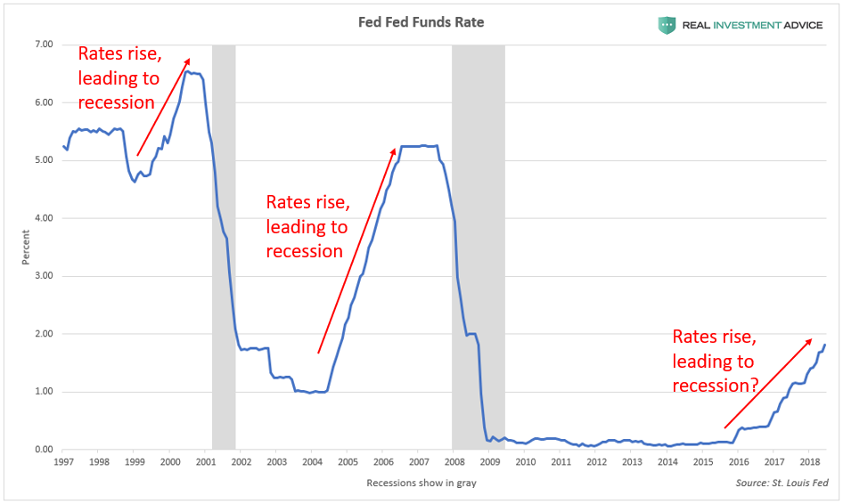
To put it simply, the stock market bubble will pop due to the removal of its fuel: cheap credit. Fed-driven economic booms, bull markets, and bubbles end after the central bank raises interest rates to a high enough level. How high do rates have to go to pop the current bubble? There is no mathematical formula to determine that, but as hedge fund manager Jeff Gundlach put it, the Fed will keep hiking until “something breaks.” In 2007, it was the subprime mortgage industry that broke first, and this time around, there is a very high probability that it will be corporate bonds, which would then spill over into the U.S. stock market (a scenario I discussed in my corporate debt report). It could also be energy junk bonds or hot tech stocks like the FAANGs that break first, for example. Because of the growing debt burden in our economy, the interest rate threshold that is necessary to end economic cycles keeps getting lower and lower.
The chart below shows how the last two recessions and bubble bursts occurred after Fed rate hike cycles. It’s virtually a guarantee that the current rate hike cycle will also lead to a strong recession and bear market.
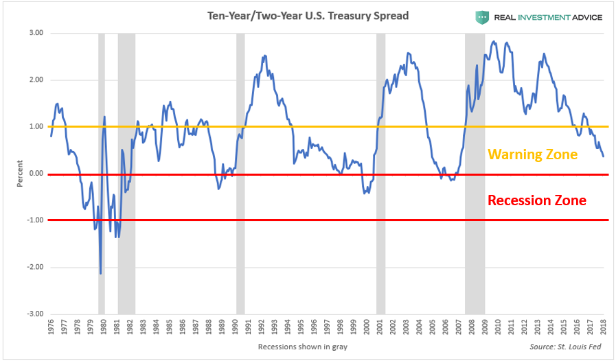
One very valuable tool for determining where we are in the economic cycle is the 10-Year/2-Year U.S. Treasury yield spread. To create this chart (see chart below), the current two-year Treasury note yield is subtracted from the current ten-year Treasury note yield and plotted over time. When the spread is between 0 percent and 1 percent, it is in the “recession warning zone” because it signifies that the economic cycle is reaching maturity and that a recession is likely to occur within a few years. When the spread falls into negative territory, that’s when the yield curve is inverted, which means that a recession is imminent within the next year or so. The yield curve inverted before every U.S. recession in the past half-century, which is why it is worth paying close attention to. (Read my piece about the Treasury yield spread to learn more.)
According to the 10-Year/2-Year U.S. Treasury bond spread, we are currently in the “recession warning zone,” but not the “recession zone” just yet. At the rate the yield curve is currently flattening, the yield curve may actually invert as soon as late-2018. According to my research, during the last six economic cycles that culminated in a recession, an average of 9.7 months elapsed between the time that the yield curve first inverted and the peak of the stock market. Recessions began an average of 5 months after the stock market peaked or 14.7 months after the yield curve inverted. According to this logic, if the current cycle follows the average of the past six cycles, the yield curve would invert in December 2018, the stock market would peak in September 2019, and the recession would begin in February 2020. Please realize that this is a not a prediction, but just an estimate based on historic economic cycles. The bear market and recession could occur even sooner than that or later. One thing is certain: with the market as overvalued as it is, the time to worry and start preparing is now – not tomorrow or in a year from now.
At this point, a significant portion of readers are probably thinking “but how can this market crash?! President Donald Trump is making America great again! That’s why this market is soaring.” Let me preface my views by saying that I actually err on the conservative/libertarian side, but I do not believe that President Trump can prevent the inevitable popping of the “Everything Bubble” that I’m warning about. First of all, this bubble is truly worldwide, so the U.S. President has no jurisdiction over the economies of China, Australia, Canada, emerging markets, etc. I believe that the popping of a massive global bubble outside of the U.S. is enough to create a bear market and recession within the U.S.
In addition, this bubble was inflating years before Trump even decided to run for office, let alone actually became President. Due to the extreme debt buildup and asset overvaluation, this bubble was destined to pop no matter who was in office – I’d be singing the same tune if Hillary Clinton had won. It’s just math. In September 2016, before the election, Donald Trump himself called the stock market a “big, fat, ugly bubble,” yet that very same bubble is now 30 percent larger (and Trump is no longer calling it a “bubble,” but is actually praising it…hmm).
Many economic bulls and Trump supporters expect the President’s tax reform plan to usher in a powerful economic boom that creates millions of new jobs and causes corporate earnings to soar, which would help to justify today’s lofty stock market levels. Unfortunately, this is more wishful thinking than reality. As Lance Roberts has explained in great detail earlier this year, “there will be no economic boom” (Part 1, Part 2) due to how saturated with debt our economy has become (among many other factors). So far, this view is being proven correct as the U.S. economy has actually started to slow down rather than accelerate. Lance also warned that the tax cuts were likely to result in more stock buybacks, with little trickle-down to the middle class or poor – another view that is being confirmed.
Summary – Part 2
To summarize, the U.S. stock market is at extremely lofty levels due to aggressive actions on the part of the Federal Reserve rather than an organic, sustainable economic boom. Booms that are created through the brute force of monetary stimulus never end well despite appearing to be normal economic booms during the good times.
Please stay tuned for Part III, where I will discuss U.S. Housing Bubble 2.0 and how it is contributing to the U.S. household wealth bubble.
If you are like most investors, the U.S. household wealth bubble means that your own investments, wealth, and retirement fund are extremely inflated and exposed to grave risk of another crash. Most investment firms have absolutely no clue that another storm is coming, let alone how to navigate it. Clarity Financial LLC, my employer, is a registered investment advisor firm that specializes in preserving and growing investor wealth in precarious times like these.
Please click here to contact us so that we can help protect your hard-earned wealth.
For the author's full ...
more

