Unfairness Of Income Distribution - Gender Issue
11. Mean income for males and females as reported by the Census Bureau
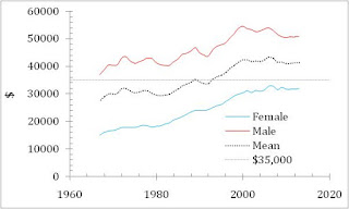

Figure 1. The evolution of mean income (real 2013 U.S. dollars) since 1967 (Source: Census Bureau, downloaded, July 10, 2015)
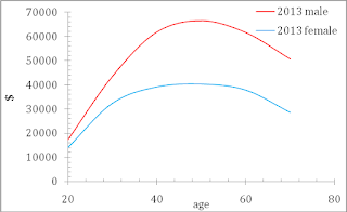

Figure 2. Mean income as a function of age for the year of 2013. Income is in 2013 US dollars. Two important features – lower mean incomes for females and earlier (age) peak value for female.
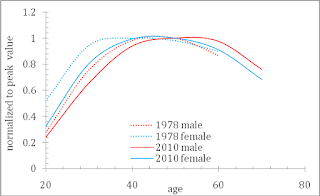

Figure 3. The age of peak mean income evolves in time. When normalized to the peak value in a given year the mean income dependence on age shifts to higher age for both male and female.
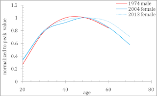

Figure 4. The age of peak mean income for female lags by about 30 years behind the peak age for males.
22. Median income for males and females as reported by the Census Bureau


Figure 5. Same effect is observed for median income – the lag is about 30 years.
33. The distribution of population with income above the Pareto threshold ($100,000)
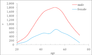

Figure 6. The number of people with income above $100,000 in 2013 as a function of age for male and female population. Total male and female population is 122,414,000 and 129,930,000, respectively. When the distribution of personal capacity and sizes of instruments is the same for male and female, one should expect the blue curve above the red one.
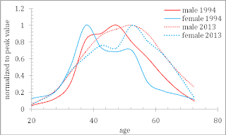

Figure 7. The evolution of the number of people above the Pareto threshold with time. For a direct comparison, all four curves for 2013 and 1994 are normalized to their respective peaks. Despite low accuracy of measurements one can observed that the peak age value for female is lower than for male. Male and female distributions both shift to higher age with time.
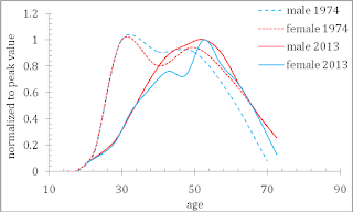

Figure 8. Same as in Figure 7 for the years of 1974 and 2013. The peak age in 1974 is around 30 years and 55 years in 2013.
44. Personal income distribution
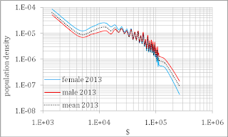

Figure 9. Personal income distributions for male, female and both genders in 2013. The exponent for the Pareto distribution of female is practically the same as for male.
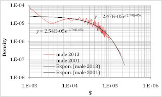

Figure 10. When corrected to the change in real GDP (1.23) and male population (106,910,000 and 122,4141,000) between 2001 and 2013, the relevant PIDs coincide. As a consequence, the Gini ratio does not change in time, as reported by the CB.
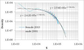

Figure 11. When corrected to the change in real GDP (0.86) the female’s PID for 2013 coincides with the male’s PID for 2001. Therefore, the female’s PID lags behind the male PID by the number of years related to the growth in real GDP per capita by 1/0.86= 1.16. The male population increasing by 1% per year makes this lag even larger. We estimate the male’s PID from the year of 1975 to 1985 to fit the female’s PID in 2013. The lag is still about 30 years.
Discussion
Our model easily explains all observed features by one cause – the female population has the same distribution of the capability to earn money (aka human capital) and consistently low sizes of work instruments (work capital) compared to those for men. Considering the same capability to earn money for females, one can conclude that the relatively lower work capitals (e.g. job positions, assets, …) are controlled by force (likely by the other gender). Fair distribution has not been achieved yet.
The relative lower instrument sizes given to females make the proportion of female above the Pareto threshold lower. In turn this effect lowers the mean income for the same age since a relatively lower number of rich female occurs in all age groups.
The faster income growth and the earlier age peak in the Pareto distribution for females indicates that their higher capacities were applied to smaller instruments (capital) in line with the deprivation of higher instrument sizes (capitals) of the female population.
The forced deprivation of higher job positions (working capital) is the cause of the observed long term income inequality between male and female in the US.
Disclosure: None


I've always heard there was inequality but I had always thought the gap was closing over time. But by the looks of that first graph, there has been absolutely no change since the 1960s. Is that really the case? I find that shocking.
Unless I'm missing something, according to the second graph it actually looks like it is getting worse.
This is quite interesting. At the same time, this data has been around a while and seems to have been chewed over pretty thoroughly. What is new here? I'm not being critical, I'm wondering what subtleties I am missing.