TTM Trade Deficit Reaches New Record $982B

The October Trade Deficit increased for the second month in a row to $78.2B. The Deficit had been getting help from exports out of the Strategic Petroleum Reserve, but the pull from the SPR has slowed in recent weeks.
The current deficit is still well below the record set back in March. If March is treated as an anomaly as it appears below, then the current month is quickly approaching the prior record of $88B.
(Click on images to enlarge)
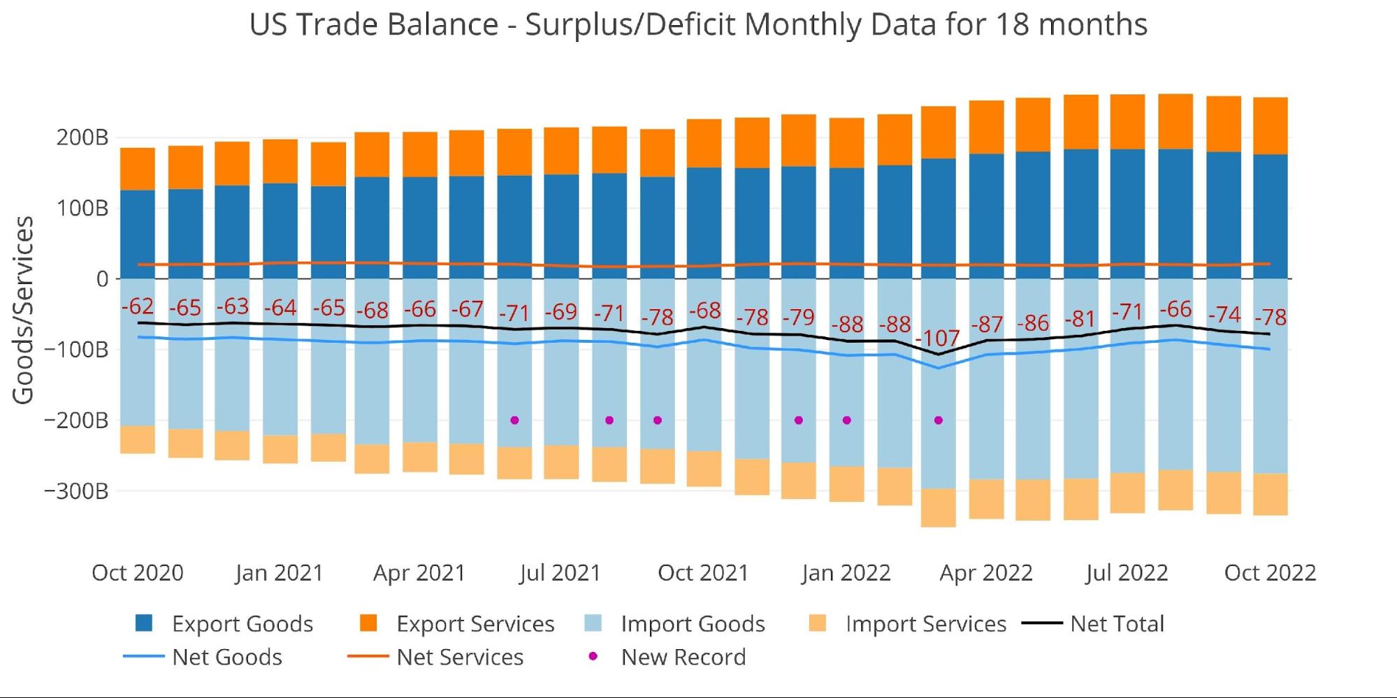
Figure: 1 Monthly Plot Detail
The table below provides detail.
Monthly Trade Deficit
-
- MoM Exported Goods are down 2.1%
-
- Imported Goods were up 0.9%
- This is the second month in a row of drops in Exported Goods exceeding 2%
-
- On a net basis, the Goods Deficit surged 6.5% MoM and increased YoY at 5.5%
- The Services Surplus fell by 10.6% MoM
- MoM Exported Goods are down 2.1%
Looking at Trailing Twelve Month:
-
- The TTM Net Deficit increased from -$970B last month to -$982B
-
- YoY, the TTM Deficit is still up 20.4% from -$816B
-
- The TTM Services Surplus continues to shrink and is down 1.7% since last October
- The TTM Net Deficit increased from -$970B last month to -$982B
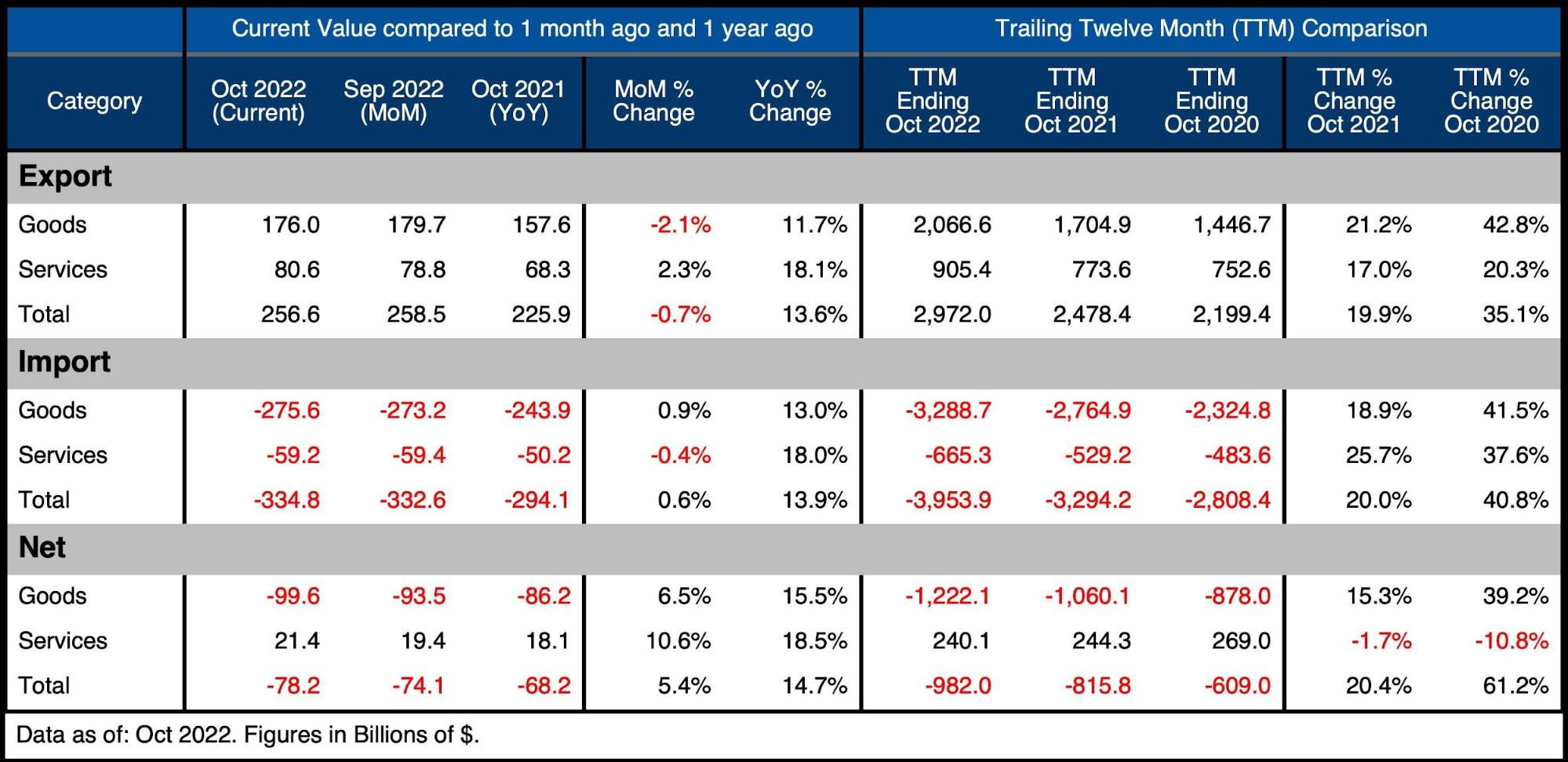
Figure: 2 Trade Balance Detail
Historical Perspective
Zooming out and focusing on the net numbers shows the longer-term trend. The massive Deficit spike in March was fully reversed but is trending back down after the last two months. The current numbers look to be resuming the trend that has been in place since March 2020.
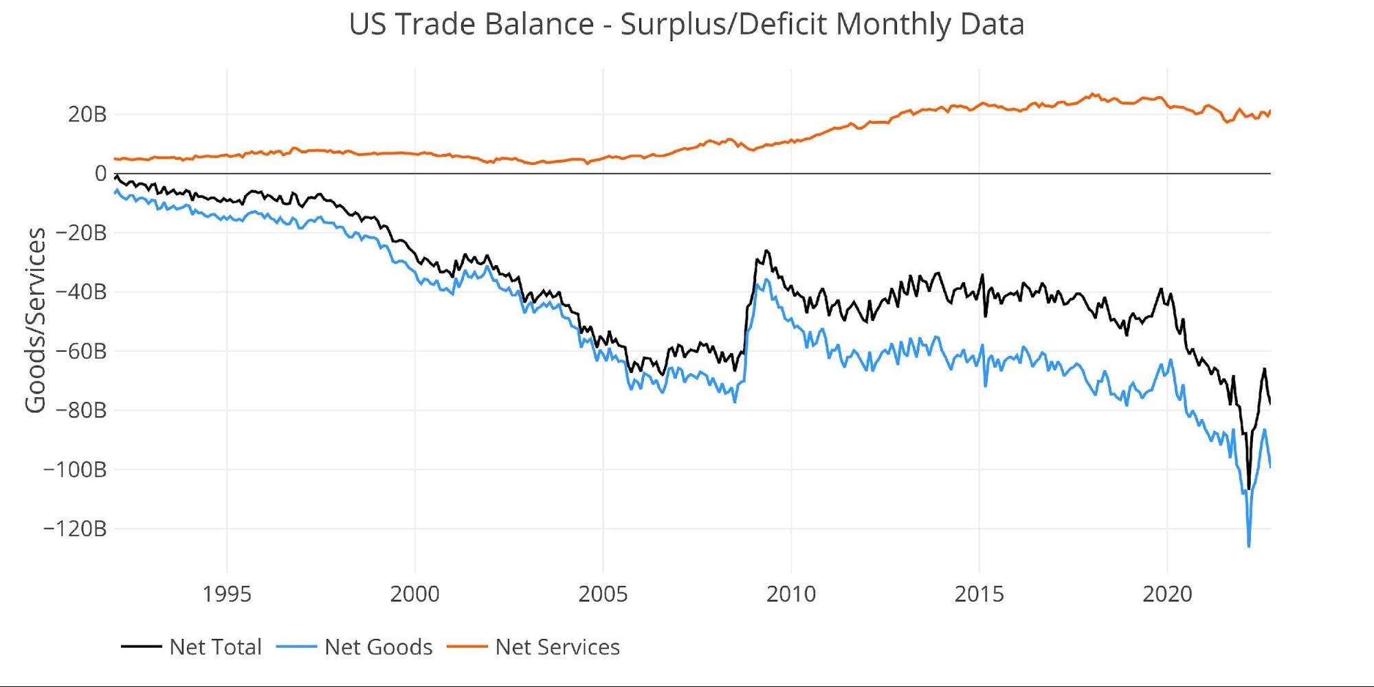
Figure: 3 Historical Net Trade Balance
The chart below zooms in on the Services Surplus to show the wild ride it has been on in recent months. It compares Net Services to Total Exported Services to show relative size. After hovering near 35% since 2013, it dropped below 30% in July last year. It now sits at 26.6%, an increase from last month due to the increase in the Services Surplus. The increase is likely temporary and the shrinking Services Surplus looks likely to continue.
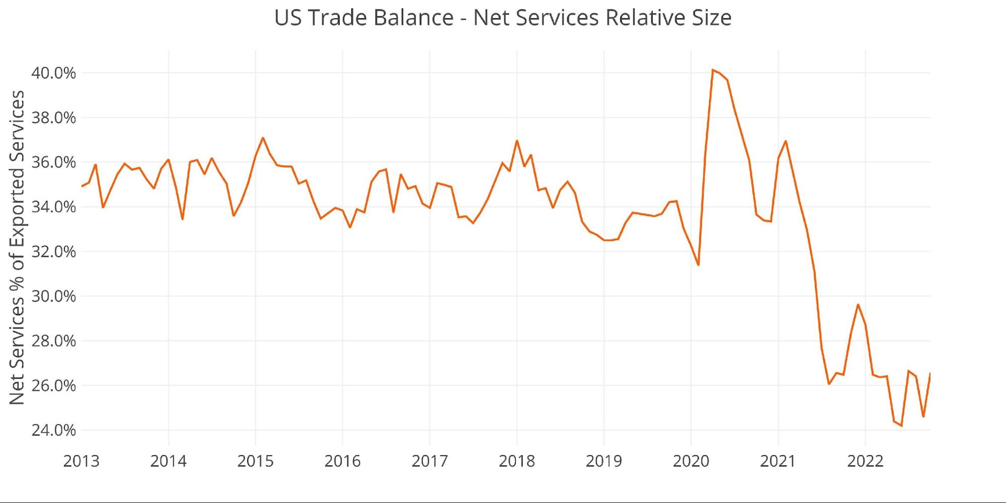
Figure: 4 Historical Services Surplus
To put it all together and remove some of the noise, the next plot below shows the Trailing Twelve Month (TTM) values for each month (i.e., each period represents the summation of the previous 12 months).

Figure: 5 Trailing 12 Months (TTM)
Although the TTM Net Trade Deficits is near historical highs, it can be put in perspective by comparing the value to US GDP. As the chart below shows, the current records are still below the 2006 highs before the Great Financial Crisis.
The current 3.82% is moving back up after reaching 3.78% last month.
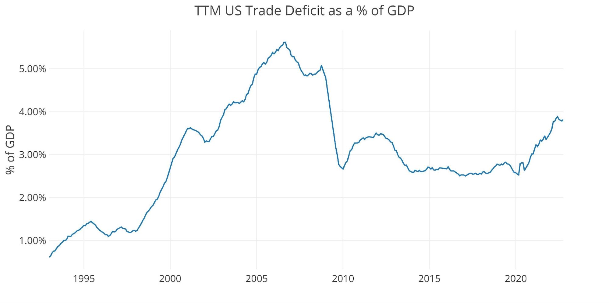
Figure: 6 TTM vs GDP
The chart below shows the YTD values. 2022 is well above prior years by a significant margin. Even though Exports have surged this year, it has been offset by even bigger increases in Imports.
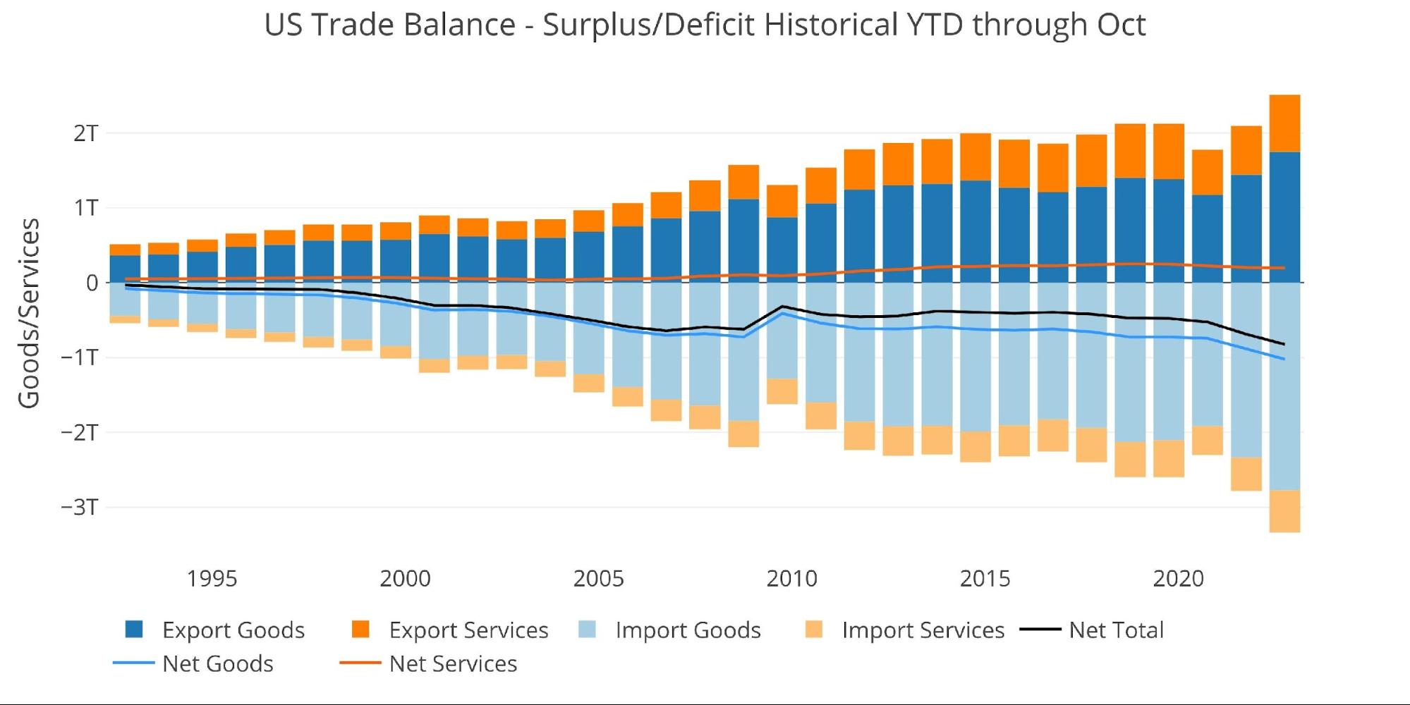
Figure: 7 Year to Date
What it means for Gold and Silver
The Trade Deficit represents how much paper the US is trading for physical goods. The Deficit sits near all-time highs, which means the US dollar continues to be sent abroad in record amounts. Trade Deficits have benefited from a stronger US Dollar, but what if the Dollar bull run has ended after the trade became so lopsided?
The world is still willing to accept paper dollars for goods, but when the Fed goes back to printing that may change. This is especially true as many developing countries have central banks that moved sooner than the Fed and have rates well ahead of the Fed. As emerging markets have been dealing with very high-interest rates, the US actually doesn’t have it so bad.
If the rest of the world starts to lose faith in the Dollar and the Fed, they may decide to start dumping Dollars. This could create a major problem for the Fed as it could exacerbate the inflation problem! As more Dollars head back to the US, there will be more in supply to bid up prices. Furthermore, import prices will likely increase making it harder for Americans to buy goods.
If the world does decide to dump Dollars at some point, they will likely turn back to gold as the world reserve currency. This is evident by Central banks who are out buying more gold.
Data Source: https://fred.stlouisfed.org/series/BOPGSTB
Data Updated: Monthly on one month lag
Last Updated: Dec 06, 2022, for Oct 2022
US Debt interactive charts and graphs can always be found on the Exploring Finance dashboard: https://exploringfinance.shinyapps.io/USDebt/
More By This Author:
Central Banks Start Q4 Buying More GoldFed Has $48B Loss In November And Sees Massive Balance Sheet Reduction
Is Managed Money Buying This Bull Market?


