
The Tape Tells All And It’s Odds On We’ve Started A 10%+ Correction - Part 1
We kick off our series of imagining alternate scenarios and evaluating the weight of the evidence by starting with the most important thing, the tape.
I’m going to walk you through my process for looking under the hood at the broader supply and demand forces driving underlying price-action in the averages and what the technicals are saying right now (hint: It’s odds on we’ve started what should be a decent-sized corrective impulse).
Here’s the basic framework we’re going to go through:
-
- Technicals
- Major Market Indices
- Leading Cyclicals
- The Generals
- Internals
- Momentum
- Participation and Breadth
- Cyclical vs. Defensives
- Credit and Spreads
- Sentiment (Collective Members Only)
- Short-term Positioning and Sentiment
- Long-term Positioning and Sentiment
- News Cycle and Popular Narratives
- Technicals
Like a thermometer
Charts reflect the collective voice of the entire marketplace. Most of the time the market is pretty good at discounting an unknowable future. But, sometimes, reflexivity kicks in and the pendulum swings too far in one direction or the other. These swings are fairly easy to identify because they only occur when a near consensus surrounding a popular narrative has been reached (ie, sentiment is running really hot or freezing cold).
To quote Bruce Kovner again, “technical analysis is like a thermometer. Fundamentalists who say they are not going to pay any attention to the charts are like a doctor who says he’s not going to take a patient’s temperature. But, of course, that would be sheer folly. If you are a responsible participant in the market, you always want to know where the market is — whether it is hot and excitable, or cold and stagnant. You want to know everything you can about the market to give you an edge.”
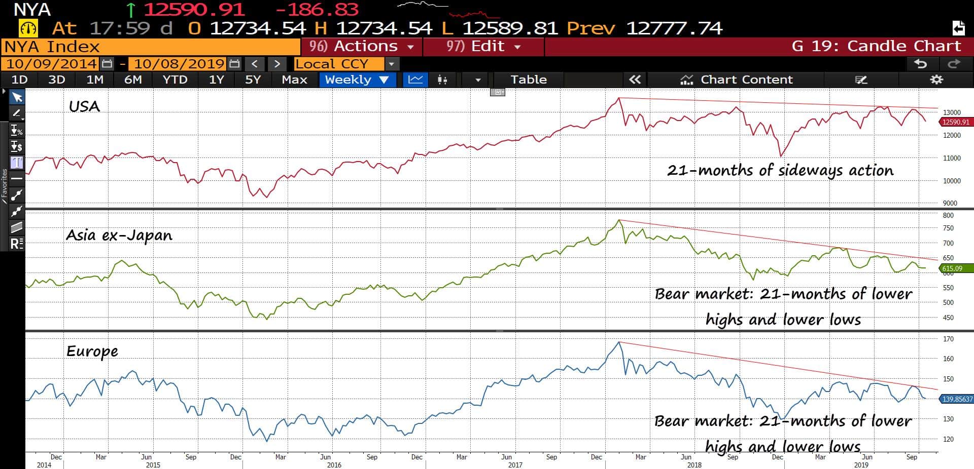
By just taking a step back and looking at the long-term trends in the major global indices we can get a feel for where the supply and demand trends have been and where they may be headed. Remember, momentum is a powerful force in markets and established trends tend to persist until they hit local extremes, usually noted by buying/selling climaxes and accompanied by a consensus narrative.
Most global indices have been in or were recently in an extended bear market — as marked by consecutive lower highs and lower lows — with the US being the sole exception.
The US NYSE has been moving sideways since Jan of 18’. Asia ex-Japan and Europe peaked around the same time and have been trending lower for 12-21 months depending on whether you count the year-to-date bounce as the start of a new trend or a corrective bounce.
(Click on image to enlarge)
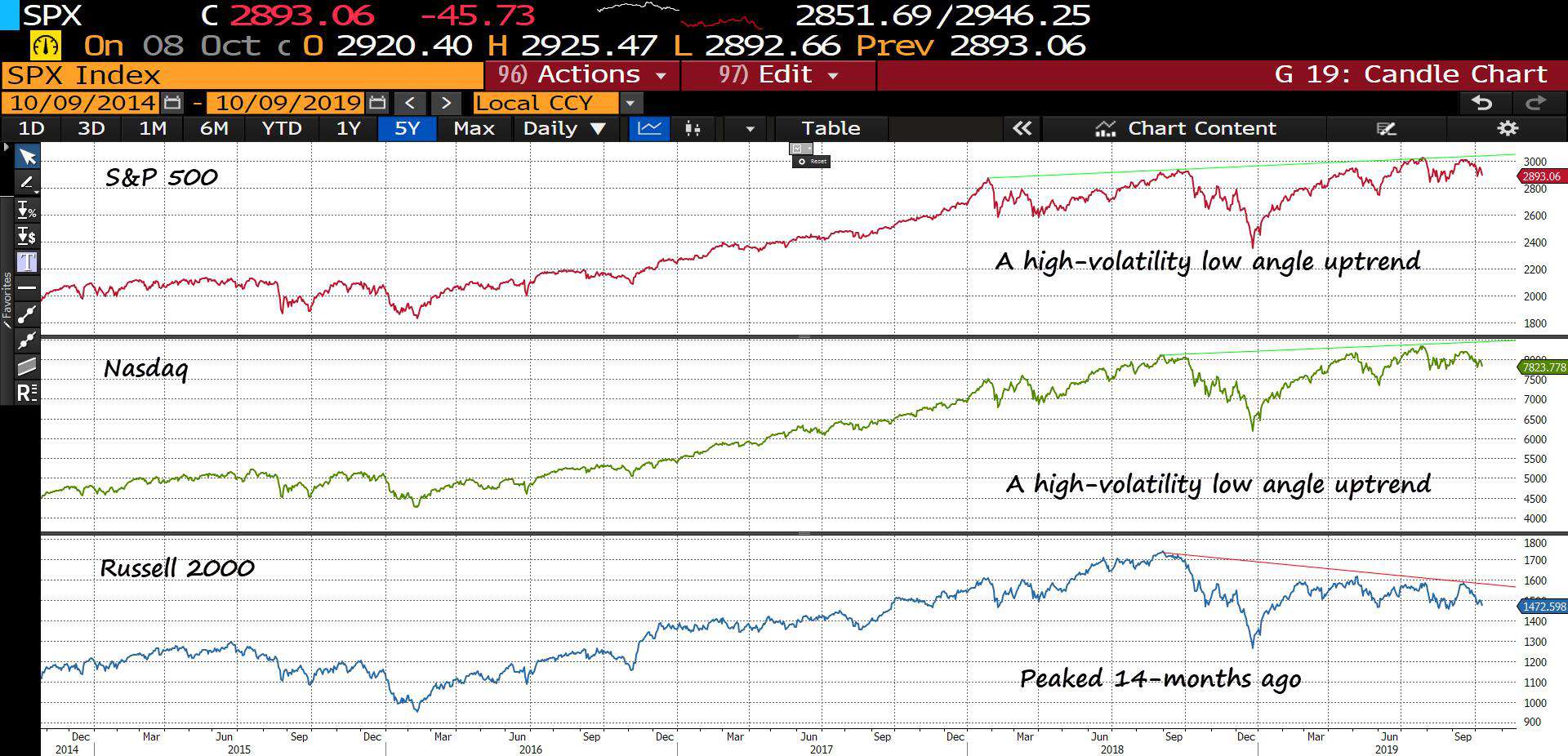
Within the US we have a mixed bag. The SPX and Nasdaq have been in a high volatility low angle uptrend and small-caps peaked 14-months ago and have yet to make a concerted advance towards new highs.
(Click on image to enlarge)
Next, we want to look at our leading cyclicals.
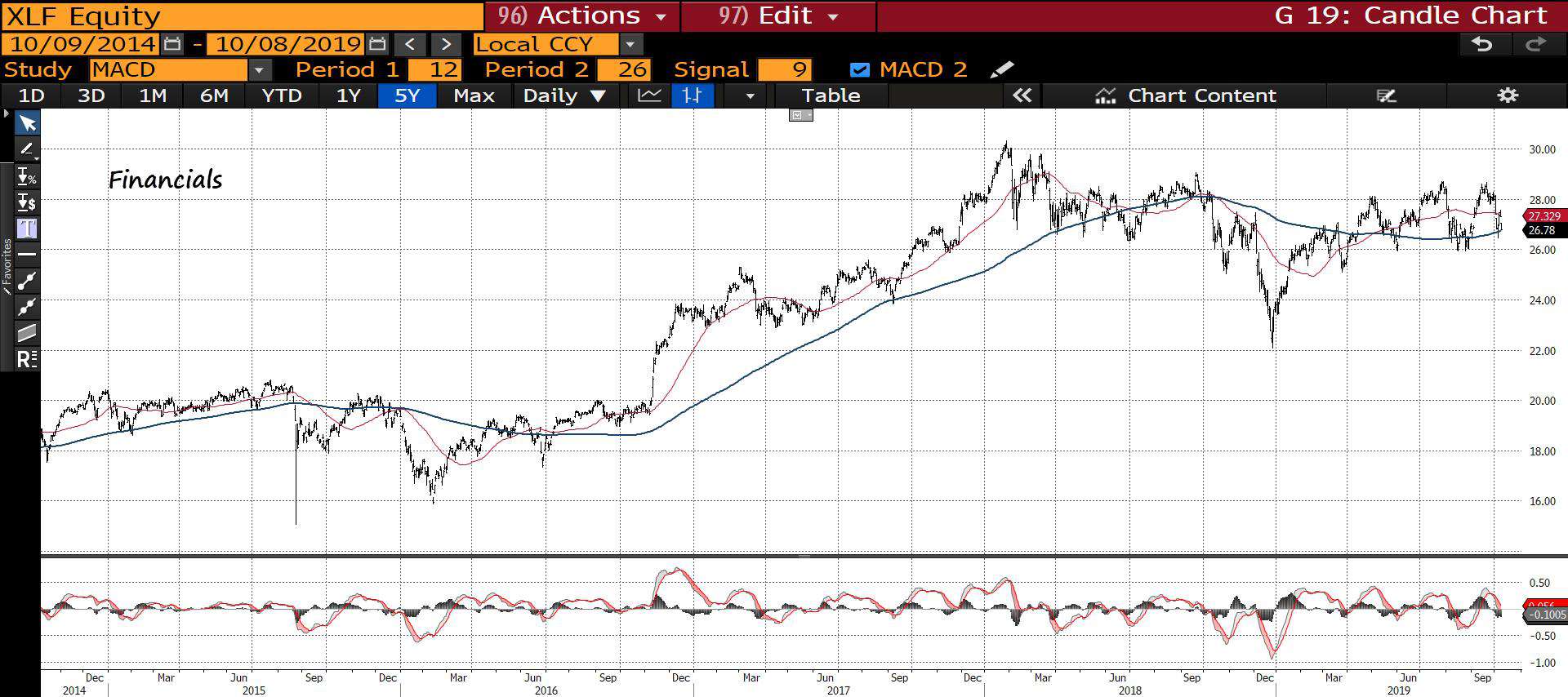
The market is a discounting mechanism and peaks on average 6-9 months before a recession hits. Within the market, there are leading cyclicals that tend to peak even earlier. These are areas of the market that track things such as financials, consumer spending, construction etc… they are representative of business activity within the broader economy.
We don’t need to get fancy here. Just look to see where the 200-day moving average (blue line is trending). The following are all 5-year charts.
Financials have traded sideways for 21-months.
(Click on image to enlarge)
Housing declined for all of 18’ but has since been moving steadily higher.
(Click on image to enlarge)

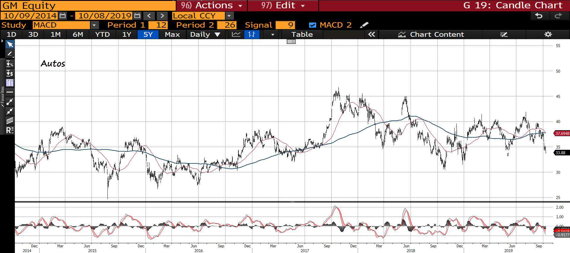
Autos have been trading sideways for a while.
(Click on image to enlarge)
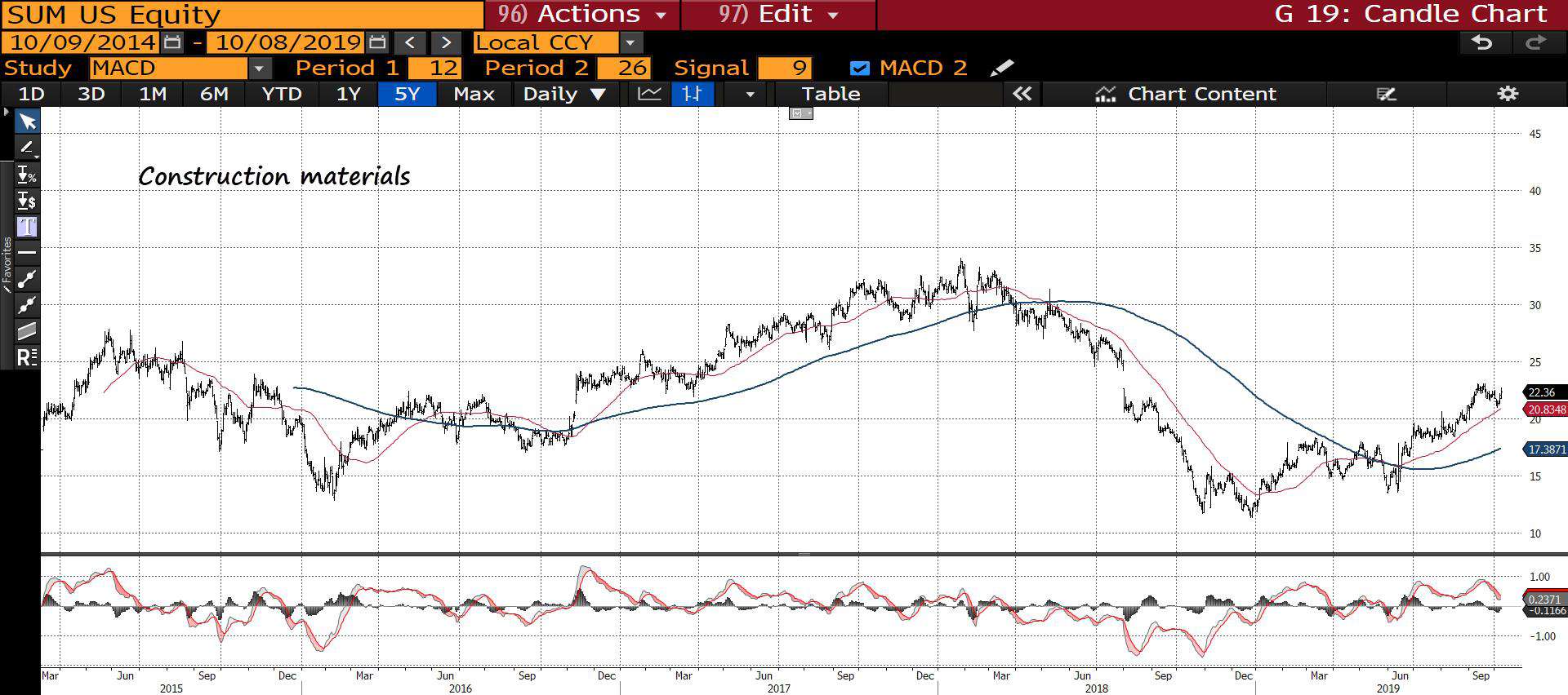
Like housing, construction materials trended lower for all of 18’ but have been steadily rising since.
(Click on image to enlarge)
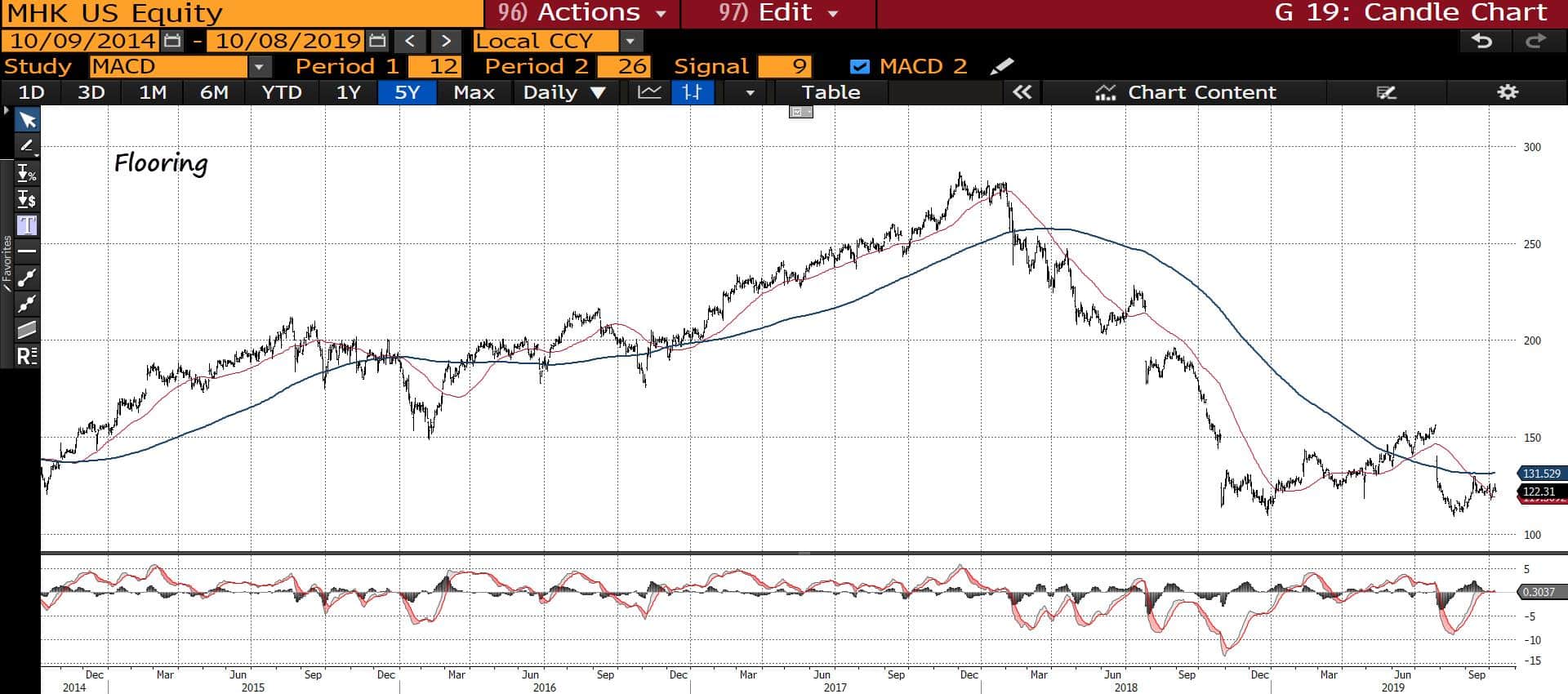
Flooring traded lower for all of 18’and has chopped sideways year-to-date.
(Click on image to enlarge)
Construction materials trended lower for all of 18’ but have been in an uptrend ytd.
(Click on image to enlarge)
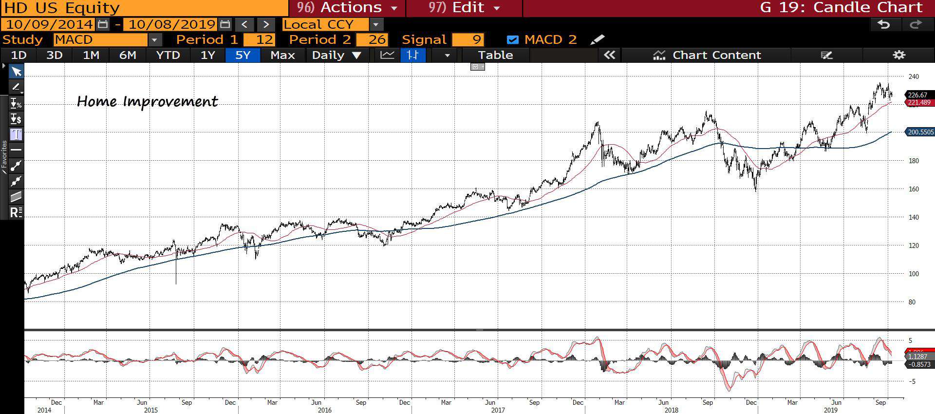
Home improvement has been in a solid uptrend ytd.
(Click on image to enlarge)
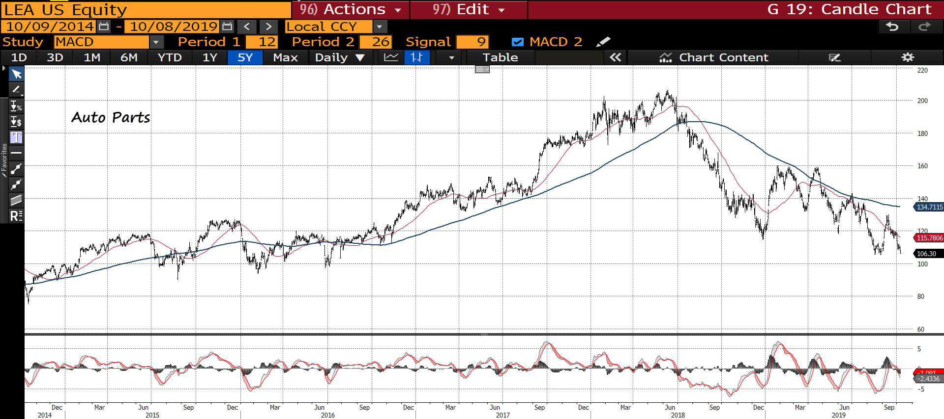
Auto parts have been trending lower for 18-months.
(Click on image to enlarge)
Semis are in a broader uptrend.
(Click on image to enlarge)
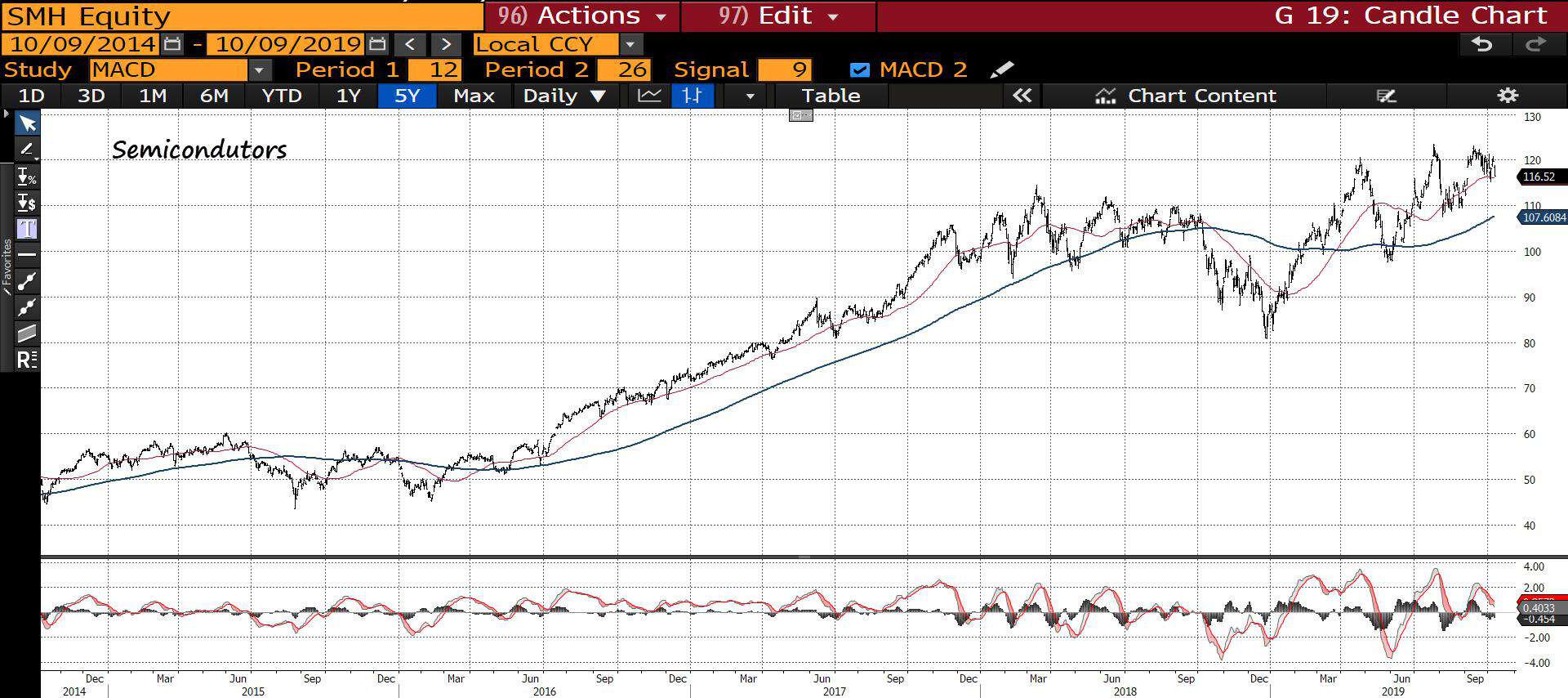
Outside of the auto sector, the majority of our leading cyclicals are for the most part positive — they are trending up and to the right.
Lastly, we have our Generals. The Generals are the stocks that capture the zeitgeist of the cycle. They’re the popular cycle outperformers. When this group begins to falter we want to take stock.
This Generals index has all the FAANMG stocks as well as some other large high-flying SAAS companies and JPM for good measure. Our Generals have been trading sideways for the better part of this year and the basket looks susceptible to at least a short-term selloff below its 200-day MA (red line). On an individual basis, there’s some increasing technical weakness in these names.
(Click on image to enlarge)

To summarize the technicals picture, we have:
-
- Market Indices
- The majority of global markets have been in an extended bear market that began on Jan 18’
- The US, for the most part, has traded sideways for the last 21-months, with large caps in a low angle volatile uptrend and small-caps in a slight downtrend for the last 14-months
- Leading Cyclicals
- Housing and construction sectors are in a broad uptrend following a year-long downtrend in 18’
- Autos are weak across the board
- Semis are trending up and to the right
- The Generals
- Been trading sideways for much of the year and look susceptible to short-term weakness
- Market Indices
Stay with me, we’re building a picture.
The strength of the line
Next up we have our market internals. Internals give us an under-the-hood look at where the capital is flowing into and out of which provides us with a sense of the strength or lack thereof, of the trend.
We start first with momentum, for which we use just a simple MACD oscillator. Currently, the SPX is working off both a weekly and daily MACD sell signal and downside momentum is accelerating.
(Click on image to enlarge)

For momentum to endure you need to have a strong line. Think of the stock market averages as a medieval battle unit, standing shoulder to shoulder as they march headlong into the enemy lines. The greater their depth of advancing soldiers the stronger their front lines are and the easier it is for them to advance. Conversely, when these lines thin out and there are fewer and fewer soldiers pushing forward, the easier it is for the line to break and momentum to reverse.
There are many ways to gauge the strength of the market’s line and one of these is the NYSE Advance/Decline line (stocks only). As long as the AD line and market are moving higher in gear with each other, there’s little to worry about; it’s unlikely the market will suffer a significant correction.
However, when this indicator diverges from the market for a significant period, it’s time to become cautious. A negative divergence that lasts a couple of weeks is likely to be only a minor correction. A major divergence that lasts a few months means a bear is waking from its slumber.
You can see the multi-month divergence that appeared in early 07’ preceding the nasty bear market.
(Click on image to enlarge)
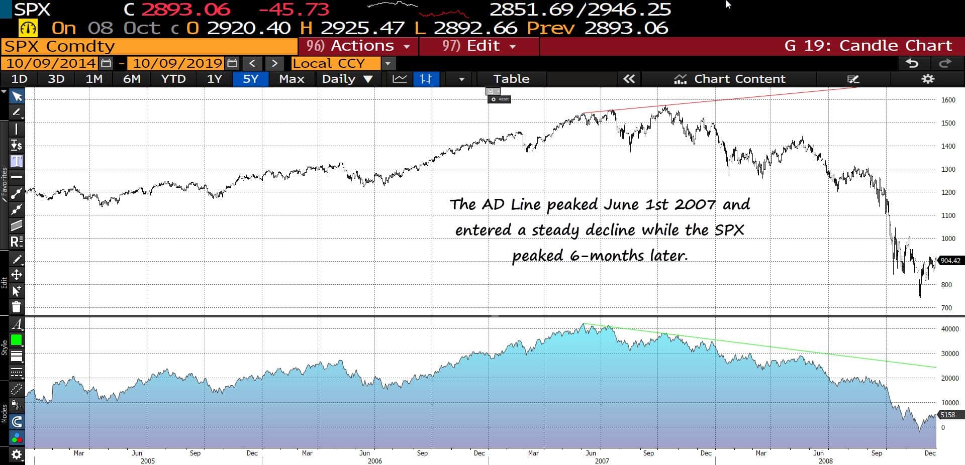
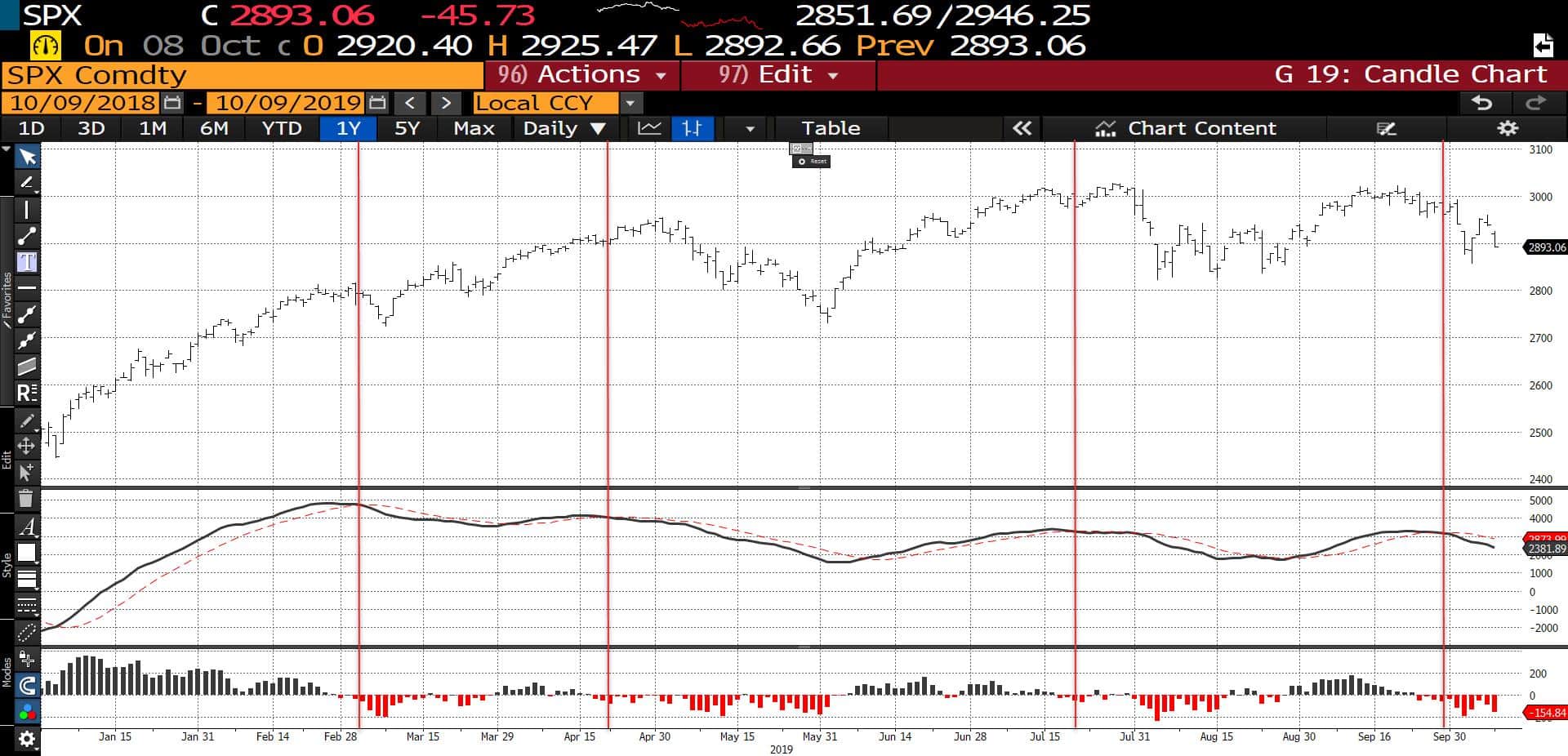
The AD line made a new high just last month and has since been moving lower in lockstep with the market. The lack of an extended negative divergence — a weakening of the line — suggests that it’s highly unlikely we’re putting in a market top right now.
(Click on image to enlarge)

For more intermediate and short-term measures of market breadth, my go-to’s are the McClellan indicators (both summation and oscillator). For a detailed explanation of how these indicators are constructed, go here. But, put simply, the McClellan Oscillator is just another way of looking at the number of advancing and declining issues in the market whereas the Summation index is just a running total (summation) of the Oscillator.
Generally speaking, when the Oscillator and Summation indicators are positive, it signals that money is flowing into the market and vice-versa when they’re both negative. And when the two hit local extremes it can indicate a reversal point.
Both triggered sell signals within the last two weeks and are not yet showing signs of a reversal in the near-term.
(Click on image to enlarge)
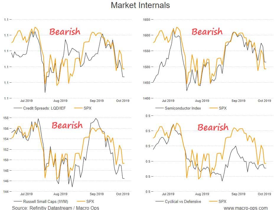
Credit spreads are widening and cyclical vs. defensive groups have been trending lower. Both are indicating that we’re likely to see a continuation of short-term weakness in the weeks ahead.
(Click on image to enlarge)
Market internals summary:
-
- Momentum
- A weekly and daily MACD sell signal are still in effect which means we should be biased to the downside until these flip
- Participation and Breadth
- The NYSE AD line made a cycle high last month and has been moving in lockstep with the market. There is no major divergence thus it’s highly unlikely we’re putting in a major top
- The McClellan indicators have not reversed the sell signals they triggered two weeks ago. Keep a downside bias
- Internals
- Credit is leading the way lower. Keep an eye on LQD/IEF and high-yield (JNK). Both look like they’re about to crack. Falling oil prices raise the potential for a selloff in credit like the one we saw at the end of last year
- Cyclical vs. Defensives have been unable to get off the floor, largely due to the relative strength of defensives. We want to see this trend reverse if we’re going to start a sustainable impulse higher
- Momentum
Playing the player: no consensus
One of our key operating guidelines is that the market is going to move in a way that frustrates the majority of people, the majority of the time.
This is why it’s important we’re constantly gauging public sentiment and the average positioning of the market. When we can identify key consensus points we can wait for technical confirmation and then fade the masses.
We look at a host of sentiment and positioning indicators. Some are good for the short-term and some for the longer-term.
Let’s start with a few of my favorite short-term ones.
Conclusion:
Combining technicals, internals, and sentiment together we get a more detailed picture of what’s going on in markets.
We can sum things up as this: Markets globally ex. US peaked nearly 2-years ago and have been mostly trading lower or sideways since. In the US, markets have largely gone sideways for the last 21-months; with large-caps slightly up and small caps down a good deal.
Outside of autos, the leading cyclical sectors are trending up and to the right, following a 12-month long beat down in 18’.
This cycle’s Generals have traded sideways for the better part of this year and look susceptible to some short-term weakness. But, they remain in a broader uptrend.
Momentum is indicating short-term weakness ahead but the broader breadth and participation of the market remains strong, which means it’s low odds that we’re in the process of putting in a cyclical top.
The credit market looks like it’s about to have a conniption. This should exacerbate short-term weakness in the stock market. But longer-term, credit spreads remain fairly tight and funding pressures are low.
Sentiment and positioning indicators show that, for the most part, the market is becoming increasingly bearish. The II is the one stubborn survey, this should get washed out following further downside.
Ultimately, the broader technical picture says that we’re likely to continue in our current volatile sideways range until we hit a local extreme in sentiment. Furthermore, the weight of the evidence suggests that this is likely a consolidation period that will lead to another impulse higher. The technicals, internals, and sentiment pictures do not yet support the argument that we’re putting in a long-term top. Though they do suggest that it’s high odds we see an acceleration in this down move over the coming weeks.
The next two weeks are some of the most volatile weeks of the year on a seasonal basis. Over the last 20-years, the S&P has tended to sell-off into the end of the month (26th is the average bottom) before rocketing higher. I expect we may see a similar pattern this time around.
Disclaimer: All statements are solely opinions and are for educational purposes only.


