
The Fed & Inflation: Has Risk Risen? Weekly Nifty 9
Research Report Excerpt #1
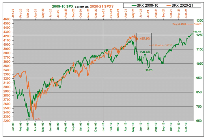
All of this standing in place has brought about a significant divergence in the 2010 analogue above. Despite a second down wave during the first 3 days of the past trading week, with the bounce-back on Thursday (5/20), the S&P 500 was never more than -4% from the last high reached on 5/7/2021. I still anticipate the pullback period to be in the -5% to -8% range and since that still hasn’t happened, I believe it is still too soon to declare the consolidation period over. As you can see in the analogue above, the current price is more than 27 percentage points above the 2010 analogue, so there continues to be a lot of POTENTIAL pressure for it to fall (at least a modest amount) in the near term. Therefore, it remains prudent to exercise caution as part of one’s game plan for at least another week or so. If even cheaper valuations are found, execute your game plan with an eye on market breadth and key support levels. If the market turns higher and in accordance with some of the seasonal and quantitative trend analysis, again, refer to your game plan with respect to higher prices.
Research Report Excerpt #2
More than 90% of the components in the S&P 500 were trading above their 50-DMA back in May of last year. The past 11 times this happened, the S&P 500 was higher a year later 10 times and up nearly +16% on average (SPX).
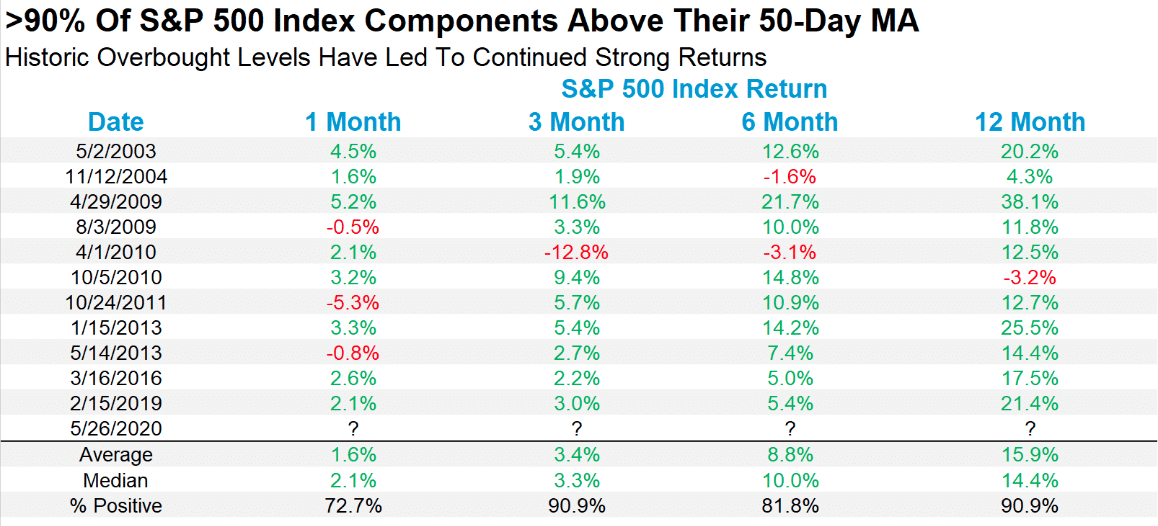
What is so interesting about this study is that it would appear as though everyone fell asleep at the wheel of the April 2021 market rally to new all-time highs. Why do I say this? On April 14, 2021 the percentage of stocks trading above their 50-DMA was 90.10 percent. The S&P 500 closed at 4,124 on this day. (See breadth chart below)

Now, reference the study concerning this breadth signal and calculate for the forward S&P 500 one and 3-month returns for the sake of brevity. With an average gain of 1.6% after this breadth signal, that would have found the S&P 500 at 4,190 around May 14th. The intraday high on May 14th was 4,183. Just saying, lean into the historic and/or quantitative studies folks. And now calculate for the 3-month average return when greater than 90% of S&P 500 stocks are trading above their 50-DMA.
Research Report Excerpt #3
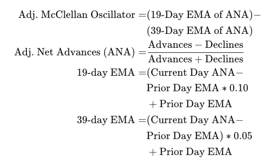
There are 2 formulas for the McClellan oscillator. The original formula, and one that adjusts for changes in the number of stocks listed on the stock exchange. The adjusted formula allows for a better comparison of values over longer periods of time.
A positive and rising indicator suggests that stocks on the exchange are being accumulated. A negative and falling indicator signals that stocks are being sold. Typically such action confirms the current trend in the index. So let’s analyze the Nasdaq McClellan Oscillator (NAMO) and see what we can discern from its trending status.
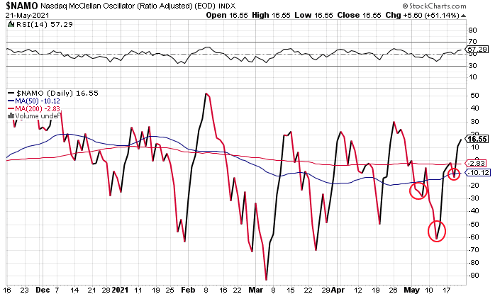
The inverse head-n-shoulders pattern suggests that this breadth indicator is resolving to the upside, and has some room for improvement. We can’t draw any additional conclusions other than there isn’t a breadth divergence taking place between the Nasdaq (NDX, QQQ) and NAMO, which validates the price action of the index this past week. The Nasdaq has had difficulties putting together winning streaks here in May and since setting a new all-time high in late April. After breaking a streak of 4 down weeks in a row, can the index put together a winning streak on positive developing breadth? That’s the question at-hand presently.
Research Report Excerpt #4
And chip stocks played a big role in that reversal. Delving into what the sector did Wednesday illustrates the way some traders incorporate price analysis into their trading outlook.
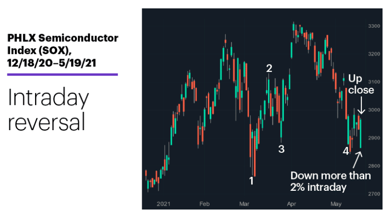
After initially falling as much as 2.3%, the PHLX Semiconductor Index (SOX) charged into positive territory before the morning was over, and ultimately closed up on the day: The chart above highlights four other days (March 11, March 17, March 25, and May 11) that were similar to Wednesday, sharing the following key characteristics:
1. an intraday loss of 2% or more
2. a higher close (above the previous day’s close)
The price action after the handful of examples shown here was mixed; the SOX was higher 5 days after the first and third examples, but lower after the second and fourth. Luckily, though, the SOX has had 161 total days like this since 1994, and the following chart shows how the chip index has performed 5 days after them:
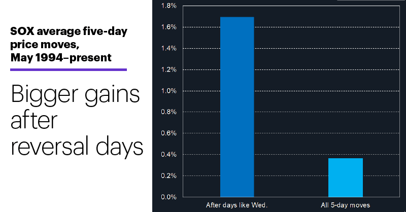
On average, the SOX posted a net gain of 1.7% in the first 5 days after days like Wednesday, a little more than 4 times the size of its average 5-day return of 0.37 percent. Also, the SOX was higher 5 days after days like Wednesday 63% of the time, 8 percentage points better than its overall 5-day average.
- Also, if we look at the subset of the days that were even more closely related to Wednesday’s price action, the 91 times the SOX was down at least 2% but reversed to close up more than 1%, the numbers were slightly better:
- After 5 days the SOX was higher 65% of the time and had an average gain of 2.4%.
- Just a heads-up:
- Of course, those numbers simply suggest that, all other factors aside, the SOX was more likely to rally than fall in the first week after days like Wednesday (don’t forget that it declined after 59 of the original 161 examples).
Research Report Excerpt #5
Throwing a bit of a yellow warning sign at markets on Wednesday were the FOMC April meeting minutes. A snapshot from the minutes, and what most financial media outlets and market participants latched on to from the minutes released is detailed below:

I offered my take concerning the bottom, highlighted portion of the FOMC minutes via Twitter and as follows:
“There is Only 1 FOMC meeting (June) between now & Jackson Hole (August). The more hawkish members have been heard, as highlighted in the April minutes. June will be about fielding this question again on “talking about, talking about tapering”. No action will be taken until a plan is agreed upon by the majority of voting members.
Fed will need to see data through base effects period & beyond, least risk errand/hasty tapering.Will see message shift 1st per Powell “well in advance” before actual tapering. That probably takes us into November at the earliest for any potential tapering. The Fed is unlikely to begin tapering in September, when Unemployment Insurance benefits and the eviction moratorium roll off. This economic event will demand diligence and prudence at the Federal and FOMC level, as it pertains to policy.”
Research Report Excerpt #6
To the Fed, what matters is the trend in the larger, more durable inflation categories that influence the longer-term inflation outlook. In those categories, sequential inflation was much more muted: rents (including owners’ equivalent rent) and healthcare services contributed just 8 basis points to the monthly gain, despite making up 49 percent of the core CPI index.

The Fed is more focused on the chart above than the previous chart, and the bond market should be as well.
Research Report Excerpt #7
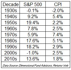
Higher costs are not the best thing for consumers, but can be okay for businesses. Their ability to pass on costs is why stocks can perform well in periods of rising prices. But when prices rise too fast, everything can come off the rails, as we saw in the 1970s. During that decade, the S&P 500 compounded at 5.9% a year, but it wasn’t enough to keep up with consumer prices, which grew at 7.4 percent. We’re nowhere near such levels of CPI, but this goes to prove that inflation in a vacuum is not the undoing of markets.
Research Report Excerpt #8
Finom Group is of the opinion that the unemployment rate will more rapidly turn down post the roll off of additional UI benefits in September. Additionally, investors shouldn’t fear a slow and tedious rebuilding of the labor force like that which followed the Great Recession (2008). We basically have a 6,000,000 Job Openings difference in the JOLTS data today than the tail end of the recession after the housing bust. (See chart of JOLTS below)

Research Report Excerpt #9
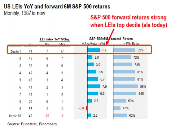
Fundstrat's Tom Lee: "Strong LEIs further support why stocks poised to “melt-up” rather than decline Given the tumultuous market movements over the past few weeks, we wanted to review why we believe a higher probability of markets gains, despite the very long list of market worries:
- US economic momentum strengthening
- US LEIs surge to +17% YoY, historically S&P 500 6M forward returns = +7.7%
- VIX is plunging after a “low energy” surge = risk on (VIX)
- Institutional investors are sitting on $3.065T in cash, nearly matching record May 2020 levels
- There are more reasons. But does this look like the stock market should be weak?
- …US LEIs are accelerating Yesterday, the latest Leading Economic Indicators (US LEI) by the Conference Board was posted. It came in at 1.6% month over month and is +17% YoY.
- The m/m change is actually accelerating
- This makes sense, as the US economy is gaining momentum from reopening
- This mean rate of change (ROC) is still rising And as shown below, has led to a whopping +17% growth in LEIs YoY.

- S&P 500 averages ~8% 6M forward returns when LEIs >7% YoY
- According to the data compiled by “tireless Ken” and our data science team, S&P 500 6M forward returns are unusually strong.
- When LEIs >+7% YoY – S&P 500 6M forward returns +7.7% – win-ratio is 82%
- This implies S&P 500 would rather >4,480 by November.
- This is consistent with our view S&P 500 will reach 4,400 before mid-year.
Disclaimer: The risk of loss in stock, stock/options, futures, futures/options, and forex trading is substantial, and site visitors and subscribers should consider whether trading these markets ...
more

