
The Coming Collapse Of The U.S. Financial System Shown In One Chart
There is one chart that should deeply concern the U.S. Federal Government. While most analysts and economists are concerned about the rising U.S. Debt to GDP or the skyrocketing Public Debt, there is another indicator that is far more worrisome. Unfortunately, I haven’t seen one economist even mention this fundamental indicator.
Why? Well, it seems as if most economists look at the world without every considering the number one driver… ENERGY. Thus, Economics 101 taught in most universities fails to incorporate energy into the equation. Therefore, as I have stated over and over, everyone seems to believe in the ENERGY TOOTH FAIRY.
First, let’s start with this dismal chart, which shouldn’t be a surprise to many Americans. This is the Total Public Debt from all sectors as of Q1 2020, from the St. Louis Federal Reserve:
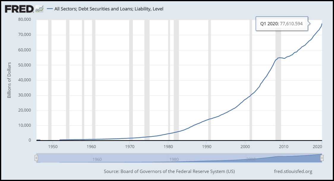
As of the first quarter of 2020, total U.S. debt from all sectors reached $77.6 trillion, about three times higher than the U.S. public debt of $26.6 trillion. So, if we take the total U.S. debt data and divide it by the population for several periods, we have the following chart:
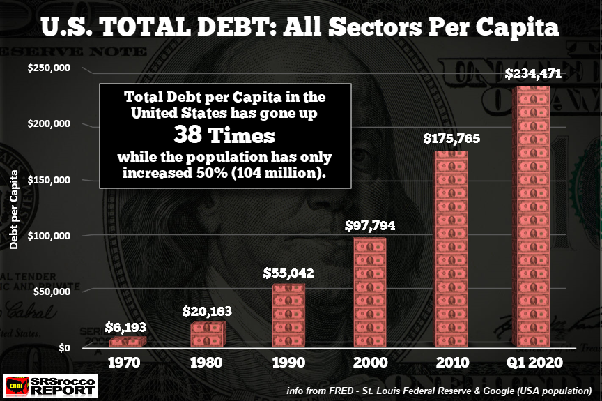
Since 1970, the total U.S. debt per capita has increased a stunning 38 times. It turns out that every American now holds enough debt to nearly purchase a quarter-million-dollar home. So, it’s no secret that the Federal Reserve has lowered interest rates to almost zero because the ability to service $77.6 trillion in debt would be impossible.
Just think if the U.S. interest rate was back up to 18% during the 1980’s Fed Volcker years? How much would it cost to service $77.6 trillion of debt with an 18% interest rate? How about a cool $14 trillion, or nearly 75% of the U.S. GDP.
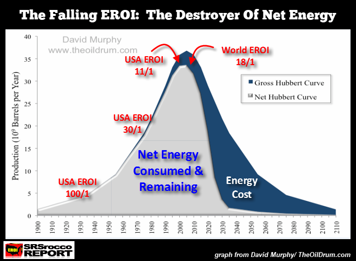
I wouldn’t count on interest rates rising unless we want to collapse the entire U.S. economy and financial system. Although, all bets are off once the U.S. and world head over the ENERGY CLIFF, shown below. The lighter area of the chart denotes the net usable oil for the economy, while the dark blue area indicates the energy cost. This is the ENERGY CLIFF.
Secondly, this brings us to the second series of charts, especially the one NEVER USED BY ECONOMISTS.
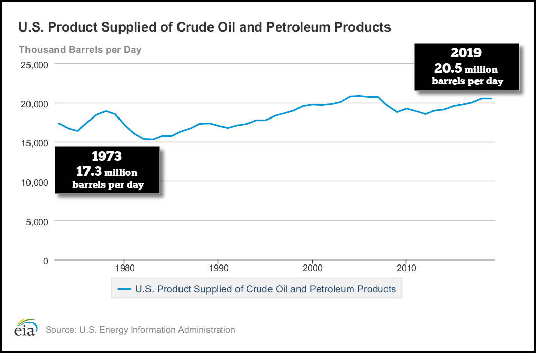
According to the EIA, the U.S. Energy Information Agency, the United States isn’t consuming that much more oil than it was in the early 1970s. In the early 1970s, Americans consumed 6.3 billion barrels of oil per year versus 7.5 billion barrels in 2019. Sure, it’s a bit more, but only 18% more, even though the U.S. population has increased by 50% during the same period.
If we take the U.S. total debt all sectors for each period and divide it by the oil consumption data, it reveals a nasty DEBT BUBBLE with unimaginable consequences. There is no way the Federal Government or Private Sector will be able to continue increasing debt when U.S. and global oil production heads over the Energy Cliff.
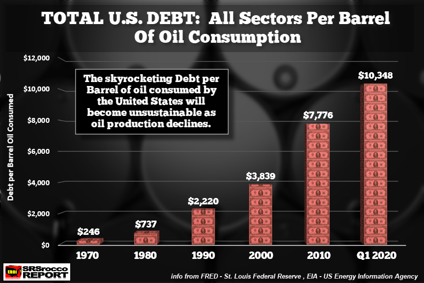
In 1970 (estimated based on 1973 data), the U.S. total debt was $246 per barrel of oil consumed. But, over the next five decades, it ballooned to $10,348 per barrel by Q1 2020. This is by far the most important chart that should concern the U.S. Government and Americans. The U.S. Debt to GDP and the rising total debt are just numbers on a page. However, when we compare the total U.S. debt to a barrel of oil consumed, we can provide a PHYSICAL METRIC in the real world run by ENERGY, not FINANCE.
Again… the main driver of the World’s Economy is ENERGY, not FINANCE.
The total debt per barrel of oil consumed increased since 1970 due to the rising oil price and Falling EROI – Energy Returned On Investment of oil. If the U.S. shale and global oil industries were able to continue increasing production for another 50 years, then debt levels could also increase. Unfortunately, we are now heading towards that Energy Cliff, with no PLAN B.
When U.S. domestic oil consumption falls regardless of declining demand or supply, the GREAT DEBT BUBBLE will POP. At that point, you would certainly be unwise to hold most of your funds in STOCKS, BONDS, and REAL ESTATE.
I have looked at many asset classes, and the safest and most liquid assets to own in the future will be physical gold and silver.
How to support the official Rocco site: I would also like to thank those foundation supporters, who have chosen to become a member by making donations through PayPal to further the research and ...
more

