
Technical Market Report For Saturday, May 29
Technical Market Report for May 29, 2021
The good news is that new lows contracted last week, and the secondaries outperformed the blue chips.
The Negatives
New highs are an indication of the breadth, and at the rate they are going, new highs are unlikely to confirm any new index highs in the near future.
The first chart covers the past six months, showing the Nasdaq composite (OTC) in blue and a 10% trend (19-day EMA) of Nasdaq new highs (OTC NH) in green. Dashed vertical lines have been drawn on the first trading day of each month. The OTC NH is not confirming rising prices.

The next chart is similar to the first one, except it shows the SPX in red and the NY NH in green. The information has been calculated with NYSE data. Similar action is seen in this chart when compared to the previous one.

The Positives
The number of new lows continues to decline. The next chart covers the past six months, showing the OTC in blue and a 10% trend (19 day-EMA) of Nasdaq new lows (OTC NL) in brown. The OTC NL has been plotted on an inverted Y axis, so decreasing numbers of new lows move the indicator upward (up is good). The OTC NL continued its recovery.

The next chart is similar to the previous one, except it shows the SPX in red and the NY NL in blue. The information has been calculated with NYSE data. The NY NL is recovering sluggishly, but it is at least recovering. The level of the indicator is not threatening.

The next chart covers the past six months, showing the OTC in blue and a 40% trend (four-day EMA) of Nasdaq new highs divided by new highs + new lows (OTC HL Ratio) in red. Dashed horizontal lines have been drawn at 10% levels for the indicator; the line is solid at the 50%, neutral level. The OTC HL Ratio recovered to a comfortably positive 80% last week.

The next chart is similar to the one above, except it shows the SPX in red and the NY HL ratio in blue. The information has been calculated with NYSE data. The NY HL Ratio rose to a very strong 90%.

Seasonality
Next week includes the first five trading days of June during the first year of the Presidential Cycle. The tables below show the daily change on a percentage basis for that period.
OTC data covers the period from 1963 to 2020, while SPX data runs from 1928 to 2020. There are summaries for both the first year of the Presidential Cycle and all years combined. Average returns for the coming week have been positive by all measures.
The number following the year represents its position in the Presidential Cycle. The number following the daily return represents the day of the week:
- 1 = Monday, 2 = Tuesday, etc.
OTC Presidential Year 1 (PY1)
Year Day1 Day2 Day3 Day4 Totals
1965-1 0.40% 2 -1.17% 3 -0.50% 4 -0.38% 5 -1.66%
1969-1 0.28% 1 -0.49% 2 -0.15% 3 -0.52% 4 -0.88%
1973-1 -0.33% 5 -1.50% 1 0.93% 2 -0.01% 3 -0.90%
1977-1 0.28% 3 -0.06% 4 0.41% 5 -0.08% 1 0.54%
1981-1 -0.20% 1 -1.54% 2 -0.32% 3 0.36% 4 -1.70%
1985-1 -0.07% 1 0.14% 2 0.27% 3 0.03% 4 0.36%
1989-1 0.48% 4 0.74% 5 -0.84% 1 0.03% 2 0.41%
1993-1 0.54% 2 0.22% 3 0.05% 4 -0.60% 5 0.21%
1997-1 0.32% 1 -1.42% 2 -0.38% 3 0.75% 4 -0.72%
Avg: 0.21% -0.37% -0.24% 0.11% -0.29%
2001-1 1.84% 5 0.30% 1 3.61% 2 -0.72% 3 5.04%
2005-1 0.95% 3 0.48% 4 -1.26% 5 0.21% 1 0.38%
2009-1 3.06% 1 0.44% 2 -0.59% 3 1.32% 4 4.23%
2013-1 0.27% 1 -0.58% 2 -1.27% 3 0.66% 4 -0.91%
2017-1 0.78% 4 0.94% 5 -0.16% 1 -0.33% 2 1.24%
Avg: 1.38% 0.32% 0.07% 0.23% 1.99%
OTC summary for PY1 1965 - 2017
Averages: 0.61% -0.25% -0.01% 0.05% 0.40%
% Winners: 79% 50% 36% 50% 57%
MDD 6/3/1981: 2.05% -- 6/4/1965: 2.05% -- 6/5/2013: 1.84%
OTC Summary for All Years 1963 - 2020
Averages: 0.16% 0.41% 0.16% 0.08% 0.81%
% Winners: 60% 71% 60% 57% 62%
MDD 6/6/2011: 4.68% -- 6/6/1967: 3.90% -- 6/6/2002: 3.77%
SPX PY1
Year Day1 Day2 Day3 Day4 Totals
1929-1 0.36% 6 1.40% 1 1.46% 2 -0.20% 3 3.04%
1933-1 1.04% 4 4.00% 5 -2.76% 6 2.23% 1 4.51%
1937-1 -1.85% 2 0.69% 3 0.19% 4 1.12% 5 0.15%
1941-1 0.11% 1 1.18% 2 -0.11% 3 0.42% 4 1.60%
1945-1 0.13% 5 0.20% 6 -0.07% 1 -0.13% 2 0.13%
1949-1 -0.35% 3 0.00% 4 -0.64% 5 -1.64% 1 -2.63%
1953-1 -1.59% 1 0.29% 2 -0.17% 3 -0.62% 4 -2.08%
1957-1 -0.13% 1 -0.19% 2 -0.02% 3 0.70% 4 0.36%
Avg: -0.37% 0.29% -0.20% -0.25% -0.52%
1961-1 0.00% 4 0.26% 5 0.52% 1 -0.28% 2 0.50%
1965-1 -0.79% 2 -0.72% 3 -0.22% 4 0.24% 5 -1.49%
1969-1 -0.50% 1 -0.30% 2 -0.04% 3 0.17% 4 -0.68%
1973-1 -0.97% 5 -0.92% 1 1.60% 2 -0.30% 3 -0.59%
1977-1 0.84% 3 -0.20% 4 0.98% 5 -0.47% 1 1.16%
Avg: -0.28% -0.38% 0.57% -0.13% -0.22%
1981-1 -0.14% 1 -1.35% 2 0.07% 3 0.19% 4 -1.23%
1985-1 -0.12% 1 0.38% 2 0.06% 3 0.47% 4 0.80%
1989-1 0.45% 4 1.10% 5 -1.07% 1 0.69% 2 1.17%
1993-1 0.81% 2 0.00% 3 -0.30% 4 -0.54% 5 -0.02%
1997-1 -0.23% 1 -0.10% 2 -0.63% 3 0.39% 4 -0.57%
Avg: 0.16% 0.01% -0.37% 0.24% 0.03%
2001-1 0.39% 5 0.51% 1 1.30% 2 -1.05% 3 1.14%
2005-1 0.90% 3 0.17% 4 -0.69% 5 0.12% 1 0.51%
2009-1 2.58% 1 0.20% 2 -1.37% 3 1.15% 4 2.55%
2013-1 0.59% 1 -0.55% 2 -1.38% 3 0.85% 4 -0.49%
2017-1 0.76% 4 0.37% 5 -0.12% 1 -0.28% 2 0.73%
Avg: 1.04% 0.14% -0.45% 0.16% 0.89%
SPX Summary for PY1 1929 - 2017
Averages: 0.10% 0.28% -0.15% 0.14% 0.37%
% Winners: 52% 61% 35% 57% 61%
MDD 6/3/1933: 2.76% -- 6/6/1949: 2.61% -- 6/4/1953: 2.08%
SPX Summary for All Years 1928 - 2020
Averages: -0.01% 0.23% 0.20% 0.21% 0.63%
% Winners: 53% 62% 54% 54% 60%
MDD 6/2/1931: 6.30% -- 6/6/2011: 4.39% -- 6/4/1962: 3.96%
June Outlook
Since 1963, over all years, the OTC in June has been up 57% of the time with an average gain of 0.6%. During the first year of the Presidential Cycle, the OTC in June has been up 43% of the time with an average loss of -0.8% (helped considerably by 9.2% and 7.1% losses in 1965 and 1969, respectively). The best June ever for the OTC was 2000 (+16.6%), while the worst was 2002 (-9.4%).
The average month has 21 trading days. The chart below has been calculated by averaging the daily percentage change for each of the first 11 trading days and each of the last 10. In months wherein there were more than 21 trading days, some of the days in the middle were not counted.
In months wherein there were less than 21 trading days, some of the days in the middle of the month were counted twice. Dashed vertical lines have been drawn after the first trading day and at five trading day intervals after that. The line is solid on the eleventh trading day, the dividing point.
In the chart below, the blue line shows the average daily performance of the OTC in June over all years since 1963, while the green line shows the average during the first year of the Presidential Cycle over the same period.

Since 1928, the SPX has been up 57% of the time in June with an average gain of 0.8%. During the first year of the Presidential Cycle, the SPX has been up 39% of the time with an average gain of 0.6%. The best June ever for the SPX was 1938 (+24.7%), while the worst was 1930 (-16.5%).
The chart below is similar to the one above, except it shows the average daily performance over all years since 1928 for the SPX in June in red, and the average daily performance during the first year of the Presidential Cycle over the same period in green.

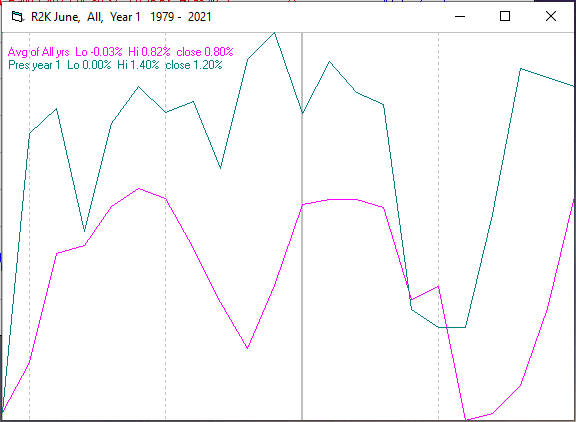
Since 1979, the Russell 2000 (R2K) has been up 64% of the time in June with an average gain of 0.8%. During the first year of the Presidential Cycle, the R2K has been up 70% of the time with an average gain of 1.2%. The best June ever for the R2K was 2000 (+8.6%), while the worst was 2010 (-7.9%).
The chart below is similar to those above, except it shows the average daily performance of the R2K over all years since 1979 in June in magenta, and the average daily performance during the first year of the Presidential Cycle over the same period in green.
Since 1885, the Dow Jones Industrial Average (DJIA) has been up 47% of the time in June with an average gain of 0.2%. During the first year of the Presidential Cycle, the DJIA has been up 38% of the time in June with an average gain of 0.2%. The best June ever for the DJIA was 1938 (+24.3%), while the worst was 1930 (-17.7%).
The chart below is similar to those above, except it shows the average daily performance over all years for the DJIA in June in grey, and the average performance during the first year of the Presidential Cycle over the same period in green.

Conclusion
Except for new highs, everything is going in the right direction. New lows have been declining and the secondaries were stronger than the blue chips last week. The strongest sectors last week were electronics and telecomm, while the weakest were utilities and biotech. I expect the major averages to be higher on Friday, June 4 than they were on Friday, May 28.


