
Technical Market Report For Saturday, Jan. 8
The good news is:
- The S&P 500 (SPX) closed at an all time high last Monday, the first trading day of the year.
The Negatives
The first week of January is usually pretty strong, even in the 2nd year (the worst year) of the Presidential Cycle. It did not work out that way for the start of this year.
The first chart covers the past 6 months showing the NASDAQ composite (OTC) in blue and a 40% trend (4 day EMA) of NASDAQ new highs divided by new highs + new lows (OTC HL Ratio), in red. Dashed vertical lines have been drawn on the 1st trading day of each month and dashed horizontal lines have been drawn at 10% levels for the indicator; the line is solid at the 50%, neutral level.
OTC HL Ratio moved upward at the beginning of the week then turned sharply downward, finishing the week in uncomfortably negative territory.

The next chart is similar to the first one except it shows the SPX in red and NY HL ratio, in blue, has been calculated with NYSE data.
NY HL Ratio fell, finishing the week slightly below the neutral line.

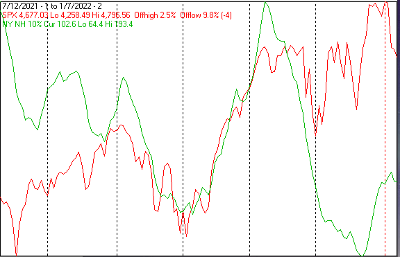
The next chart covers the past 6 months showing the SPX in red and a 10% trend (19 day EMA) of NYSE new highs (NY NH) in green.
NY NH failed to confirm the SPX all time high by a wide margin and its upward move that began in late December was arrested.
The next chart is similar to the one above except it shows the OTC in blue and OTC NH, in green, has been calculated with NASDAQ data.
The upward move of OTC NH that began in December was also arrested last week.

The next chart covers the past 6 months showing the OTC in blue and a 10% trend (19 day EMA) of NASDAQ new lows (OTC NL), in brown. OTC NL has been plotted on an inverted Y axis so decreasing numbers of new lows move the indicator upward (up is good).
The upward move of OTC NL was arrested last week and the numeric value of the indicator (306) is extreme.

The next chart is similar to the one above except is shows the SPX in red and NY NL has been calculated with NYSE data.
NY NL also turned downward last week. The value of the indicator at 96 is uncomfortably high, but much better than OTC NL.

The Positives
Seasonally, this decline is scheduled to last until the end of the month. It will be easy to identify when new lows disappear.
Seasonality
Next week includes the 5 trading days prior to the 2nd Friday of January during the 2nd year of the Presidential Cycle. The tables below show the daily change, on a percentage basis, for that period.
OTC data covers the period from 1963 to 2020 while SPX data runs from 1953 to 2020. There are summaries for both the 2nd year of the Presidential Cycle and all years combined. Prior to 1953 the market traded 6 days a week so that data has been ignored.
Average returns for the coming week have been mixed; weaker during the 2nd year of the Presidential Cycle than other years,
Report for the week before the 2nd Friday of January.

The number following the year is the position in the Presidential Cycle.

Daily returns from Monday to 2nd Friday.


OTC Presidential Year 2 (PY2)

 Year       Mon     Tue     Wed    Thur    Fri    Totals

 1966-2  -0.02%   0.17%   0.27%   0.05%  -0.12%   0.36%

 1970-2   1.01%   0.04%  -0.54%   0.24%   0.34%   1.08%

 1974-2   0.39%  -0.44%  -1.97%  -0.85%   0.89%  -1.98%

 1978-2  -1.44%  -0.62%  -0.49%   0.45%   0.23%  -1.86%


 1982-2  -1.69%  -0.78%  -0.85%   0.09%   0.77%  -2.47%

 1986-2   0.08%   1.15%  -0.25%  -1.76%   0.32%  -0.46%

 1990-2   0.11%  -0.42%  -1.33%  -0.41%  -2.04%  -4.09%

 1994-2   0.48%  -0.15%   0.17%   0.12%   0.57%   1.19%

 1998-2   0.80%  -0.88%  -1.16%  -0.40%  -3.36%  -5.01%


 Avg     -0.05%  -0.22%  -0.69%  -0.47%  -0.75%  -2.17%


 2002-2  -1.08%   0.92%  -0.53%   0.11%  -1.21%  -1.79%

 2006-2   0.57%   0.07%   0.48%  -0.63%   0.02%   0.50%

 2010-2  -0.21%  -1.30%   1.12%   0.38%  -1.24%  -1.24%

 2014-2  -0.44%   0.96%   0.30%  -0.23%   0.44%   1.04%

 2018-2   0.29%   0.09%  -0.14%   0.81%   0.68%   1.73%


 Avg     -0.17%   0.15%   0.25%   0.09%  -0.26%   0.05%


OTC summary for PY2 1966 - 2018

 Avg     -0.08%  -0.09%  -0.35%  -0.14%  -0.26%  -0.93%

 Win%       57%     50%     36%     57%     64%     43%


OTC summary for all years 1963 - 2021

 Avg      0.31%  -0.04%  -0.03%   0.51%   0.11%   0.85%

 Win%       64%     56%     54%     73%     64%     64%


SPX PY2

 Year       Mon     Tue     Wed    Thur    Fri    Totals

 1954-2  -0.52%   0.52%   0.56%   0.48%   0.95%   2.00%

 1958-2  -0.46%   0.79%  -0.02%  -0.59%  -0.93%  -1.22%


 1962-2  -0.78%   0.04%  -0.27%   0.59%   0.35%  -0.07%

 1966-2   0.20%   0.09%  -0.24%   0.18%   0.15%   0.39%

 1970-2   0.49%  -0.68%  -0.20%   0.05%  -0.30%  -0.64%

 1974-2  -0.84%  -1.99%  -2.81%  -1.10%   1.37%  -5.36%

 1978-2  -1.07%  -0.52%  -0.48%   0.09%  -0.14%  -2.12%


 Avg     -0.40%  -0.61%  -0.80%  -0.04%   0.28%  -1.56%


 1982-2  -2.32%  -0.41%  -1.22%   0.57%  -0.18%  -3.56%

 1986-2  -0.11%   1.50%  -2.73%  -0.89%  -0.07%  -2.31%

 1990-2   0.45%  -1.18%  -0.66%   0.35%  -2.47%  -3.50%

 1994-2   1.14%  -0.24%   0.01%  -0.36%   0.52%   1.07%

 1998-2   0.21%  -1.07%  -0.27%  -0.83%  -2.97%  -4.92%


 Avg     -0.12%  -0.28%  -0.97%  -0.23%  -1.03%  -2.64%


 2002-2  -0.65%  -0.36%  -0.48%   0.12%  -0.95%  -2.31%

 2006-2   0.37%  -0.04%   0.35%  -0.63%   0.12%   0.17%

 2010-2   0.17%  -0.94%   0.83%   0.24%  -1.08%  -0.77%

 2014-2  -0.25%   0.61%  -0.02%   0.03%   0.23%   0.60%

 2018-2   0.17%   0.13%  -0.11%   0.70%   0.67%   1.56%


 Avg     -0.04%  -0.12%   0.11%   0.10%  -0.20%  -0.15%


SPX summary for PY2 1954 - 2016

 Avg     -0.22%  -0.22%  -0.46%  -0.06%  -0.28%  -1.24%

 Win%       47%     41%     24%     65%     47%     35%


SPX summary for all years 1953 - 2021

 Avg      0.08%  -0.14%  -0.21%   0.29%   0.00%   0.02%

 Win%       57%     43%     46%     72%     51%     52%
Sell In May And Go Away
It is the 2nd year of the Presidential Cycle (PY2) that legitimizes that saying.
PY2 is, on average, the weakest of the 4 years in the Presidential Cycle and most of that weakness has occurred between May and September.
Since 1963, over all years, the OTC has been up 74% of the time with an average yearly gain of 14.2%. During PY2 the OTC has been up 50% time with an average gain of 0.8%. The best PY2 ever for the OTC was 1998 (+39.6%), the worst 1974 (-35.1%).
The charts below show the average daily return over all years and for PY2. Dashed vertical lines have been drawn on the 1st trading day of each month.
In the chart below the blue line shows the average of the OTC over all years since 1963 while the grey line shows the average during PY2 over the same period.

Since 1928, over all years, the SPX has been up 68% of the time with an average yearly gain of 8.1%. During PY2 the SPX has been up 57% of the time with an average yearly gain of 4.3%. The best PY2 ever for the SPX was 1954 (+45.0%), the worst 1974 (-29.7%).
The chart below is similar to the one above except it shows the average daily performance over all years for the SPX in red and the performance during PY2 in grey.

Since 1979, over all years, the Russell 2000 (R2K) has been up 71% of the time with an average yearly gain of 11.5%. During PY2 the R2K has been up 50% time with an average gain of 0.9%. The best PY2 ever for the R2K was 2010 (+25.3%), the worst 2002 (-21.6%).
The chart below is similar to those above except it shows the daily performance over all years of the R2K in magenta and the performance during PY2 in grey.

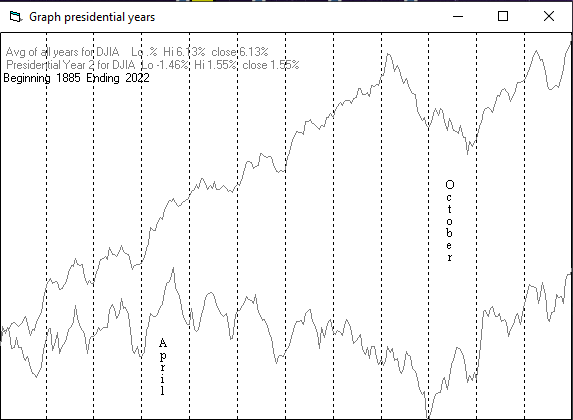
Since 1985, over all years, the Dow Jones Industrial Average (DJIA) has been up 66% of the time with an average yearly gain of 7.4%. During PY2 the DJIA has been up 56% time with an average yearly gain of 3.8%. The best PY2 ever for the DJIA was 1954 (+44.0%), the worst 1930 (-33.8%).
The chart below is similar to those above except it shows the daily performance over all years of the DJIA in black and the performance during the PY2 in grey.
Conclusion
The seasonal rally got cut short and the seasonal weakness is scheduled to last until the end of the month. Breadth has been awful so there is little reason to expect a turnaround any time soon (time measured in weeks).
The strongest sectors last week were Banks and Energy (up from the bottom last week) while the weakest were Precious metals and Electronics.
I expect the major averages to be lower on Friday, January 14, than they were on Friday January 7.
Last week's positive forecast was a miss.


Is it possible to get a reminder that Mike Burk has posted an article?
Sure, all you need to do is click the "follow" button under his profile photo. Then you'll get an email whenever he publishes an article.