
The good news is:
- We are entering a seasonally strong period that lasts until the end of the year.
The Negatives
New highs maintained their low levels while new lows maintained their high levels last week. There was a bulge in downside volume on the NYSE Friday (probably traders closing their positions before taking the next 2 weeks off).
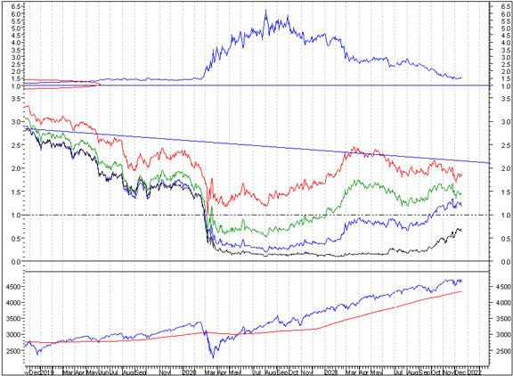
The first chart covers the past 6 months showing the Nasdaq composite (OTC) in blue and a 40% trend (4 day EMA) of Nasdaq new highs divided by new highs + new lows (OTC HL Ratio), in red. Dashed horizontal lines have been drawn at 10% levels for the indicator; the line is solid at the 50%, neutral level.
OTC HL Ratio turned back down last week.

The next chart is similar to the previous one except it shows the S&P 500 (SPX) in red and NY HL ratio, in blue, has been calculated with NYSE data.
NY HL Ratio also turned downward last week.

The next chart covers the past 6 months showing the SPX in red and a 10% trend (19 day EMA) of NYSE new highs (NY NH) in green.
NY NH continued falling as the SPX danced around its all time high.

The next chart is similar to the one above except it shows the OTC in blue and OTC NH, in green, has been calculated with Nasdaq data.
Like the chart above OTC NH continued falling.

The Positives
The market is oversold and we entering a period that usually has a modestly upward bias on the lowest volume of the year.
The next chart covers the past 6 months showing the OTC in blue and a 10% trend (19 day EMA) of Nasdaq new lows (OTC NL), in brown. OTC NL has been plotted on an inverted Y axis so decreasing numbers of new lows move the indicator upward (up is good).
While desperately looking for a positive I wish to point out that last Friday’s OTC low was only slightly above the December 3 low while OTC NL is well above its December 3 low. This is a modest non confirmation.

The next chart is similar to the one above except is shows the SPX in red and NY NL has been calculated with NYSE data.
Not quite the same picture here, however, the decline in NY NL was halted.

Seasonality
Next week includes the 4 trading days prior to Christmas during the first year of the Presidential Cycle. The tables below show the daily change, on a percentage basis, for that period.
OTC data covers the period from 1963 to 2020 while SPX data runs from 1953 to 2020. There are summaries for both the first year of the Presidential Cycle and all years combined. Prior to 1953 the market traded 6 days a week, so that data has been ignored.
Average returns for the coming week have been modest and mixed.
Report for the 4 days before Christmas.
The number following the year represents its position in the Presidential Cycle.

The number following the daily return represents the day of the week;

1 = Monday, 2 = Tuesday etc.


OTC Presidential Year 1 (PY1)

               Day4       Day3       Day2       Day1       Totals

 1965-1       0.00% 1   -0.49% 2   -0.63% 3   -0.03% 4    -1.16%

 1969-1       1.28% 5    0.33% 1    0.03% 2   -0.42% 3     1.22%

 1973-1      -0.35% 3    0.03% 4   -0.83% 5   -0.95% 1    -2.10%

 1977-1      -0.77% 2    0.52% 3    0.37% 4    0.51% 5     0.62%


 1981-1      -0.32% 1   -0.37% 2   -0.10% 3    0.13% 4    -0.67%

 1985-1       0.06% 4    0.14% 5   -0.48% 1   -0.38% 2    -0.65%

 1989-1      -0.39% 2    0.60% 3    0.95% 4    0.79% 5     1.95%

 1993-1       0.12% 1   -0.59% 2    0.06% 3    0.35% 4    -0.07%

 1997-1       0.10% 5    0.49% 1   -1.45% 2   -0.69% 3    -1.55%


 Avg         -0.09%      0.05%     -0.20%      0.04%      -0.20%


 2001-1      -1.09% 3   -3.25% 4    1.42% 5   -0.07% 1    -2.98%

 2005-1      -0.01% 2    0.42% 3    0.66% 4    0.13% 5     1.20%

 2009-1       1.17% 1    0.67% 2    0.75% 3    0.71% 4     3.31%

 2013-1      -0.29% 4    1.15% 5    1.08% 1    0.16% 2     2.09%

 2017-1      -0.44% 2   -0.04% 3    0.06% 4   -0.08% 5    -0.50%


 Avg         -0.13%     -0.21%      0.80%      0.17%       0.62%


OTC summary for PY1 1965 - 2017

Averages     -0.07%     -0.03%      0.14%      0.01%       0.05%

%Winners        36%        64%        64%        50%         43%

MDD  12/20/2001  4.30% --  12/24/1997  2.13% --  12/24/1973  2.09%


OTC summary for all years 1963 - 2020

Averages      0.07%     -0.05%      0.19%      0.25%       0.45%

% Winners      49%        57%        64%        66%         66%


SPX PY1

               Day4       Day3       Day2       Day1       Totals

 1953-1      -0.16% 1   -0.76% 2   -0.28% 3    0.45% 4    -0.76%

 1957-1       1.07% 4   -0.80% 5    0.00% 1    0.10% 2     0.36%


 1961-1      -0.70% 2   -0.20% 3   -0.37% 4    0.07% 5    -1.19%

 1965-1      -0.47% 1    0.39% 2    0.30% 3   -0.11% 4     0.12%

 1969-1       0.85% 5   -0.88% 1   -0.39% 2    1.05% 3     0.64%

 1973-1       0.08% 3   -0.28% 4   -1.07% 5   -0.68% 1    -1.95%

 1977-1      -0.20% 2    0.59% 3    0.81% 4    0.95% 5     2.14%


 Avg         -0.09%     -0.07%     -0.14%      0.26%      -0.05%


 1981-1      -0.53% 1   -0.37% 2   -0.46% 3    0.19% 4    -1.18%

 1985-1       0.10% 4    0.44% 5   -1.12% 1   -0.69% 2    -1.27%

 1989-1      -0.36% 2    0.11% 3    0.57% 4    0.77% 5     1.08%

 1993-1      -0.11% 1   -0.12% 2    0.43% 3    0.01% 4     0.22%

 1997-1      -0.89% 5    0.73% 1   -1.53% 2   -0.68% 3    -2.37%


 Avg         -0.36%      0.16%     -0.42%     -0.08%      -0.71%


 2001-1       0.58% 3   -0.84% 4    0.44% 5   -0.02% 1     0.16%

 2005-1      -0.61% 2    0.25% 3    0.42% 4    0.04% 5     0.11%

 2009-1       1.05% 1    0.36% 2    0.23% 3    0.53% 4     2.16%

 2013-1      -0.06% 4    0.48% 5    0.53% 1    0.29% 2     1.25%

 2017-1      -0.32% 2   -0.08% 3    0.20% 4   -0.05% 5    -0.25%


 Avg          0.13%      0.03%      0.36%      0.16%       0.68%


SPX summary for PY1 1953 - 2017

Averages     -0.04%     -0.06%     -0.08%      0.13%      -0.04%

%Winners        35%        47%        53%        65%         59%

MDD  12/24/1997  2.37% --  12/24/1973  2.02% --  12/24/1985  1.80%


SPX summary for all years 1953 - 2020

Averages      0.06%      0.07%     -0.02%      0.21%       0.32%

% Winners      44%        57%        51%        65%         62%
Money supply (M2) and Interest Rates
The following charts were supplied by Gordon Harms.
M2 growth continued to level off. Perhaps the Fed has quit calculating M2.

Treasury rates at their close last Friday and their changes from last month:
2yr yield 0.634% up from 0.524%
5yr yield 1.170% down from 1.229%
10yr yield 1.407% down from 1.566%
30yr yield 1.814% down from 1.934%

The next chart is a close up showing just the past year from the chart above.
Conclusion
Breadth has continued to deteriorate; however, the market is a bit oversold going into a period of modest strength on the lowest volume of the year.
The strongest sectors last week were Utilities (same as past 3 weeks) and Telecom (for the 2nd week) while the weakest were Transportation and Energy.
I expect the major averages to be higher on Thursday December 23 than they were on Friday December 17.
Comments
Log in or sign up to join the conversation.