
It’s all too easy to get caught up in the moment, especially if one is an active trader. In an environment where many of us utilize momentum-based or trend-following strategies, often via short-dated options, it can be sobering to examine long-term trends and examine current statistics vis-à-vis historical readings.
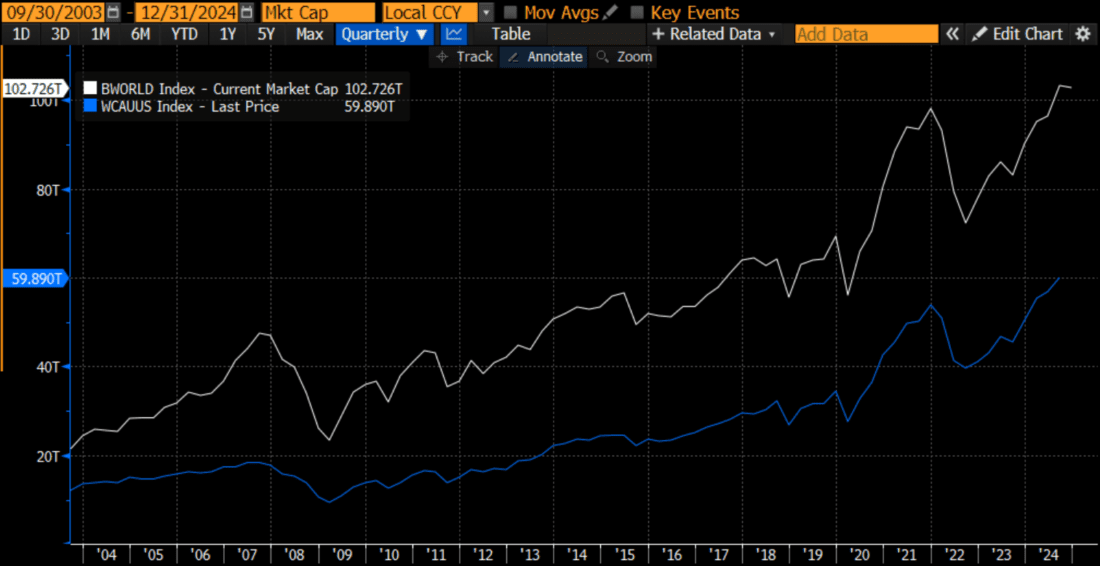
First, we will take a look at the total stock market capitalization of global and US markets. The most stunning feature is that they are both up about fivefold over the past 20 years. That is over 8% compounded annual growth. Not too shabby. Interestingly, the US was 57% of global market cap at start of graph in September 2003; now it’s 58.3%. It is easy to believe that the enormous growth in the largest US stocks would cause them to dominate global market cap. Instead, a chart like the one below can offer a reminder about how much growth case from other parts of the world as well.
Total Stock Market Capitalizations Since September 2003, Global (white) and US (blue)
(Click on image to enlarge)
Source: Bloomberg
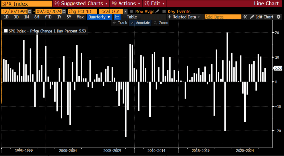
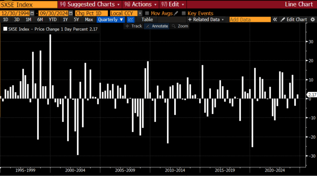
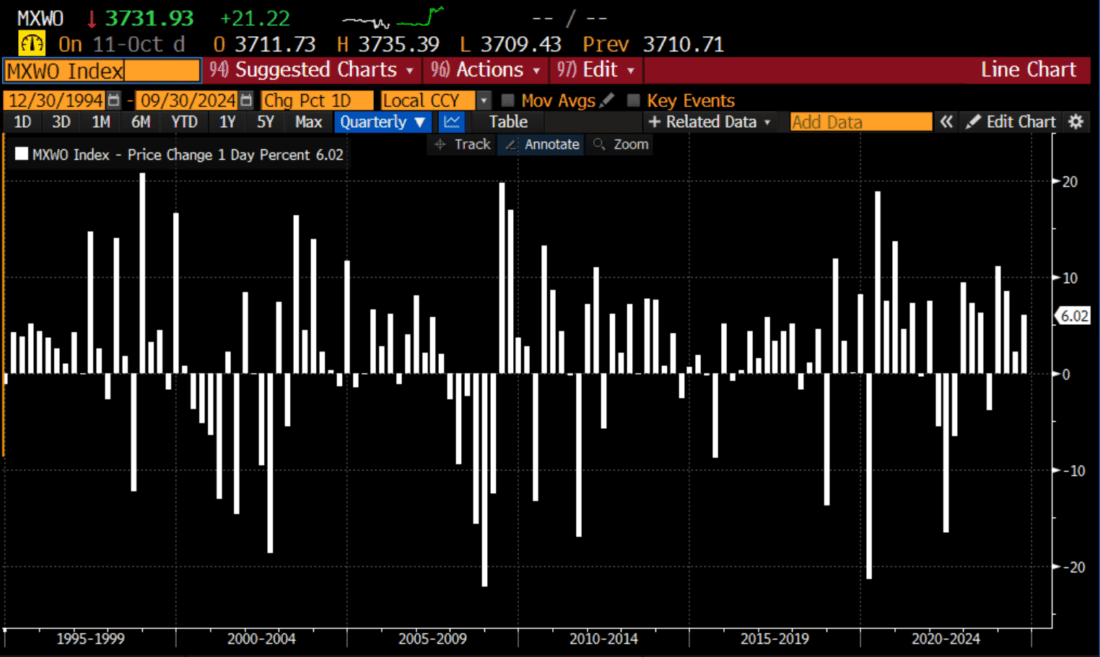
The charts below show quarterly returns for the S&P 500, Stoxx 50, and MSCI Global indices. All have certainly been on nice runs, though Europe has lagged somewhat. Note the relatively uninterrupted period of gains that prevailed in the late ‘90s. The current and recent magnitudes of gains have been relatively high, but have indeed been punctuated by periodic declines:
SPX Quarterly Returns Since December 1994
(Click on image to enlarge)
Source: Bloomberg
STOXX 50 Quarterly Returns Since December 1994
(Click on image to enlarge)
Source: Bloomberg
MSCI World Index Quarterly Returns Since December 1994
(Click on image to enlarge)
Source: Bloomberg
The next few charts focus on interest rates in the US and abroad. Compared to the years since 2008, aka the post-GFC period, we have been recently experiencing very high rates – especially after long stretches of negative real rates. But over a period of multiple decades, the currently elevated rates are actually relatively normal, or even low, on a historical basis. When we consider that the above charts showed steadily positive equity returns during the late ‘90s, when rates tended to be above current levels, we have to wonder whether rate cuts are truly necessary.
(Click on image to enlarge)
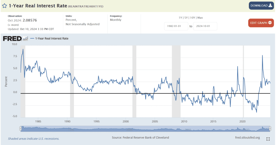
Source: 1-Year Real Interest Rate (REAINTRATREARAT1YE) | FRED | St. Louis Fed (stlouisfed.org)
(Click on image to enlarge)
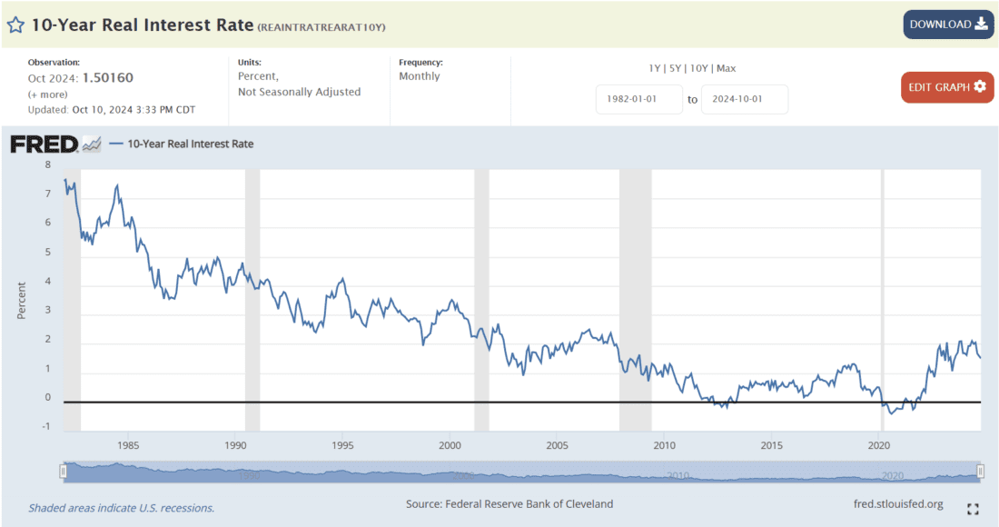
Source: 10-Year Real Interest Rate (REAINTRATREARAT10Y) | FRED | St. Louis Fed (stlouisfed.org)
(Click on image to enlarge)
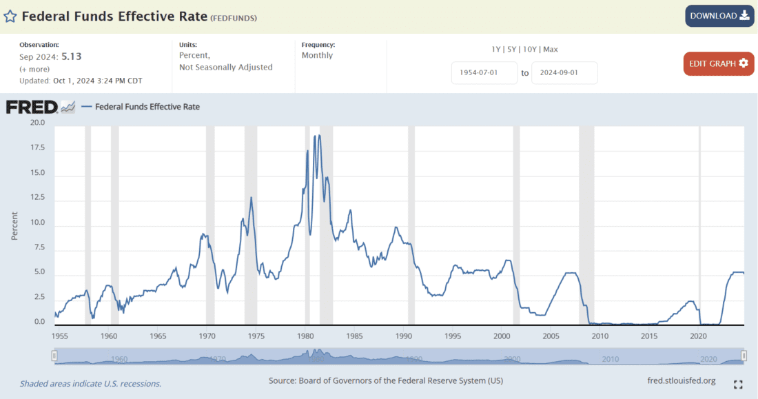
Source: Federal Funds Effective Rate (FEDFUNDS) | FRED | St. Louis Fed (stlouisfed.org)
The same goes for Europe, though the historical chart for the ECB only goes back to the creation of the Eurozone. The rates appear historically high, but that is because the timeframe is shorter. Like the US, it is relatively high for the 21st century.
(Click on image to enlarge)
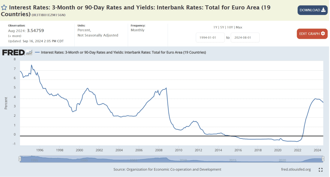
(Click on image to enlarge)
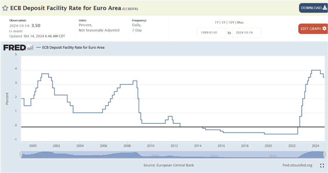
Source: ECB Deposit Facility Rate for Euro Area (ECBDFR) | FRED | St. Louis Fed (stlouisfed.org)
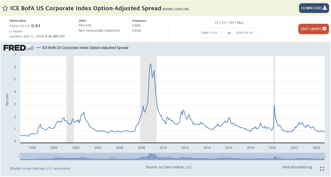
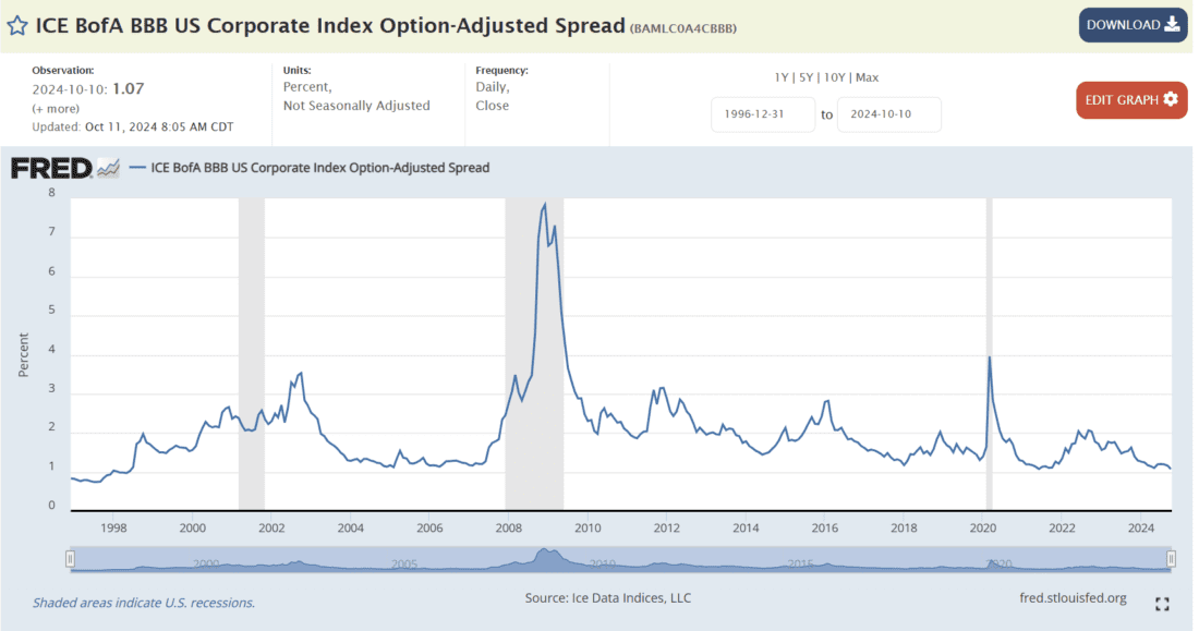
Although it is important to examine the key base rates, that is only one component of the cost of borrowing for key companies. Their debt is typically priced at some level above Treasury securities of similar durations to account for their relative credit risk. From that viewpoint, major companies are not having much trouble borrowing money, since US Corporate credit spreads at or near 25-year lows:
(Click on image to enlarge)
(Click on image to enlarge)
Finally, we return to a graph that we have used before that attempts to map the difference between 2 and 10-year Treasury yields to recessions. While it is true that inverted yield curves typically precede recessions, note that the recessions only begin after the curve normalizes:
Difference Between 2-Year and 10-Year Treasury Rates, with NBER Recession Start (red) and End (green) Dates
(Click on image to enlarge)
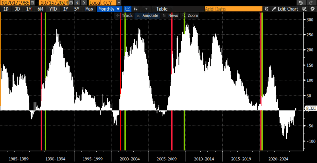
Sources: Bloomberg, Interactive Brokers
More By This Author:
Newton’s First Law At Work TodayThe Two Eras Of Tesla – BT And AX
Let’s Fit The Narrative To The Desired Outcome


Comments
Log in or sign up to join the conversation.