
Shrug Today, Bleed Tomorrow
Deutsche Bank was out this morning with a 217-year chart that says it all.
To wit, markets have reached a point of Peak Lunacy. In a world choking on economic, political, demographic and military troubles, stock and bond prices have never been so high. Or as its crack analyst Jim Reid put it, "we’re in a period of very elevated global asset prices – possibly the most elevated in aggregate through history".
He got that right. Even MarketWatch appeared to be escaping its bullish brain-freeze this AM, noting that perhaps the casino's "great shrug" has become a tad overdone:
The perennial headline: Stock market shrugs off everything. North Korea (shrug). Terrorist attacks (shrug). Hurricanes (shrug). Investor complacency (shrug). Lofty valuations (shrug). Trump (the best shrug, believe me). Whatever it is — screw it, buy!
Accordingly, on Friday afternoon the robo-machines tagged 2,500 on the S&P 500 for the first time based on absolutely nothing. Indeed, it can be well and truly said that the stock market has degenerated to the point where it now reflects exactly zero information about the real economic world and is "discounting" a "future" that can be measured in just days or even hours.
In the first place, the indices today stand where they did in early 2000 and late 2007---that is, rising insensibly day after day as if begging to be stopped by something. Anything.
Our friend Lance Roberts aptly captured this dynamic in some charts published over the weekend. His key point is that at the bubble cycle reaches its apogee, the process of trader capitulation tends to give the market a false turbo-charge.
Referencing the upward bends in the dotted red lines below, he noted: “One of the hallmarks of a late-stage bull-market cycle is the acceleration in price as investors capitulate by ‘jumping in’ as prices accelerate."
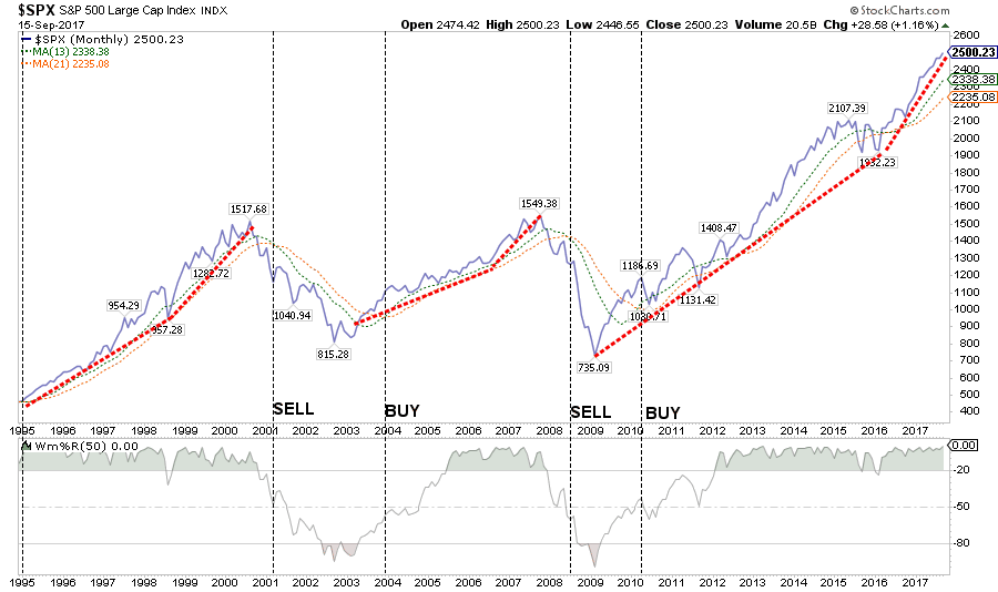
Our point, however, is not merely to refute the "this time is different" meme that is again rampant in the casino and on bubble vision. The actual fact of the matter is that this time is far worse than either of the last two bubbles, which eventually sent the S&P's large cap index crashing by 46% and 53%, respectively.
That's because after three straight bubble cycles and furious central bank money printing and asset prices falsification this last time around, the mainstream narrative about the world has decayed into one giant tissue of lies and fantasies. There is virtually no part of this latest rendition of a "goldilocks" world that is even remotely true.
For instance, the US economy has allegedly reached a condition of near full employment and full recovery from the trauma of the Great Recession. Then why in the world do we get this picture---even from the government's own sketchy statistical mills?
Yes, manufacturing is not the be all and end all of capitalist prosperity. But then again, an economy has to "make" something to thrive, even if it is pursuing Adam Smith's comparative advantage to the nth degree.
In fact, US manufacturing is not "growing" or even recovering at all. After last week's punk report for August, it still stood 4% below its pre-crisis peak in December 2007. Statistically speaking, US manufacturing output has been shrinking at a 0.41% annual rate for the last 10 years!
By contrast, between the June 1990 and August 2000 cyclical peaks, manufacturing output grew at a 4.6% annual rate. That decelerated sharply to 1.8% between the mid-2000 peak and December 2007, but at least it was still expanding on the back of the Greenspan mortgage/housing bubble.

Not to worry, say the Wall Street globalists. If there aren't any jobs in the rust belt, Uncle Sam can borrow more money to pay for their Medicaid and foods stamps, thereby stimulating output while extending a helping hand to all those less fortunate peeps stuck in Flyover America.
Besides, worldwide manufacturing output is now allegedly expanding on a pleasantly synchronized basis. So that means more growth and higher stock prices all around, right?
No it isn't and doesn't.
What the perma-bulls see as good news in the global PMIs (purchasing managers indices) has nothing whatsoever do with capitalist growth or sustainable global prosperity.
Instead, its more nearly the opposite; it's the footprint of the Red Suzerains of Beijing rigging their Brobdingnagian tower of debt to generate the appearance of stability and expansion for their upcoming coronation of Mr. Xi as the new Mao Zedong at the upcoming National Peoples Congress.
This is an every five year event and is scheduled to start on October 18. Beijing's latter day commissars have spared no efforts since China's economy begin to hit the skids in late 2015 to keep the Ponzi expanding long enough to assure a triumphal close of the 19th National Congress of the Communist Party of China.
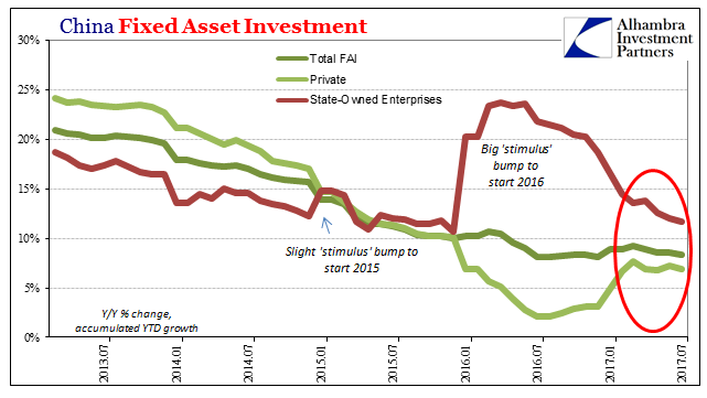
Beijing's handiwork is evident in the three lines in the chart below---with the dark green line representing overall CapEx. The latter is the artificial and unsustainable spring-wheel of China's booming economy, but it had dropped from 22% per annum growth rate when Mr. Xi took the helm in 2012 to 10% by early 2016, and was heading rapidly into low single digits from there.
To forestall bad news at the party congress, there occurred a big eruption in the brown line dramatized in the chart. CapEx growth suddenly more than doubled in the one-third of China's economy that is already saturated in excess capacity. That is, the state owned enterprises (SOEs) in steel, aluminum, autos, shipbuilding, chemicals, building equipment and supplies, railway and highway construction etc.
Almost as if a switch had been flicked on by Mr. Xi himself (it essentially was), SOE CapEx soared back toward the 25% year-over-year rate by mid-2016, keeping total CapEx hugging the 10% growth line.
But the trouble down below was palpable. The light green line represents private sector fixed asset investment in China, and it was heading toward zero. That's perhaps owing to the rational anticipation by private entrepreneurs that China's debt and construction fueled boom was running out of steam----even if the latter do believe Beijing will never allow the Chinese bubble to completely implode.
As it happened, the SOE spending spurt did modestly lift private CapEx as well, but the rebound was short-lived all around. Now that good results through October have been assured, SOE spending is being sharply reined-in and overall fixed asset investment has regressed to its downward glide path.
To be sure, you cannot grow an economy indefinitely by building pyramids or any other kind of low-return/no return investment---even if the initial spurt of growth can last for years as China's last two decades show.
But ultimately the illusion of Keynesian spending gets exposed and the deadweight costs of malinvestments and excess capacity exact a heavy toll.
And if the investment boom was financed with reckless credit expansion, as was also the case in China where total debt grew from one-half trillion dollars in 1995 to approximately $40 trillion today, the morning-after toll is especially severe and disruptive---something that used to be called a "depression" in times past.
In the immediate period, however, the kind of state-driven credit impulse pictured above does cascade through the world economy with a small lag owing to a rise in the rate of Chinese imports for raw materials, intermediate components and sophisticated capital goods.
If you want to call that a synchronized global expansion, do so at your own peril. It is absolutely clear that six months from now the Wall Street bulls and denizens of the Eccles Building alike will be scratching their heads about the sudden, unforeseen global slowdown and the morning after contraction of China's CapEx and construction frenzy.
Actually, the China head fake is so artificial that it borders on the ludicrous. Beijing has so thoroughly manipulated and rigged the system for a splendid celebration at the 19th Congress that it has even ordered executives at China's legions of stockbrokers to not leave their posts on vacation for the duration.
That's synchronization for sure! But it's not exactly what the Wall Street stock peddlers who moonlight as economists and strategists have in mind. As Bloomberg described it:
As China’s most important political event in years draws nearer, regulators have made it clear to the nation’s top financiers that they don’t want to see any major turbulence in markets.
The China Securities Regulatory Commission has ordered local brokerages to mitigate risks and ensure stable markets before and during the Communist Party’s twice-a-decade leadership congress next month, according to people familiar with the matter. The CSRC has also banned brokerage bosses from taking holidays or leaving the country from Oct. 11 until the congress ends, the people said.
Indeed, what is coming out of China is absolutely the opposite of a sustainable credit impulse that is providing locomotive power to the world economy. As the brilliant investor who called the US housing bubble 10 years ago, Kyle Bass, observed over the weekend, China is heading for a thundering credit collapse within the next year.
After all, its economy sits precariously upon a $40 trillion mountain of debt----a figure which is actually 80X greater than the $500 billion level of just two decades ago.
We're in the such late stages of a game that is the largest global imbalance I've ever seen in my life.When you look at on balance sheet and off balance sheets, you look at on balance sheet in the banks, you look in the shadow banks. The number of total credit in the system, China is right at $40 trillion. Think about the number I just said. $40 trillion. And that's using an exchange rate of call it 6.7 to the dollar, right? So it's grown 1,000% in a decade. And we're on a $40 trillion credit system on $2 trillion of equity on maybe $1 trillion of liquid reserves.
We have called this the Red Swan, and Kyle Bass thinks its arrival date is somewhere between November and June of next year. But whatever the timing, it is starkly clear that the US economy is not going to be catapulted out of its slide toward the flat-line by a surge in global growth and export demand.
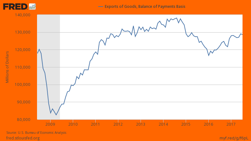
Indeed, notwithstanding the short-term boost to the world economy affected by Beijing in anticipation of its plenary, the fact is US exports are still 7% below their September 2014 level and barely above the pre-recession peak 10-years ago.
Moreover, once the Red Ponzi goes into its impending meltdown, global trade will hit the skids as it did in late 2008. As also shown, US exports plunged by more than 30% during the 10 months after June 2008.
Another case of the utterly false main street narrative is embedded in last week's ballyhoo ab0ut median household income finally having rebounded to its 1999 level.
As we noted at the time----zero real gains in 17 years is hardly a sign of economic health. In fact, real household income way back in 1987 was actually $52,700 in constant dollars (2015$) or 90% of 2016 levels. This means that real household income growth averaged just 0.33% per year over the last three decades.
We also noted that during that same 30 year period, real returns on the Wilshire 5000 had averaged nearly 8.0% per year. Needless to say, there is no known universe in which real annual returns on equity can grow at 24 times the rate of real gains in household incomes indefinitely.
But even that lop-sided contrast presumes the BLS's inflation ruler is roughly accurate. But it is not. Whereas the BLS claims that nominal household income over this period should be deflated for annual inflation of about 2.1% per year, it is surely the case that the denizens of Flyover America would take sharp issue with that proposition.

As a matter of fact, the actual cost of living has grown far faster than the Washington acknowledges. As Jim Quinn has aptly noted,
All is well. Real median household income just surpassed the level achieved in 1999. Think about that for a second. It took seventeen years for the average American family to get back to a household income of $59,000.
But $59,000 of household income in 2017 doesn’t quite go as far as it did in 1999, with even BLS manipulated inflation showing an 87% increase in medical costs, 80% increase in energy costs, 51% increase in food costs, 53% increase in housing costs, and a 115% increase in college education. And of course the BLS changed their methodology, boosting household income by $1,700 in 2013. So, in reality it is still below 1999 levels.
The chart below provides the government reported cumulative increases in key categories since 2000. Not only does the government purposely under-report the increases in these costs, they also purposely under-weight the significance of particular categories in order to reduce the reported level of inflation. Some of these categories show significant increases, but they are far lower than what average Americans are actually experiencing in the real world.
One of the outrageous examples of how the government uses academic gibberish about product improvements to drastically under-report CPI is how they report new vehicle inflation. The average price of a new car in 2000 was $22,000. Today, the average price is $34,500. That’s a 57% increase. The BLS bullshit artists have the gall to report new vehicle inflation of a whopping 2% since 2000.
They have “adjusted” away 55% of the actual increase by saying airbags and other unnecessary technological baubles improved automobiles to such an extent, prices didn’t really go up. What a fucking joke. Having your ass warmed with the push of a button didn’t put the extra $12,500 in your bank account to pay for that car. And new vehicles account for 3.6% of the CPI calculation, while health insurance accounts for 1% of the weighting. Yeah, that reflects reality.
Another outrageous example of under-reporting inflation is in the highest weighted category of housing. It is supposed to reflect the cost of rent and home ownership. The owners equivalent rent calculation is purposely opaque in order to suppress the true cost increase. Median home prices were $165,000 in 2000 and are currently $317,000, a 92% increase.
The average rent of $475 in 2000 has risen to $910 today, also a 92% increase. So it makes total sense for the BLS drones to report a 53% increase in housing since 2000. I’m sure their academic model adjusted the true increase downward by 39% due to some obscure algorithm created by a Princeton economics professor.

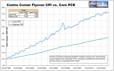
In a word, the mainstream narrative is a false story. When the big four horseman of mainstreet inflation---food, energy, medical care and housing----are accurately measured and weighted as per our Flyover CPI, the inflation rate faced by most American households has increased at better than 3.1% per annum since the turn of the century.
That means, in turn, that real household incomes are 15% lower than in 1999 and barely above levels achieved way back in 1987.
Needless to say, there are a lot more examples where these came from. But, still, if manufacturing output has been shrinking for a decade and real household median incomes have been stagnant for 30 years, the question recurs: How can you then value stocks and bonds at the highest level in world history?
Easy. You can't!
So we would say to the casino gamblers and robo-machine: Shrug today if you must; you'll have plenty of time bleed tomorrow.
Disclosure: None.


