
Revisiting Equity Vs. Yield
Some of you may recall an interesting ratio chart that I examine from time to time: this is the S&P 500 cash index divided by the 10-year interest rate. Over the course of many years, it has followed a channel pattern with remarkable precision.
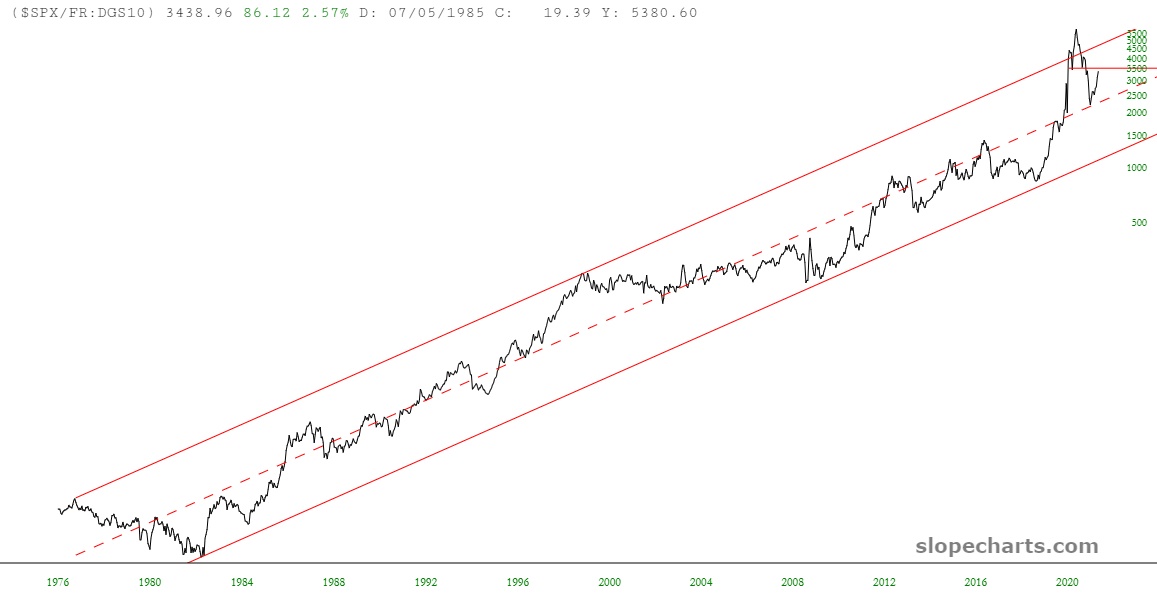
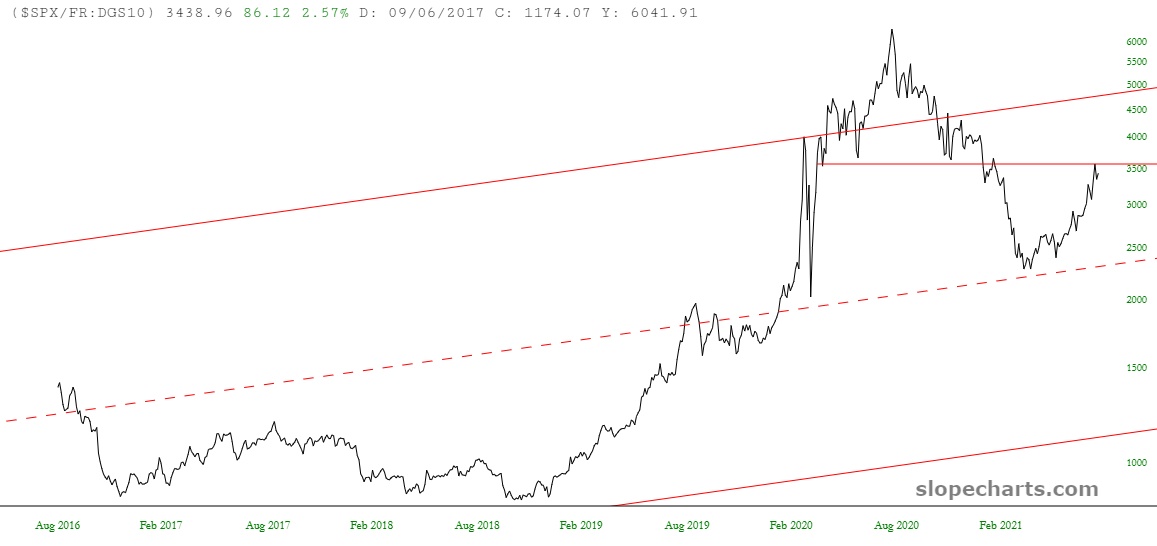
A few months ago, I was troubled by the fact that this ratio had traveled down to its midline, which strongly suggested support and, therefore, a strong equity market. Well, my fears have been fully realized, as this close-up view illustrates. However, take careful note of where the ratio price is now: right up against an important resistance line, which formerly provided the role of support.
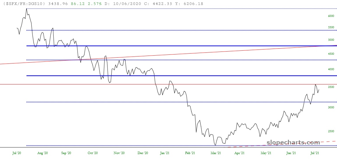
Looking at the Fibonacci Retracement levels from this same recent peak-to-trough, you can see how we are approaching a major 38.2% resistance level as well (emphasized here with the darker blue line).
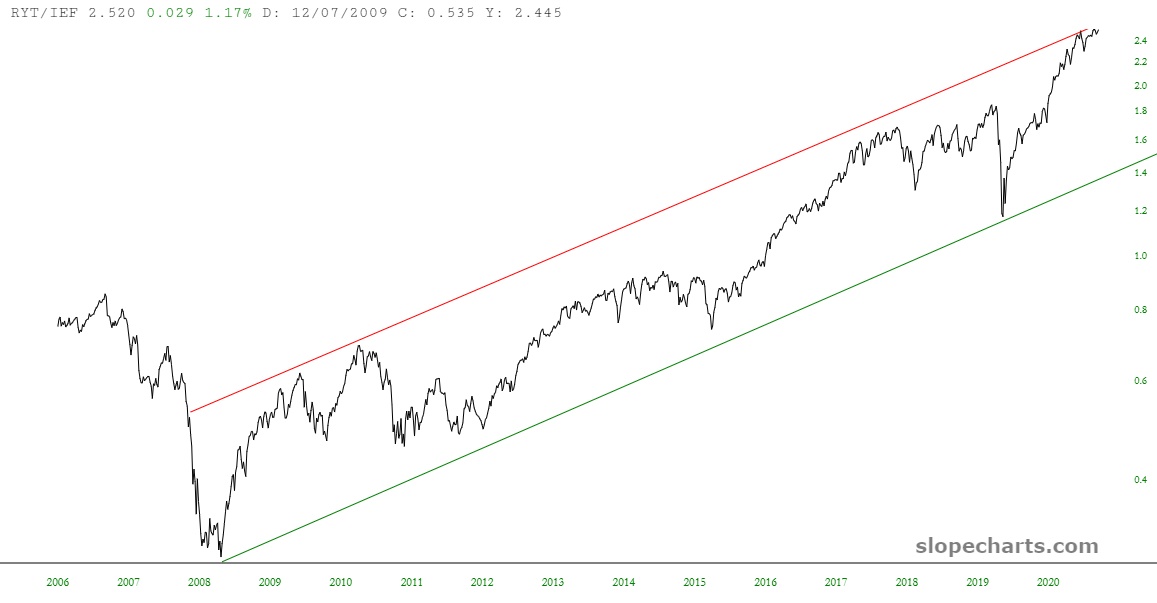
And just to drive the point home one similar way, below is as ratio chart of two similar instruments to the pair above: in this instance, it is RYT (the S&P equal weight technology index) and the IEF (the 7-10 year Treasury bond fund). We can see a superb channel here also and, surprise, surprise, present price levels are mashed right up against resistance.
Disclaimer: This is not meant to be a recommendation to buy or to sell securities nor an offer to buy or sell securities. Before selling or buying any stock or other investment you should consult ...
more

