
Real Earnings Of Private Employees Improved In March
Here is a look at two key numbers in Friday's monthly employment report for March:
|
The government has been tracking the data for Production and Nonsupervisory Employees for decades. But coverage of Total Private Employees only dates from March 2006.
Let's examine the broader series, which goes back far enough to show the trend since before the Great Recession. I want to look closely at a five-snapshot sequence.
First, here is a chart of the Average Hourly Earnings. I've included a linear regression through the data to highlight the trend. Hourly earnings increased at a faster pace through 2008, but the pace slowed from early 2009 onward.

But the hourly earnings above are nominal (not adjusted for inflation). Let's look at the same data adjusted for inflation using the Consumer Price Index. Since the government series above is seasonally adjusted, I've used the seasonally adjusted CPI, and I've chained the series to the dollar value of the latest month of hourly wages so that the numbers reflect the purchasing power in today's dollars. As we see, the difference is amazing.

The decline in real wages at the onset of the recession accords with our expectations. But why the rise in the middle of the recession when the Financial Crisis began unfolding in earnest? Let's add another data series to the mix: Average Hours per Week. About eight months into the recession, hours per week began to fall. The number bottomed a few months before the recession ended and then began increasing a few months after it ended.
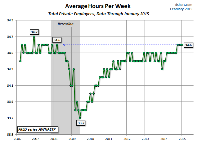
For a better understanding of the relationship between hourly earnings and the average work week, let's overlay the two. We see a striking inverse correlation during the Financial Crisis. And by the Fall of 2010, the two began to reverse their directions.

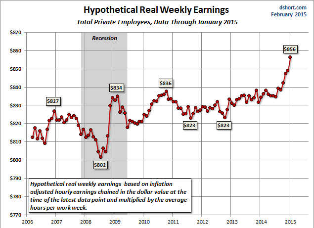
The next chart multiplies Real Average Hourly Earnings times the Average Hours Per Week for a snapshot of the trend in weekly wages.
Finally, let's create a snapshot of hypothetical expected real annual earnings by multiplying the weekly earnings times 50 (yes, a couple of weeks of unpaid vacation).
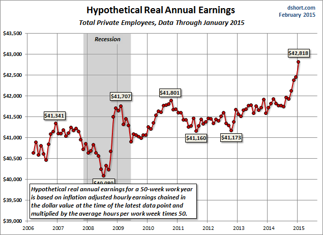
The key word in the chart title is "hypothetical" because among the various factors not included in our calculation is the fact that the employed population is constantly changing, and the rate and types of change accelerate in proximity to recessions. Employees are terminated, shifted to part-time or replaced by part-time employees. During recoveries, new employees are added.
The Great Recession is now well behind us. But the last chart above offers a reminder of the sluggishness of the recovery at this point -- approaching five years after the recession ended. The post-recession real annual earnings peaked in September 2010, hit an interim low in August 2011 and a lower low in October 2012. It has subsequently rebounded to an interim high just below the 2010 peak.
In Summary...
- Nominal average hourly earnings are a penny off the all-time high set last month.
- Real average hourly earnings are 18 cents below the December 2008 high.
- Hypothetical weekly earnings, rounded to the dollar, are $1 below the previous high in September 2010.
- Hypothetical annual earnings are $30 below the September 2010 peak.
© Copyright 2013, Advisor Perspectives, Inc. All rights reserved.


