
The Third Estimate for Q2 GDP came in at -0.6% (-0.58% to two decimals), down from -1.6% (1.57% to two decimals) in Q4 2021. With a per-capita adjustment, the headline number is lower at -0.80% to two decimal points.
Here is a chart of real GDP per capita growth since 1960. For this analysis, we've chained in today's dollar for the inflation adjustment. The per-capita calculation is based on quarterly aggregates of mid-month population estimates by the Bureau of Economic Analysis, which date from 1959 (hence our 1960 starting date for this chart, even though quarterly GDP has is available since 1947). The population data is available in the FRED series POPTHM. The logarithmic vertical axis ensures that the highlighted contractions have the same relative scale.
The chart includes an exponential regression through the data using the Excel GROWTH function to give us a sense of the historical trend. The regression illustrates the fact that the trend since the Great Recession has a visibly lower slope than the long-term trend. In fact, the current GDP per-capita is 8.0% below the pre-recession trend (2008).
(Click on image to enlarge)
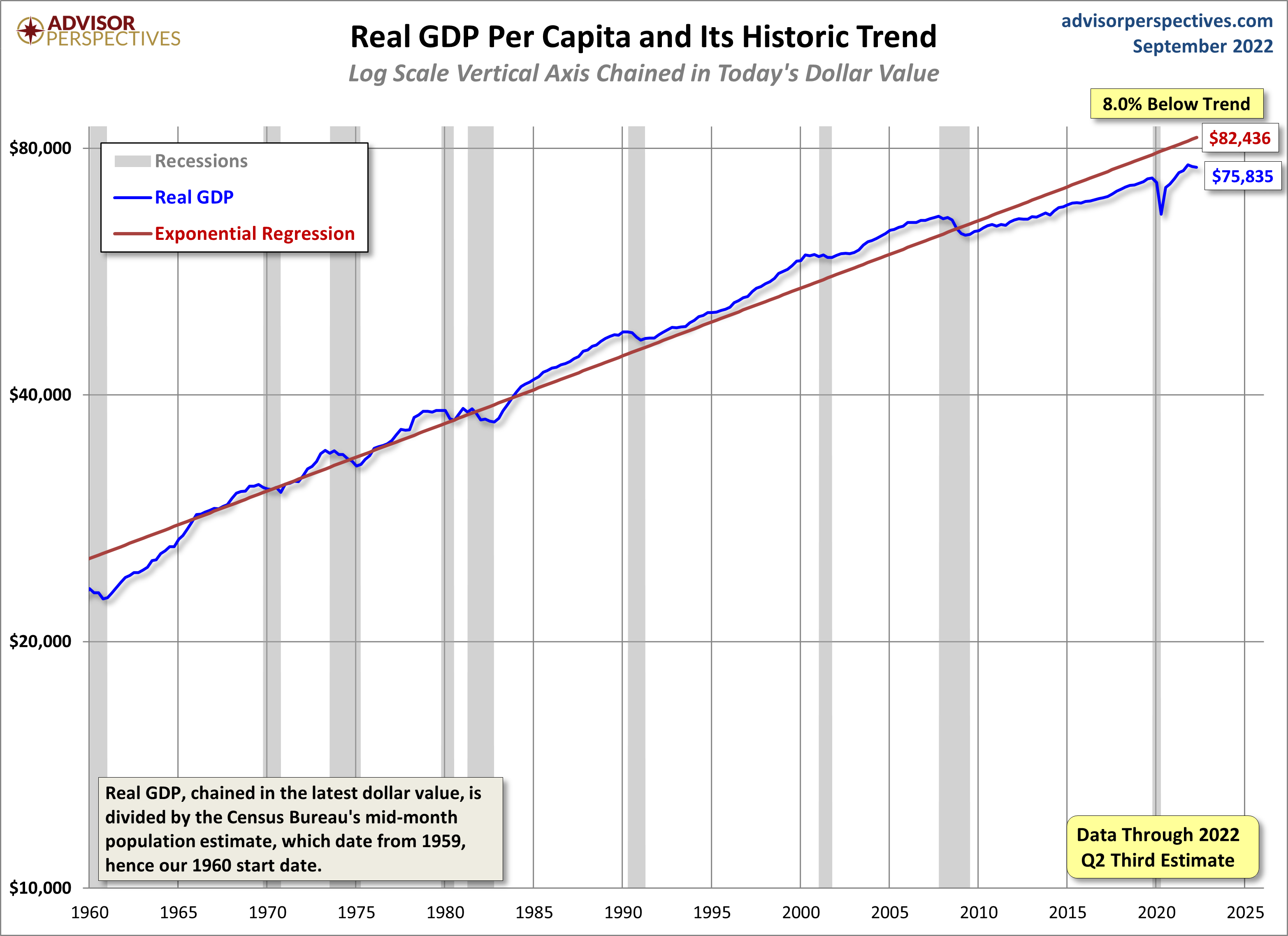
The real per-capita series gives us a better understanding of the depth and duration of GDP contractions. As we can see, since our 1960 starting point, the recession that began in December 2007 is associated with a deeper trough than previous contractions, which perhaps justifies its nickname as the Great Recession.
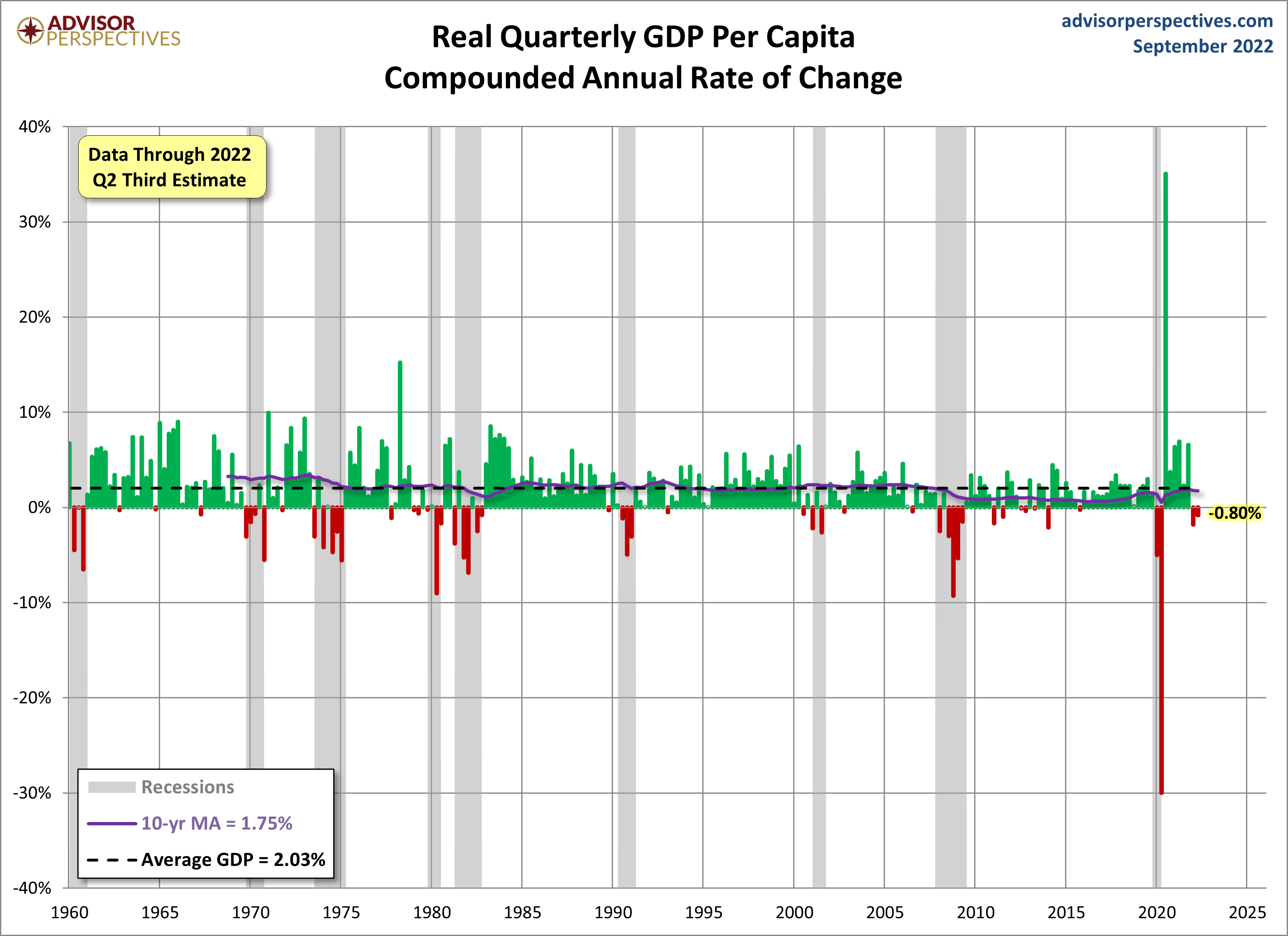
Quarterly GDP Compounded Annual Rate of Change
The standard measure of GDP in the US is expressed as the compounded annual rate of change from one quarter to the next. The current real GDP is -0.6%. But with a per-capita adjustment, the data series is lower at -0.8%. The 10-year moving average illustrates that US economic growth has slowed dramatically since the last recession and dropped significantly at the start of the COVID-19 recession, only to bounce back soon after.
(Click on image to enlarge)
GDP per capita, as we've seen, is a weaker series than GDP. What does it suggest about recession risk? The next chart shows the YoY change in real GDP per capita since 1960. We've again highlighted recessions. The red dots show the YoY real GDP for the quarter before the recession began, and the dotted line gives us a sense of how the current level compares to recession starts since 1960. This chart suggests that, despite chronic weakness in the economy, this indicator is not recessionary. That said, we must remember that GDP is a heavily revised lagging indicator.
(Click on image to enlarge)
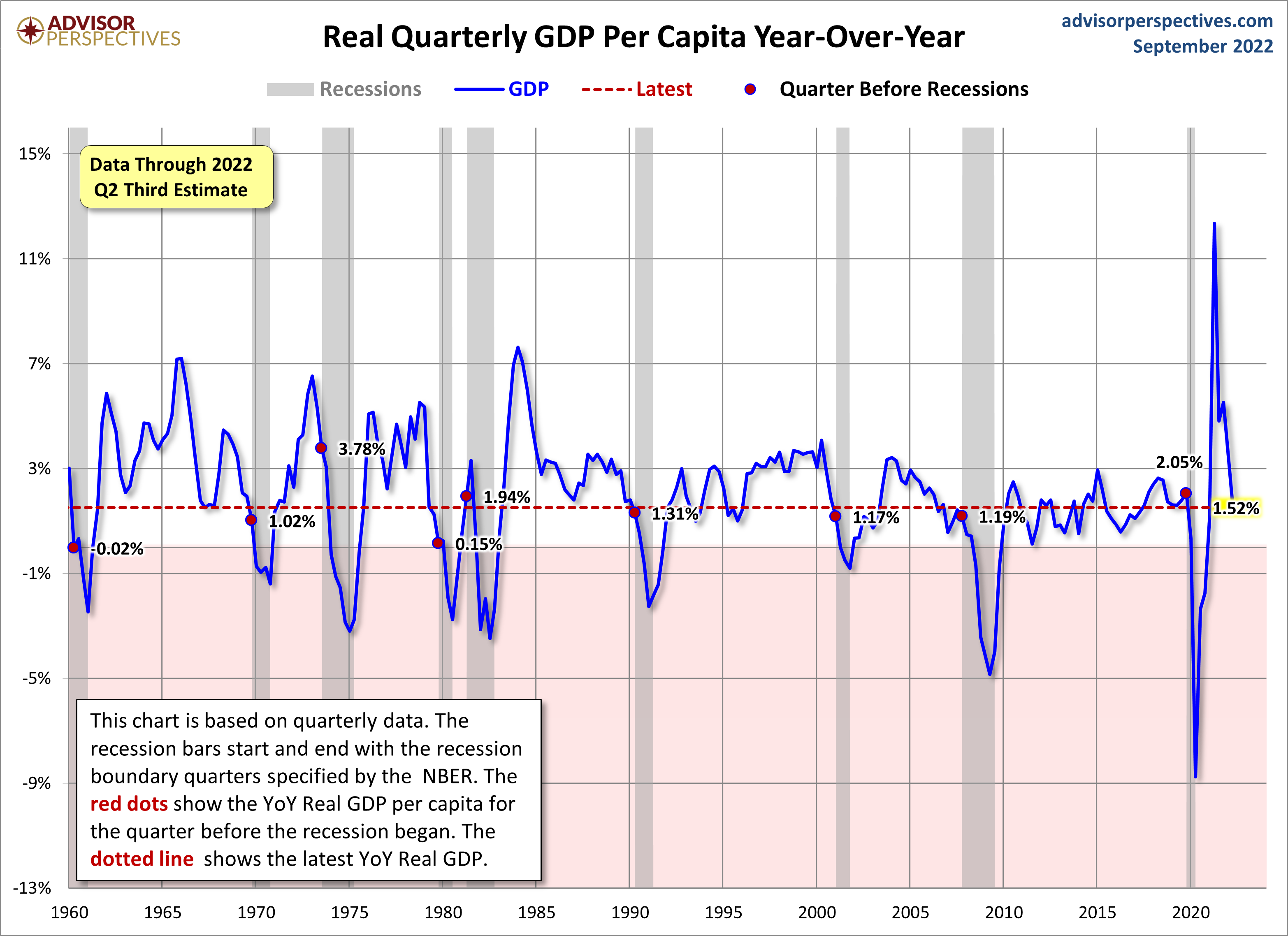
The current YoY at 1.52% is now below the 2.02% average value of the eight recession starts in the chart above.
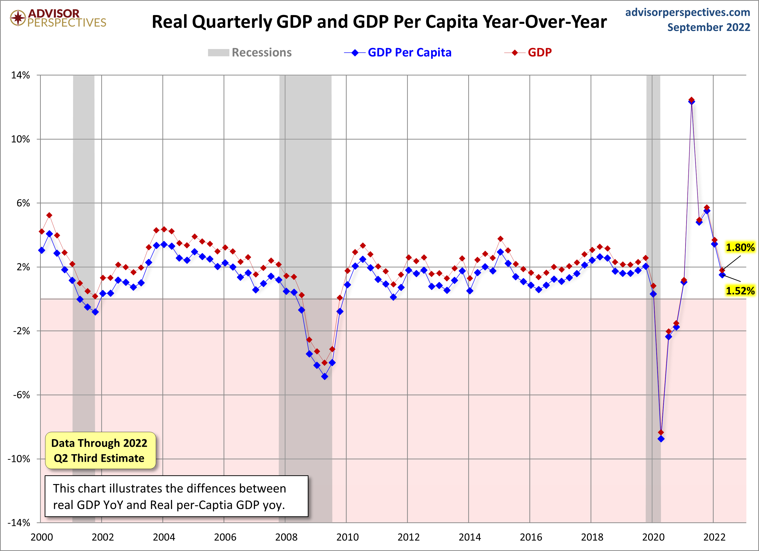
How do the two compare YoY series compare, GDP and GDP per capita? Here is an overlay of the two in the 21st century.
(Click on image to enlarge)
More By This Author:
Q2 GDP Third Estimate: Real GDP At -0.6%, As ExpectedCryptocurrencies Through Wednesday, Sept. 28
Pending Home Sales Waned In August

Comments
Log in or sign up to join the conversation.