Moving Averages In Extended Market Climates - Part Three
<< Read More Moving Averages In Extended Market Climates Part Two - The Countdown Clock
<< Read More: Moving Averages In Extended Market Climates
For starters lets pick up with the chart we left off with the other day.
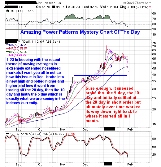
In the chart above we walked thru what I call the countdown clock when it came to moving averages in extended market climates and what it leads to once there are no more moving averages to trade off of. 1-27-18 As I write this our indexes are currently above the 5 day moving average. Its only a matter of time before it burns itself out to the upside much like our mystery chart did as shown above.
As you can see after its initial break to the downside once the moving average countdown clock went to zero, initially it blew thru all the moving averages I mentioned the other day. While it even broke the 50 day average it did end up stalling out at a prior side to side support as shown in blue and that is why I always am drawing support lines for you. In the process it went from $75 to $40 in about one month's time. If that doesn't wake you up to the dangers of chasing stocks out of FOMO in extended issues and market climates I don't know what does. Consider this what I like to call the 1st shot across the bow to the downside.
But this is where it gets interesting.After tagging a side to side support zone here too came the famous snap back rally that took it from $40 to almost $60 in like 4 days at the beginning of Feb.
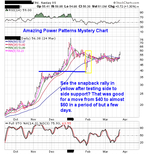
A key point here is just because a stock has been selling off does not mean you chase it on the short side because that snap back rally from $40 to almost $60ended up ripping ones face off in the process had they chased a bus on the short side of the market.
As for our mystery chart of the day and who is it?
Its one of the biggest and baddest names of the party like its 1999 dotcom bull market cycle.
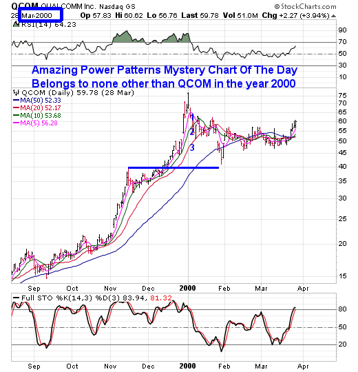
Moving on you can see the dust settled and the stock one could say went thru a period of base building or even one could say the bottom of a cup for almost two months.
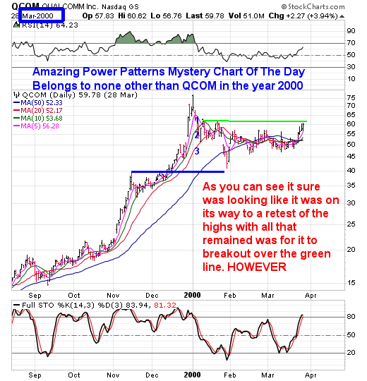
However when we look at what the Nasdaq index was doing at that moment in time we see what?
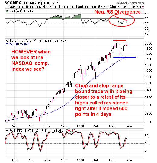
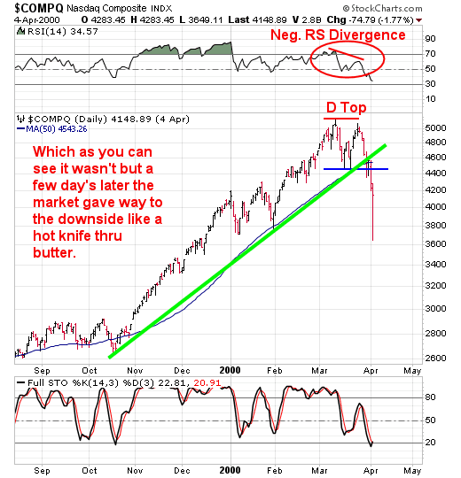
So what did that do to QCOM? Simple, in tandem with the indexes it too followed to the downside.
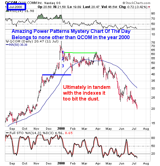
Ever hear the phrase "Follow The Leaders"?Most associate that phrase with up trending markets BUT, its a two way street, hence the adage:
"When The Leaders Start Rolling Over Pay Attention As The Rest Of The Market May Not Be Far Behind"
One look at QCOM AFTER its Moving Average burnout clock expired and one can seeit topped BEFORE the market did. That drop from its peak (where Wall St. was all "The sky's the limit" by upping estimates by the way) was like I've mentioned earlier , its 1st shot across the bow to the downside.
Now lets talk about what a bear market rally is. Keep in mind I'm only going to scratch the surface here for now due to time constraints. Remember, more often than not markets do not go straight down without backing and filling along the way. Think the bunny hop to the downside. Two steps down, one step up, two steps down and so on. In the chart below I want you to look at the yellow box.THAT, is your bear market rally, feeble in this case but it is what it is compared to others I've seen.
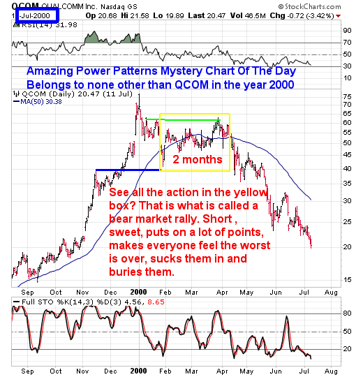
Consider everything within the yellow box as a two month period of time where one could say the worst was over, this is just a correction. That was the mindset out there anyway. When it comes to bear market rallies I like to think of them as:
"Just when you think its safe to get back into the water that is when the sharks show up".
We've all heard the phrase "Tops Are A Process". Consider this chart a good example of that.
So, now that I've walked you thru the mechanics of what climax runs can lead to, at the least consider this the first step towards being prepared when the time comes.
Remember, like I've said climax runs are the beginning of the end of a bull market cycle. We've seen that in the year 1929, 2000, and 2007. Know what else those periods of time leading up to those tops had in common?
All the news out there was good, great and over the top (sound familiar?). All the Wall St. analysts were constantly raising estimates and projections for the year to come (sound familiar?) all AFTER the market has already ran for months on end.
Does all this sound familiar? It should, here is another example, can you say bitcoin in December 2017 when it made its moving average burnout climax run and was sitting at like 20,000 or whatever absurd number it was with people coming out of the woodwork saying sky's the limit and throwing out crazy numbers like 40,000 AFTER its gone from like 1000 to 20,000? And lets not forget our FB feeds and every financial news web portal littered with advertising about it being the next big thing AFTER it already WAS the big thing.
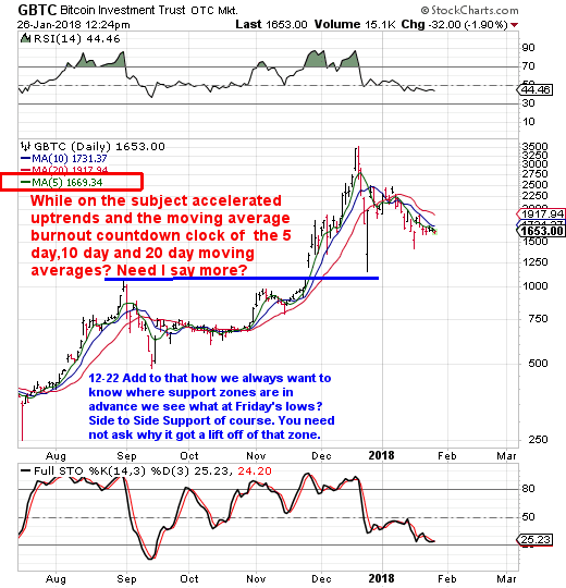
Look, I don't know if indeed we are currently going to follow the same script here in our markets like QCOM did and Bitcoin currently is. All I am pointing out are the similarities and they are strikingly similar. I'd rather you all be aware of what this could lead to over time than to be a deer in the headlights. Only time will tell and yes tops are a process of time, price and charts.
Its because of all that we've just gone thru the last four or so days with this educational segment that we are sitting in a high cash position.Believe me, its been a long time since our markets have gone thru what we just went thru month to date.
Heck, I heard the other day that the last time the markets have ran this long WITHOUT so much as a 5% correction was 90 years ago. Let that sink in.
Now given complacency reigns supreme and also that the last time we had an actual real normal correction, it also means there is a lot of emotional money that has forgot what happens to growth stocks (and in this instance mom and pop Dow type stocks which one could say are trading like growth stocks this go around) when a traditional 5%er hits the tape.
Lastly, as for the Moving Average Countdown Clock from part one and two of this series? Take a look at QCOM in the year 2000 and right below it the index charts.

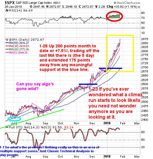
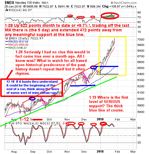
Can you say strikingly similar? Again, much like my comments above on Bitcoin's similarities with QCOM's the same applies- I'm not saying this is the route our current markets are going to go because we're all smart enough to know that nobody out there no matter what they say knows exactly what the market is going to do as the market is the boss not you nor I, all I'm pointing out is the symmetry here of the past. All of which leads me to the old adage of: "History may not repeat itself but a lot of times it often rhymes"
People, at the current unsustainable rate of climb in the market's here its not about making money anymore, its about protecting it vs running the risk of being a potential deer in the headlights should even a 5% correction takes place. Especially when you have names that look like the indexes do technically speaking here.
Disclosure: None.
Disclaimer: THESE ARE NOT BUY RECOMMENDATIONS! Comments contained in the body of this report are technical opinions only. The material herein has been obtained from sources ...
more


Superb post
Yes, he's always good.