Money Supply Growth Continues Massive Divergence From History

The 13-week annualized non-seasonally adjusted money supply growth rate is crashing at a time when it typically moves up. The market is becoming increasingly more vulnerable to a major event in the weeks or months ahead. Let’s take a look at the data…
Recent Trends
Seasonally Adjusted Money Supply in November was negative for a fourth consecutive month, coming in at -$63B. This makes 6 of the last 8 months contractionary in seasonally adjusted M2.
(Click on images to enlarge)
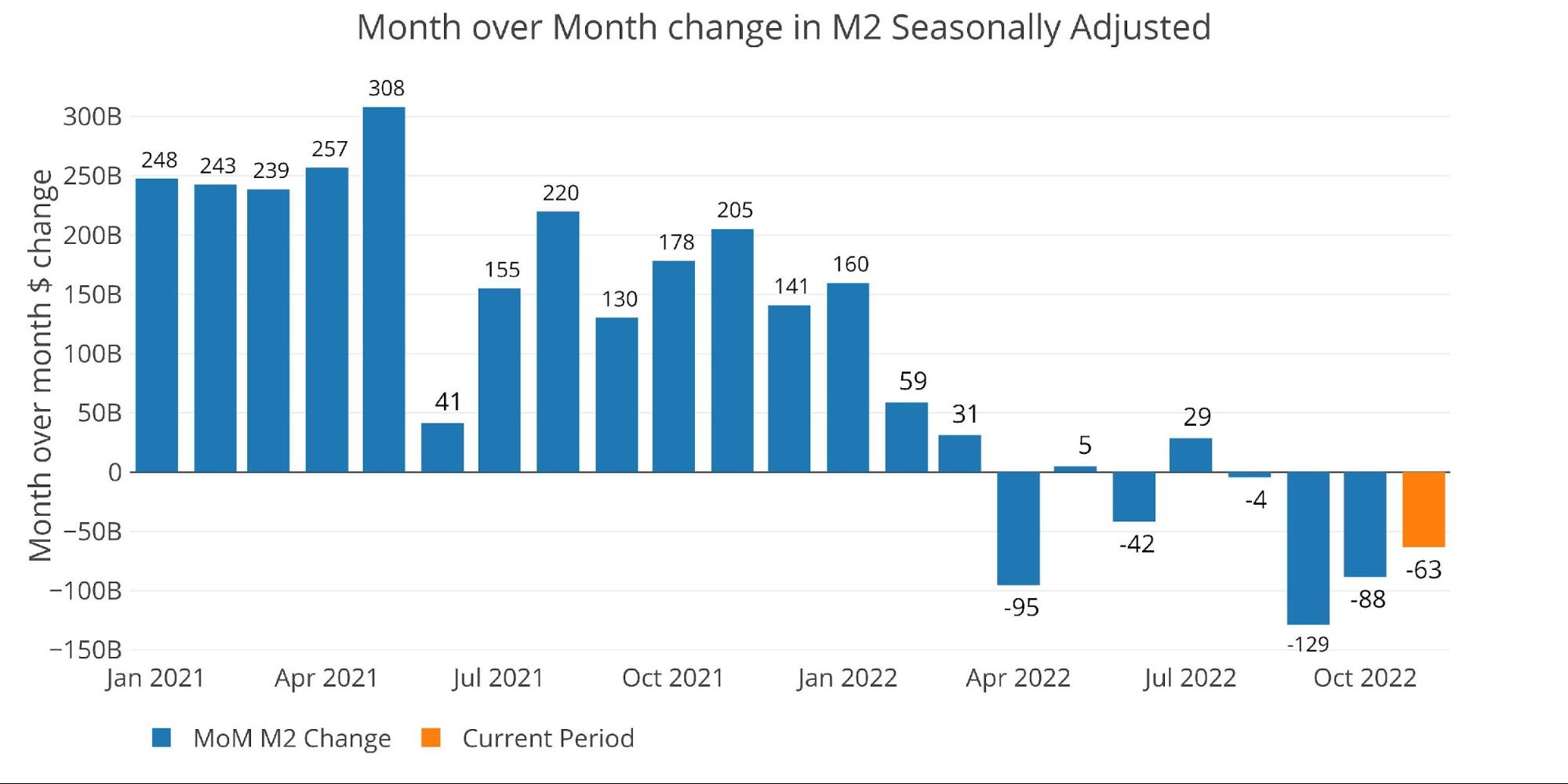
Figure: 1 MoM M2 Change (Seasonally Adjusted)
Figure 2 below shows non-seasonally adjusted money supply which is a bit more erratic and is also slightly ahead of seasonally adjusted. On a raw basis, December has finally seen a meaningful increase in Money Supply for the first time since March. This could change, however, as only one week for December has been counted so far.
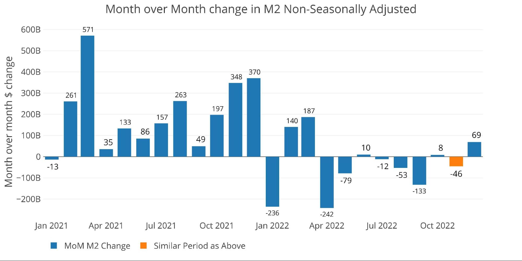
Figure: 2 MoM M2 Change (Non-Seasonally Adjusted)
Looking at seasonally adjusted, the latest month is below the 6-month average growth rate (-3.5% vs -2.7%). The 1-year growth rate is now exactly 0% while the 3-year has fallen to 11.9%. Please note that as of this past January, the 3-year growth rate was as high as 14.6% with 1-year growth at 13.1%

Figure: 3 M2 Growth Rates
When looking at the average monthly growth rate, before Covid, November historically expands at an annualized rate of 5.2%. This year missed by an incredible 870 bps.
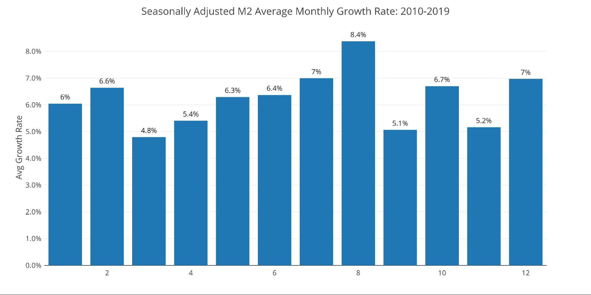
Figure: 4 Average Monthly Growth Rates
The Fed only offers weekly data that is not seasonally adjusted. As the chart below shows, the most recent week is positive which is driving December positive in Figure 2. This is the week ending December 5th so does not include most of December.
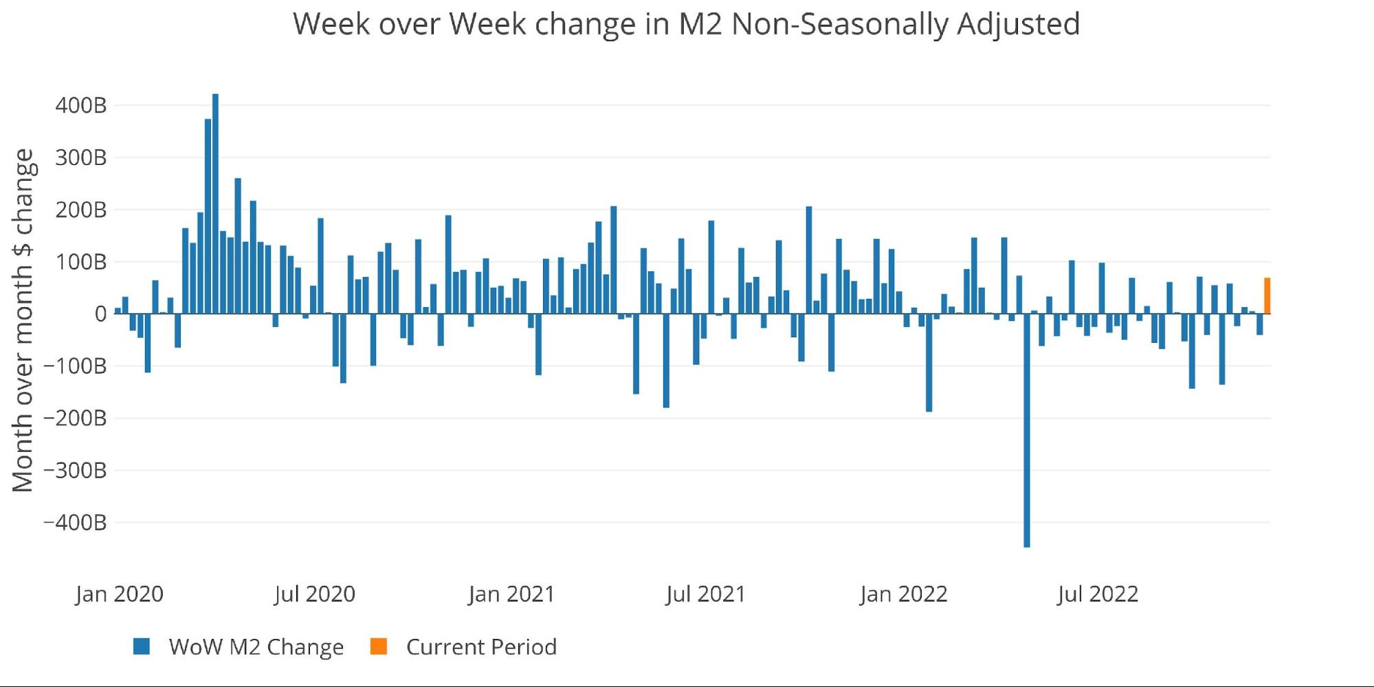
Figure: 5 WoW M2 Change
The “Wenzel” 13-week Money Supply
The late Robert Wenzel of Economic Policy Journal used a modified calculation to track Money Supply. He used a trailing 13-week average growth rate annualized as defined in his book The Fed Flunks. He specifically used the weekly data that was not seasonally adjusted. His analogy was that in order to know what to wear outside, he wants to know the current weather, not temperatures that have been averaged throughout the year.
The objective of the 13-week average is to smooth some of the choppy data without bringing in too much history that could blind someone from seeing what’s in front of them. The 13-week average growth rate can be seen in the table below. Decelerating trends are in red and accelerating trends in green.
Growth has fallen to -3.48% decelerating for the seventh week in a row. This follows 11 weeks of increasing growth rate, or more accurately decreasing negative growth rate. As shown below, the vast majority of weeks over the last year have seen a deceleration in money supply growth.

![]()
![]()
Figure: 6 WoW Trailing 13-week Average Money Supply Growth
The plot below really helps show the current divergence seen in M2. While only 10 years are shown, even showing 25 years would highlight the current year as a major divergence from history. This is an epic slowdown in money supply growth that is unprecedented.
The Fed may be confident in their rate hikes and the resiliency of the economy, but they are playing with serious fire. They have put the entire economy at serious risk of a major event as the liquidity has dried up extremely fast.
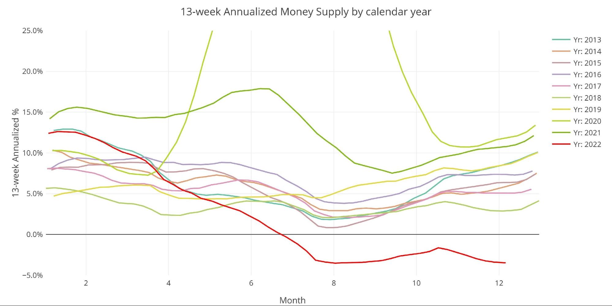
Figure: 7 Yearly 13-week Overlay
Behind the Inflation Curve
Incredibly, even with the contracting money supply, the Fed is still not doing enough to solve the inflation problem. To combat rising prices, the Fed would need to undo most of the money it has created over the last several years. This would require bringing interest rates above the rate of inflation to really collapse the money supply.
The growth rate for 2022 is exactly 0 which is why the bar cannot be seen on the far right of the graph below. While the drop has been extreme, it must be noted that we were coming from record levels of growth. Bringing the YoY growth rate to zero will not be enough to combat the raging inflation fire, but it will be enough to crash the economy that is completely dependent on easy money and high liquidity.
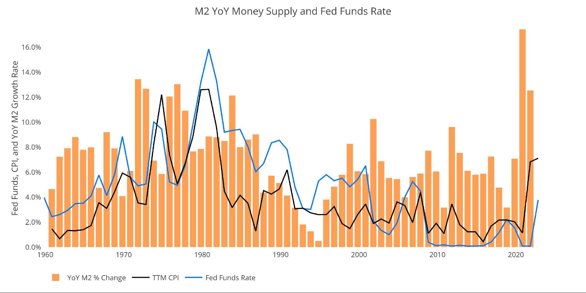
Figure: 8 YoY M2 Change with CPI and Fed Funds
Historical Perspective
The charts below are designed to put the current trends into historical perspective. The orange bars represent annualized percentage change rather than raw dollar amount. The current slowdown can be seen clearly on the right side.
The Money Supply slowdown is a major driver of the weakness seen in the stock market over the last several months. The massive increase seen in 2020 is what pushed the market to explode higher. Now the stock market is out of fuel which has left it directionless over the last several months.

Figure: 9 M2 with Growth Rate
Taking a historical look at the 13-week annualized average also shows the current predicament. This chart overlays the log return of the S&P. Mr. Wenzel proposed that large drops in Money Supply could be a sign of stock market pullbacks. His theory, derived from Murray Rothbard, states that when the market experiences a shrinking growth rate of Money Supply (or even negative) it can create liquidity issues in the stock market, leading to a sell-off.
While not a perfect predictive tool, many of the dips in Money Supply precede market dips. Specifically, the major dips in 2002 and 2008 from +10% down to 0%. The economy is now grappling with a peak growth rate of 63.7% in July 2020 down to -3.4%. This is a major collapse.
Amazingly, the stock market has held up as well as it has, but likely that is because the major events have not yet manifested themselves. The collapse has been so sudden and significant that it hasn’t had time to be fully digested by the market. As time wears on, the rot from 12 years of easy money will begin to manifest.
Please note the chart only shows market data through December 5th to align with available M2 data.
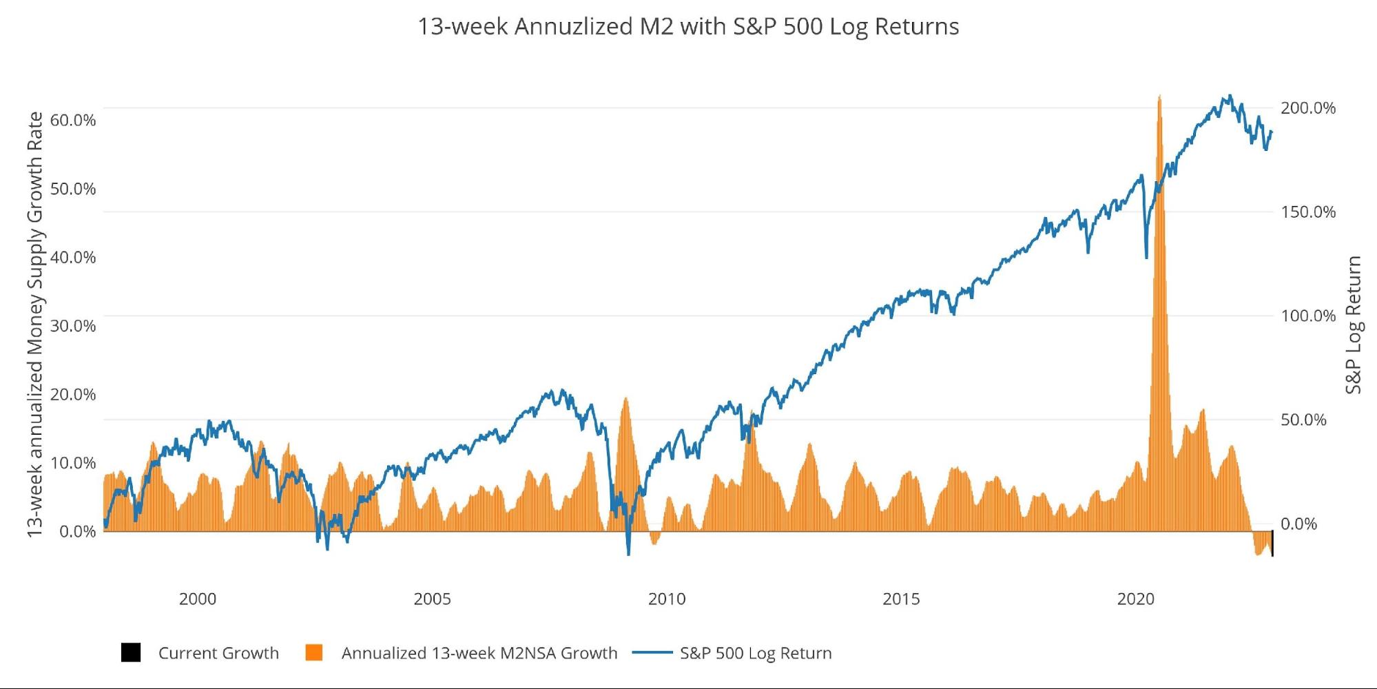
Figure: 10 13-week M2 Annualized and S&P 500
One other consideration is the massive liquidity buildup in the system. The Fed offers Reverse Repurchase Agreements (reverse repos). This is a tool that allows financial institutions to swap cash for instruments on the Fed balance sheet.
Current Reverse Repos peaked at $2.42T on Sept. 30. The value always tops out at the quarter end but it does not look like this quarter will see a new record with the amount “only” at $2.2T. The fall in money supply is finally starting to weigh on the reverse repo market.
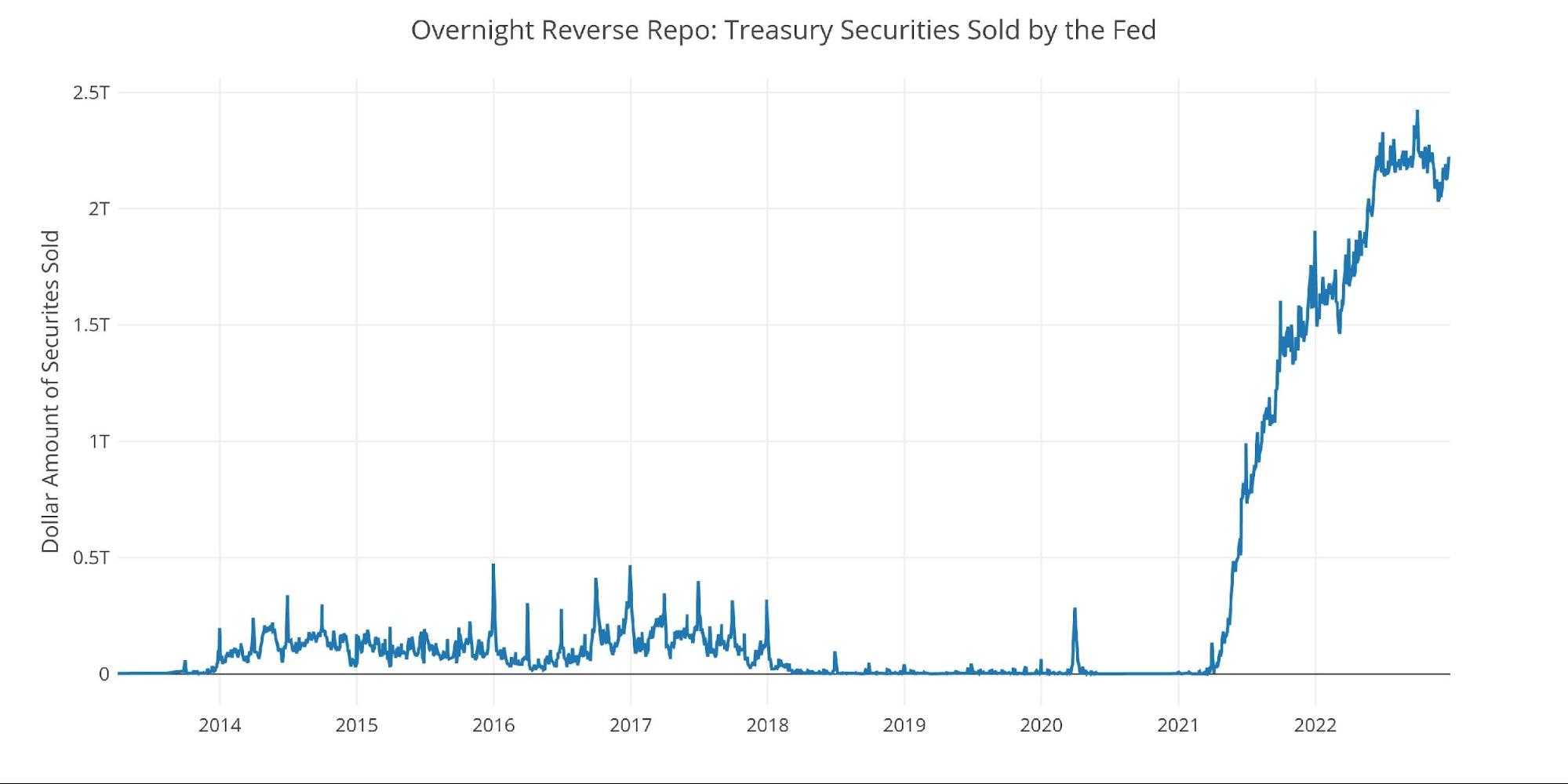
Figure: 11 Fed Reverse Repurchase Agreements
What it means for Gold and Silver
The market is currently experiencing an epic slowdown in the Money Supply growth rate. Based on historical data, Money Supply growth tends to bottom in August and start moving up in September. That increase has run out of steam quickly and turned back down in a big way revisiting the lows from August. This has not happened before.
As 2023 gets started, there could be major risks for the stock market and economy at large. The Fed has been lucky so far to not see a major catastrophe. The Fed likely moved fast enough so that when something happens, they can even save face and claim victory. “We have proven we can defeat inflation, but there is a much bigger risk facing the economy right now”.
Of course, the Fed will deny the fact that they created the risk by using easy money followed by collapsing the money supply. When the Fed does pivot, the market should finally figure out that the Fed has no way out of the easy money without an unbearable collapse in the stock market and economy. At this point, gold and silver will take off and never look back.
Data Source: https://fred.stlouisfed.org/series/M2SL and also series WM2NS and RRPONTSYD. Historical data changes over time so numbers of future articles may not match exactly. M1 is not used because the calculation was recently changed and backdated to March 2020, distorting the graph.
Data Updated: Monthly on fourth Tuesday of the month on 3-week lag
Most recent data: Dec 05, 2022
Interactive charts and graphs can always be found on the Exploring Finance dashboard: https://exploringfinance.shinyapps.io/USDebt/
More By This Author:
Fed’s Favorite Price Inflation Measure Comes In Slightly Hotter Than ExpectedBig Spending Bill Is A Big Problem For The Fed’s Inflation Fight
Gold And Silver Are Setting Up For A Strong Advance In 2023


