Markets On The Brink - Bad News, Or...
There are several major markets sitting at critical long-term inflection points.
Here's a collection of charts with key levels illustrated with trend lines in black. The intention of this post is to have you see how so many markets are at price points that could lead to major reversals or breakouts!
I've put brief comments next to most of them.
The big question is will the SPY break the closing basis trendline from the 2016 lows and the breakout level of 212!

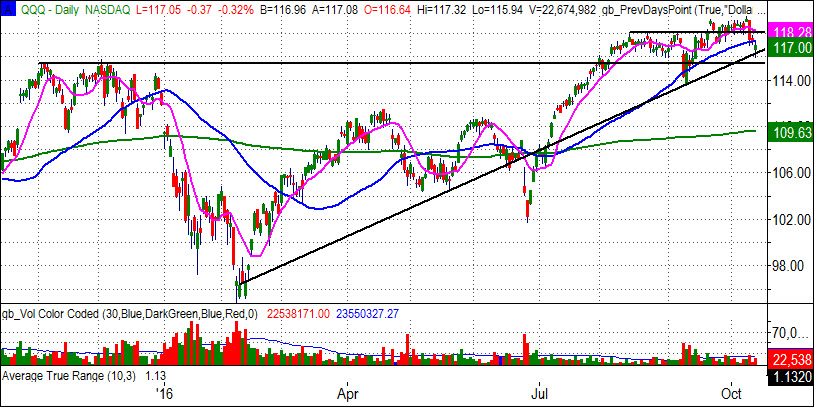
This line in the QQQ illustrates the basic rising support levels if you ignore the Brexit hiccup.

This weekly view of IWM shows the intersection of the trendline form the 2016 lows and the historical significance of 120.

The general feeling in the market is rates will rise, but TLT has a lot of support at 132. The green line is the 200-day MA. Like most of the charts on this page this is a logical place to hold, and a potentially big drop if it breaks.

As you might expect, this weekly view of the Dollar index tells a similar story as the TLT. It's broken a major resistance line and looks as if it expects higher interest rates. A big move up from here would have many analysts turn more bearish on stocks.

Gold broke hard last week from a logical level, and along with the up move in UUP and down move in TLT. It all makes sense, and just like the TLT, it sits on the 200-day MA for the first time since it turned up earlier this year. The blue line on this weekly chart is a 50-week average.

HEDJ, the European Equities hedged for currencies has spent a lot of time at the very pivotal area around 56.

FXI has had a nice run. In this chart you can see the green line (200-week MA) has been a very pivotal area at least 6 times in the last 5 years.

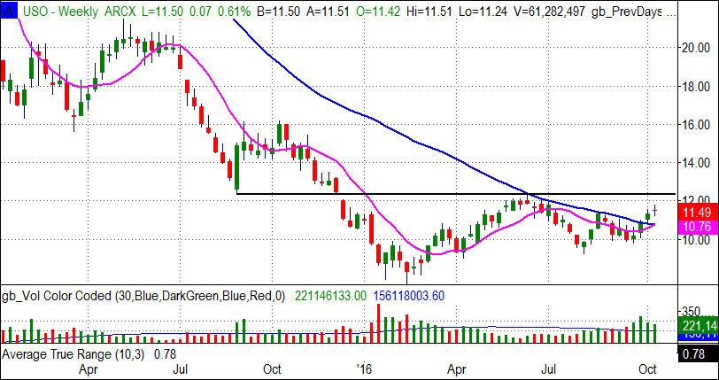
On a weekly basis USO has a well developed base with and interesting pick up in volume as it breaks over the 50-week MA for the first time since the collapse. However, the 12.40 area is the big number to watch.

Finally, with stocks pulling back, the strongest index, Nasdaq (QQQ) is experiencing rising number of new 52 week lows (see red histogram chart below). This is a sign of weakness that should be treated as a significant warning.

Disclosure: None.


thanks for sharing
Great set of charts, thank you.