Market Relief Rally: Analyzing Key Resistance Levels In 21 ETFs

Image Source: Pixabay
The past few days have provided a much-needed relief rally to the market as a whole. Across a wide span of financial assets, a quick and powerful upsurge has sprung prices from the depths toward what I perceive as vitally-important zones of resistance. These take the form of price gaps, Fibonacci resistance levels, or simple horizontal lines, but in each case, it will take very little to complete the trip to these exhaustion zones (or, if you’re inclined to be bullish, the same charts show that it wouldn’t take very much to violate these levels of resistance and put even more wind into the bullish sails).
Below are twenty-one ETFs that I believe illustrate this succinctly. I’ll share a few words preceding each chart to summarize why I think it is at a meaningful price juncture.
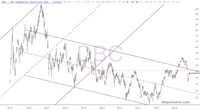
We start with the commodities fund, which re-penetrated its descending price channel and formed a small rounded top. The war in Gaza pushed oil prices strongly higher, but the price gap caused between Friday and Monday is close to being sealed. Oil is the biggest component of DBC.
The Dow 30 Industrials broke a substantial trendline many weeks ago, and the rally over the course of Friday, Monday, and Tuesday has brought prices back to the horizontal, which is the base of a right triangle top.
The EFA is particularly impressive, because the pink tinted zone constitutes a very clean head and shoulders topping pattern, and the dashed line represents the neckline. Moreover, this H&S top is neatly beneath a massive failed ascending trendline.
Gold, by way of the GLD fund, broke beneath a symmetric triangle pattern. This might only be about 60% done with its bounce, but I believe firm resistance is represented by both the blue trendline as well as the magenta-colored horizontal.
The IEFA, which is similarly constituted as the EFA, also has an H&S top, and the light blue tint shows the large area of overhead supply.
Homebuilders, represented by the ITB, broke below a long-standing horizontal line. I think there’s plenty more to go on the downside here.
The small caps have been meandering along a tremendous and long-standing sine-wave pattern for the past couple of years. It has become very oversold a week ago, but this extreme has been eliminated, and the blue horizontal line represents a median for this sine-wave as well as, conveniently, the neckline of another H&S top.
Banks, which are closely aligned with small caps, likewise have bounced mightily, yet the dashed blue line will be a formidable foe for any further price ascent.
Corporate bonds, as with all other interest-sensitive funds, have rallied recently, causing some relief to interest rate markets .The blue line, only a little above Tuesday’s high price, will be a crucial test.
The price gap for the mid-cap markets is the key resistance point for MDY.
Municipal bonds, which collapsed beneath a lifelong-long trendline (in red) is just beneath that line, which has transformed its role from support to that of resistance.
Here we see the S&P 100 fund, and its price gap has already been perfectly closed.
Silver has been week for almost the entirety of 2023, and it is just beneath a price gap that should prove to be a strong limit to any further recovery bounce.
As with the OEF, its bigger brother SPY has a nearby price gap that was established several weeks ago and will be a vitally important test. If SPY manages to push above this level, the next test is only slightly higher, which represents a major Fibonacci Retracement level.
Here is oil, which as mentioned above with DBC, has formed a small rounded top and has bounced just beneath it, thanks to the conflict in the Middle East.
Homebuilders have broken a huge wedge pattern, and the pink zone represents a price level that will be difficult for the fund to re-enter.
Another flavor of industrials, the XLI, is beneath a broken ascending trendline as well as a zone of tremendous overhead supply represented by the dashed line.
Consumer Discretionary had benefited from a well-formed bullish base (in green) but is not equally vulnerable to an opposing topping pattern (in pink).
On a different note, below are a couple of extraordinary sine-wave patterns which have been amazing in their temporal regularity. The Consumer Staples fund may have achieved an important bottom on Friday.
Similarly, retail may have bottomed, although it is far from a sure thing, considering the state of the rest of the equity market.
Lastly, the Dow Utility fund has performed sensationally as both a bearish and a bullish trading vehicle. Most recently, it has ascended powerfully toward the Fibonacci line shown below and is very close to achieving the target I set in place when it bounced off its lifelong bullish trendline last week.
More By This Author:
I tilt to the bearish side. Slope of Hope is not, and has never been, a provider of investment advice. So I take absolutely no responsibility for the losses – – or any credit ...
more


