
(Click on image to enlarge)
Key Takeaways
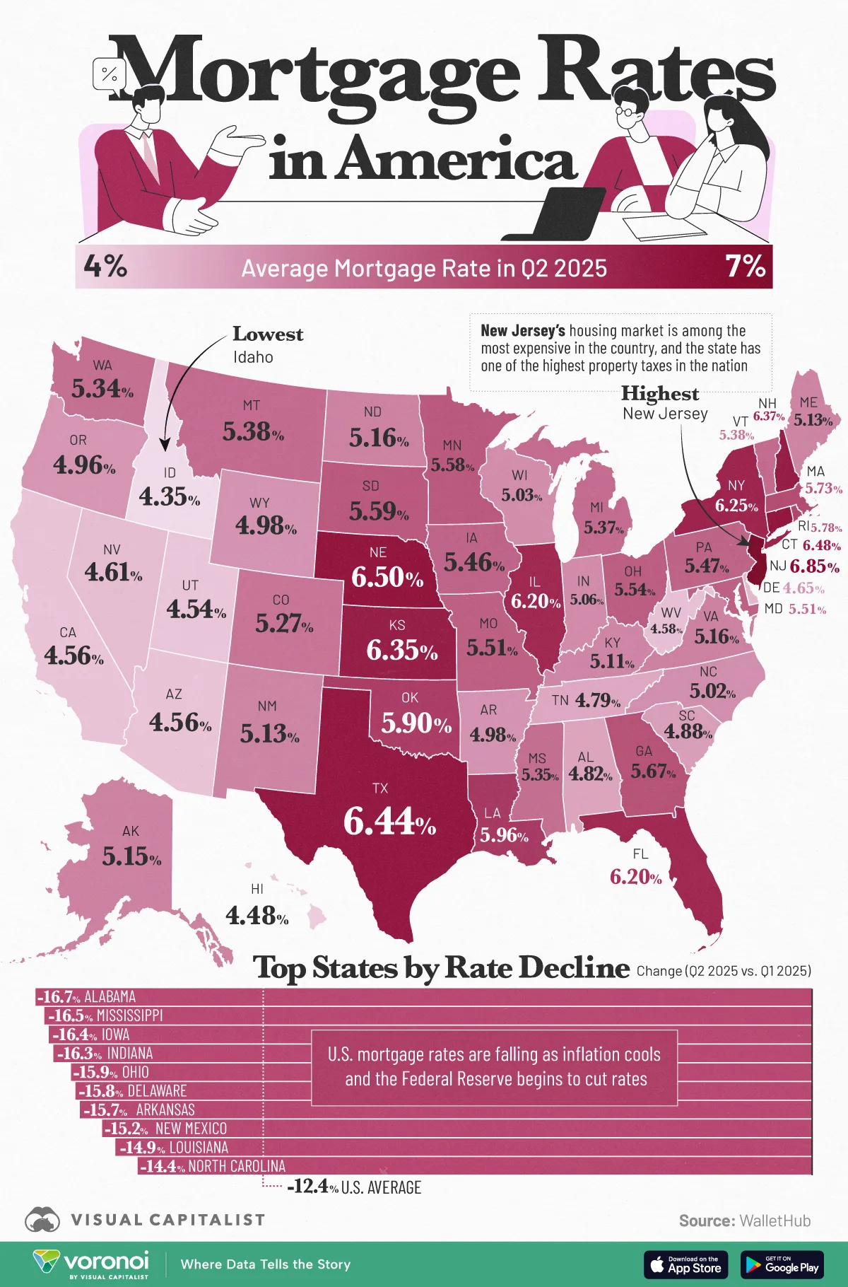
- New Jersey tops the nation with the highest average mortgage rate (6.85%) in Q2 2025.
- Alabama saw the largest quarter-over-quarter decrease in average mortgage rates (−16.7%).
After two years of high borrowing costs, mortgage rates eased in Q2 2025 across most U.S. states. Still, buying a home remains difficult. The median age of homebuyers has climbed from 30 in 2010 to a record 38 in 2024, showing that more Americans are entering the housing market later in life.
In this map, we chart the average home mortgage rate by state, based on data from WalletHub.
New Jersey Leads
At 6.85%, New Jersey has the highest average rate in Q2 2025. This lines up with its expensive housing market and one of the highest property tax burdens in the country. Nearby high-cost states like Connecticut (6.48%) and New York (6.25%) also sit near the top.
Meanwhile, a cluster of Western and Southern states anchor the lower end: Idaho (4.35%), Hawaii (4.48%), Utah (4.54%), California (4.56%), Arizona (4.56%), and South Carolina (4.88%).
Largest Quarter-Over-Quarter Movers
When comparing to Q1 2025, the biggest relative drop in mortgage rates occurs in Alabama (−16.7%), followed by Iowa (−16.4%), Indiana (−16.3%), Ohio (−15.9%), and Delaware (−15.8%).
Several Plains and Midwestern states—Nebraska (−14.2%), Kansas (−13.6%), and Missouri (−14.1%)—also recorded steep declines.
Market Expectations
After a Federal Reserve rate cut and a drop in 10-year Treasury yields, the average rate on 30-year mortgages has settled in the mid to low 6% range, down from nearly 7% earlier in the year.
Most forecasts expect rates to stay steady through the rest of 2025. The Mortgage Bankers Association predicts the average 30-year rate will end the year at 6.5%, while Fannie Mae projects 6.4%.
More By This Author:
Charted: Long-Term Unemployment In The U.S. (2005–2025)
Visualizing Global Wealth Inequality In 2025
Chart: Nvidia’s Market Cap Compared To Banks

Comments
Log in or sign up to join the conversation.