Jobs Report: 7 Of 8 Categories Below 12-Month Trend
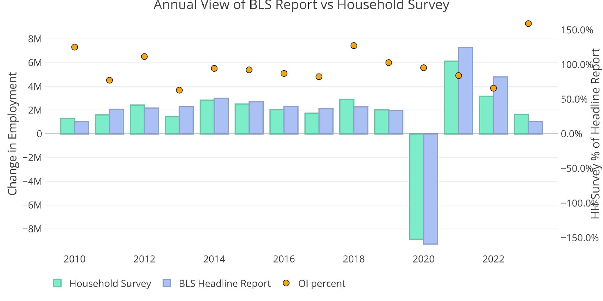
The BLS reported that 236k jobs were added in March. Similar to December and January, the Household survey greatly exceeded the Headline Report with 577k jobs added. The Household Survey was surprisingly strong given the current economic environment.
Figure: 1 Primary Report vs Household Survey – Monthly
Three months into the year, the Household Survey is actually exceeding the Headline Report by the largest margin ever. As of March, total jobs as reported by the Household Survey is 60% greater than the Headline Report. The next largest year was in 2018, when the Household Survey was greater by 27.5%.
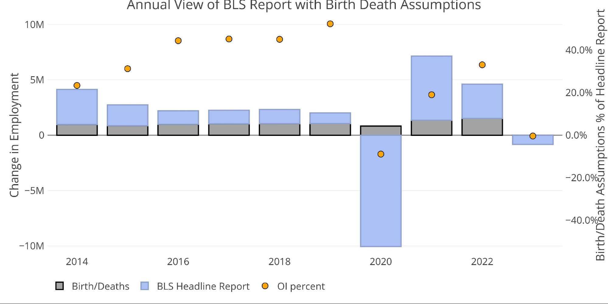
The BLS also publishes the data behind their Birth/Death assumptions. These are the jobs that the BLS assumes based on companies starting or closing. While the data is not seasonally adjusted, it directly impacts the Headline Report. The chart below shows the impact of Birth/Death jobs on the total number for the last several months.
March was a very modest number with a loss of 29k jobs due to the birth/death model. This is only the fourth negative month going back to March of last year.
Figure: 3 Primary Unadjusted Report With Birth Death Assumptions – Monthly
On an annual basis, the number is almost exactly flat on the year with only an addition of 3,000 jobs as a result of birth/death assumptions.
Figure: 4 Primary Unadjusted Report With Birth Death Assumptions – Annual
Digging Into the Report
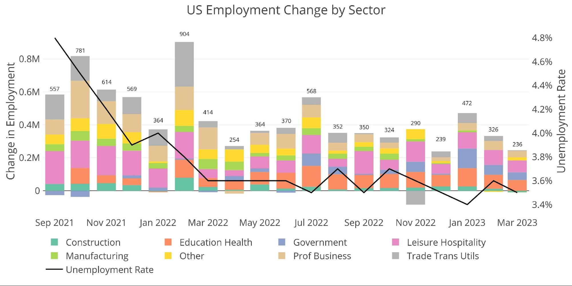
The 236k jobs added was the smallest report going back to December 2020. It was enough to bring the official unemployment back down to 3.5% after inching up to 3.6% last month. The labor force participation rate also ticked up to 62.6%, which is the highest since March 2020, right as Covid hit the job market.
Figure: 5 Change by sector
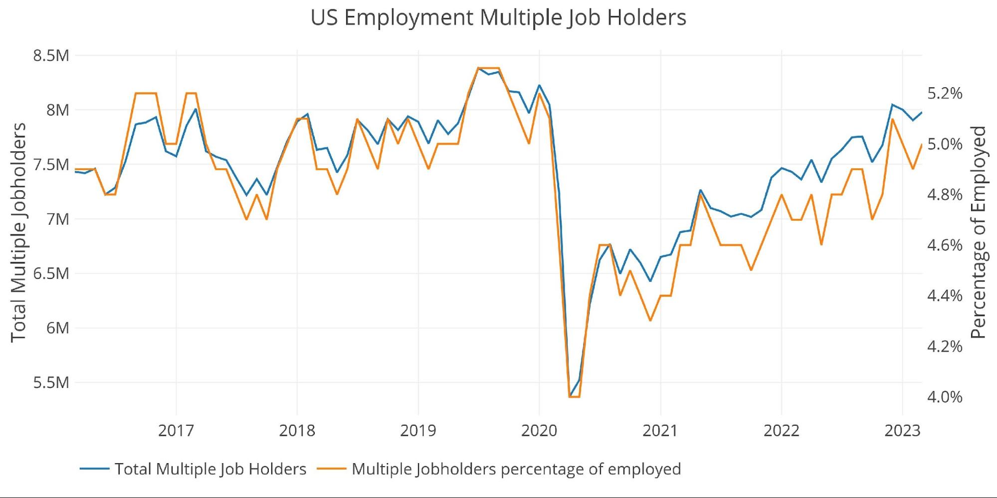
The number of workers with multiple jobs increased in March by 75k to 7.98M and now make up 5% of the labor force. This means that 31.8% of the current jobs report was due to people getting second jobs!
Figure: 6 Multiple Full-Time Employees
Full-time job holders also saw a modest increase, rising by 7k to 395k. The current number is still slightly below the all-time peak seen last August.
Figure: 7 Multiple Full-Time Employees
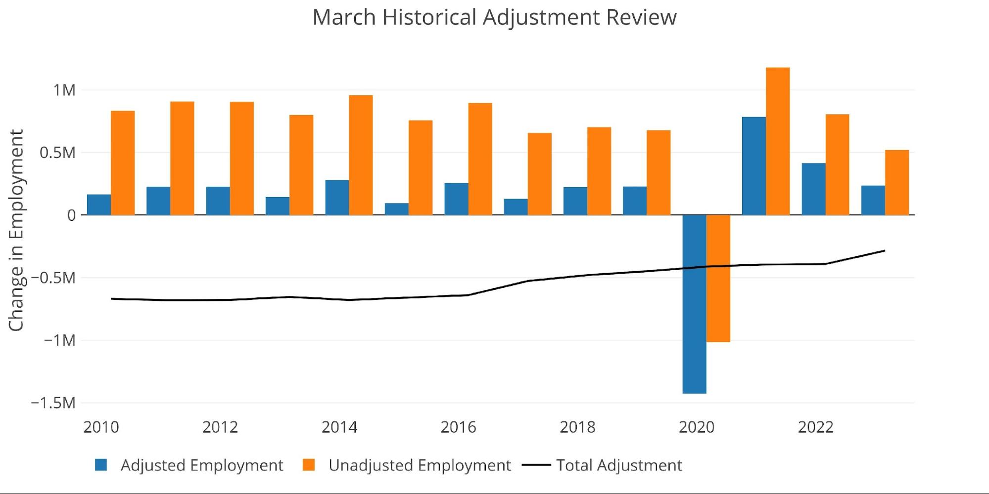
The March report is typically revised down when the seasonal adjustments are made. That said, this March saw the smallest seasonal adjustment going back to at least 2010. A seasonal adjustment that is closer to the historic norm would have made the current report significantly worse.
Figure: 8 YoY Adjusted vs Non-Adjusted
Breaking Down the Adjusted Numbers
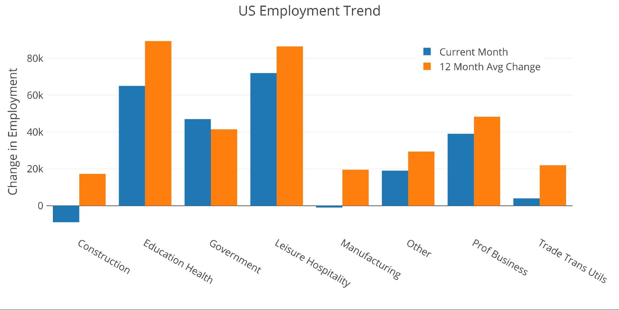
Comparing the current month to the 12-month trend shows that this month had 7 of 8 total months that were below the 12-month trend. This suggests the labor market is definitely slowing.
Figure: 9 Current vs TTM
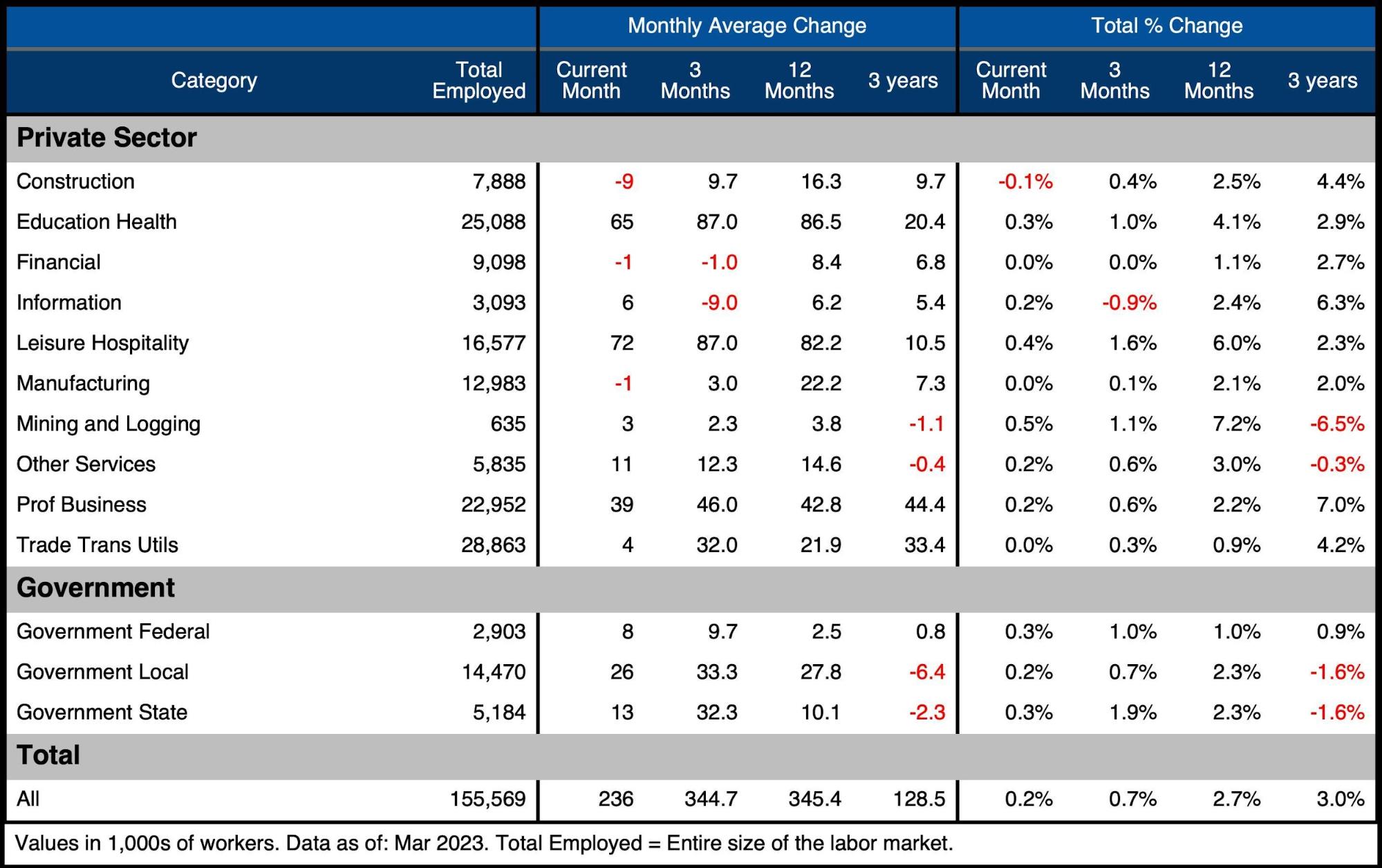
The table below shows a detailed breakdown of the numbers.
Key takeaways:
-
- Three categories were actually negative for the month
- Government was responsible for 47k of the 236k jobs (20%)
- Over the last three months, Financial Services are down by 1k, and Tech (Information) is down by 9k
The fact that tech is only showing a drop of 9k jobs is quite surprising. Multiple tech firms have announced major layoffs that collectively go well beyond 9k. Furthermore, very few companies in Tech are hiring. It’s possible the seasonal adjustments can explain some of the difference, but more likely this is the BLS understating the true state of the economy at the moment.
Figure: 10 Labor Market Detail
Revisions
While the headline number gets all the attention, the number is typically revised several times. Over the last three months (not including the current month), jobs have been revised down by an average of 4.7k. This means the actual jobs report has been weaker than originally reported.
Figure: 11 Revisions
Historical Perspective
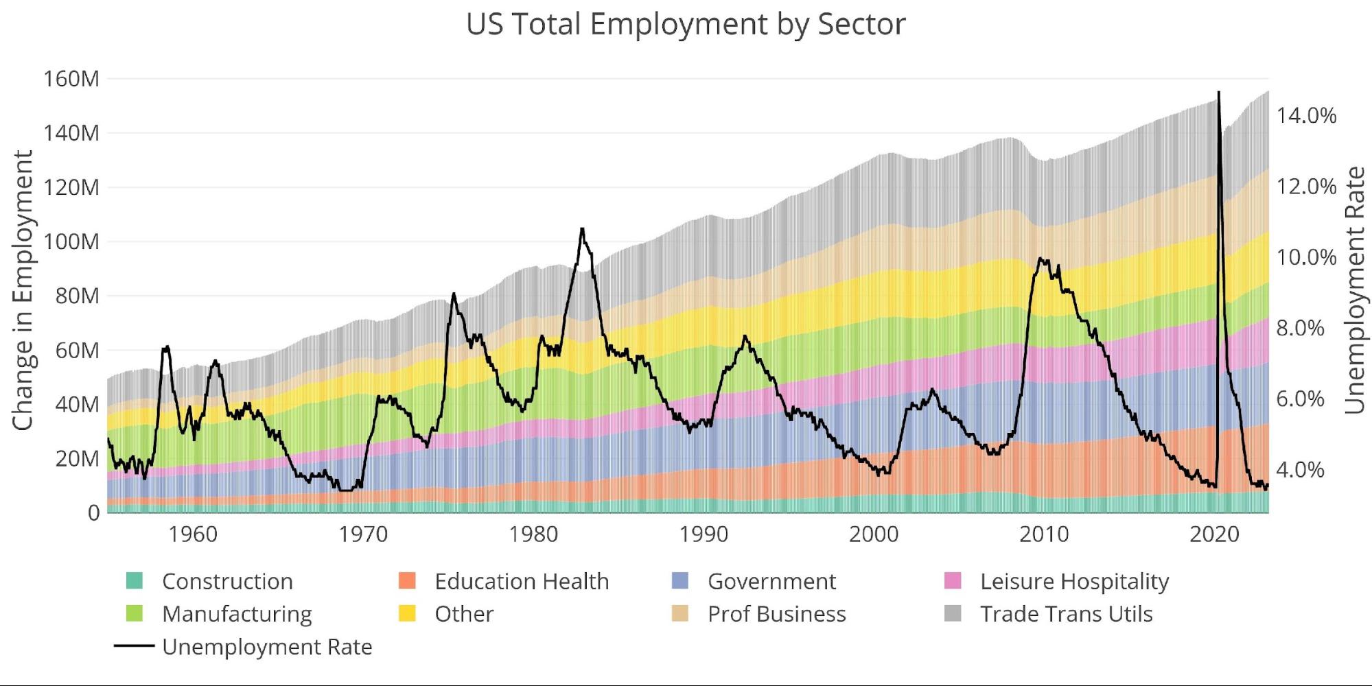
The chart below shows data going back to 1955. As shown, the economy is currently “enjoying” its lowest unemployment rate on record. This is quite hard to believe given the current economic environment and job losses that have been announced and implemented.
Figure: 12 Historical Labor Market
The labor force participation rate has reached a post-pandemic high of 62.6% but sits below the 63.3% in Feb 2020 and well below the 66% from before the Financial Crisis.
Figure: 13 Labor Market Distribution
Wrapping Up
Because the market was closed, we won’t know how the stock market will respond to the job market until Monday. The report was mostly in-line with expectations. Average hourly earnings, were up in March by 9 cents which annualizes to 3.3%, this is down from 4.4% in October 2022.
Unfortunately for workers, their pay increases are not keeping up with inflation. This means that most of the workforce is actually getting a pay cut, which is not typically a sign of a healthy job market. The job market has defied logic so far over the last year. The economy has several signs that it is slowing, if not already in recession. The yield curve is inverted, the Money Supply growth has collapsed, companies continue to announce layoffs and more.
The Fed is keeping its head in the sand, assuming their higher rates will not absolutely destroy the bubble economy that its cheap money has created. Even after the SVB collapse, the Fed is ignoring the signs of an economy on the brink. It’s only a matter of time before something else breaks, and it will be much bigger than SVB. When that happens, the job numbers will most likely go deeply negative and the Fed will be forced to launch easy money policies to try and “rescue” the economy. Gold and silver seem to be front-running this move, continuing to show strength even in the face of hawkish comments by the Fed.
More By This Author:
Dollar WoesFranklin D. Roosevelt’s Gold Heist
Trade Deficit Increases Again In February To $70.5B


