
How Well Off Are Typical Americans Today?
How well off are typical Americans today?
That's a difficult question to answer using conventional economic statistics like GDP, because over time, GDP has become an increasingly less representative measure of the quality of life that Americans enjoy. That discrepancy hasn't gone unnoticed, as 61% of the respondents to a survey at Debate.org to the question "Is GDP growth a good indicator of improving quality of life?" answered "No".
But there is an alternative. Last year, we realized that it is now possible to calculate Irving Fisher's consumption-based "national dividend" concept, which wasn't possible in 1906 when he proposed it or for much of the following eight decades, until the U.S. Census Bureau and the U.S. Bureau of Labor Statistics began their annual survey of U.S. consumer expendituresat the household level in 1984.
We now have the ability to track the trends in the economic well-being of the average American "consumer unit", which consists of American families, single persons living alone or sharing a household with others but who are financially independent, or two or more persons living together who share expenses. The following chart shows the major trends for the nominal average expenditures of U.S. consumer units from 1984 through 2015.

In the chart, we've indicated both the total national dividend, which represents the average annual expenditures by U.S. consumer units/households and also what might be described as the "true" national dividend, which accounts for the average amount of that consumption that was financed by debt, and which should provide a good indication of degree to which Americans have sought to attain a particular level of quality of life today at the expense of impairing their quality of life tomorrow, as the bills for their total consumption come due.
We observe a generally rising trend in the nominal data for both the total national dividend and the true national dividend.
Let's next account for the effects of inflation over time. In the next chart, we've adjusted the nominal values for the national dividend per consumer unit/household for inflation as measured by the Consumer Price Index for All Urban Consumers, so that they're expressed in terms of constant 2015 U.S. dollars. [On a side note, data from the Consumer Expenditure Survey is used to regularly revise and update the Consumer Price Index market basket of goods and services and their relative importance, which is why this measure of inflation is particularly relevant.]

In the inflation-adjusted chart, we see that since 1984, the total national dividend per typical American consumer units/households has been essentially flat. However, that outcome has been increasingly financed by debt, which we see in the falling trend for the true national dividend over time.
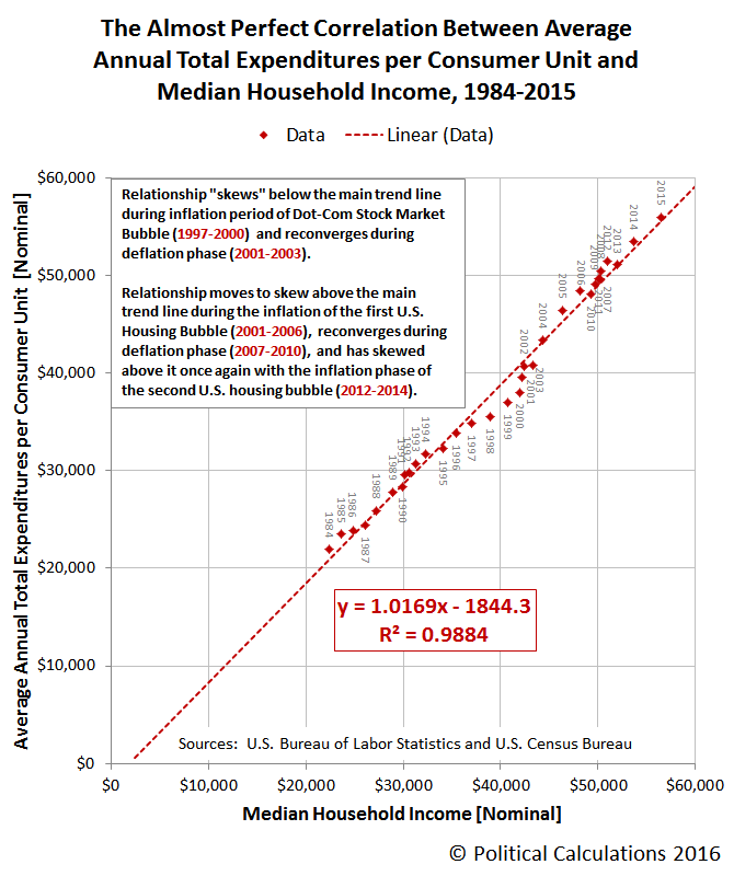
Since 2013, we see that there has been some improvement in both measures, where rising incomes have enabled increased consumption. In the next chart, we'll show the nearly one-to-one nominal relationship that exists between the average annual expenditures of U.S. consumer units and median household income.
The 2015 Consumer Expenditure Survey summarizes the major changes in how American consumer units/households spent their money from 2014 to 2015.
Personal insurance and pensions expenditures rose 10.9 percent to $6,349. This was primarily driven by the 11.4 percent increase in pensions and Social Security expenditures. In particular, non-payroll deposits to retirement plans, such as IRAs and Keoghs, rose 45.2 percent to $795 and payroll deductions for private pensions increased 25.2 percent to $645.
Education expenditures increased 6.4 percent. This was largely driven by a 63.7 percent increase in finance, late, and interest charges for student loans to $157.
Transportation expenditures increased 4.7 percent to $9,503. Within transportation, expenditures on vehicle purchases increased 21.1 percent, while spending on gasoline and motor oil declined 15.3 percent, continuing trends highlighted in the 2014-15 midyear report.
Expenditures on cash contributions reversed their 2013 and 2014 declines, increasing by 1.7 percent.
Expenditures on the discretionary categories of food away from home and entertainment continued increasing in 2015, up 7.9 percent and 4.2 percent respectively, after increasing 6.2 percent and 9.9 percent in 2014.
In 2014, health insurance saw the largest year over year increase in where Americans spend their money, coinciding with the implementation of the Affordable Care Act and its sharp increase in health insurance premiums.
References
U.S. Bureau of Labor Statistics and U.S. Census Bureau. Consumer Expenditure Survey. Total Average Annual Expenditures. 2015. [Online Database]. Accessed 16 October 2016.
U.S. Census Bureau. Income, Poverty, and Health Insurance in the United States: 2014 (P60-252). Current Population Survey. Annual Social and Economic Supplement (ASEC). Table H-5. Race and Hispanic Origin of Householder -- Households by Median and Mean Income. [https://www2.census.gov/programs-surveys/cps/tables/time-series/historical-income-households/h05.xls]. 16 September 2016. Accessed 16 October 2016. [Note: Median incomes for 2013 and 2014 were revised with respect to values reported in previous years.]
U.S. Bureau of Labor Statistics. Consumer Price Index - All Urban Consumers (CPI-U), All Items, All Cities, Non-Seasonally Adjusted. CPI Detailed Report Tables. Table 24. [Online Database]. Accessed 16 October 2016.
Disclosure: None.


