
Gold: A Few Bullish Signs
(Click on image to enlarge)
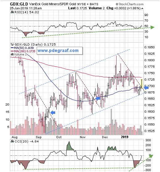
This chart courtesy Stockcharts.com compares gold mining stocks to gold bullion. In a bull market, we expect miners to outperform bullion, (as now). The blue arrows point to breakouts along the way. The supporting indicators are positive, with room to rise. The 50DMA (blue line), is rising up in anticipation of a ‘bullcross-over’ with the 200DMA (red line).
(Click on image to enlarge)
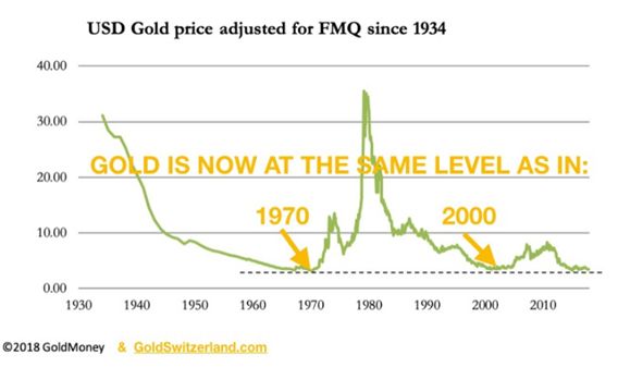
This chart courtesy sources listed shows gold is now valued in Fiat Money Quantity, at the same bargain price as in 1970 and 2000.
(Click on image to enlarge)
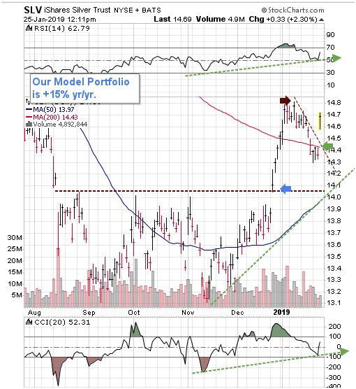
This chart features SLV, a silver ETF. The blue arrow points to a December breakout from a long-time trading range. The green arrow points to the completion from the testing of that breakout. A rise above the brown arrow will send SLV (and all silver products) ‘up and away’.
Disclaimer: Investing involves risk taking. Please do your own due diligence. Peter Degraaf is NOT responsible for your trading decisions.
Peter Degraaf is a stocks and commodities investor with ...
more


Good stuff!