
The following analysis breaks down the Fed balance sheet in detail. It shows different parts of the balance sheet and how those amounts have changed. It also shows historical interest rate trends.
Breaking Down the Balance Sheet
The Fed’s balance sheet shrunk by $118B in May. This was the largest amount since September of last year. The balance sheet had been shrinking by about $80B for the last several months and saw a big drop this month.
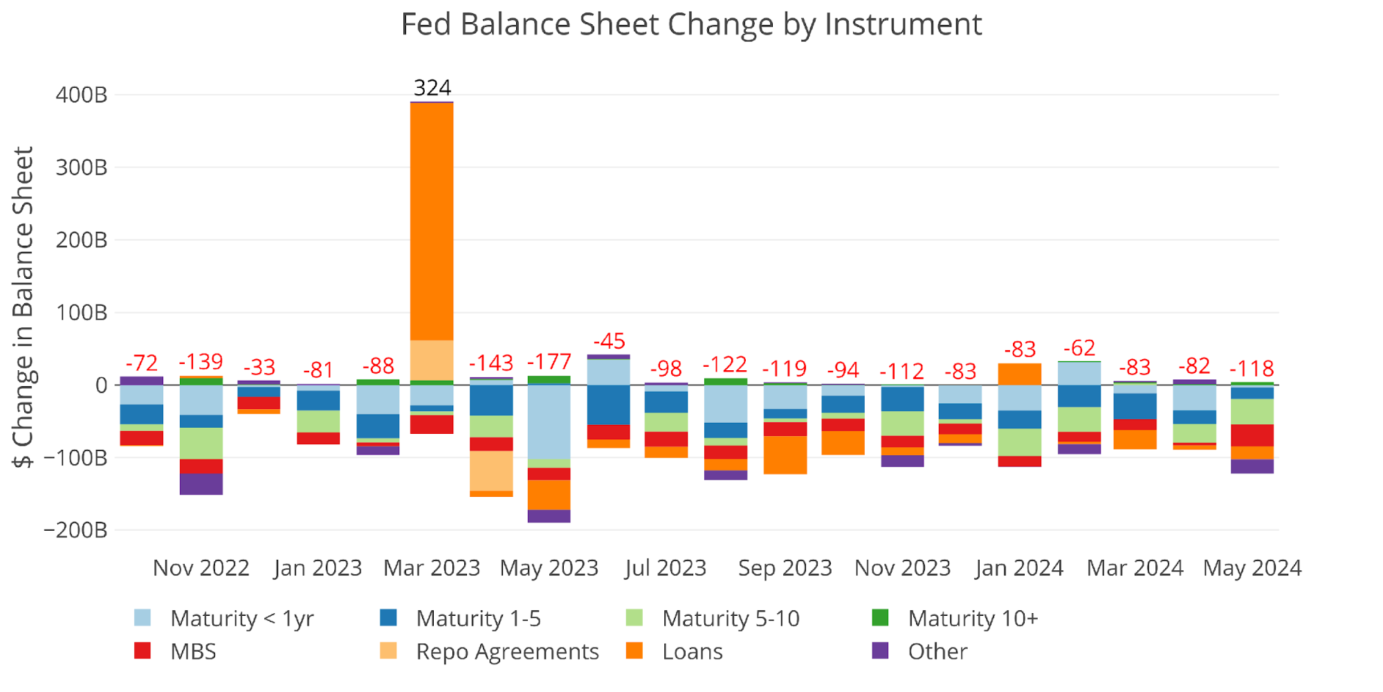
Figure: 1 Monthly Change by Instrument
The table below provides more detail on the Fed’s QT efforts. Ironically, longer term debt of 10+ years has increased across all time periods.
(Click on image to enlarge)
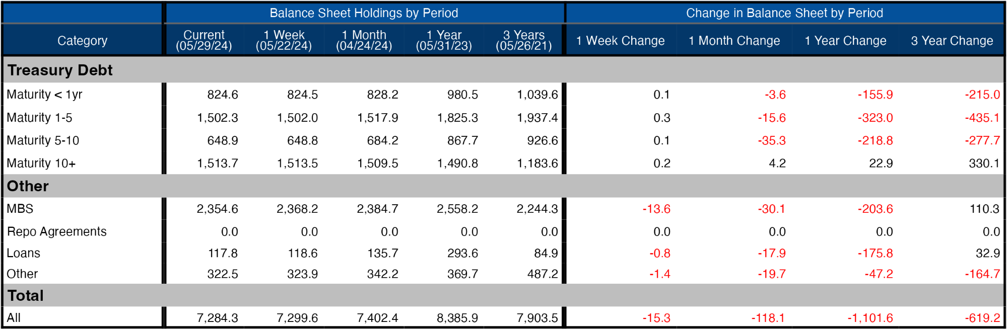
Figure: 2 Balance Sheet Breakdown
The weekly activity can be seen below. It shows that a big driver of the drop this last month was 5-10-year maturity.
(Click on image to enlarge)
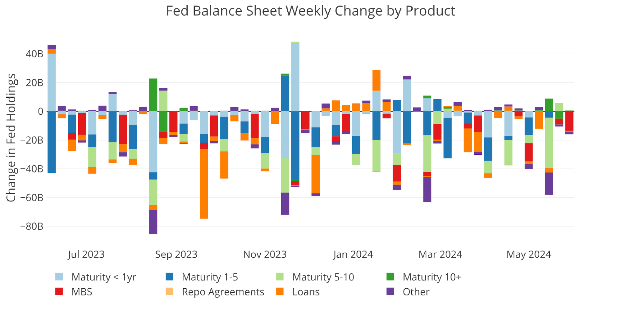
Figure: 3 Fed Balance Sheet Weekly Changes
The chart below shows the balance on detailed items in Loans and also Repos. These were the programs set up in the wake of the SVB collapse last year. Three of the four programs have dropped close to zero, but the Bank Term Funding Program (BTFP) remains elevated. The BTFP was the program that allowed banks to value their Treasury assets at par for up to one year. That amount has started dropping some after the 1 year period expired but it still remains north of $100B. We can track this metric over the next few months to see how the banks are doing.
(Click on image to enlarge)
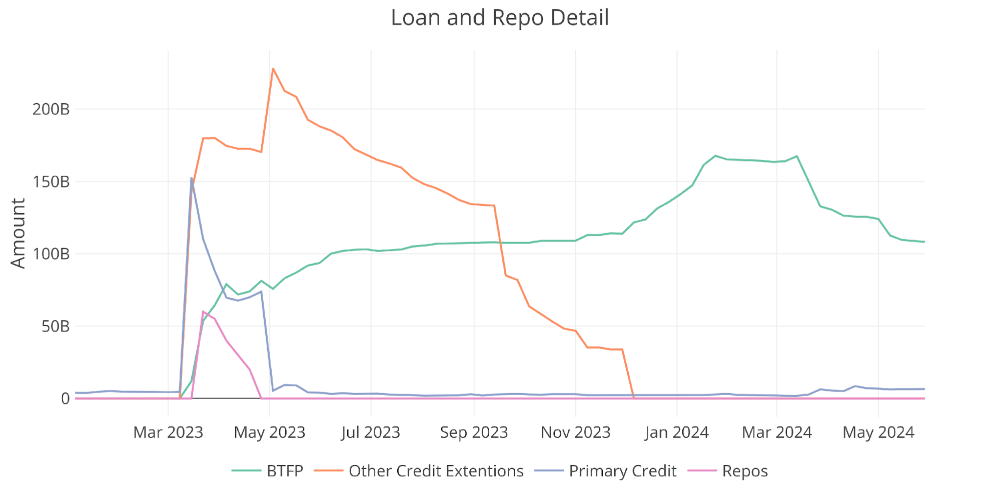
Figure: 4 Loan Details
Yields
Yields have climbed back up in recent weeks.
(Click on image to enlarge)
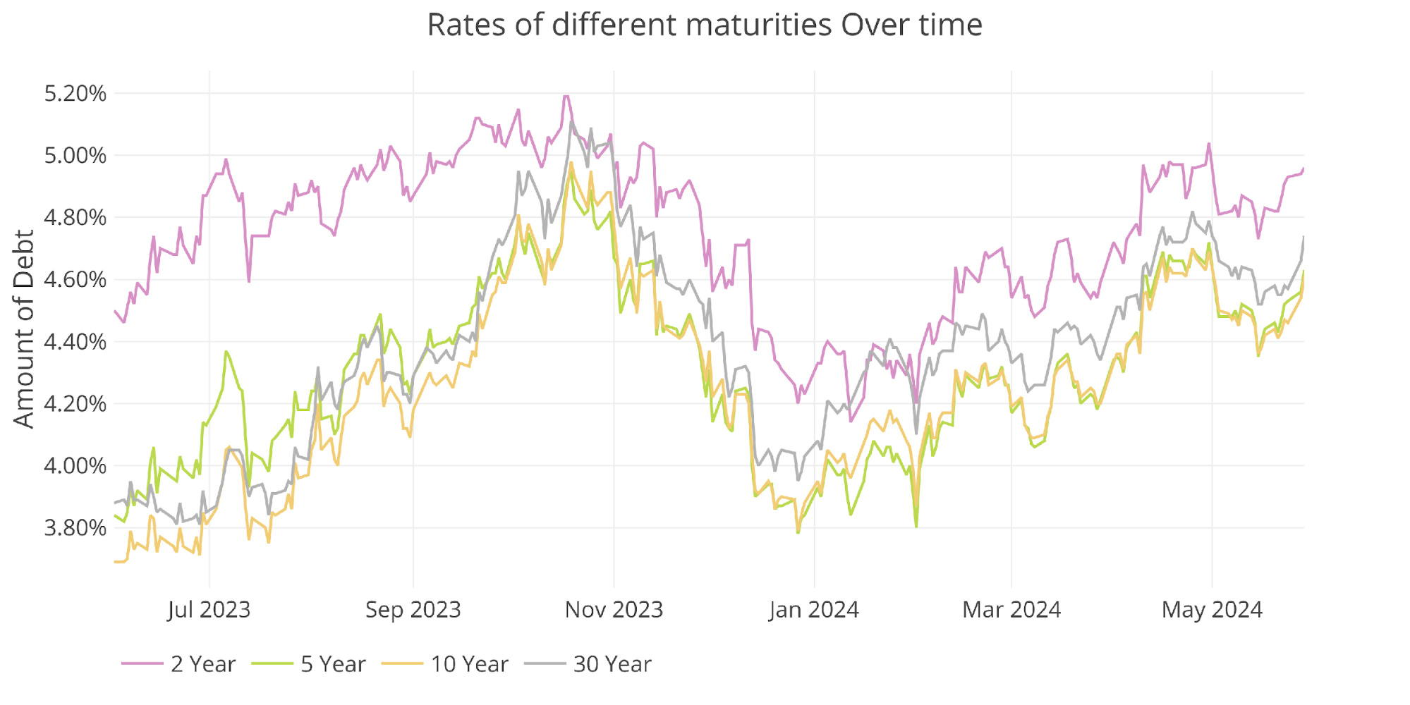
Figure: 5 Interest Rates Across Maturities
The yield curve remains inverted at -35bps.
(Click on image to enlarge)
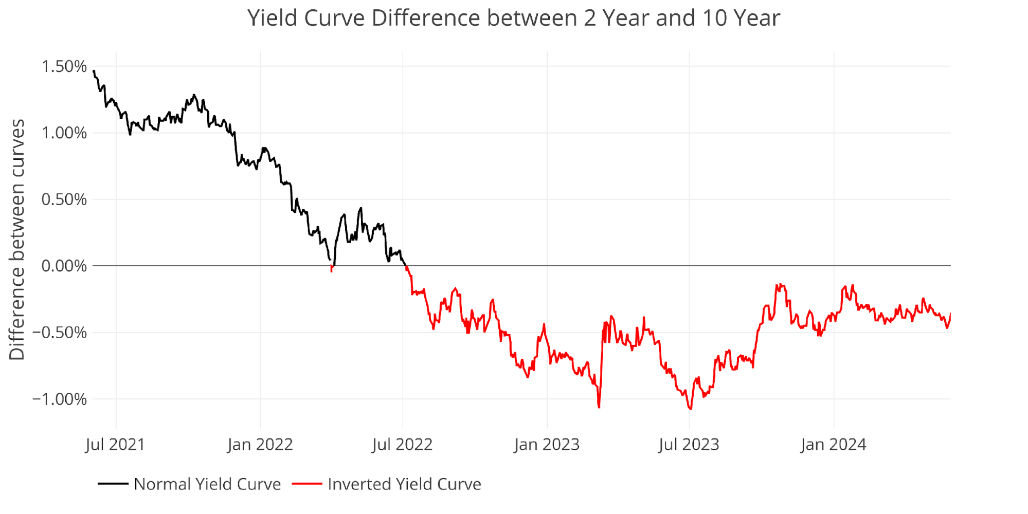
Figure: 6 Tracking Yield Curve Inversion
The chart below shows the current yield curve, the yield curve one month ago, and one year ago. There has been little movement over the last month.
(Click on image to enlarge)
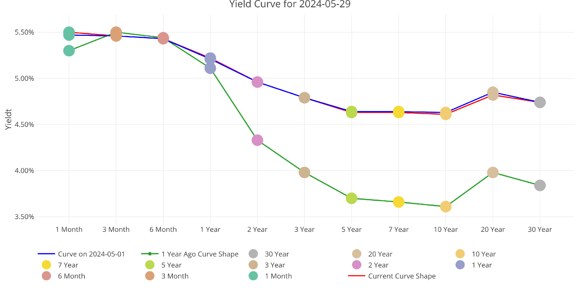
Figure: 7 Tracking Yield Curve Inversion
The Fed Takes Losses
When the Fed makes money, it sends it back to the Treasury. This has netted the Treasury close to $100B a year. This can be seen below.
(Click on image to enlarge)
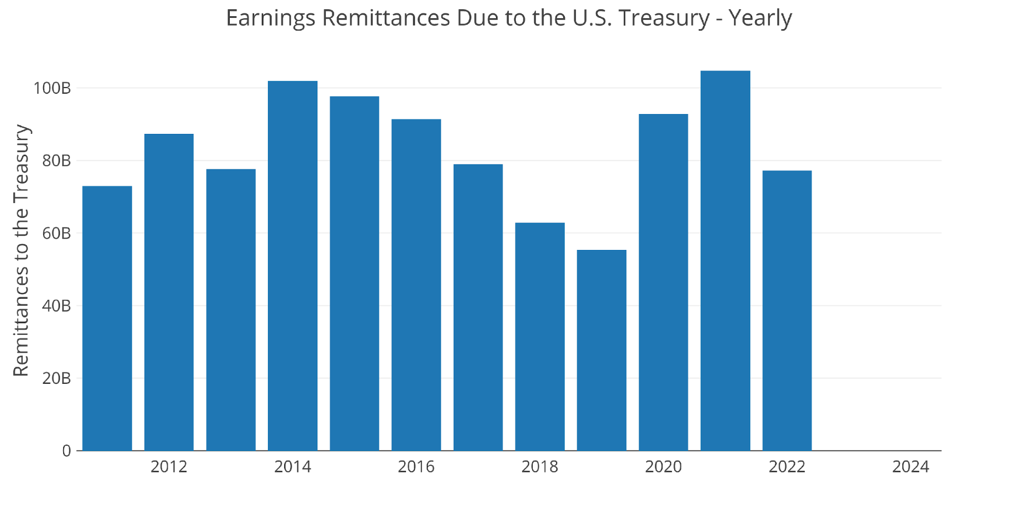
Figure: 8 Fed Payments to Treasury
You may notice in the chart above that 2023 and 2024 are showing $0. That’s because the Fed has been losing money. According to the Fed: The Federal Reserve Banks remit residual net earnings to the U.S. Treasury after providing for the costs of operations… Positive amounts represent the estimated weekly remittances due to U.S. Treasury. Negative amounts represent the cumulative deferred asset position … deferred asset is the amount of net earnings that the Federal Reserve Banks need to realize before remittances to the U.S. Treasury resume.
Basically, when the Fed makes money, it gives it to the Treasury. When it loses money, it keeps a negative balance by printing the difference. That negative balance has just exceeded $171! This negative balance is increasing by about $10B a month!
(Click on image to enlarge)
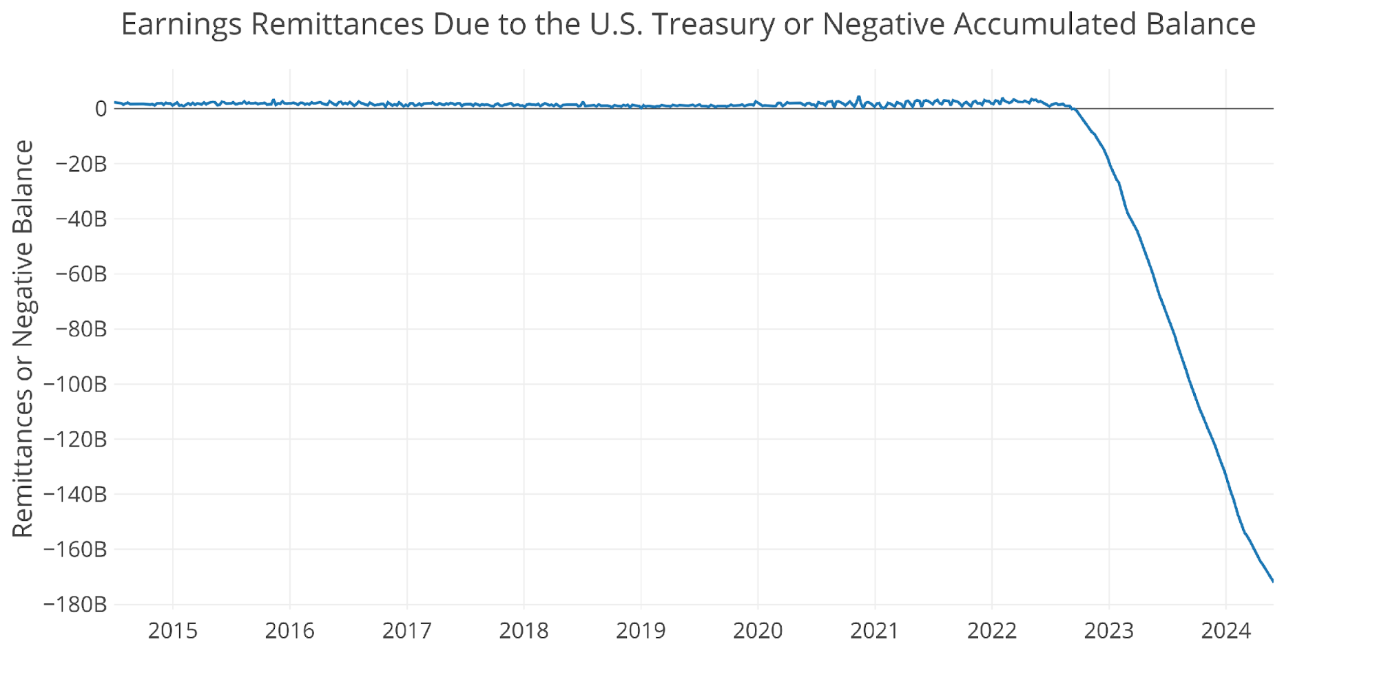
Figure: 9 Remittances or Negative Balance
Who Will Fill the Gap?
The Fed has not been buying in the Treasury market for over a year (they have been selling); however, the Treasury is still issuing tons of new debt. Who has been picking up the slack since the Fed stepped away?
International holdings have increased a decent amount over the last year by about $500B. This is a decent uptick, but is it sustainable and can it cover all the debt being issued? The answer to both questions is “probably not”.
Note: data is updated on a lag. The latest data is as of March
(Click on image to enlarge)
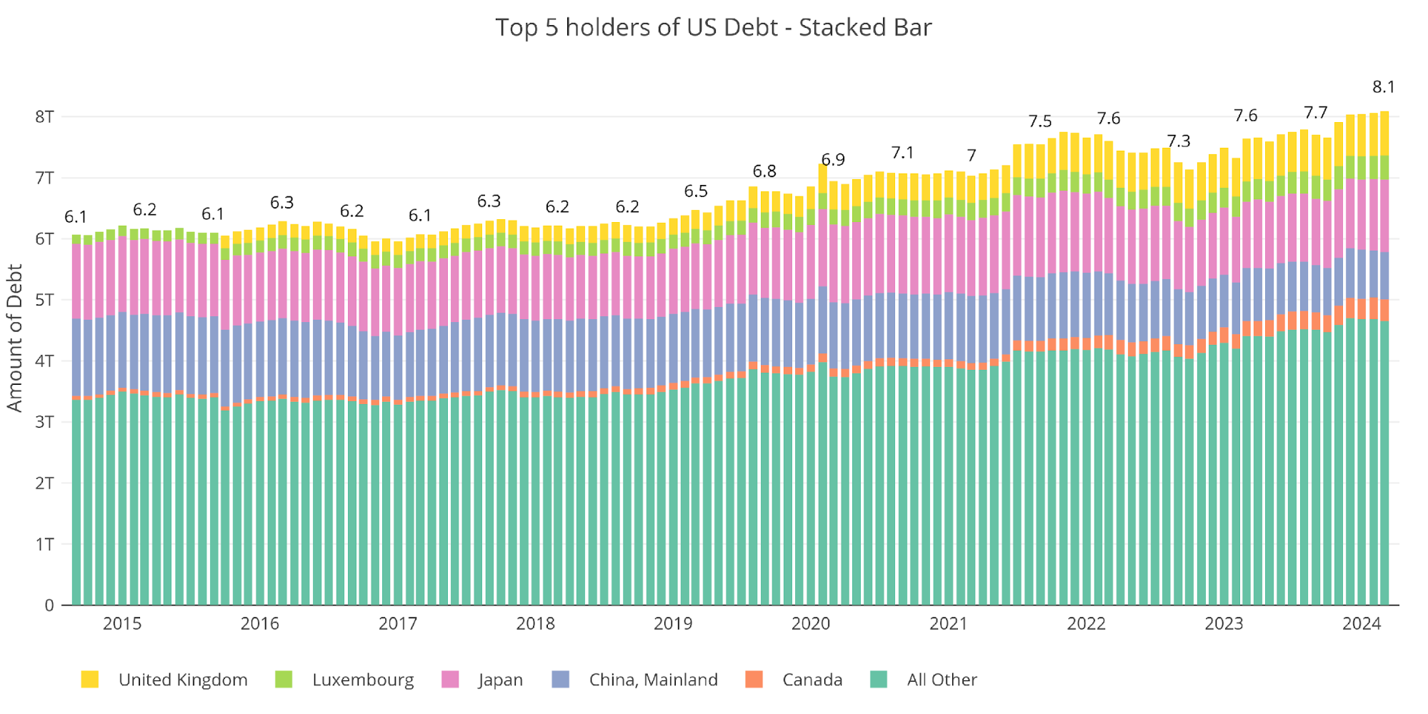
Figure: 10 International Holders
It should be noted that China continues to reduce holdings of US Treasuries. They shed another $100B, but Japan made up the difference. Canada and Luxembourg also saw large increases, especially relative to their size. Canada increased holdings by 50% in a single year!
(Click on image to enlarge)
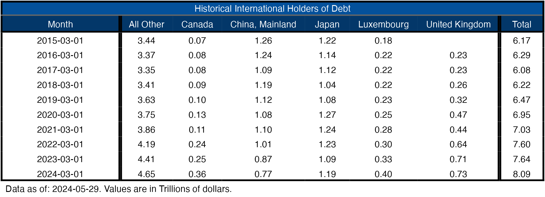
Figure: 11 Average Weekly Change in the Balance Sheet
Historical Perspective
The final plot below takes a larger view of the balance sheet. It is clear to see how the usage of the balance sheet has changed since the Global Financial Crisis.
The recent moves by the Fed in the wake of the SVB collapse can also be seen below. When the next break in the economy occurs, it’s likely that the balance sheet will spike again.
(Click on image to enlarge)
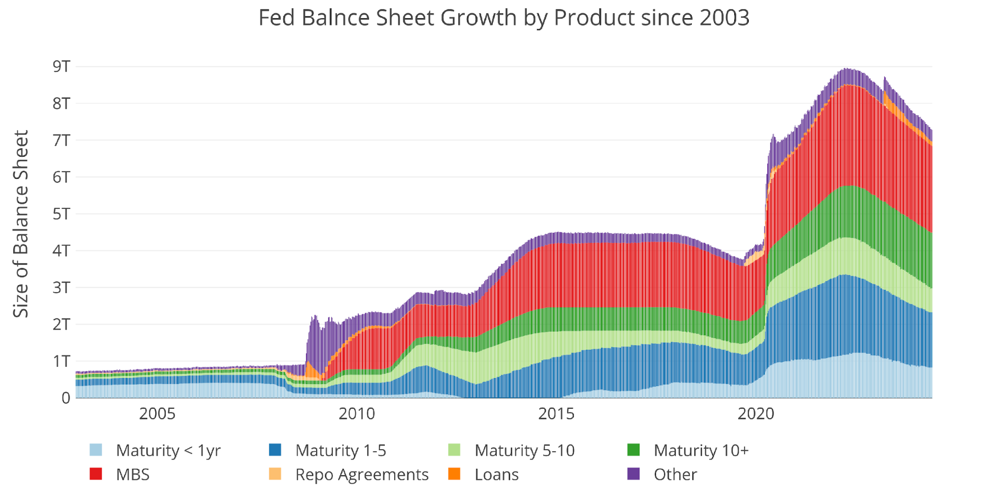
Figure: 12 Historical Fed Balance Sheet
Data Source: https://fred.stlouisfed.org/series/WALCL and https://fred.stlouisfed.org/release/tables?rid=20&eid=840849#snid=840941
Data Updated: Weekly, Thursday at 4:30 PM Eastern
Last Updated: May 29, 2024
Interactive charts and graphs can always be found on the Exploring Finance dashboard: https://exploringfinance.shinyapps.io/USDebt/
More By This Author:
What A China-Taiwan Conflict Could Mean For Semiconductors, Gold
Which Central Banks Are Selling Gold?
Money Supply Growth Is Flattening Out


Comments
Log in or sign up to join the conversation.