Fed Misses The Target Again
Breaking Down the Balance Sheet
The Fed saw a reduction in its balance sheet of $45M. The majority of this was in Treasuries of 1-5 year maturities with a reduction of $55B. The next biggest reduction was in MBS totaling $20B, which fell short of the target $35B. The Fed has still never reached its MBS target since QT began.
(Click on images to enlarge)
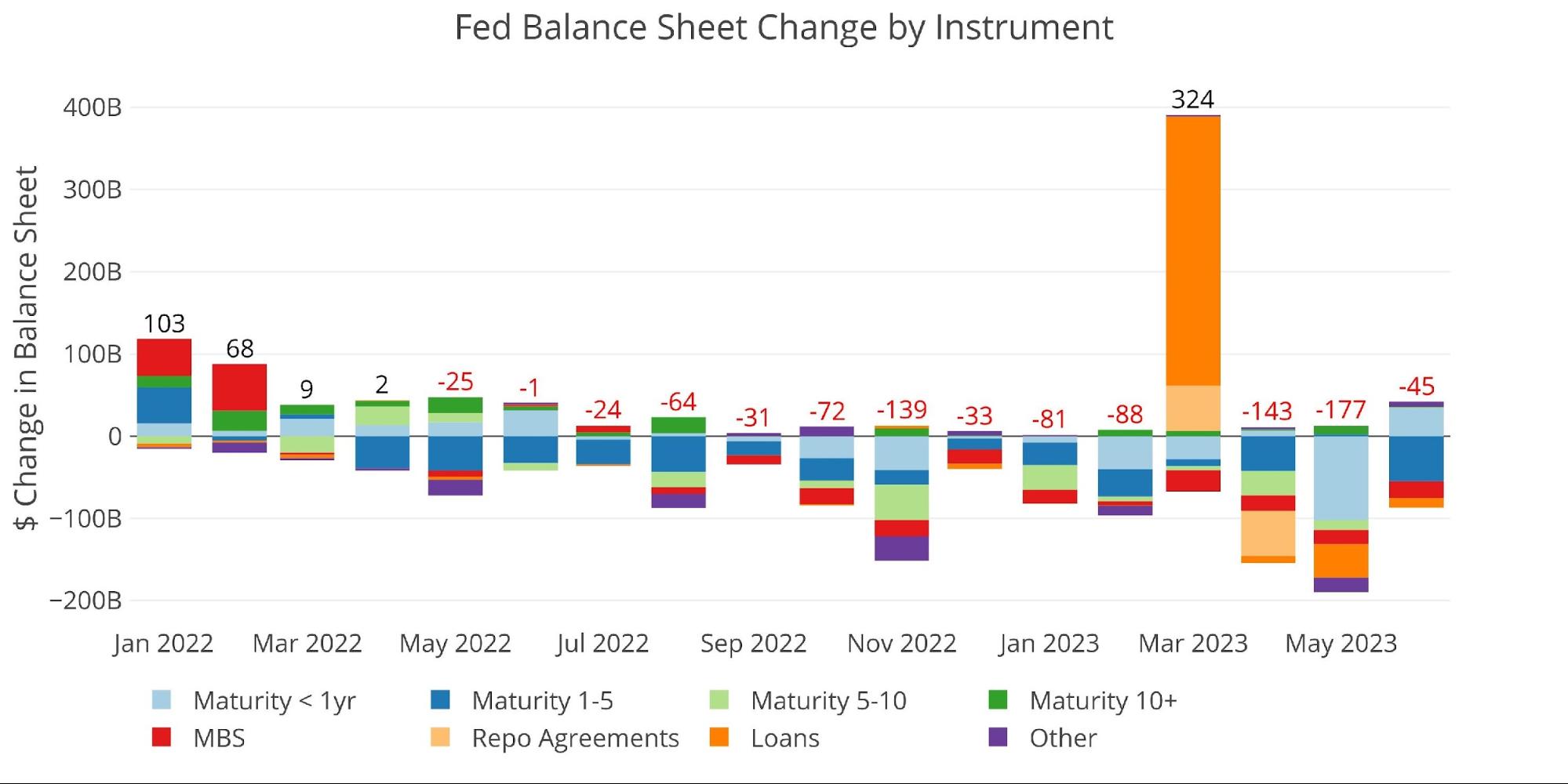
Figure: 1 Monthly Change by Instrument
The table below provides more detail on the Fed’s QT efforts.
-
- Treasuries saw a net reduction of $19.2B which was well short of the $65B target
-
- The shortfall this month could be to balance the overshoot last month
-
- The reduction of Loans has slowed significantly
- Treasuries saw a net reduction of $19.2B which was well short of the $65B target
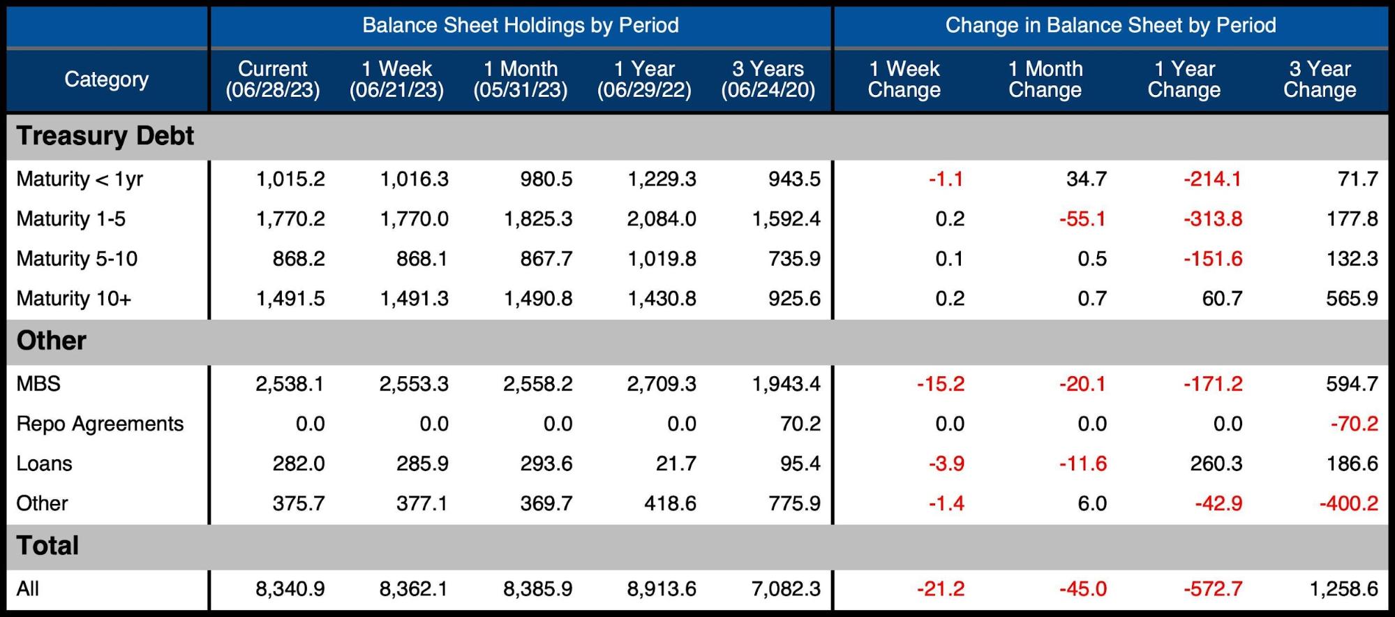
Figure: 2 Balance Sheet Breakdown
The weekly activity can be seen below. It shows how there were some big moves at the end of May and early June, but the action has dropped off significantly in recent weeks.
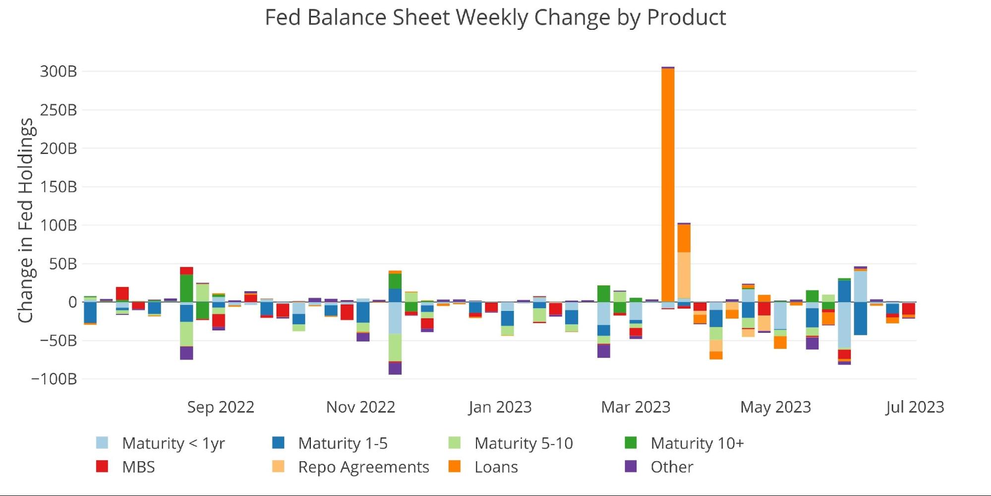
Figure: 3 Fed Balance Sheet Weekly Changes
The chart below shows the balance on detailed items in Loans and also Repos. Primary Credit has dropped down close to zero, but the Bank Term Funding Program (BTFP) continues to increase each month which means banks are still leveraging this facility. Other Credit Extensions have fallen some but remain at elevated levels.
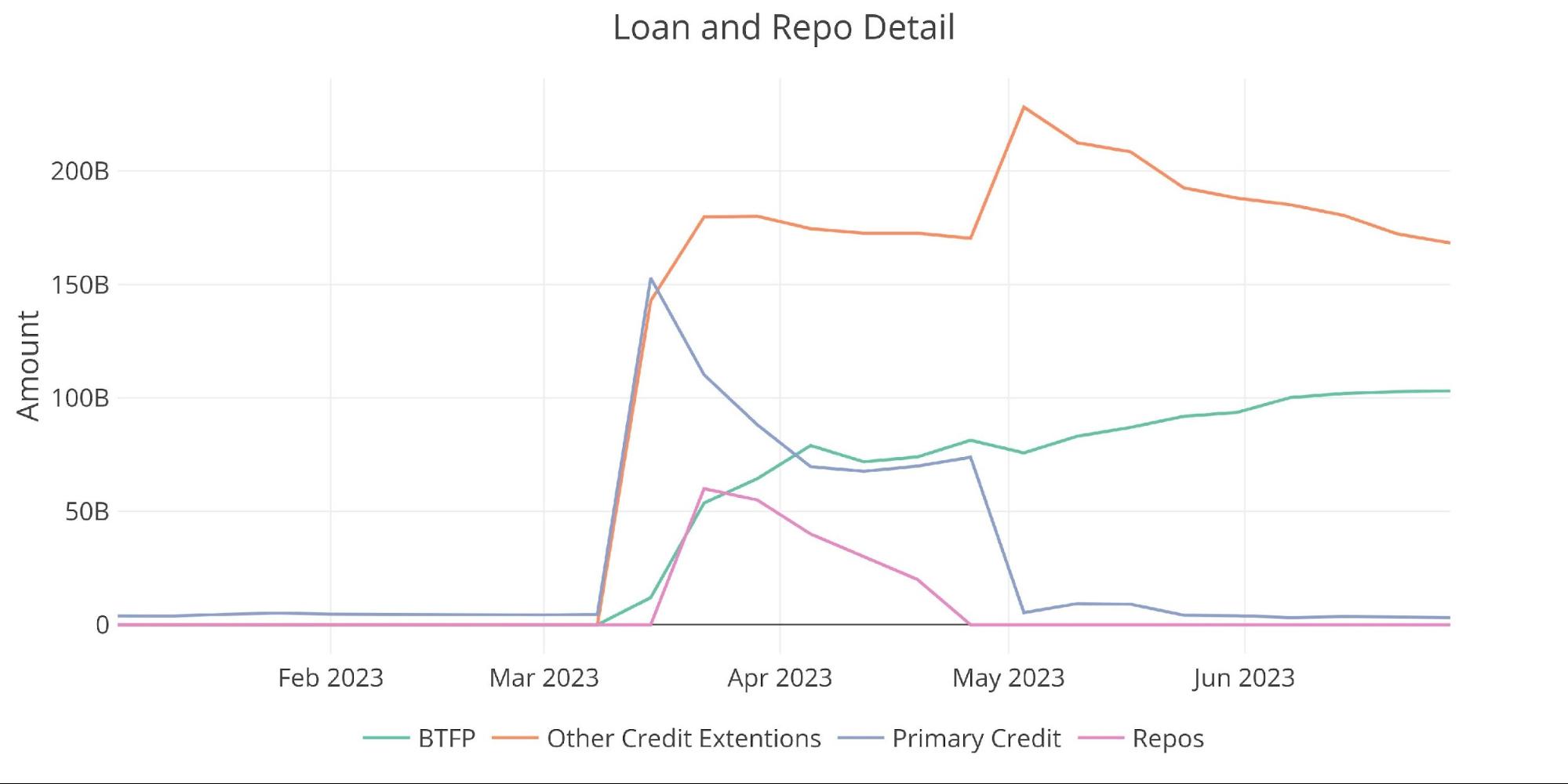
Figure: 4 Loan Details
Yields
Yields have climbed back up in recent months with the 2-Year overshooting to the upside in a big way.
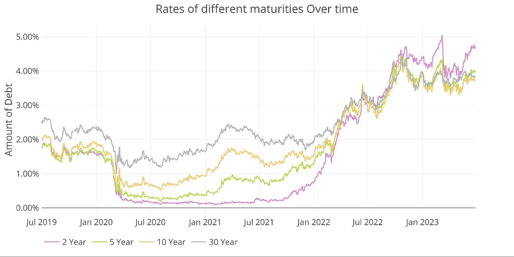
Figure: 5 Interest Rates Across Maturities
The dramatic increase in the 2-Year has driven the yield curve to the most inverted since the brief spike down in the wake of the SVB collapse. When SVB fell, it took the yield curve from -91bps to -107bps for a day before bouncing back to -90bps. The yield curve is now inverted by -100bps with no major market catalyst driving it lower. The trend suggests the inversion could still get worse.
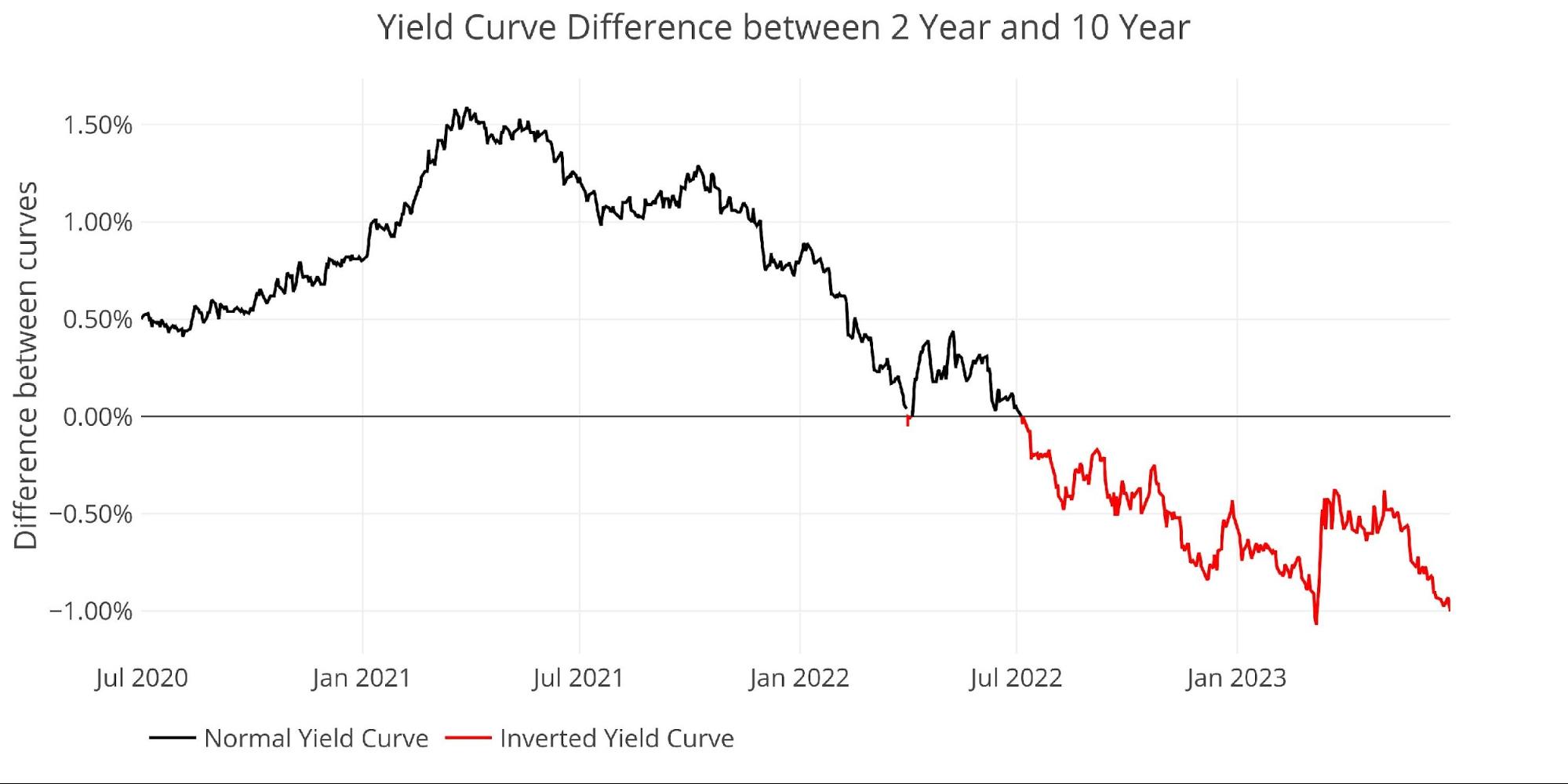
Figure: 6 Tracking Yield Curve Inversion
The chart below shows the current yield curve, the yield curve one month ago, and one year ago. The change over the last month has seen the middle of the curve move up while longer rates have stayed anchored at the lower end.
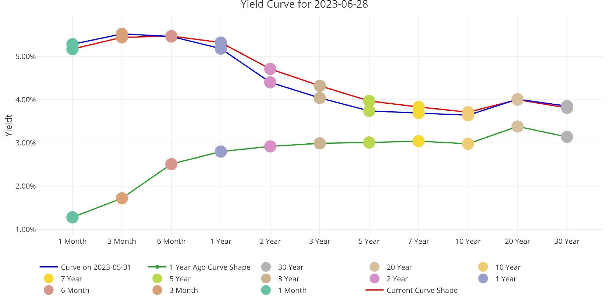
Figure: 7 Tracking Yield Curve Inversion
The Fed Takes Losses
The Fed has recently accumulated about $74B in total losses. This is driven by two factors:
-
- Similar to SVB, it is selling assets (under QT) that are now worth less than when it bought them
- The interest paid out to banks (5%+) is greater than the interest it receives from its balance sheet (2%)
When the Fed makes money, it sends it back to the Treasury. This has netted the Treasury close to $100B a year. This can be seen below.
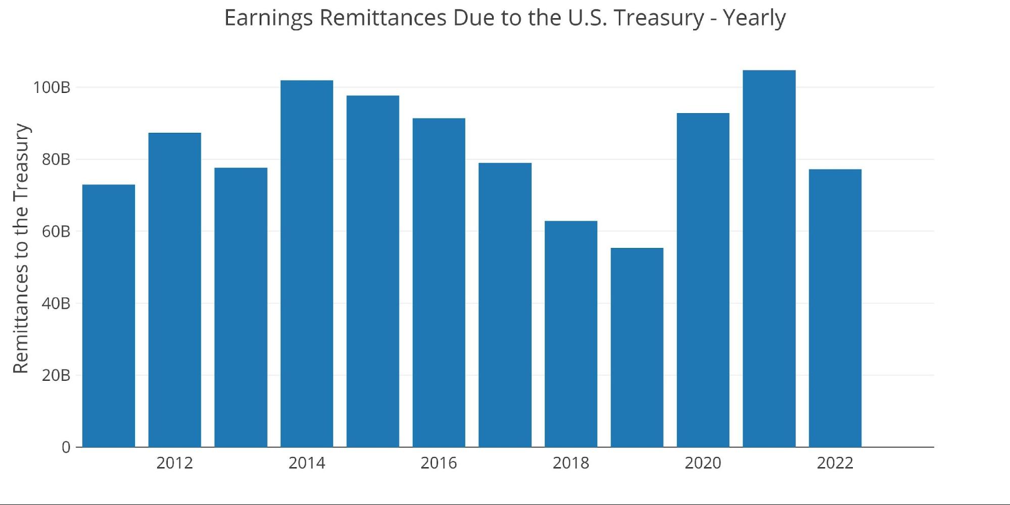
Figure: 8 Fed Payments to Treasury
You may notice in the chart above that 2023 is showing $0. That’s because the Fed is losing money this year. According to the Fed: The Federal Reserve Banks remit residual net earnings to the U.S. Treasury after providing for the costs of operations… Positive amounts represent the estimated weekly remittances due to U.S. Treasury. Negative amounts represent the cumulative deferred asset position … deferred asset is the amount of net earnings that the Federal Reserve Banks need to realize before remittances to the U.S. Treasury resume.
Basically, when the Fed makes money, it gives it to the Treasury. When it loses money, it keeps a negative balance by printing the difference. That negative balance has just exceeded $74B! This negative balance is increasing by about $10B a month and will only get worse if the Fed continues to raise rates.
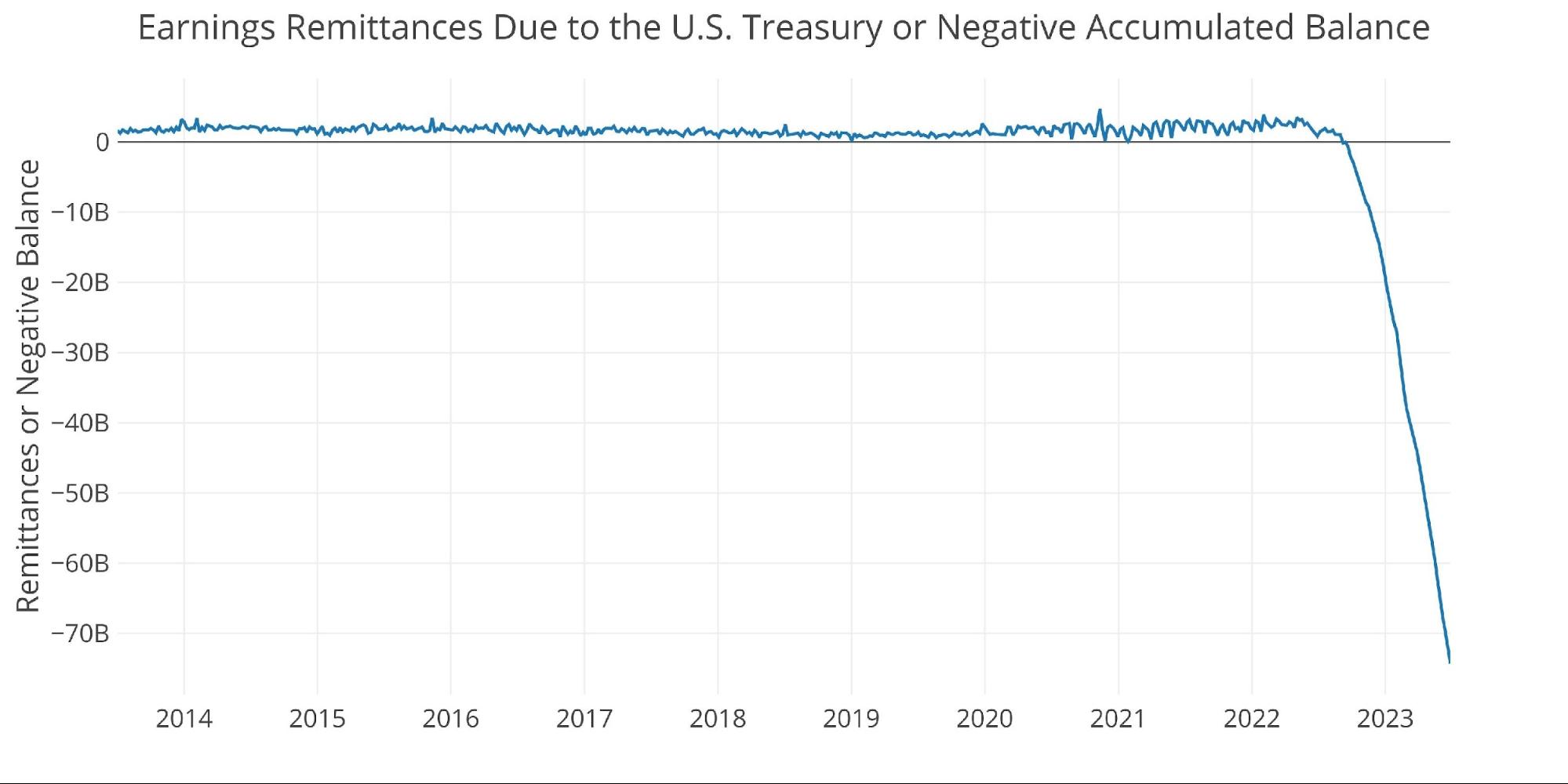
Figure: 9 Remittances or Negative Balance
Note: these charts are a correction to earlier articles that aggregated the Fed’s negative balance, overstating the losses.
Who Will Fill the Gap?
The Fed had been one of the biggest buyers of Treasuries over the last several years. Specifically, during Covid, they were absorbing more than 100% of the debt being issued by the Fed. They have now been net sellers of Treasuries for 13 months.
In that time, foreign entities holding US debt have remained flat as shown in the chart below. Luckily for the Treasury, they have not had to issue much debt to start this year because of the debt ceiling. That has changed quickly and dramatically now that the debt ceiling has been lifted.
With foreign entities showing little appetite for more debt, the Fed selling treasuries, and many institutions have stepped back from the Treasury market due to regulatory reasons… who will buy all the new debt coming from the Treasury?
Note: data is updated on a lag. The latest data is as of April.
(Click on image to enlarge)
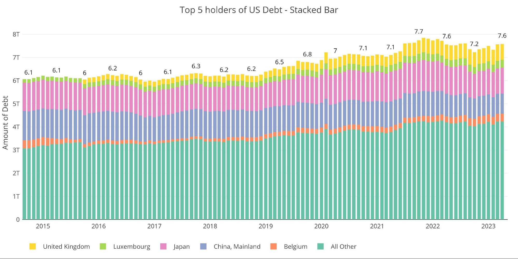
Figure: 10 International Holders
As shown below, both China and Japan have reduced holdings in US Treasuries over the last year. They had been the biggest buyers and are instead now reducing their positions.
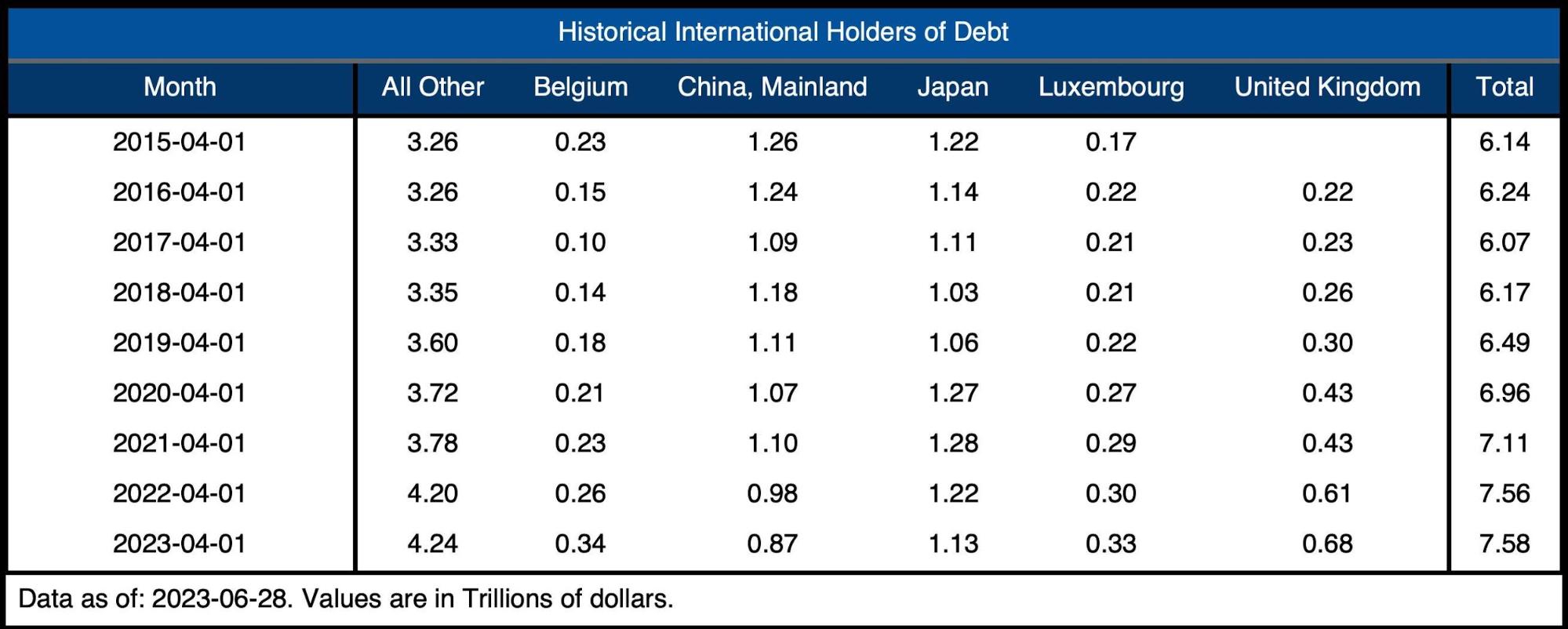
Figure: 11 Average Weekly Change in the Balance Sheet
Historical Perspective
The final plot below takes a larger view of the balance sheet. It is clear to see how the usage of the balance sheet has changed since the Global Financial Crisis.
The moves by the Fed in March following the SVB collapse can also be seen below. Most of that spike has reversed at this point, but the Fed is still miles away from reducing its balance sheet in a meaningful way. Given that they are most likely closer to the end of their easing cycle rather than the beginning, it seems impossible to conceive a way the Fed balance sheet ever returns to a normal level.
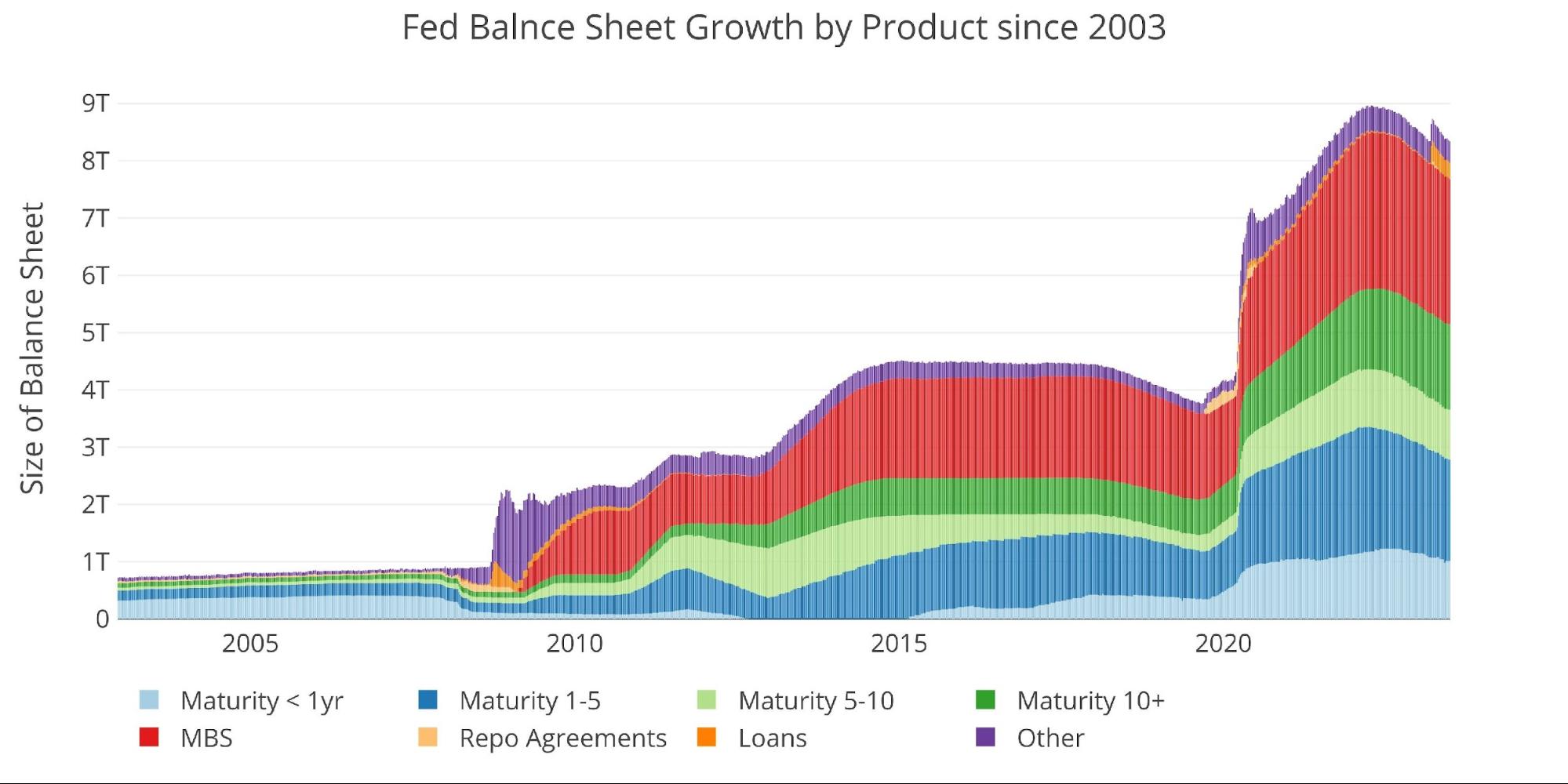
Figure: 12 Historical Fed Balance Sheet
Wrapping up
The Fed continues on its way, raising rates and reducing the balance sheet. Albeit, they paused this month and have mostly fallen short of their monthly reduction targets… but they are tightening. This is clearly evident in the crashing money supply metrics.
The Fed seems blind to the fact that the Economy cannot handle the tightening for an extended period. They have most certainly already broken something (e.g., commercial real estate), but the problems have not bubbled to the surface. They will soon, most likely before the end of the year. At that point, the Fed is going to look rather foolish and likely lost whatever credibility they have left.
Markets can re-price rather quickly, and no market is under more pressure to the upside than gold and silver. The technical analysis shows that it got a bit ahead of itself this spring, but the supply constraints and delivery volume at the Comex hint at a potentially explosive move when things break. Better to load up before that happens.
Data Source: https://fred.stlouisfed.org/series/WALCL and https://fred.stlouisfed.org/release/tables?rid=20&eid=840849#snid=840941
Data Updated: Weekly, Thursday at 4:30 PM Eastern
Last Updated: Jun 28, 2023
Interactive charts and graphs can always be found on the Exploring Finance dashboard: https://exploringfinance.shinyapps.io/USDebt/
More By This Author:
Things Happen Slowly And Then All At Once
How Is The Spot Price For Gold Determined?
Rebound In Money Supply Will Prove Too Little, Too Late


