CPI: Relief From The SPR Drain Has Ended

With the CPI losing the relief from cooling energy prices, this month showed a solid uptick in prices, coming in at 0.54% (~6.6% annualized).
(Click on images to enlarge)
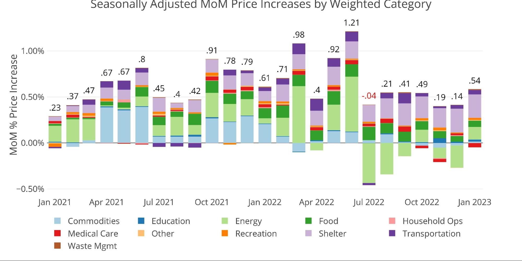
Figure: 1 Month Over Month Inflation
This should not come as a surprise since Biden finally stopped depleting the Strategic Petroleum Reserve. As shown below, the releases have flatlined, but the damage has been done. The SPR sits at the lowest level since 1983.

Figure: 2 SPR Inventory
The administration clearly used the SPR as a way to help in the elections. You can see below how they dramatically increased the usage heading into November before it turned lower in December and has then had no movement in Jan or Feb. Data was last updated Feb 3rd.
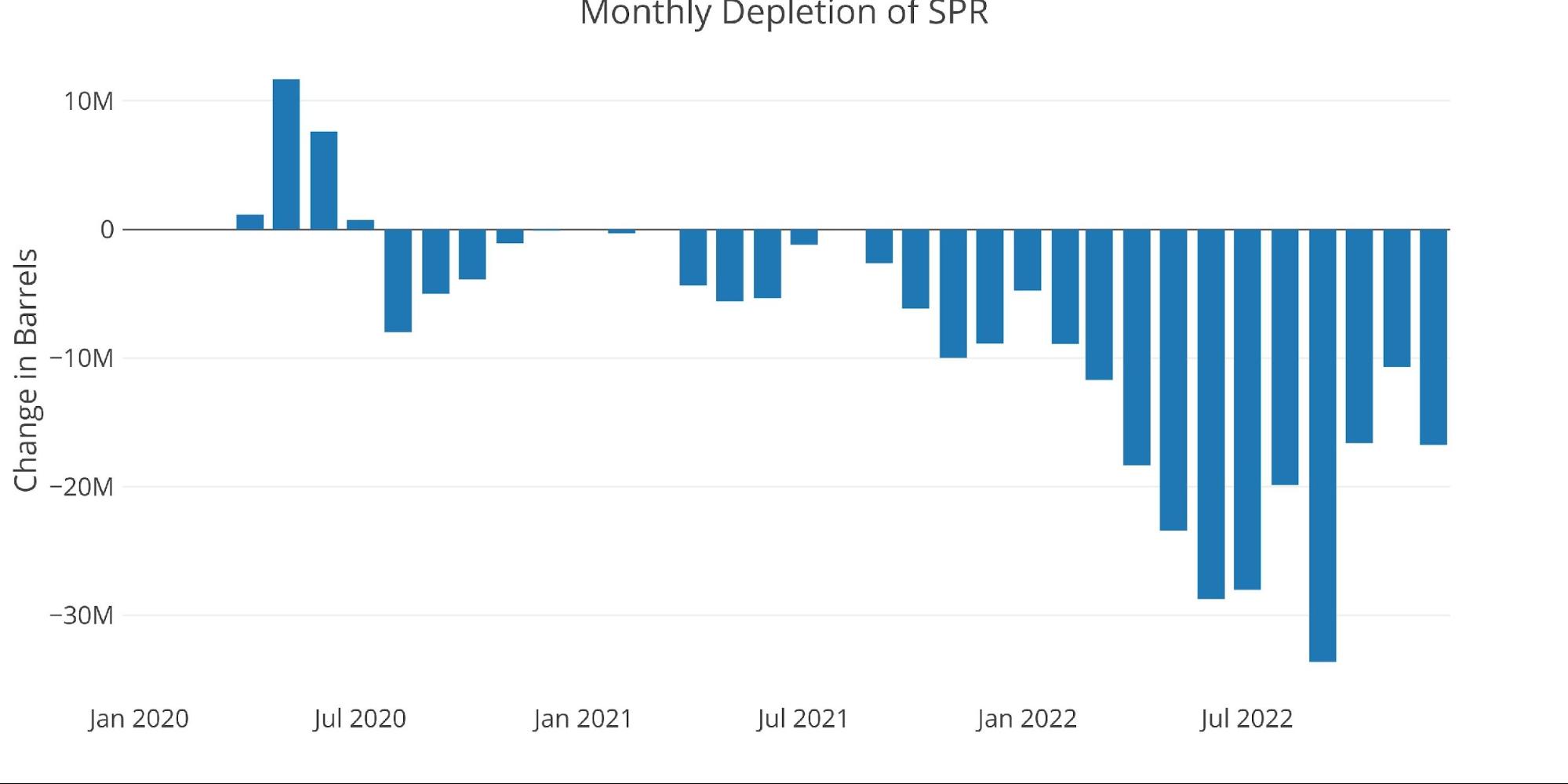
Figure: 3 SPR MoM
This is going to make it harder to bring down inflation. The only good news for the YoY prints is that some big numbers are set to come off the board in the next five months (.71, .98, .4, .92, and 1.21 in June). That should get the CPI back into a decent range assuming that Energy prices do not spike heading into the late spring and summer.
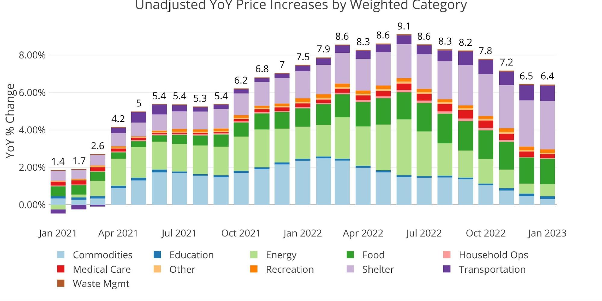
Figure: 4 Year Over Year Inflation
One concerning thing about the most recent print is that many categories sit above the current 12-month trend. 6 of the 11 categories are currently showing as rising faster than the trailing twelve-month average.

Figure: 5 MoM vs TTM
The table below gives a more detailed breakdown of the numbers. It shows the actual figures reported by the BLS side by side with the recalculated and unrounded numbers. The weighted column shows the contribution each value makes to the aggregated number. Details can be found on the BLS Website.
Some key takeaways:
-
- The CPI continues to show relatively high Shelter increases, rising by 0.74% this month and 7.9% over the last year
-
- This has still understated actual market increases which were showing close to 15% at points last year
-
- Food was up 0.5% MoM while Energy rose 2%
- Medical Care was the lone category to chart an MoM decline of -0.7% but is still up 3% YoY
- The CPI continues to show relatively high Shelter increases, rising by 0.74% this month and 7.9% over the last year
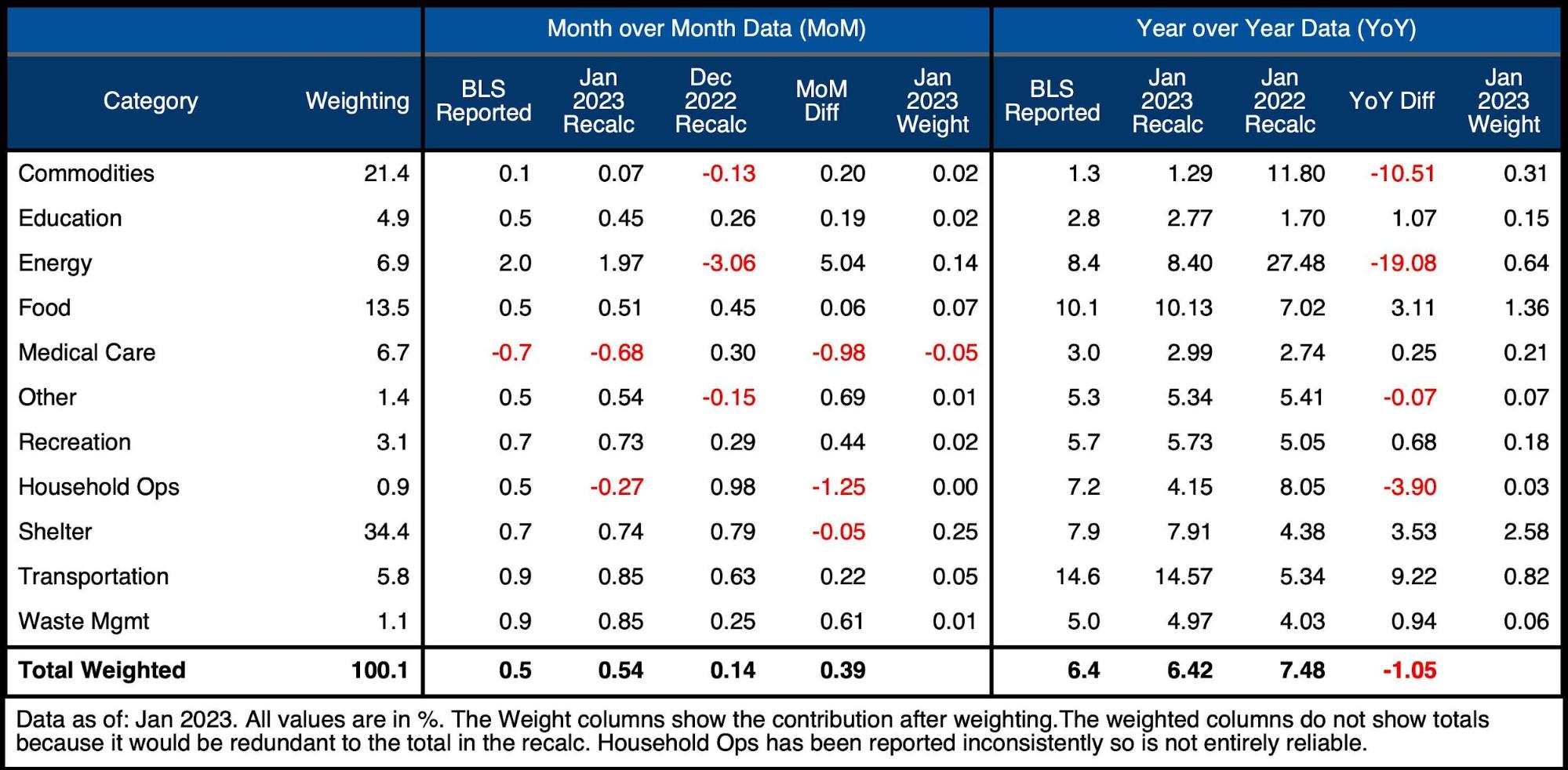
Figure: 6 Inflation Detail
Looking at the Fed Numbers
While the Fed does have different categories (e.g., Energy is in transportation), their aggregate numbers match to the BLS. The Fed categories are actually much worse than the BLS. In this case, 6 of 8 categories were above the 12-month average.
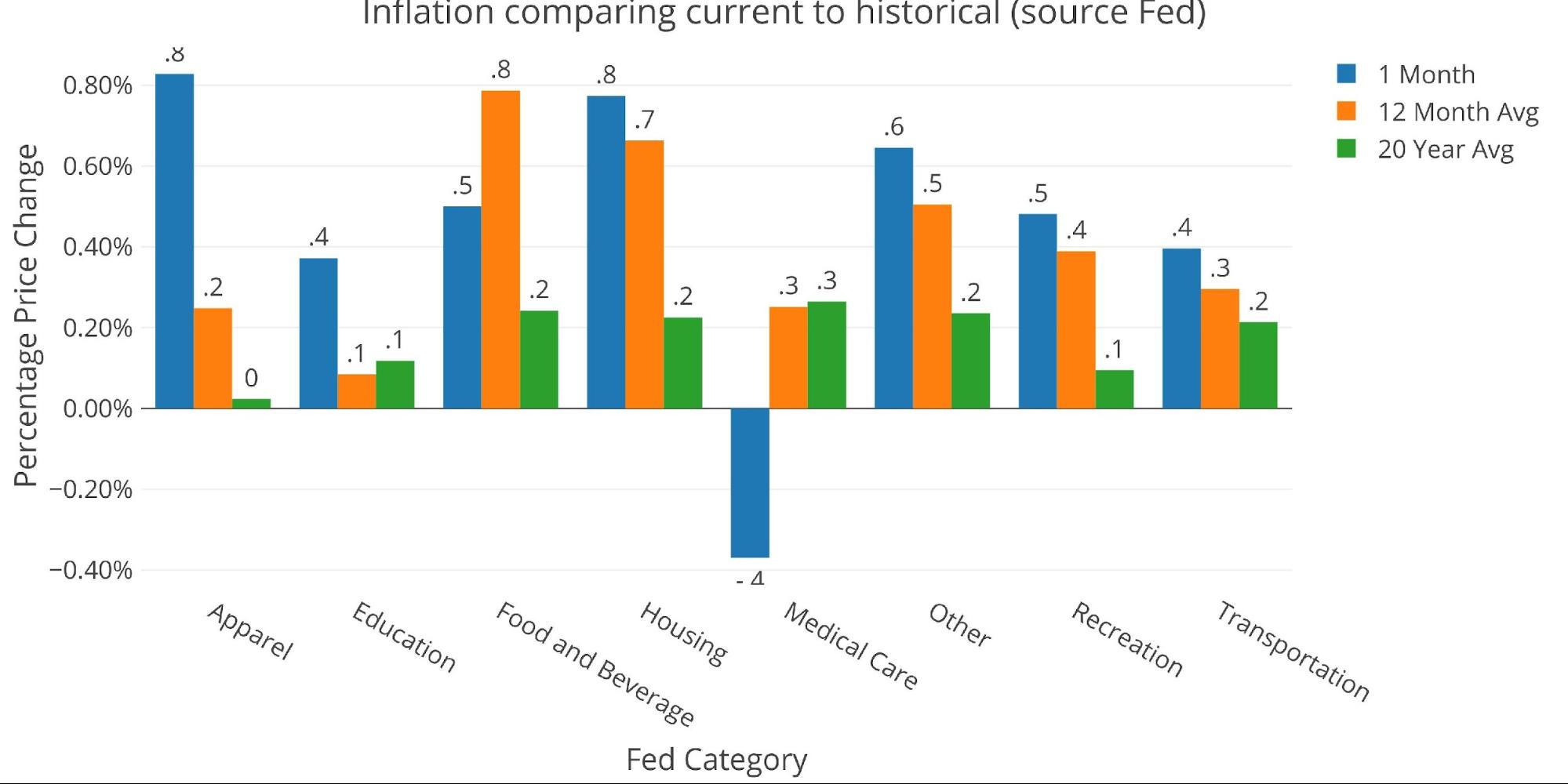
Figure: 7 Current vs History
Fed Historical Perspective
Taking a longer look at the CPI produces the chart below. As can be seen, the mistake made by the Fed in the past has been to lower the Fed Funds rate (gray line) just as inflation started coming down.
The biggest issue that is facing Powell is that the inflation line is still above the level of interest rates. Presumably, with the big numbers coming off in the next few months, the CPI could fall below the Fed Funds rate. This of course, also assumes nothing blows up between now and then that forces the Fed to pivot earlier.

Figure: 8 Fed CPI
BLS Historical Perspective
The BLS weightings have only been scraped back to 2012, thus the chart below shows the past 10 years of annual inflation data, reported monthly. It cannot show the spikes of the 70’s and 80’s shown in the Fed data above.
As mentioned, the current month is mostly flat. While we know big numbers are coming due to fall off, the data is still much too elevated.
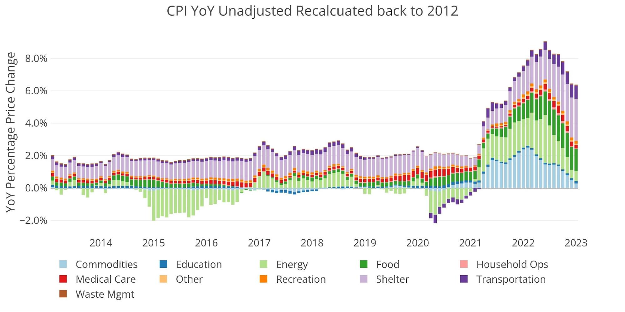
Figure: 9 Historical CPI
Wrapping Up
While the 0.54% may seem small or modest relative to recent history, that still annualizes to a 6.68% annual rise in prices. Factor in how the BLS dramatically understates inflation and you are still talking about double-digit price increases!
The Fed has been reloading its gun as fast as it can because it needs to be ready to shower the economy with easy money during the next downturn. Everyone can be talking about soft landing all they want, but the yield curve is still massively inverted which is the clearest signal of a coming recession. The Fed has already sowed those seeds with their hikes.
The Fed will cut when the crisis does inevitably materialize. It always takes longer than anyone expects but then it comes on rather quickly. When the crisis comes, it will get very ugly and the Fed will have to be very forceful with its monetary policy. This is when the CPI/Inflation trend shown above in Figure 7 repeats itself, and the dip in the CPI is followed by an even bigger spike. Prepare yourself by hedging with gold and silver, something that cannot be printed into existence on a whim.
Data Source: https://www.bls.gov/cpi/ and https://fred.stlouisfed.org/series/CPIAUCSL
Data Updated: Monthly within first 10 business days
Last Updated: Jan 2023
Interactive charts and graphs can always be found on the Exploring Finance dashboard: https://exploringfinance.shinyapps.io/USDebt/
More By This Author:
January CPI Throws Cold Water On “Disinflation” NarrativeChinese Gold Imports Hit Highest Level Since 2018
This Is Less Than Ideal


