
Ark Innovation Vs. Invesco Nasdaq In The Dot.Com Bust
Innovation as an Asset Class: The Implosion of the Nasdaq 100 & Ark Invest ETF
2020 was a brutal year for Kailash Concepts Research (KCR). US bonds rose to offensive levels, offering investors a 0.50% yield, while equities soared to valuations above the dot.com peak. The pain for our team was intense.

Our evidence-based investment process is driven by historical data, algebra, and common sense. By the end of 2020, there was nothing less common than common sense. Basic maths were tossed out the window and replaced by empirically impossible narratives spouted by promotional fund managers and CEOs.
The two years that followed this peak in financial insanity made KCR look intelligent.
This success did not stem from any brilliant forecasts by the team. Rather, we credit our unwavering faith in behavioral finance, which shows that human beings repeat the same mistakes every market cycle. History has taught us that nobody learns from history in financial matters.
Coming off a string of winning years like 2021 and 2022, KCR is here to warn our readers of the obvious: nothing happens in a straight line. Today’s story is a cautious one. Results have been “too good for too long.” The market is a humbling machine, and we may be overdue for some uncomfortable months.
As always, we look to history for guidance. Today we will be focusing on price action first and then closing with fundamentals. Like our piece, Anatomy of a Bear Market, which documented how the fallout from speculative bubbles led to violent volatility, we will be looking at the dot.com analog using the Nasdaq 100 Index in the dot.com bubble and ARK Investment Management today.
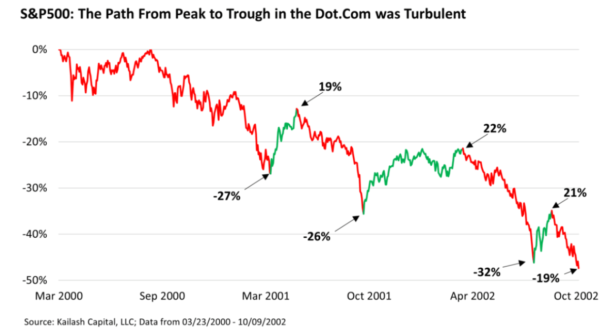
We’ll start off using the S&P 500 before jumping into those more speculative holdings. The chart below shows the decline in the S&P 500 from the peak of the dot.com bubble on 03/23/2000 to its trough on 10/07/2002.
The full extent of the -47% decline is shown on the left-hand axis. Along the way we highlighted in green the counter-trend rallies. Each annotation along the way shows the decline and subsequent rally from the relevant low. Example: the first leg down, the index fell -27%. From there it rallied 19%. Then fell -26% before ripping 22% higher. The path to the final bottom, -47% lower, was characterized by violent volatility.
KCR believes the dot.com implosion is the only modern period analogous to the recent bubble. We have spilled epic ink explaining that the bubble, which peaked in 2021, took US equity valuations beyond dot.com levels. We have also explained that the bubble we are coming out of has another, possibly darker side, in the form of leverage that exceeded levels seen at the peak of the GFC.
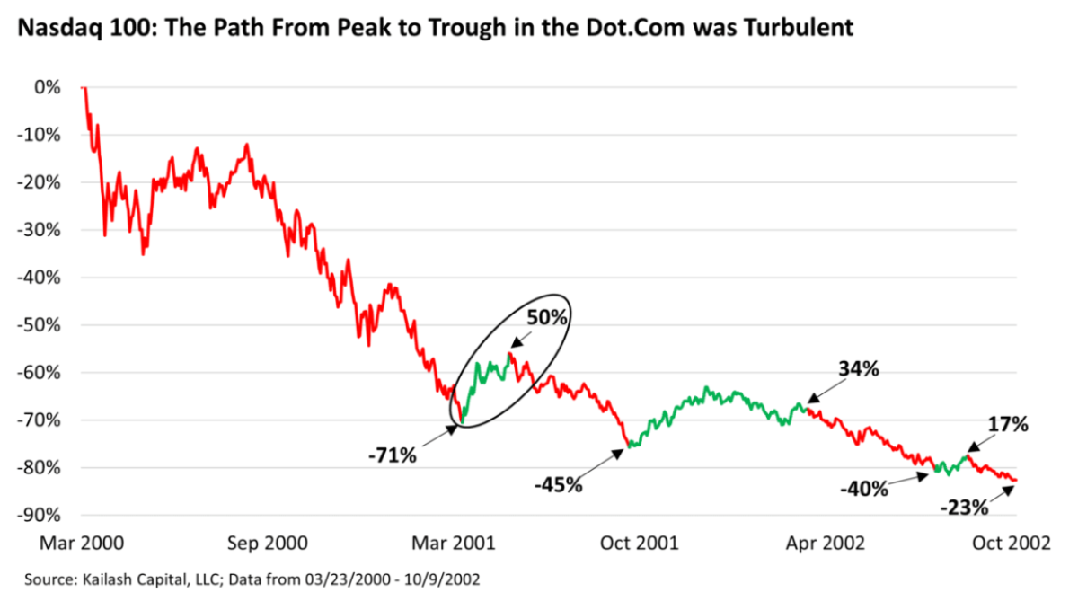
The confluence of deflating valuations and bursting credit bubbles suggests that the fate of expensive, low-quality firms today could be far worse than what befell investors in the dot.com bubble. For the purposes of imperfect analog, we have used the Nasdaq 100 as a proxy for the low-quality firms that collapsed from the 2000 peak.
Young investors may balk at the idea that the QQQ passively managed fund could be viewed as a speculative vehicle. Today the Invesco QQQ Trust is loaded with blue-chips like Microsoft and Google. This makes it easy to forget that the Nasdaq of the late 1990s could easily be conflated with the ARK Innovation ETF (ARKK) today.
As a reminder, the Nasdaq exchange embraced an advertising campaign, something that had never been done by a stock market, to attract new listings in the 1990s.[1] Touting their technological prowess, lower listing fees, and lower minimum requirements to qualify for listing, Nasdaq became the locus of “new economy” stocks.[2],[3]
The chart below shows the decline in the QQQs from the peak of the dot.com bubble using the S&P 500’s countertrend rallies as the lines of demarcation. This is an attempt to show how the most speculative names of the dot.com mania fared when investors’ “risk on” appetite resumed during a secular bear market.
The results are largely the same as the S&P 500; only the losses and countertrend rallies are more pronounced.
QQQ vs ARKK: The Implosion of Innovation, Then & Now
The chart below shows the collapse in the QQQs from the dot.com peak to the trough and overlays the declines in the ARKK fund from the broad market peak in December of 2021. The areas of green shading show the periods when the S&P 500 experienced fierce countertrend rallies post the dot.com bust.
While the path lower has not been identical, we find it a welcome coincidence that both novelty-laden tech products were down -70% just 12 months from their respective peak.
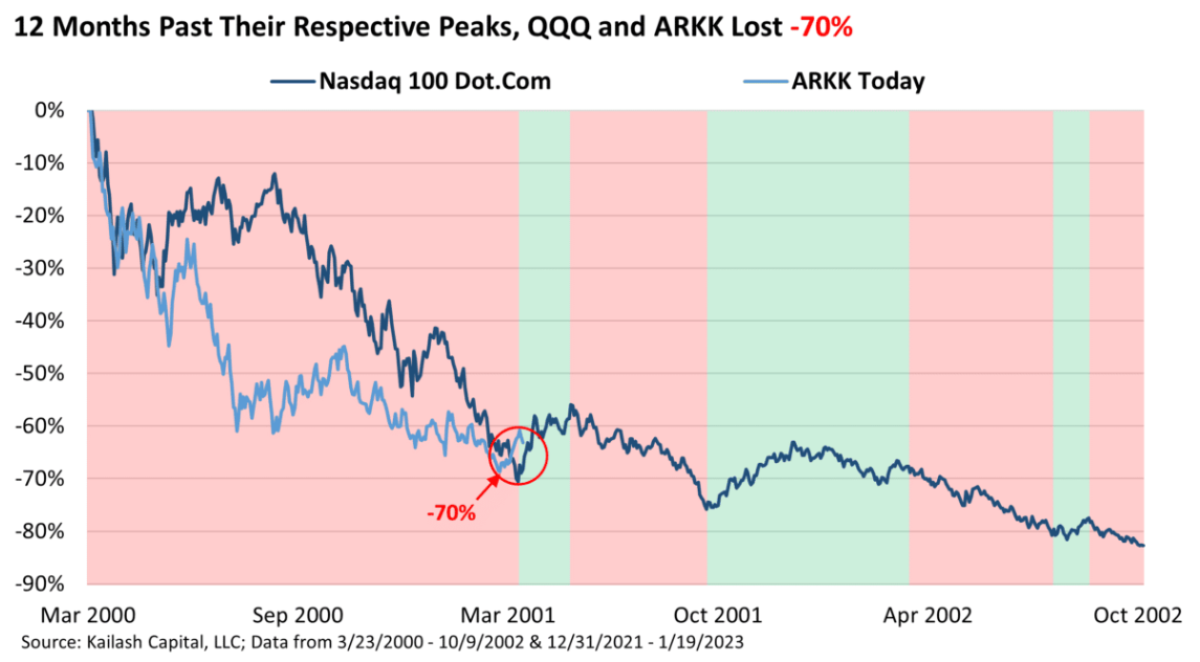
Please do not misconstrue this as a trading call or investment advice of any kind. We merely put this up to show the similarities between the two exchange-traded funds (ETFs).
We have no idea if the post-dot.com precedent will repeat perfectly. History is a rhyming machine, not a repeating machine. The broader point we are making is that investors should not be surprised to see a package of low-quality novelty stocks gap higher.
Speculative Fundamentals and Revisiting Low-Volatility
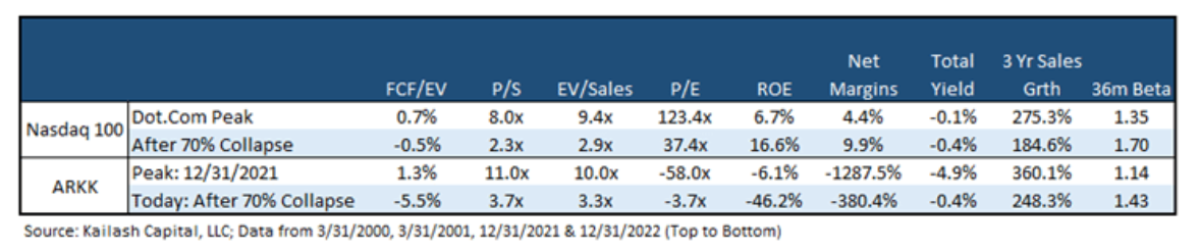
The table below shows:
- First Row: the fundamentals of the Nasdaq 100 at the peak of the dot.com bubble
- Second Row: the fundamentals of the Nasdaq 100 after falling -71% a year after the peak
- Third Row: the fundamentals of the ARKK ETF on 12/31/2021, right as the S&P 500 peaked
- Fourth Row: the fundamentals of the ARKK ETF today
ARKK’s fundamentals were worse than the QQQs at the dot.com peak and are worse today than the QQQs after they had fallen -71%. In our view, there was no empirical precedent for ARKK’s holdings to generate decent returns at the peak and they continue to offer investors dismal fare. History suggests that violent rallies are the rule, not the exception, in such expensive and low-quality stocks.
Our writing over the last several months has highlighted several places where we see long-term opportunities for value-biased investors. While these stocks may have statistical tailwinds, we have readily acknowledged that they are in sectors with unusually high volatility. In our piece Inflation is Taxation without Legislation or Representation we offered up an eclectic group of stocks that:
- had below market levels of volatility
- yields that exceeded the one-month T-bill and
- were highly ranked in our models
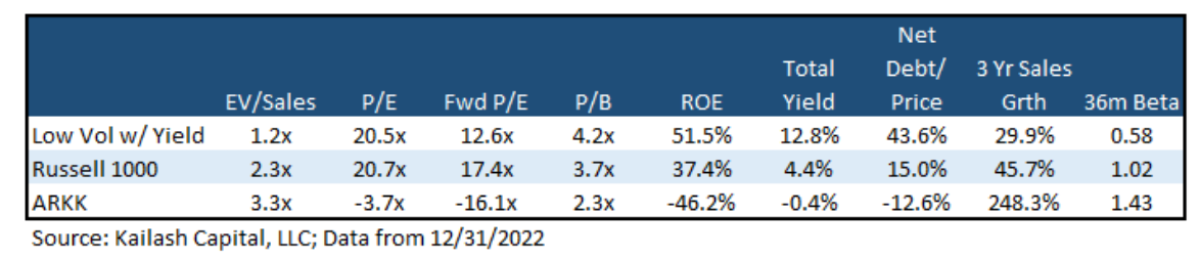
The table below shows the fundamentals of these high-quality, low-volatility income stocks (first row) and compares them to the Russell 1000 and ARKK. We would suggest that while stocks with poor fundamentals may gap up at times, KCR’s low-volatility names will compound wealth in a more stable and sustainable fashion.
More By This Author:
Nailing Alternative Investment Portfolio Construction: What Are We Working With?Exploring the Link Between Lumber Prices and Timber Markets
Looking Ahead At The PE Landscape With Quantitative Data From 2022


