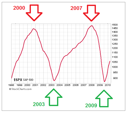
The chart below shows the S&P 500’s 200-day moving average between 1998 and 2010. Given the S&P 500 dropped by over 50% on two separate occasions in that period, it was helpful to have tools to monitor the market’s risk-reward profile.
What Are The Charts Telling Us Today?
This week’s stock market video goes beyond the S&P 500 to help us gain a better understanding of the market’s bigger picture tolerance for risk. Numerous markets are covered, including gold, silver, and energy. The broader analysis can provide insight beyond the widely followed S&P 500.
Video Length - 00:30:55
Disclosure: This post contains the current opinions of the author but not necessarily those of Ciovacco Capital Management. The opinions are subject to change ...
Disclosure: This post contains the current opinions of the author but not necessarily those of Ciovacco Capital Management. The opinions are subject to change without notice. This article is distributed for informational purposes only and should not be considered as investment advice or a recommendation of any particular security, strategy or investment product. The charts and comments are not recommendations to buy or sell any security. Market sectors and related ETFs are selected based on his opinion as to their importance in providing the viewer a comprehensive summary of market conditions for the featured period. Chart annotations are not predictive of any future market action rather they only demonstrate the opinion of the author as to a range of possibilities going forward. All material presented herein is believed to be reliable but we cannot attest to its accuracy. The information contained herein (including historical prices or values) has been obtained from sources that Ciovacco Capital


Thanks for sharing