3 Charts Every Investor Must See
Yesterday Jeff Gundlach gave another terrific presentation on the markets. There were three charts, in particular, that really stood out to me.
The first shows the recent trend in junk bond issuance. Since 2009, it has just surged to levels never before seen, both nominally and as a percent of GDP:

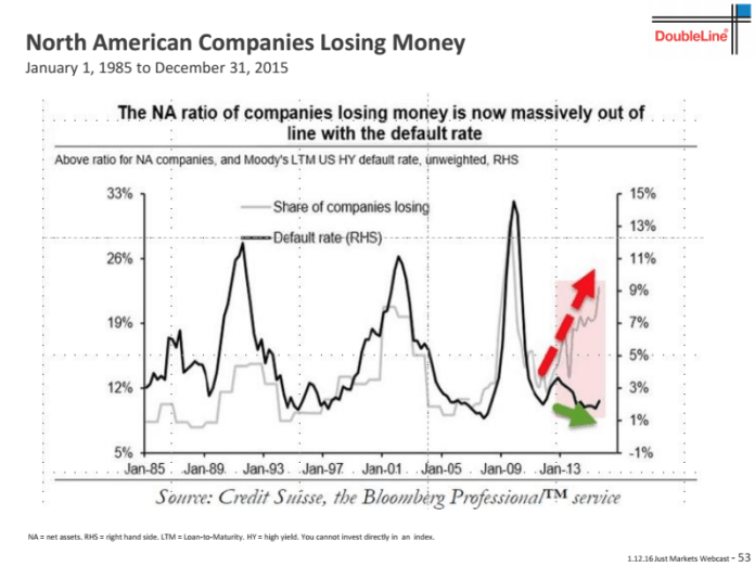
The second chart shows a new rising trend in companies that are losing money and how default rates typically follow suit:

Finally, these trends are important because, as I’ve been writing for months now, the credit markets typically lead both the economy and the stock market.

‘The bigger they come, the harder they fall?’
Disclosure: Information in “The Felder Report” (TFR), including all the information on the Felder Report ...
more


These charts are truly scary. It implies that a 2008 style bear market is certain. The trouble this time is the Fed has fewer resources it can throw at the problem. Are we headed for negative interest rates like Raoul Pal implies (he said.5% 10-year T-bonds by 2017)? I feel like we're living the "Big Short" on steroids.
Druck is probably right, go all in on gold.
The Fed should already be buying non financial assets, to try to kindle a little inflation or we are deflation bound. That would be ok if interest rates were not scraping the ground. But they are scraping the ground and deflation is dangerous in this environment.
I don't think they can turn junk into gold when oil is collapsing. This could cause a credit crisis.