
In response to a standing request, here is an updated comparison of four major secular bear markets. The numbers are through the December 30, 2022 close.
This chart series features an overlay of the Four Bad Bears in U.S. history since the equity market peak in 1929. They are:
- The Crash of 1929, which eventually ushered in the Great Depression,
- The Oil Embargo of 1973, which was followed by a vicious bout of stagflation,
- The Tech Bubble crash and,
- The Financial Crisis following the record high in October 2007.
The series includes four versions of the overlay: nominal, real (inflation-adjusted), total return with dividends reinvested and real total return. The starting point is the aligned peaks prior to the four epic declines. We've used an interval of 252 days for the x-axis as it is roughly the number of market days in a calendar year.
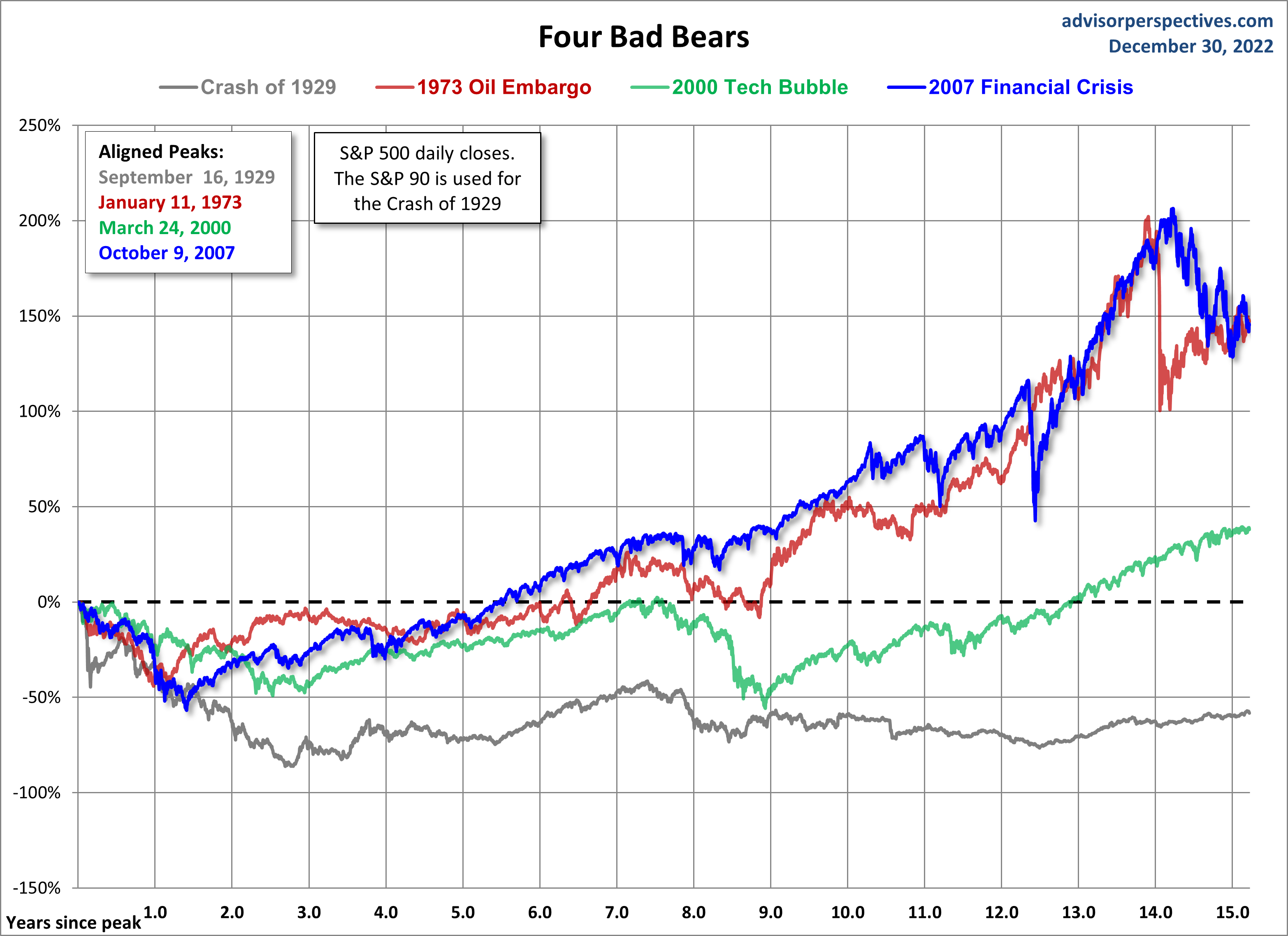
The first chart shows the price, excluding dividends for these four historic declines and their aftermath. We are now 3,835 market days from the 2007 peak in the S&P 500.
(Click on image to enlarge)
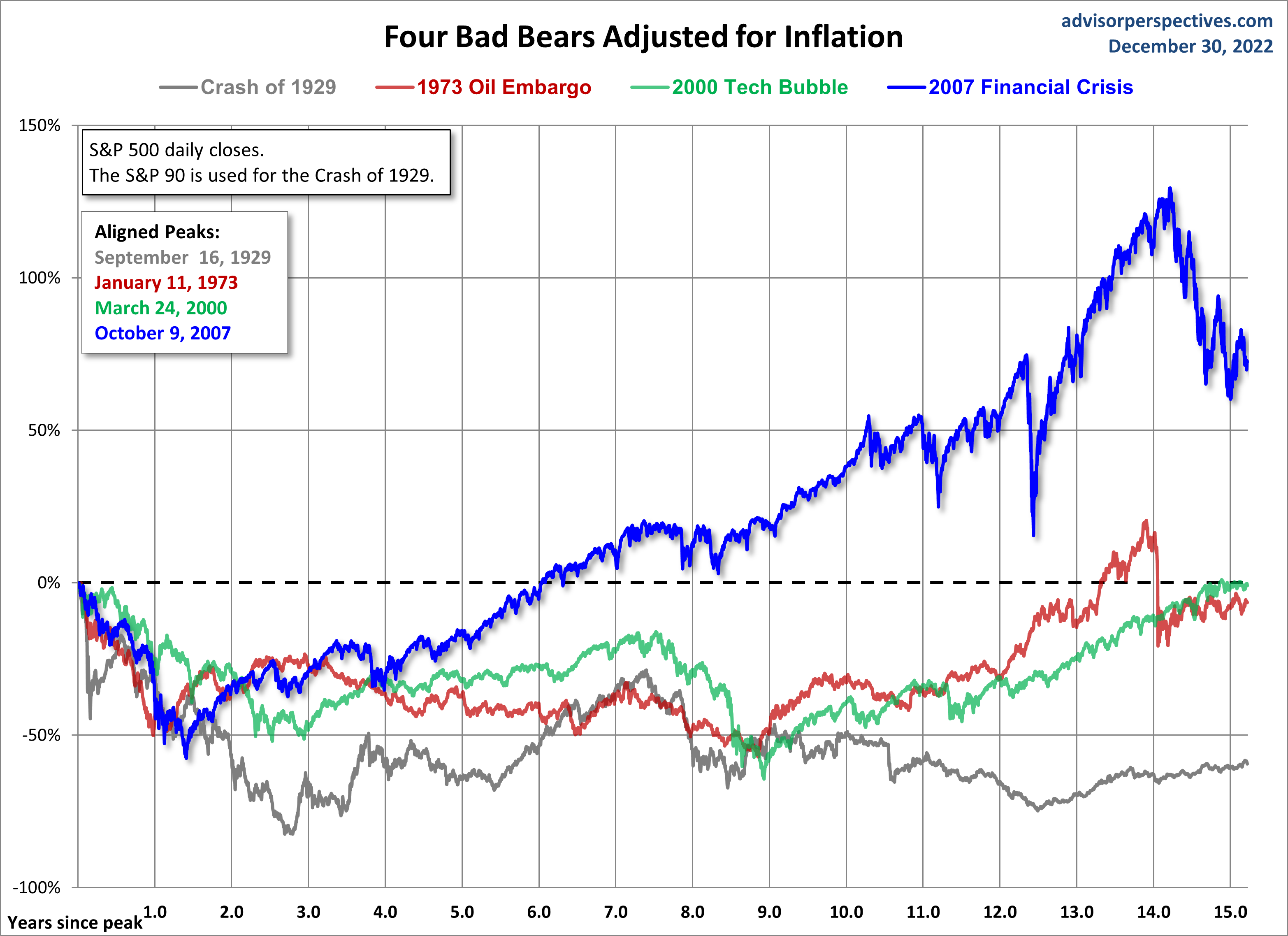
Inflation-Adjusted Performance
When we adjust for inflation, the gap between our current recovery and the other three widens, thanks to exceptionally low inflation in recent years.
(Click on image to enlarge)
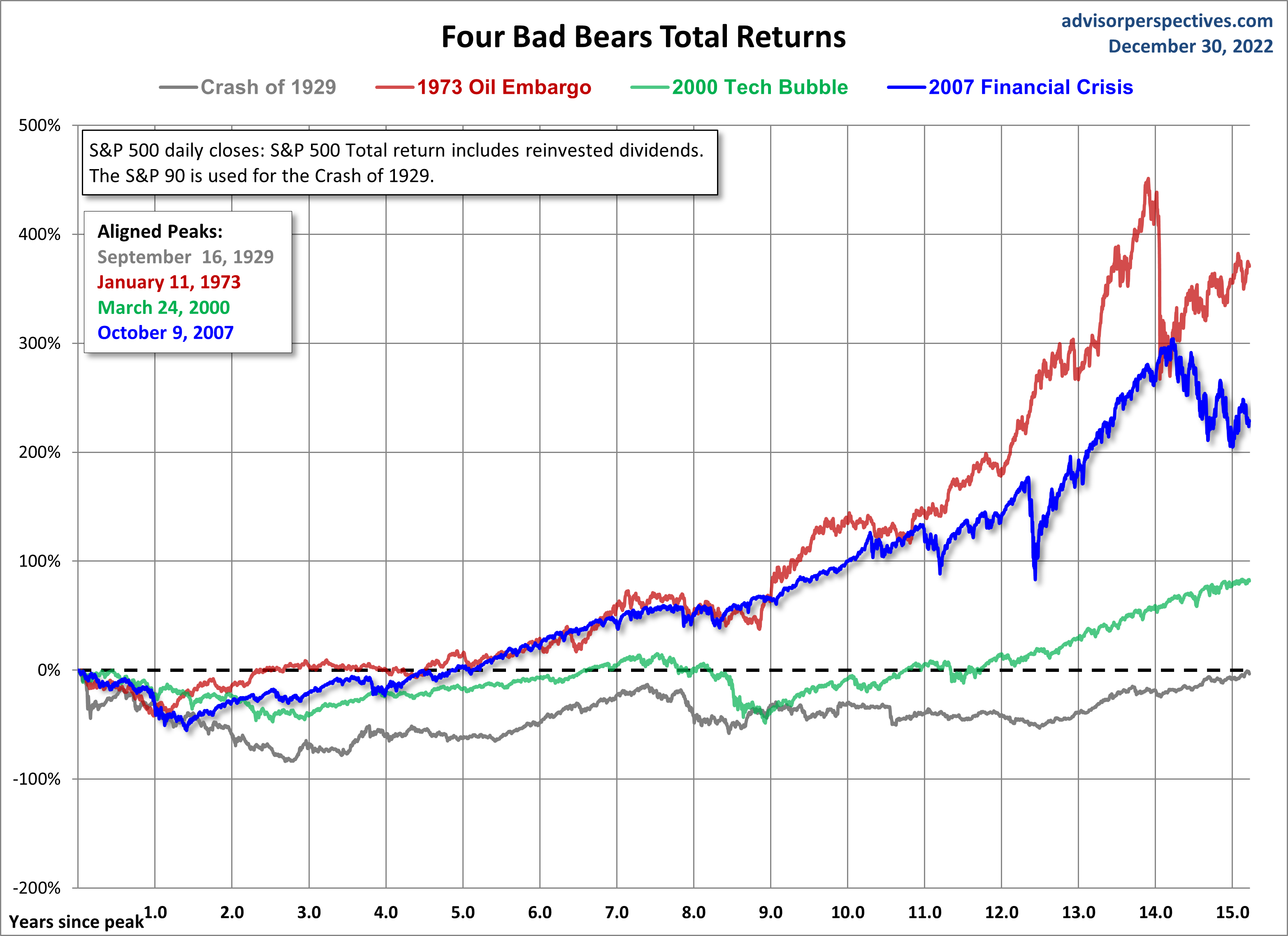
Nominal Total Returns
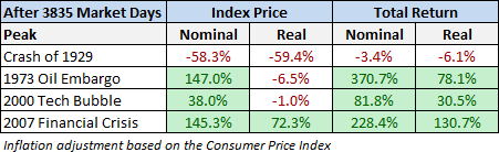
Now let's look at a total return comparison with dividends reinvested. The 1973 Oil Embargo Bear recovery is the top performer, up 370.7%. The 2007 crisis recovery is inches away in second place, up 228.4%.
(Click on image to enlarge)
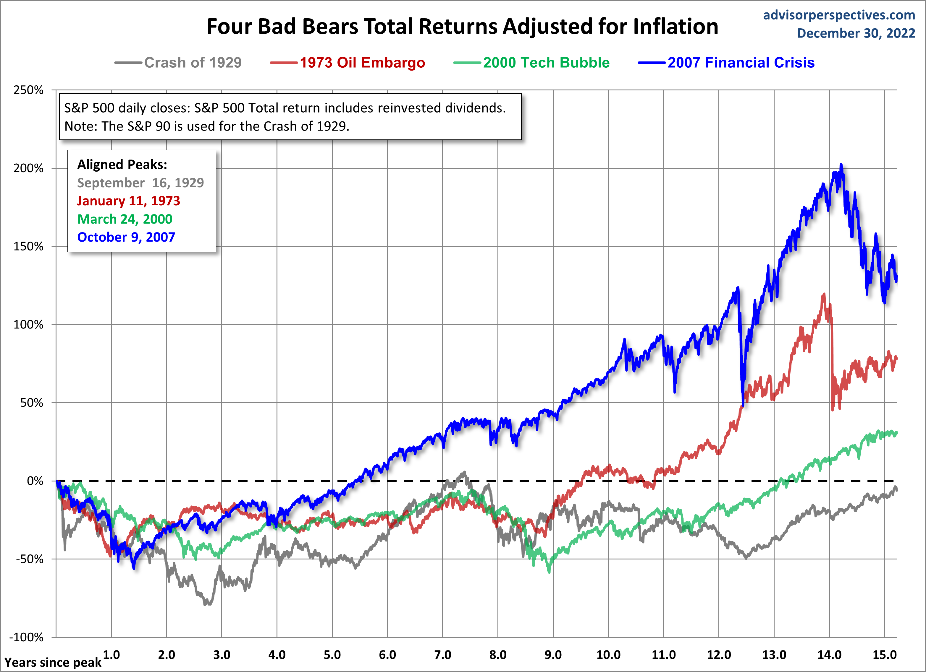
Real Total Returns
When we adjust total returns for inflation, the picture significantly changes. The spread between three of the four markets narrows dramatically, and the current real total return since the 2007 crisis has pulled far ahead of the others, up 130.7%. Second place, by this metric, goes to the post-Oil Embargo rally, with 78.1%.
(Click on image to enlarge)
Here is a table showing the relative performance of these four cycles at the equivalent point in time.
(Click on image to enlarge)
For a better sense of how these cycles figure into a larger historical context, here's a long-term view of secular bull and bear markets, adjusted for inflation, in the S&P Composite since 1871.
These charts are not intended as a forecast but rather as a way to study the current market in relation to historic market cycles.
More By This Author:
November Trade Deficit At $61.5B
Regression To Trend: 115% Above Trend In December
Cryptocurrencies Through January 4th

Comments
Log in or sign up to join the conversation.