What Is This Chart Telling Us About What’s Coming?
The economy is already in recession. It’s not a matter of a recession arriving soon… a recession is already here.
By quick way of review…
1) Copper, a commodity that is closely aligned with economic growth, has erased HALF of its pandemic gains.
2) Oil, another commodity that is closely aligned with economic growth, has collapsed by 23% in the last four months. And the situation is getting worse: oil dropped over 9% on Tuesday.
In light of all of this, you might be saying, “OK Graham, is a recession is already here, why isn’t it showing up in the data?”
Because the data is backward-looking.
Every piece of data the U.S. reports concerns what has already happened… usually months ago. Case in point, the U.S. only just released its GDP data concerning the first quarter of 2022 eight days ago.
To put that into context, the economy is now in its THIRD quarter of the year. And we’re only just getting the final results for the first quarter now!?!
Again, every piece of data in the U.S. is weeks, if not months old.
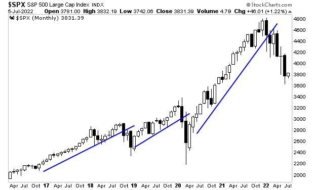
The market, by way of contrast, is forward-looking: it discounts what is about to happen.
With that in mind, what does the below chart tell you about the true state of the economy today?

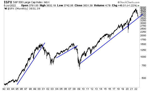
And if you think that chart is nasty looking, you better not look at this next one.

It makes perfect sense… the last two recessions saw major bear markets that erased over 50% of the stock market’s value. Why would this one be different?
More By This Author:
Two Portfolio Saving Charts
The Government’s Own Data Tells Us an Economic Collapse is Underway
Why Stocks Are About to Fall Another 25%


