
The Long-Term Message From Transportation Stocks
SIMILARITIES TO 2011-2012 AND 2015-2016
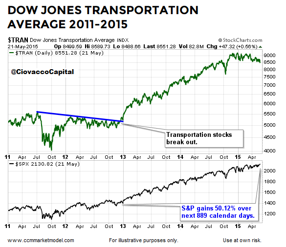
Over the past ten months, numerous developments (breadth thrusts, asset class behavior, sentiment, etc.) have told us to remain open to a bottoming-process/rally similar to action following major stock market lows in October 2011 and February 2016. After experiencing resistance at the blue line in the graph below, the Dow Jones Transportation Average finally broke out in December 2012, which provided another indication of increasing risk appetite. Following the “this looks different move” in transportation stocks, the S&P 500 tacked on an additional 50% over the next 2.4 years.
(Click on image to enlarge)
SIMILAR BREAKOUT IN 2016
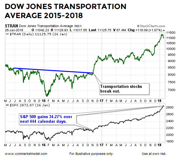
The “increasing risk appetite” pattern was also in play after stocks made a major low in February 2016. The Dow Jones Transportation Average experienced resistance at the blue line below for several months before breaking out in November 2016. After the push higher in transportation stocks, the S&P 500 gained an additional 34.27% over the next 1.2 years.
(Click on image to enlarge)
SIMILAR PATTERN IN HUMAN BEHAVIOR 2018-2019
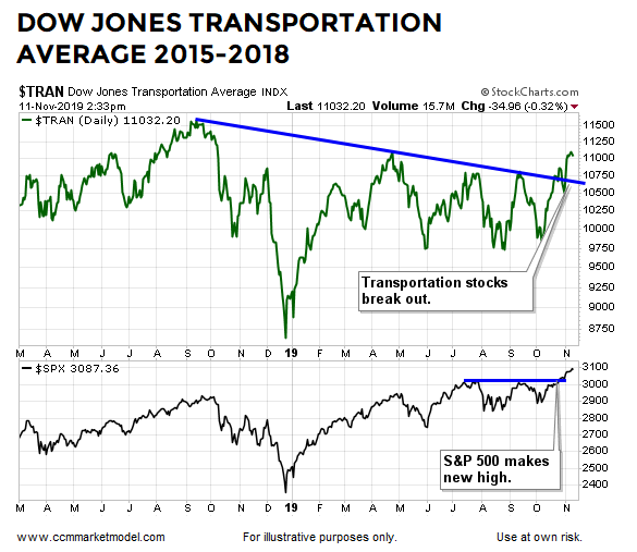
The Dow Jones Transportation Index had trouble clearing the blue line below in September 2018, April 2019, July 2019, and again in September 2019. Transportation stocks have successfully cleared the formally insurmountable line in recent sessions. The longer the breakout remains in place, the more meaningful it becomes.
(Click on image to enlarge)
HOW DID STOCKS AND BONDS PERFORM IN 2012 AND 2016?
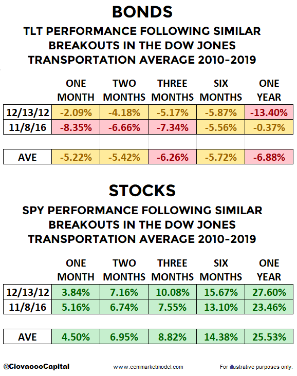
Logic says it leans bullish when economically-sensitive transportation stocks are able to clear previous areas of multi-month resistance. Thus, we would expect growth-oriented stocks to outperform defensive-oriented bonds following breakouts similar to the ones shown above that took place in December 2012 and November 2016. Not surprisingly, that is exactly what happened in the two previous cases.
(Click on image to enlarge)
THESE CHARTS SAY THE STOCK MARKET’S POTENTIAL UPSIDE IS MUCH GREATER THAN MOST BELIEVE
This week’s CCM stock market video provides a very long-term view rarely covered on Wall Street. Since markets exhibit fractal behavior, everything we know on a daily chart also applies to every conceivable timeframe from one-minute charts to annual charts. You can draw your own conclusions after reviewing common patterns in human behavior over the past sixty-six years.
RECENT BREAKOUT ALIGNS WITH PREVIOUS SIGNALS
Numerous forms of observable evidence have been in place over the past ten months that align with the “stocks could significantly outperform bonds” message above, including data covered in the posts below:
After An Extremely Rare Move In Bonds, How Have Stocks And Bonds Performed In The Past?
The Bullish Message From The Stock/Bond Ratio
Demographic Sweet Spot Says Bull Market Could Last Until 2035


