Saturday, September 11, 2021 1:06 AM EST
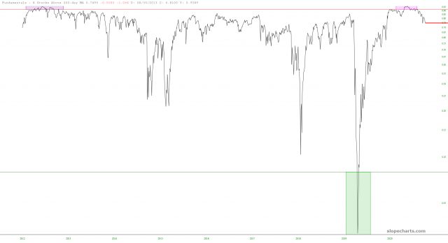
Here’s a fresh chart of the percentage of stocks above their 200-day moving averages. Breadth continues to wither away.

How did you like this article? Let us know so we can better customize your reading experience.
It seens that the author is trying to make a point. But a graph without legible labels does not do that very well. And certainly there needs to be some more comment about "why", which it is OK to label it "One person's opinion."