The Curious Sine Curve Of Equity Returns
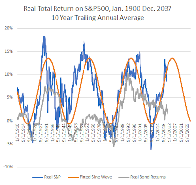
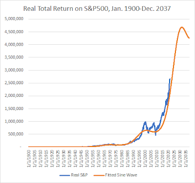
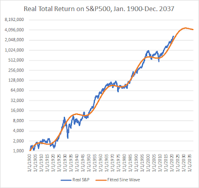
Occasionally, I take a new look at how equities are doing compared to a long-term sine wave. Over the course of the last century or so, real total returns on the S&P 500 follow a sine curve pattern in a surprisingly regular way. I'm just fitting curves here, so I don't want to say too much about it, but it is interesting.
The positive performance of the stock market over the last few years is actually right in line with the long-term trends.
Here are charts comparing real total returns to the sine curve, fitted to 20th century results, with the last 21 years out of sample.
Comments
Please wait...
Comment posted successfully.
No Thumbs up yet!


