
The good news is:
- The breadth indicators showed a modest improvement last week.
The Negatives
Negatives are in short supply.
The Positives
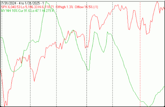
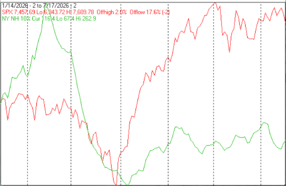
The first chart covers the last 6 months showing the SPX in red and a 10% trend (19 day EMA) of NYSE new highs (NY NH) in green. Dashed vertical lines have been drawn on the 1st trading day of each month.
NY NH not likely to confirm a new high, but, it is rising.
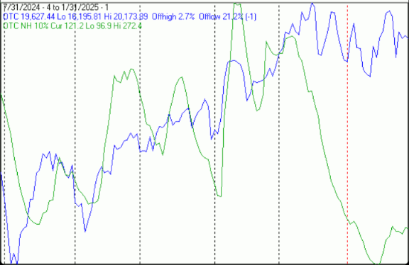
The next chart is similar to the 1st one except it shows the NASDAQ composite (OTC) in blue and OTC NH in green has been calculated with NASDAQ data.
OTC NH has stalled at a low level, a long way from confirming a new high should it occur.
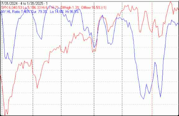
The next chart covers the past 6 months showing the SPX in red and a 40% trend (4 day EMA) of NYSE new highs divided by new highs + new lows (NY HL Ratio), in blue. Dashed horizontal lines have been drawn at 10% levels for the indicator; the line is solid at the 50%, neutral level (equal numbers of new highs and new lows).
NY HL ratio held near its recent high.
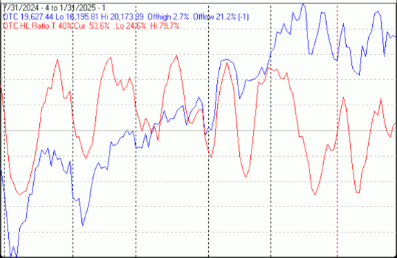
The next chart is similar to the one above except it shows the OTC in blue and OTC HL ratio, in red, has been calculated with NASDAQ data.
OTC HL Ratio took a little dive last week, but finished the week in positive territory.
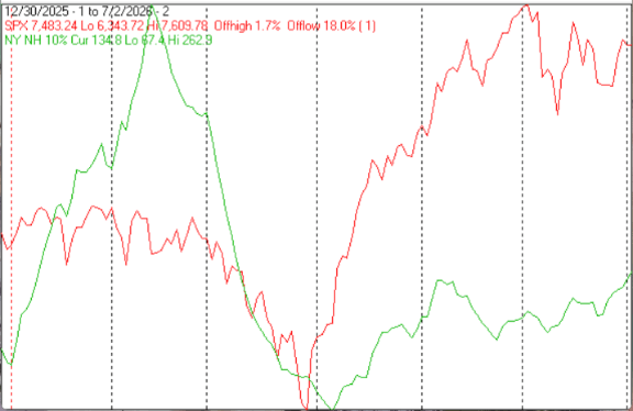
The next chart covers the past 6 months showing the OTC in blue and a 10% trend (19 day EMA) of NASDAQ new lows (OTC NL) in brown. OTC NL has been plotted on an inverted Y axis so decreasing numbers of new lows move the indicator upward (up is good).
OTC NL continued its move upward last week.
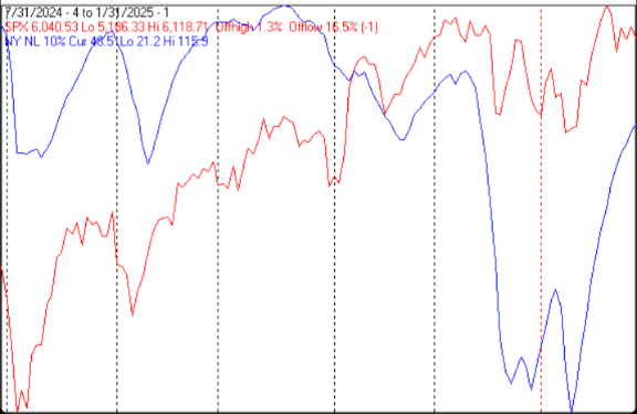
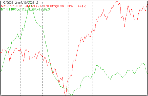
The next chart is similar to the one above except it shows the SPX in red and NY NL, in blue, has been calculated with NYSE data.
NY NL continued moving sharply upward.
Seasonality
Next week includes the first 5 trading days of February during the 1st year of the Presidential Cycle. The tables below show the daily change, on a percentage basis, for that period.
OTC data covers the period from 1963 to 2024 while SPX data runs from 1928 to 2024. There are summaries for both the 1st year of the Presidential Cycle and all years combined.
Seasonally next weeks returns have been modestly positive by all measures.
Report for the first 5 days of February.
The number following the year represents its position in the Presidential Cycle.
The number following the daily return represents the day of the week;
1 = Monday, 2 = Tuesday etc.
OTC Presidential Year 1 (PY1)
Day1 Day2 Day3 Day4 Day5 Totals
1965-1 0.23% 1 0.15% 2 0.50% 3 -0.08% 4 0.15% 5 0.95%
1969-1 0.67% 1 0.01% 2 0.41% 3 -0.24% 4 0.21% 5 1.06%
1973-1 0.14% 4 -1.14% 5 -0.36% 1 -0.38% 2 0.21% 3 -1.52%
1977-1 0.80% 2 0.17% 3 -0.13% 4 0.43% 5 -0.13% 1 1.12%
1981-1 -2.39% 1 0.24% 2 0.52% 3 0.88% 4 0.80% 5 0.07%
Avg -0.11% -0.11% 0.19% 0.12% 0.25% 0.33%
1985-1 -0.10% 5 0.84% 1 0.69% 2 0.62% 3 0.96% 4 3.02%
1989-1 0.48% 3 0.48% 4 0.29% 5 -0.09% 1 0.79% 2 1.95%
1993-1 0.78% 1 0.48% 2 0.50% 3 0.03% 4 -1.11% 5 0.68%
1997-1 -0.28% 1 -0.17% 2 -1.85% 3 -0.15% 4 0.84% 5 -1.60%
2001-1 0.36% 4 -4.39% 5 -0.65% 1 0.81% 2 -2.13% 3 -6.00%
Avg 0.25% -0.55% -0.20% 0.24% -0.13% -0.39%
2005-1 0.30% 2 0.31% 3 -0.84% 4 1.41% 5 -0.22% 1 0.96%
2009-1 1.22% 1 1.46% 2 -0.08% 3 2.06% 4 2.94% 5 7.60%
2013-1 1.18% 5 -1.51% 1 1.29% 2 -0.10% 3 -0.11% 4 0.76%
2017-1 0.50% 3 -0.11% 4 0.54% 5 -0.06% 1 0.19% 2 1.06%
2021-1 2.55% 1 1.56% 2 -0.02% 3 1.23% 4 0.57% 5 5.89%
Avg 1.15% 0.34% 0.18% 0.91% 0.67% 3.25%
OTC summary for PY1 1965 - 2021
Averages 0.43% -0.11% 0.05% 0.42% 0.26% 1.06%
% Winners 80% 67% 53% 53% 67% 80%
MDD 2/7/2001 6.29% -- 2/6/1997 2.43% -- 2/2/1981 2.39%
OTC summary for all years 1963 - 2024
Averages 0.36% 0.07% -0.02% 0.11% 0.08% 0.60%
% Winners 71% 68% 54% 60% 61% 66%
MDD 2/7/2002 7.86% -- 2/7/2001 6.29% -- 2/5/2018 5.97%
SPX PY1
Day1 Day2 Day3 Day4 Day5 Totals
1929-1 0.39% 5 -0.15% 6 -0.62% 1 0.23% 2 -0.82% 3 -0.97%
1933-1 -3.89% 3 -1.80% 4 -0.31% 5 -1.23% 6 0.47% 1 -6.75%
1937-1 0.28% 1 0.67% 2 0.72% 3 0.11% 4 -1.60% 5 0.19%
1941-1 -0.70% 6 -0.40% 1 0.10% 2 1.81% 3 0.39% 4 1.20%
1945-1 0.22% 4 0.74% 5 0.37% 6 0.37% 1 0.22% 2 1.92%
1949-1 0.79% 2 0.07% 3 -0.20% 4 -1.50% 5 -1.59% 6 -2.43%
1953-1 0.49% 1 0.11% 2 -0.45% 3 -1.02% 4 -1.30% 5 -2.17%
1957-1 -0.22% 5 -0.20% 1 -1.44% 2 -0.16% 3 -0.46% 4 -2.48%
1961-1 0.19% 3 0.65% 4 -0.13% 5 -0.74% 1 -0.18% 2 -0.21%
Avg 0.29% 0.27% -0.37% -0.61% -0.66% -1.07%
1965-1 0.02% 1 -0.03% 2 0.09% 3 -0.07% 4 -0.32% 5 -0.31%
1969-1 -0.12% 1 0.03% 2 0.27% 3 0.33% 4 -0.01% 5 0.50%
1973-1 -1.09% 4 -0.36% 5 -0.10% 1 0.19% 2 -0.69% 3 -2.05%
1977-1 0.50% 2 -0.18% 3 -0.50% 4 0.03% 5 0.01% 1 -0.13%
1981-1 -2.04% 1 1.22% 2 0.10% 3 0.81% 4 0.75% 5 0.84%
Avg -0.55% 0.14% -0.03% 0.26% -0.05% -0.23%
1985-1 -0.56% 5 0.96% 1 0.14% 2 -0.10% 3 0.77% 4 1.22%
1989-1 -0.13% 3 -0.08% 4 0.04% 5 -0.31% 1 1.21% 2 0.73%
1993-1 0.85% 1 0.01% 2 1.05% 3 0.53% 4 -0.14% 5 2.30%
1997-1 0.07% 1 0.32% 2 -1.39% 3 0.24% 4 1.21% 5 0.45%
2001-1 0.55% 4 -1.75% 5 0.36% 1 -0.15% 2 -0.84% 3 -1.83%
Avg 0.16% -0.11% 0.04% 0.04% 0.44% 0.57%
2005-1 0.69% 2 0.32% 3 -0.28% 4 1.10% 5 -0.11% 1 1.73%
2009-1 -0.05% 1 1.58% 2 -0.75% 3 1.64% 4 2.69% 5 5.11%
2013-1 1.01% 5 -1.15% 1 1.04% 2 0.05% 3 -0.18% 4 0.77%
2017-1 0.03% 3 0.06% 4 0.73% 5 -0.21% 1 0.02% 2 0.62%
2021-1 1.61% 1 1.39% 2 0.10% 3 1.09% 4 0.39% 5 4.57%
Avg 0.66% 0.44% 0.17% 0.73% 0.56% 2.56%
SPX summary for PY1 1929 - 2021
Averages -0.05% 0.08% -0.04% 0.13% 0.00% 0.12%
% Winners 63% 58% 54% 58% 46% 58%
MDD 2/4/1933 7.06% -- 2/5/1949 3.26% -- 2/6/1953 2.75%
SPX summary for all years 1928 - 2024
Averages 0.23% 0.11% -0.17% 0.06% -0.01% 0.21%
% Winners 65% 61% 47% 53% 51% 65%
MDD 2/4/1933 7.06% -- 2/5/2018 6.19% -- 2/5/1932 5.47%
February
Since 1963, over all years, the OTC in February has been up 55% of the time with an average gain of 0.6%. During the 1st year of the Presidential Cycle February has been up only 40% time with an average loss of -2.8%. On average February has been the worst month of the 1st year of the Presidential Cycle. The best February ever for the OTC was 2000 (+19.2%), the worst 2001 (-22.4%).
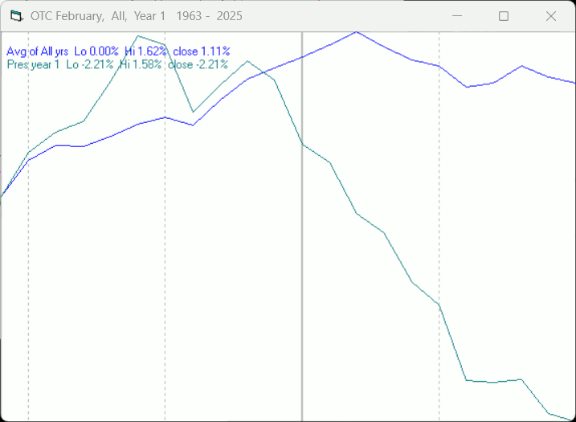
The average month has 21 trading days. The chart below has been calculated by averaging the daily percentage change for each of the 1st 11 trading days and each of the last 10. In months when there were more than 21 trading days some of the days in the middle were not counted. In months when there were less than 21 trading days some of the days in the middle of the month were counted twice. Dashed vertical lines have been drawn after the 1st trading day and at 5 trading day intervals after that. The line is solid on the 11th trading day, the dividing point.
In the chart below the blue line shows the average daily performance of the OTC in February over all years since 1963, while the green line shows the average during the 1st year of the Presidential Cycle over the same period.
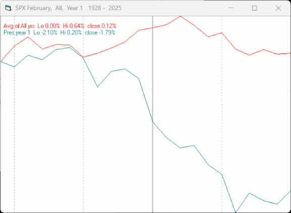
Since 1928 the SPX has been up 53% of the time in February and has, on average, lost -0.1%. During the 1st year of the Presidential Cycle the SPX has been up 46% of the time with an average loss of -1.7%. The best February ever for the SPX was 1931 (+11.4%) the worst 1933 (-18.4%).
The chart below is similar to the one above except it shows the average daily average performance over all years since 1928 for the SPX in February in red and the average daily performance during the 1st year of the Presidential Cycle, over the same period, in green.
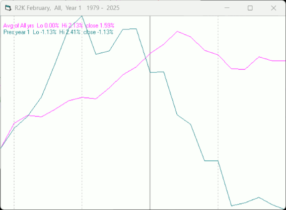
Since 1979 the Russell 2000 (R2K) has been up 59% of the time in February with an average gain of 1.1%. During the 1st year of the Presidential Cycle the R2K has been up 64% of the time with an average loss of -0.9%. The best February for the R2K 2000 (+16.4%), the worst 2009 (-12.3%)
The chart below is similar to those above except it shows the average daily performance of the R2K, over all years since 1979, in February in magenta and the average daily performance during the 1st year of the Presidential Cycle in green.
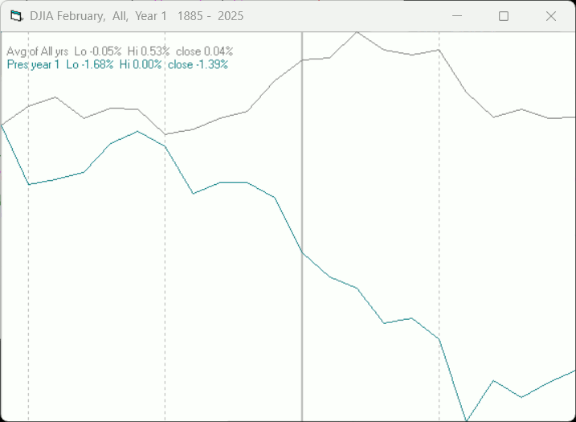
Since 1885 the Dow Jones Industrial Average (DJIA) has been up 52% of the time in February with an average loss of -0.2%. During the 1st year of the Presidential Cycle the DJIA has been up 40% of the time in February with an average loss of -1.2%. The best February for the DJIA 1931 (+13.2%), the worst 1933 (-15.6%)
The chart below is similar to those above except it shows the average daily performance over all years for the DJIA in February in grey and the average performance during the 1st year of the Presidential Cycle in green.
Conclusion
The breadth indicators were stronger than prices would suggest.
Seasonality has been ok during the 1st week of February, but deteriorates badly after that.
The strongest sectors last week were Precious Metals (for the 2nd week) and Internet while the weakest were Electronics and Energy (both for the 2nd week in a row).
I expect the major averages to be higher on Friday February 7 than they were on Friday January 30.
Last week the DJIA was up while the other indices were down, so I am calling last weeks positive forecast a tie.
More By This Author:
Technical Market Report For January 25, 2025Technical Market Report For January 18, 2025
Technical Market Report For January 11, 2025
Comments
Log in or sign up to join the conversation.