
Some Surprisingly Bad Data To Contend With
Last week, we highlighted what we deemed to be Some Surprisingly Good Data. We cited the surge in Empire State General Business Conditions Index, the readings from US Home Purchases, Retail Sales, and even Hotel Occupancies as data that surprised to the upside - in a pretty big way.
The positive surprises helped fuel the narrative that the stock market was advancing on the idea that the economy was indeed recovering. And perhaps recovering faster than anyone had expected. As such, current prices, which the bears argued were getting ahead of themselves, could be seen as appropriate.
After all, states were reopening. Workers were going back to their offices. People were heading back to their favorite restaurants. Airlines were adding flights. And professional sports were coming back. There was hope. And the feeling was that maybe, just maybe, we could put COVID-19 in the rear-view mirror. Which is certainly what the White House would have us believe. Things were good.
But... Right on schedule following the re-openings and the national protests, the coronavirus made a comeback. A pretty impressive comeback, at that. Which, in short, puts a big dent in the bullish thesis that everything is all better now.
I know, I know, you've heard the COVID story already. You've watched it on the news. You've read the stories and the news alerts on your phones. And like many, you are probably tired of hearing about COVID stuff.
But, just as last week's missive detailed some surprisingly good data/charts. This week we are going to look at some surprisingly bad data. As in some REALLY surprisingly bad data.
Lest we forget, the country began reopening stores, restaurants, bars, hair salons, etc. because we had COVID on the run. The curve had been flattened. The risk of the health care system being overwhelmed in the state you reside had fallen. And so it was time to get things back to normal.
First, let's take a look at what "curve flattening" and a positive trend in the number of new cases of coronavirus looks like. Below is a chart of the number of daily new cases and a 5-day moving average in the United Kingdom to give you a clear picture of the trend.
(Click on image to enlarge)
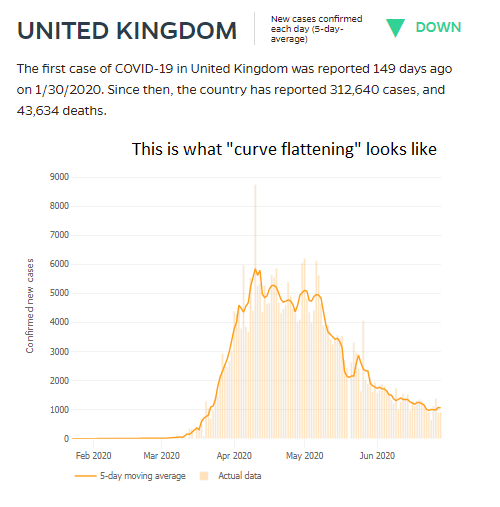
Source: Johns Hopkins University
As it says on the chart, THIS is what "curve flattening" looks like. This is what a decline in the risk of COVID spread looks like.
From my seat, it is important to recall that the outbreak in the UK was behind the U.S. by at least a couple of weeks. As such, it would be safe to assume that a graph of new COVID cases would look similar in the good 'ol USofA. But that's where you'd be wrong. As in REALLY wrong!
(Click on image to enlarge)

Source: Johns Hopkins University
Yes, in late May, the trend of new cases in the U.S. was definitely going the right direction. But then folks got impatient.
Instead of remaining diligent and actually flattening the curve, many states decided it was time to get back to business. The daily briefings from the White House stopped. No, instead of sticking to the plan and reopening when the data warranted, we wanted to move on - NOW.
People were tired of hearing the warnings from Dr. Fauci. They were sick of hearing about COVID. Lots of folks wanted to, in the words of a former neighbor, "get my life back."
So, we reopened. Despite the fact that at the time the states reopened, exactly ZERO met the criteria outlined by the CDC and the White House. No, everyone had coronavirus fatigue. It was time to move on.
Except, apparently it wasn't.
Unfortunately, as of Friday, the 5-day moving average of cases in the United States is roughly double where it stood near the end of May.
Below are some of the really bad charts I've been talking about. Charts of new cases from Arizona, Florida, Texas, and Georgia.
(Click on image to enlarge)

(Click on image to enlarge)

(Click on image to enlarge)

(Click on image to enlarge)

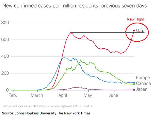
Also in the category of surprisingly bad data/charts is the trend of the virus around the world. First up is a chart of the 5-day moving averages of the 10 most-affected countries. Note that the US and Brazil are leading the way higher here.
(Click on image to enlarge)

Source: Johns Hopkins University, The New York Times
As I've noted, this is NOT what "curve flattening" looks like.
Next is the argument that the U.S. is doing better than other countries. Well, it clearly looks like we may be better than some countries, such as Brazil and India.
(Click on image to enlarge)

Source: Johns Hopkins University
(Click on image to enlarge)

Source: Johns Hopkins University
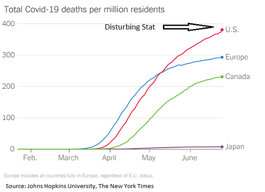
But this is definitely the case when compared to Europe, Canada, or Japan, which are developed countries with somewhat similar economic systems.
(Click on image to enlarge)
Then there is the idea that the U.S. is doing better because our death rate is lower. Also not true compared to Europe, Canada, and Japan.
(Click on image to enlarge)
The Point
My point on this fine Monday morning is that a healthy part of the bull case for the stock market is that we can reopen the country and that the economy will recover in short order.
However, in order for this to occur, people have to feel safe enough to go to a restaurant, head back to the malls, or get on a plane. And the bottom line is that unless/until the current spike in cases falls and the curve is ACTUALLY flattened, people are unlikely to feel safe.
Thus, the question becomes, how long will it take for the virus to be contained? And can the stock market continue to ignore the surprisingly bad news on the virus, to look ahead, and to assume that growth will resume tout suite?
Obviously, I don't have the answers here. But these are the important questions I'll be wrestling with over the holiday weekend.
Here's wishing everyone a Happy Fourth!
Weekly Market Model Review
Each week we do a disciplined, deep dive into our key market indicators and models. The overall goal of this exercise is to (a) remove emotion from the investment process, (b) stay "in tune" with the primary market cycles, and (c) remain cognizant of the risk/reward environment.
The Major Market Models
We start with six of our favorite long-term market models. These models are designed to help determine the "state" of the overall market.
There are no changes to report on the Primary Cycle board this week. However, I will note that the hypothetical average historical return for the S&P 500 based on the current readings of the models moved up to +13.4% from +10.7%. As such, there was some internal improvement in a couple models. Overall, the board suggests that the bulls be given the benefit of any doubt here and the dips (even the scary ones) should be bought.
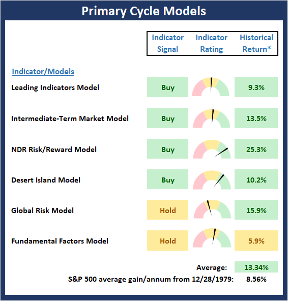
* Source: Ned Davis Research (NDR) as of the date of publication. Historical returns are hypothetical average annual performances calculated by NDR. Past performances do not guarantee future results or profitability - NOT INDIVIDUAL INVESTMENT ADVICE.
The State of the Fundamental Backdrop
Next, we review the market's fundamental factors in the areas of interest rates, the economy, inflation, and valuations.
There are also no changes to the Fundamental Factors board to report this week. Clearly the board offers a mixed bag and/or something for both teams to crow about. The bulls can cite, overwhelmingly positive monetary conditions and low inflation while the bears will argue that valuations are a problem and the economy is questionable. The bottom line is this is what makes a market.

* Source: Ned Davis Research (NDR) as of the date of publication. Historical returns are hypothetical average annual performances calculated by NDR. Past performances do not guarantee future results or profitability - NOT INDIVIDUAL INVESTMENT ADVICE.
The State of the Trend
After looking at the big-picture models and the fundamental backdrop, I like to look at the state of the trend. This board of indicators is designed to tell us about the overall technical health of the current trend.
The trend board took a hit last week as five of the board's components faltered. As such, we've got to rate the board as moderately negative - especially from a short-term perspective. However, I'll also note that the S&P is currently flirting with its 200-day moving average, which while not exactly a strong timing indicator, is viewed by many as the line of demarcation between a bullish and bearish environment. Personally, I'm watching key support at 2965 as the really important line in the sand.
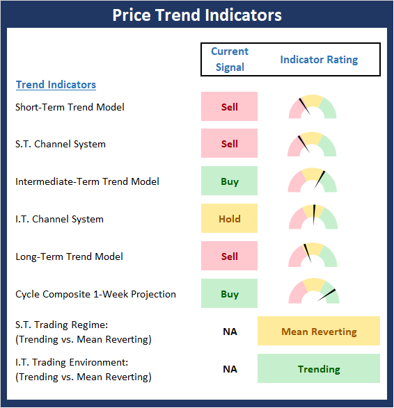
* Source: Ned Davis Research (NDR) as of the date of publication. Historical returns are hypothetical average annual performances calculated by NDR. Past performances do not guarantee future results or profitability - NOT INDIVIDUAL INVESTMENT ADVICE.
The State of Internal Momentum
Next, we analyze the "oomph" behind the current trend via our group of market momentum indicators/models.
The Momentum Board also gave up some ground last week. But given that stocks are currently in a consolidation phase, this is to be expected. So, since there isn't an abundance of red on the board and the volume/thrust indicators remain in decent shape, I'm willing to exhibit some patience here and allow the bulls the chance to work through what appears to be a consolidation phase.
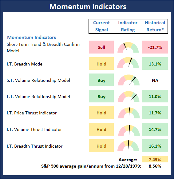
* Source: Ned Davis Research (NDR) as of the date of publication. Historical returns are hypothetical average annual performances calculated by NDR. Past performances do not guarantee future results or profitability - NOT INDIVIDUAL INVESTMENT ADVICE.
Early Warning Signals
Once we have identified the current environment, the state of the trend, and the degree of momentum behind the move, we then review the potential for a counter-trend move to begin. This batch of indicators is designed to suggest when the table is set for the trend to "go the other way."
The Early Warning board continues to sport a lot of contradictory evidence, which suggest that neither team holds an edge to start the week. However, we will note that stocks are becoming oversold and sentiment is sinking from a near-term perspective - a positive from a contrarian point of view.
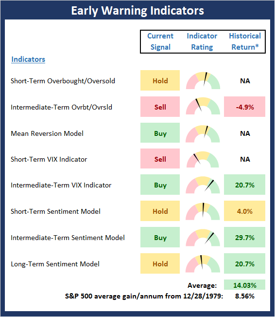
* Source: Ned Davis Research (NDR) as of the date of publication. Historical returns are hypothetical average annual performances calculated by NDR. Past performances do not guarantee future results or profitability - NOT INDIVIDUAL INVESTMENT ADVICE.
Disclosure: At the time of publication, Mr. Moenning held long positions in the following securities mentioned: none - Note that positions may change at any time.
The opinions and forecasts ...
more

